Note
Access to this page requires authorization. You can try signing in or changing directories.
Access to this page requires authorization. You can try changing directories.
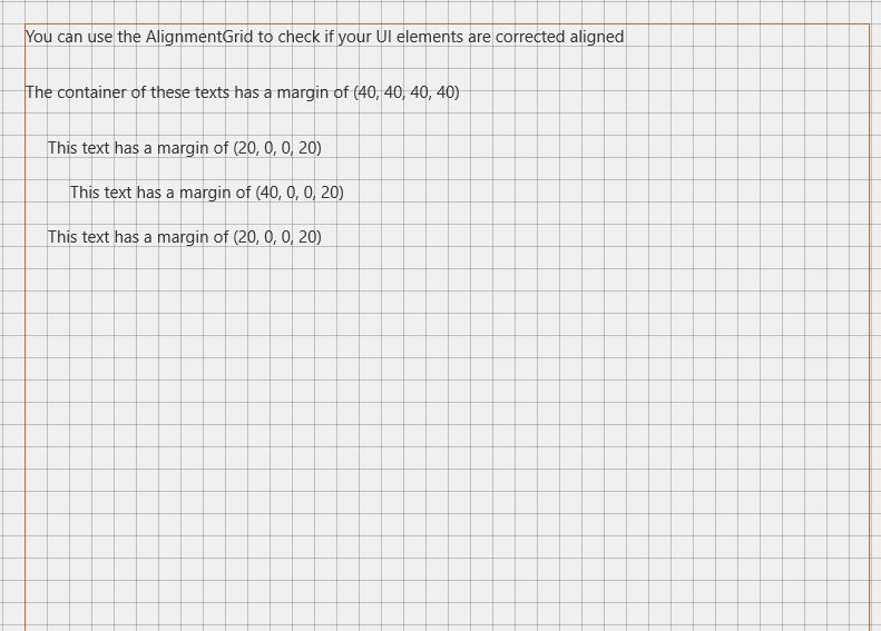
The AlignmentGrid Control can be used to display a grid to help with aligning controls.
You can control the grid's steps with HorizontalStep and VerticalStep properties. Line color can be defined with LineBrush property.
Syntax
<developerTools:AlignmentGrid Opacity="1" LineBrush="Black"
                    HorizontalStep="20" VerticalStep="20"/>
Sample Output
Properties
| Property | Type | Description |
|---|---|---|
| HorizontalStep | double | Gets or sets the step to use horizontally |
| LineBrush | Brush | Gets or sets line Brush |
| VerticalStep | double | Gets or sets the step to use vertically |
Sample Project
AlignmentGrid Sample Page Source. You can see this in action in the Windows Community Toolkit Sample App.
Requirements
| Device family | Universal, 10.0.16299.0 or higher |
|---|---|
| Namespace | Microsoft.Toolkit.Uwp.DeveloperTools |
| NuGet package | Microsoft.Toolkit.Uwp.DeveloperTools |