Note
Access to this page requires authorization. You can try signing in or changing directories.
Access to this page requires authorization. You can try changing directories.
Attached Shadows allow you to more easily create beautiful shadow effects within your app with little to no modification of the visual tree required, unlike our previous DropShadowPanel control.
Platform APIs:
AttachedCardShadow,AttachedDropShadow
Introduction
There are two types of attached shadows available today, the AttachedCardShadow and the AttachedDropShadow. It is recommended to use the AttachedCardShadow where possible, if you don't mind the dependency on Win2D. The AttachedCardShadow provides an easier to use experience that is more performant and easier to apply across an entire set of elements, assuming those elements are rounded-rectangular in shape. The AttachedDropShadow provides masking support and can be leveraged in any UWP app without adding an extra dependency.
Capability Comparison
The following table outlines the various capabilities of each shadow type in addition to comparing to the previous DropShadowPanel implementation:
| Capability | AttachedCardShadow | AttachedDropShadow | DropShadowPanel (deprecated) |
|---|---|---|---|
| Dependency/NuGet Package | 🟡 Win2D viaMicrosoft.Toolkit.Uwp.UI.Media |
✅ UWP Only (Composition Effect)Microsoft.Toolkit.Uwp.UI |
✅ UWP Only (Composition Effect)Microsoft.Toolkit.Uwp.UI |
| Layer | Inline Composition + Win2D Clip Geometry |
Composition via Target Element Backdrop |
Composition viaContentControl Container |
| Modify Visual Tree | ✅ No | 🟡 Usually requires single target element, even for multiple shadows | ❌ Individually wrap each element needing shadow |
| Extra Visual Tree Depth | ✅ 0 | 🟡 1 per sibling element to cast one or more shadows to | ❌ 4 per Shadowed Element |
| Masking/Geometry | 🟡 Rectangular/Rounded-Rectangles only | ✅ Can mask images, text, and shapes (performance penalty) | ✅ Can mask images, text, and shapes (performance penalty) |
| Performance | ✅ Fast, applies rectangular clipped geometry | 🟡 Slower, especially when masking (default); can use rounded-rectangles optimization |
❌ Slowest, no optimization for rounded-rectangles |
| ResourceDictionary Support | ✅ Yes | ✅ Yes | ❌ Limited, via complete custom control style + still need to wrap each element to apply |
| Usable in Styles | ✅ Yes, anywhere, including app-level | 🟡 Yes, but limited in scope due to element target | ❌ No |
| Supports Transparent Elements | ✅ Yes, shadow is clipped and not visible | ❌ No, shadow shows through transparent element | ❌ No, shadow shows through transparent element |
| Animation Support | ✅ Yes, in XAML via AnimationSet |
🟡 Partial, translating/moving element may desync shadow | ❌ No |
AttachedCardShadow (Win2D)
The AttachedCardShadow is the easiest to use and most performant shadow. It is recommended to use it where possible, if taking a Win2D dependency is not a concern. It's only drawbacks are the extra dependency required and that it only supports rectangular and rounded-rectangular geometries (as described in the table above).
The great benefit to the AttachedCardShadow is that no extra surface or element is required to add the shadow. This reduces the complexity required in development and allows shadows to easily be added at any point in the development process. It also supports transparent elements, without displaying the shadow behind them!
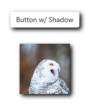
Example
The example shows how easy it is to not only apply an AttachedCardShadow to an element, but use it in a style to apply to multiple elements as well:
    xmlns:ui="using:Microsoft.Toolkit.Uwp.UI"
    xmlns:media="using:Microsoft.Toolkit.Uwp.UI.Media"/>

    <Page.Resources>
        <media:AttachedCardShadow x:Key="CommonShadow" Offset="4"/>

        <Style TargetType="Button" BasedOn="{StaticResource DefaultButtonStyle}">
            <Setter Property="ui:Effects.Shadow" Value="{StaticResource CommonShadow}"/>
            <Setter Property="HorizontalAlignment" Value="Center"/>
        </Style>
    </Page.Resources>

    <StackPanel Spacing="32" VerticalAlignment="Center">
        <Button Content="I Have a Shadow!"/>
        <Image ui:Effects.Shadow="{StaticResource CommonShadow}"
               Height="100" Width="100"
               Source="ms-appx:///Assets/Photos/Owl.jpg"/>
    </StackPanel>
Example Output
AttachedDropShadow (Composition)
The AttachedDropShadow provides masking support to a wide variety of elements including transparent images, shapes, and text. Masking to a custom shape that's not rectangular or rounded-rectangular is the main scenario where an AttachedDropShadow will be useful. Unlike it's predecessor, the DropShadowPanel, the AttachedDropShadow doesn't need to wrap the element being shadowed; however, it does require another element to cast the shadow on to.
This makes it a bit more complex to use than the AttachedCardShadow and the DropShadowPanel, but since multiple AttachedDropShadow elements can share the same surface, this makes it much more performant than its predecessor.
Remarks
While DropShadowPanel encapsulated the complexities of adding a shadow, it added a lot of depth and complexity to the visual tree. AttachedDropShadow instead requires that you provide the surface where the shadows should be cast, such as a common backdrop element. This means that each shadow can use the same shared surface rather than creating its own backdrop element for each shadow (like DropShadowPanel did). This slight trade-off for ease-of-use is a gain in performance. However, it does mean it may not be as flexible for certain use cases with manipulation of an element. In those cases we recommend to try and use AttachedCardShadow instead or wrapping an element and its backdrop in a custom control.
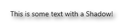
Example
The following example shows how to use an AttachedDropShadow as a resource with a TextBlock to mask the shadow of some text:
    <Page.Resources>
        <ui:AttachedDropShadow x:Key="CommonShadow" Offset="4" CastTo="{x:Bind ShadowTarget}"/>
    </Page.Resources>

    <Grid>
        <Border x:Name="ShadowTarget"/>
        <TextBlock ui:Effects.Shadow="{StaticResource CommonShadow}"
                   Text="This is some text with a Shadow!"
                   HorizontalAlignment="Center"/>
    </Grid>
Example Output
Animation
Either type of Attached Shadow can be easily animated using the Toolkit's AnimationSet api. These provide an easy XAML based way to animate a wide variety of elements, including a variety of shadow properties. They can also be animated with any other composition animation technique in code-behind as well using either the AnimationBuilder or built-in composition animations.
Platform APIs:
BlurRadiusDropShadowAnimation,ColorDropShadowAnimation,OffsetDropShadowAnimation,OpacityDropShadowAnimation
Note
AttachedCardShadow has better support for animations which involve translation of the element along with the shadow. If animating an AttachedDropShadow it is best to only animate the shadow itself vs. moving the element it is attached to. This can cause the shadow and element to be desynchronized.
Example
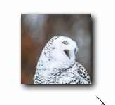
The following example uses a combination of behaviors and animations apis to create an animated shadow effect when hovering over an image with an OffsetDropShadowAnimation:
    xmlns:ui="using:Microsoft.Toolkit.Uwp.UI"
    xmlns:media="using:Microsoft.Toolkit.Uwp.UI.Media"
    xmlns:interactivity="using:Microsoft.Xaml.Interactivity"
    xmlns:interactions="using:Microsoft.Xaml.Interactions.Core"
    xmlns:ani="using:Microsoft.Toolkit.Uwp.UI.Animations"
    xmlns:behaviors="using:Microsoft.Toolkit.Uwp.UI.Behaviors"/>

    <Image Height="100" Width="100"
           Source="ms-appx:///Assets/Photos/Owl.jpg">
        <ui:Effects.Shadow>
            <media:AttachedCardShadow Offset="4" CornerRadius="0"/>
        </ui:Effects.Shadow>
        <ani:Explicit.Animations>
            <ani:AnimationSet x:Name="ShadowEnterAnimation">
                <ani:OffsetDropShadowAnimation To="12"/>
            </ani:AnimationSet>

            <ani:AnimationSet x:Name="ShadowExitAnimation">
                <ani:OffsetDropShadowAnimation To="4"/>
            </ani:AnimationSet>
        </ani:Explicit.Animations>
        <interactivity:Interaction.Behaviors>
            <interactions:EventTriggerBehavior EventName="PointerEntered">
                <behaviors:StartAnimationAction Animation="{x:Bind ShadowEnterAnimation}"/>
            </interactions:EventTriggerBehavior>
            <interactions:EventTriggerBehavior EventName="PointerExited">
                <behaviors:StartAnimationAction Animation="{x:Bind ShadowExitAnimation}"/>
            </interactions:EventTriggerBehavior>
        </interactivity:Interaction.Behaviors>
    </Image>
Example Output
Sample Project
Attached Shadows sample page Source. You can see this in action in Windows Community Toolkit Sample App.