Note
Access to this page requires authorization. You can try signing in or changing directories.
Access to this page requires authorization. You can try changing directories.
The Interactable component is an all-in-one container to make any object easily interactable and responsive to input. Interactable acts as a catch-all for all types of input including touch, hand rays, speech etc and funnel these interactions into events and visual theme responses. This component provides an easy way to make buttons, change color on objects with focus, and more.
How to configure Interactable
The component allows for three primary sections of configuration:
- General input configuration
- Visual Themes targeted against multiple GameObjects
- Event handlers
General input settings
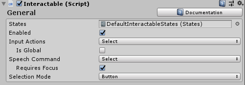
States
States is a ScriptableObject parameter that defines the interactions phases, like press or observed, for Interactable Profiles and Visual Themes.
The DefaultInteractableStates (Assets/MRTK/SDK/Features/UX/Interactable/States/DefaultInteractableStates.asset) ships with MRTK out-of-box and is the default parameter for Interactable components.
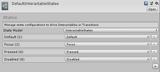
The DefaultInteractableStates asset contains four states and utilizes the InteractableStates state model implementation.
Default: Nothing is happening, this is the most isolated base state.
Focus: The object is being pointed at. This is a single state, no other states are currently set, but it will out rank Default.
Press: The object is being pointed at and a button or hand is pressing. The Press state out ranks Default and Focus. This state will also get set as a fallback to Physical Press.
Disabled: The button should not be interactive and visual feedback will let the user know if for some reason this button is not usable at this time. In theory, the disabled state could contain all other states, but when Enabled is turned off, the Disabled state trumps all other states.
A bit value (#) is assigned to the state depending on the order in the list.
Note
It is generally recommended to utilize the DefaultInteractableStates (Assets/MRTK/SDK/Features/UX/Interactable/States/DefaultInteractableStates.asset) when creating Interactable components.
However, there are 17 Interactable states available that can be used to drive themes, though some are meant to be driven by other components. Here is a list of those with built-in functionality.
- Visited: the Interactable has been clicked.
- Toggled: The button is in a toggled state or Dimension index is an odd number.
- Gesture: The hand or controller was pressed and has moved from the original position.
- VoiceCommand: A speech command was used to trigger the Interactable.
- PhysicalTouch: A touch input is currently detected, use
NearInteractionTouchableto enable. - Grab: A hand is currently grabbing in the bounds of the object, use
NearInteractionGrabbableto enable
Enabled
Toggles whether an Interactable will start enabled or not. This corresponds to the Interactable.IsEnabled in code.
An Interactable's enabled property is different than the enabled property configured via GameObject/Component (i.e SetActive etc). Disabling the GameObject or Interactable MonoBehaviour will disable everything in the class from running including input, visual themes, events, etc. Disabling via Interactable.IsEnabled will disable most input handling, resetting related input states. However, the class will still run every frame and receive input events which will be ignored. This is useful for displaying the Interactable in a disabled state which can be done via Visual Themes. A typical example of this would be a submit button waiting for all the required input fields to be completed.
Input Actions
Select the input action from the input configuration or controller mapping profile that the Interactable component should react to.
This property can be configured at runtime in code via Interactable.InputAction.
IsGlobal
If true, this will mark the component as a global input listener for the selected input action. Default behavior is false which will restrict input to only this Interactable collider/GameObject.
This property can be configured at runtime in code via Interactable.IsGlobal.
Speech Command
Speech command, from the MRTK Speech Commands Profile, to trigger an OnClick event for voice interaction.
This property can be configured at runtime in code via Interactable.VoiceCommand.
Requires Focus
If true, the voice command will only activate the Interactable if and only if it already has focus from a pointer. If false, then the Interactable will act as a global listener for the selected voice command. The default behavior is true, as multiple global speech listeners can be difficult to organize in a scene.
This property can be configured at runtime in code via Interactable.VoiceRequiresFocus.
Selection Mode
This property defines the selection logic. When an Interactable is clicked, it iterates into a next Dimension level. Dimensions is similar to rank and defines a state outside of inputs (i.e focus, press etc). They are useful for defining Toggle states or other multi-rank states associated with a button. The current Dimension level is tracked by Interactable.DimensionIndex.
The selection modes available are:
- Button - Dimensions = 1, simple clickable Interactable
- Toggle - Dimensions = 2, Interactable alternates between on/off state
- Multi-dimension - Dimensions >= 3, every click increases the current dimension level + 1. Useful for defining a button state to a list, etc.
Interactable also allows for multiple Themes to be defined per Dimension. For example when SelectionMode=Toggle, one theme may be applied when the Interactable is deselected and another theme applied when the component is selected.
The current Selection Mode can be queried at runtime via Interactable.ButtonMode. Updating the mode at runtime can be achieved by setting the Interactable.Dimensions property to match the desired functionality. Furthermore, the current dimension, useful for Toggle and Multi-Dimension modes, can be accessed via Interactable.CurrentDimension.
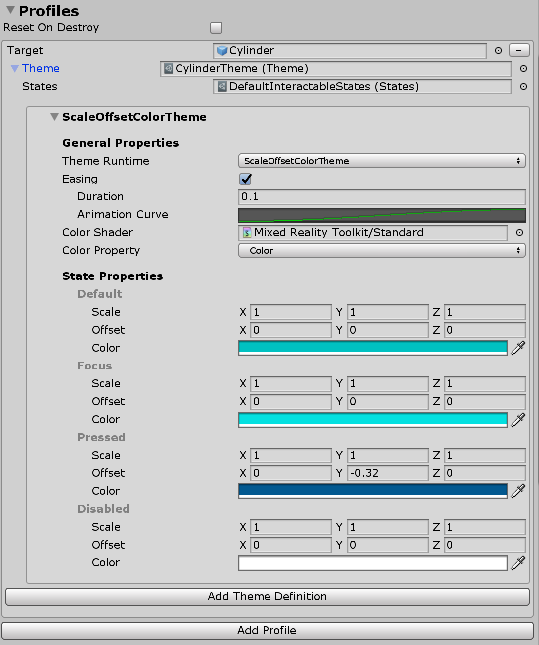
Interactable profiles
Profiles are items that create a relationship between a GameObject and a Visual Theme. The profile defines what content will be manipulated by a theme when a state change occurs.
Themes work a lot like materials. They are scriptable objects that contain a list of properties that will be assigned to an object based on the current state. Themes are also re-usable and can be assigned across multiple Interactable UX objects.
Reset On Destroy
Visual themes modify various properties on a targeted GameObject, dependent on the class and type of theme engine selected. If Reset On Destroy is true when the Interactable component is destroyed, the component will reset all modified properties from active themes to their original values. Otherwise, when destroyed, the Interactable component will leave any modified properties as-is. In this latter case, the last state of values will persist unless altered by another external component. The default is false.
Events
Every Interactable component has an OnClick event that fires when the component is simply selected. However, Interactable can be used to detect input events other than just OnClick.
Click the Add Event button to add a new type of Event Receiver definition. Once added, select the type of Event desired.
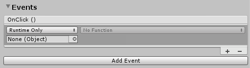 )
)
There are different types of event receivers to respond to different types of input. MRTK ships with the following set of receivers out-of-box.
InteractableAudioReceiverInteractableOnClickReceiverInteractableOnFocusReceiverInteractableOnGrabReceiverInteractableOnHoldReceiverInteractableOnPressReceiverInteractableOnToggleReceiverInteractableOnTouchReceiver
A custom receiver can be created by making a new class that extends ReceiverBase.
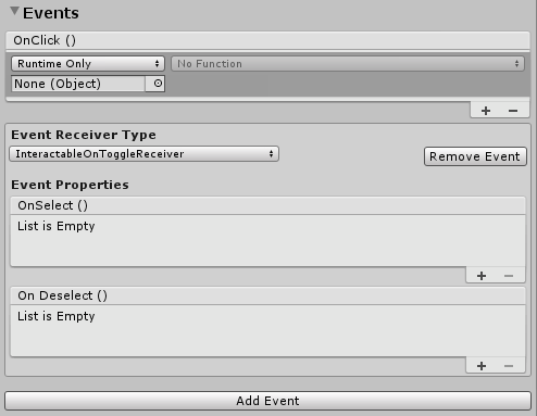
Example of a Toggle Event Receiver
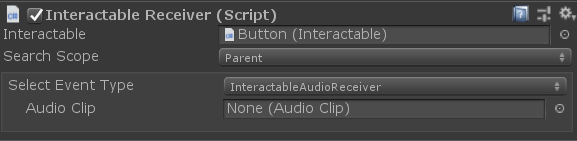
Interactable receivers
The InteractableReceiver component allows for events to be defined outside of the source Interactable component. The InteractableReceiver will listen for a filtered event type fired by another Interactable. If the Interactable property is not directly assigned, then the Search Scope property defines the direction the InteractableReceiver listens for events which is either on itself, in a parent, or in a child GameObject.
InteractableReceiverList acts in a similar fashion but for a list of matching events.
Create custom events
Like Visual Themes, events can be extended to detect any state pattern or to expose functionality.
Custom events can be created in two main ways:
Extend the
ReceiverBaseclass to create a custom event that will show up in the dropdown list of event types. A Unity event is provided by default, but additional Unity events can be added or the event can be set to hide Unity events. This functionality allows a designer to work with an engineer on a project to create a custom event that the designer can setup in the editor.Extend the
ReceiverBaseMonoBehaviorclass to create a completely custom event component that can reside on the Interactable or another object. TheReceiverBaseMonoBehaviorwill reference the Interactable to detect state changes.
Example of extending ReceiverBase
The CustomInteractablesReceiver class displays status information about an Interactable and is an example of how to create a custom Event Receiver.
public CustomInteractablesReceiver(UnityEvent ev) : base(ev, "CustomEvent")
{
    HideUnityEvents = true; // hides Unity events in the receiver - meant to be code only
}
The following methods are useful to override/implement when creating a custom Event Receiver. ReceiverBase.OnUpdate() is an abstract method that can be used to detect state patterns/transitions. Furthermore, the ReceiverBase.OnVoiceCommand() and ReceiverBase.OnClick() methods are useful for creating custom event logic when the Interactable is selected.
public override void OnUpdate(InteractableStates state, Interactable source)
{
    if (state.CurrentState() != lastState)
    {
        // the state has changed, do something new
        lastState = state.CurrentState();
        ...
    }
}

public virtual void OnVoiceCommand(InteractableStates state, Interactable source,
                                    string command, int index = 0, int length = 1)
{
    base.OnVoiceCommand(state, source, command, index, length);
    // voice command called, perform some action
}

public virtual void OnClick(InteractableStates state,
                            Interactable source,
                            IMixedRealityPointer pointer = null)
{
    base.OnClick(state, source);
    // click called, perform some action
}
Displaying custom event receiver fields in the inspector
ReceiverBase scripts use InspectorField attributes to expose custom properties in the inspector. Here's an example of Vector3, a custom property with tooltip and label information. This property will show up as configurable in the inspector when an Interactable GameObject is selected and has the associated Event Receiver type added.
[InspectorField(Label = "<Property label>",Tooltip = "<Insert tooltip info>",Type = InspectorField.FieldTypes.Vector3)]
public Vector3 EffectOffset = Vector3.zero;
How to use Interactable
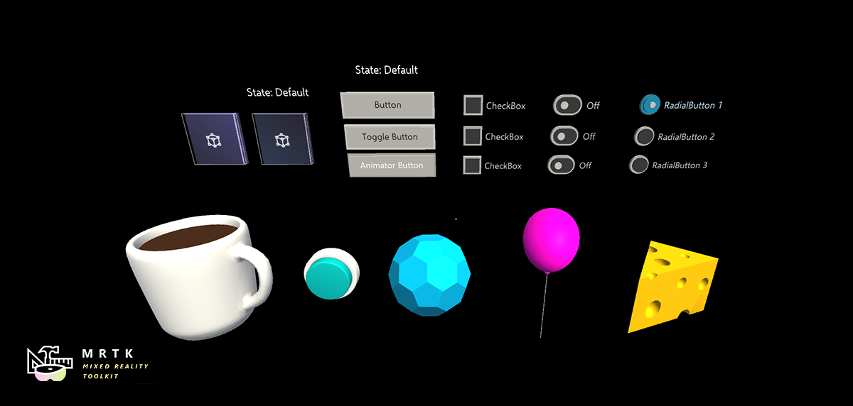
Building a simple button
One can create a simple button by adding the Interactable component to a GameObject that is configured to receive input events. It can have a collider on it or on a child to receive input. If using Interactable with a Unity UI based GameObjects, it should be under the Canvas GameObject.
Take the button one step further, by creating a new profile, assigning the GameObject itself and creating a new theme. Furthermore, use the OnClick event to make something happen.
Note
Making a button pressable requires the PressableButton component. Additionally, the PhysicalPressEventRouter component is needed to funnel press events to the Interactable component.
Creating toggle and multi-dimension buttons
Toggle button
To make a button Toggle-able, change the Selection Mode field to type Toggle. In the Profiles section, a new toggled theme is added for each profile that is used when the Interactable is toggled on.
While the SelectionMode is set to Toggle, the IsToggled check box can be used to set the default value of the control at runtime initialization.
CanSelect means the Interactable can go from off to on while the CanDeselect means the inverse.
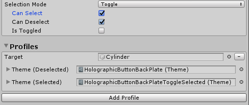
Developers can utilize the SetToggled and IsToggled interfaces to get/set the toggle state of an Interactable via code.
// If using SelectionMode = Toggle (i.e Dimensions == 2)

// Make the Interactable selected and toggled on
myInteractable.IsToggled = true;

// Get whether the Interactable is selected or not
bool isSelected = myInteractable.IsToggled;
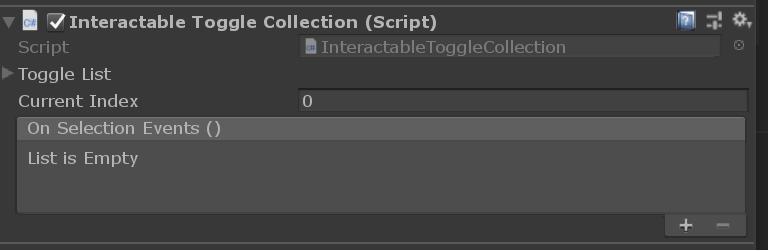
Toggle button collection
It is common to have a list of toggle buttons where only one can be active at any given time, also known as a radial set or radio buttons etc.
Use the InteractableToggleCollection component to enable this functionality. This control ensures only one Interactable is toggled on at any given time. The RadialSet (Assets/MRTK/SDK/Features/UX/Interactable/Prefabs/RadialSet.prefab) is also a great starting point out-of-box.
To create a custom radial button group:
- Create multiple Interactable GameObjects/buttons
- Set each Interactable with SelectionMode = Toggle, CanSelect = true, and CanDeselect = false
- Create an empty parent GameObject over all the Interactables and add the InteractableToggleCollection component
- Add all Interactables to the ToggleList on the InteractableToggleCollection
- Set the InteractableToggleCollection.CurrentIndex property to determine which button is selected by default at start
Multi-dimensional button
Multi-Dimension selection mode is used to create sequential buttons, or a button that has more than two steps, like controlling speed with three values, Fast (1x), Faster (2x) or Fastest (3x).
With dimensions being a numeric value, up to 9 themes can be added to control the text label or texture of the button for each speed setting, using a different theme for each of step.
Every click event will advance the DimensionIndex by 1 at runtime until the Dimensions value is reached. Then the cycle will reset to 0.
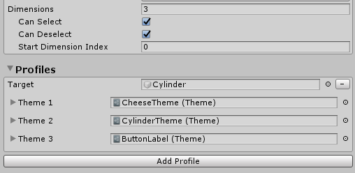
Developers can assess the DimensionIndex to determine which dimension is currently active.
// If using SelectionMode = Multi-dimension (i.e Dimensions >= 3)

//Access the current DimensionIndex
int currentDimension = myInteractable.CurrentDimension;

//Set the current DimensionIndex to 2
myInteractable.CurrentDimension = 2;

// Promote Dimension to next level
myInteractable.IncreaseDimension();
Create Interactable at runtime
Interactable can be easily added to any GameObject at runtime. The following example demonstrates how to assign a profile with a visual theme.
var interactableObject = GameObject.CreatePrimitive(PrimitiveType.Cylinder);
var interactable = interactableObject.AddComponent<Interactable>();

// Get the default configuration for the Theme engine InteractableColorTheme
var newThemeType = ThemeDefinition.GetDefaultThemeDefinition<InteractableColorTheme>().Value;

// Define a color for every state in our Default Interactable States
newThemeType.StateProperties[0].Values = new List<ThemePropertyValue>()
{
    new ThemePropertyValue() { Color = Color.black},  // Default
    new ThemePropertyValue() { Color = Color.black}, // Focus
    new ThemePropertyValue() { Color = Random.ColorHSV()},   // Pressed
    new ThemePropertyValue() { Color = Color.black},   // Disabled
};

interactable.Profiles = new List<InteractableProfileItem>()
{
    new InteractableProfileItem()
    {
        Themes = new List<Theme>()
        {
            Interactable.GetDefaultThemeAsset(new List<ThemeDefinition>() { newThemeType })
        },
        Target = interactableObject,
    },
};

// Force the Interactable to be clicked
interactable.TriggerOnClick()
Interactable events via code
One can add an action to the base Interactable.OnClick event via code with the following example.
public static void AddOnClick(Interactable interactable)
{
    interactable.OnClick.AddListener(() => Debug.Log("Interactable clicked"));
}
Use the Interactable.AddReceiver<T>() function to add event receivers dynamically at runtime.
The example code below demonstrates how to add an InteractableOnFocusReceiver, which listens for focus enter/exit, and furthermore define action code to perform when the event instances fire.
public static void AddFocusEvents(Interactable interactable)
{
    var onFocusReceiver = interactable.AddReceiver<InteractableOnFocusReceiver>();

    onFocusReceiver.OnFocusOn.AddListener(() => Debug.Log("Focus on"));
    onFocusReceiver.OnFocusOff.AddListener(() => Debug.Log("Focus off"));
}
The example code below demonstrates how to add an InteractableOnToggleReceiver, which listens for selected/deselected state transitions on toggle-able Interactables, and furthermore defines action code to perform when the event instances fire.
public static void AddToggleEvents(Interactable interactable)
{
    var toggleReceiver = interactable.AddReceiver<InteractableOnToggleReceiver>();

    // Make the interactable have toggle capability, from code.
    // In the gui editor it's much easier
    interactable.Dimensions = 2;
    interactable.CanSelect = true;
    interactable.CanDeselect  = true;

    toggleReceiver.OnSelect.AddListener(() => Debug.Log("Toggle selected"));
    toggleReceiver.OnDeselect.AddListener(() => Debug.Log("Toggle un-selected"));
}