Note
Access to this page requires authorization. You can try signing in or changing directories.
Access to this page requires authorization. You can try changing directories.
Unlike MRTK2, MRTK3 isn't distributed as a Unity project. Instead, MRTK3 consists of a loosely coupled collection of individual UPM packages distributed through the Mixed Reality Feature Tool, as well as through our official Git repository.
As a result, we no longer ship our sample scenes inside the MRTK library/package itself. Instead, we maintain the UnityProjects folder at the top level of the Git repository, which contains any Unity projects we want to ship. Currently, this folder includes the MRTKDevTemplate project, which contains all of our example scenes and is configured to align with our recommended best settings.
We also recommend using the MRTKDevTemplate project for local development when submitting fixes or changes. All of the packages are specified as local on-disk dependencies, making editing and submitting changes easy. Clone the repo and ensure you're on the mrtk3 branch, and open the MRTKDevTemplate Unity project.
Within MRTKDevTemplate, you can find all of our sample scenes. Most of the sample scenes are in UnityProjects/MRTKDevTemplate/Assets/Scenes, while some experimental or early-preview sample scenes are located in UnityProjects/MRTKDevTemplate/Assets/Data Binding Example.
Included sample scenes
We list below just a few of them.
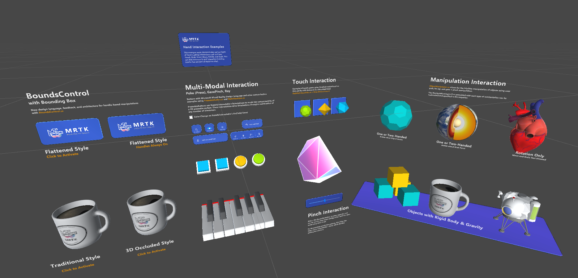
HandInteractionExamples
This sample scene offers a wide variety of interaction examples. Despite the name, this scene is a good example of cross-platform input, including hand tracking, controller input, and mouse input. Examples of several different UI controls and interactables are present, including the volumetric UI systems.

BoundsControlExamples
Various configurations of BoundsControl, showing both flattened and 3D bounds.
CanvasExample
Shows a collection of UX components built with UnityUI. These UX components are built with a combination of XRI interactables and traditional UGUI event handlers. This combination enables flexibility and responsive design across a wide variety of input methods and contexts. For more information, see the UX Components overview.
CanvasUITearsheet
This scene showcases all available UI building blocks and their permutations in MRTK. All controls are based on the new Mixed Reality Design Language.
DialogExample
This scene demonstrates use of the Dialog control.
EyeGazeExample
Example of using the Gaze Interactor to highlight objects within a scene.
HandMenuExamples
Demonstrates using a menu appearing beside the hand.
InteractableButtonExamples
An example of different styles of interactable buttons.
NearMenuExamples
Near interaction menu examples.
NonCanvasObjectBarExample
Demonstrates the Object Bar component, which enables horizontal or vertical arrangement of arbitrary 3D objects.
NonCanvasUIBackplateExample
The scene demonstrates UIBackplate.prefab, which you can use to construct various types of UI panels and menus.
SampleEmptyMRTKScene
The sample empty MRTK scene only contains the core MRTK prefab (MRTK XR Rig) and the input simulator prefab (MRTKInputSimulator). It's intended to give developers an empty scene with only the MRTK essentials necessary to get started.
SlateDrawingExample
A demonstration of using MRTK3 to create a basic drawing application.
SpatialMappingExample
The spatial mapping example scene demonstrates using ARMeshManager (MRTK XR Rig > ARSpatialMeshManager) in MRTK3 to visualize the spatial mesh.
TabViewExample
Shows a collection of toggles that control the visibility of associated game objects.
ToggleCollectionExample
Demonstrates the ToggleCollection script, which allows multiple toggle interactables to be grouped. Only one toggle can be toggled at any given time.
DataBinding and Theming sample scenes
The following scenes demonstrate very early-preview functionality and are subject to large changes.
Assets\UX Theming Example\Scenes\AudioTheming
Change the sound of a virtual keyboard using Data Binding and Theming.
Assets\UX Theming Example\Scenes\BatteryLevelExample
Using Data Binding to update a battery level display.
Assets\UX Theming Example\Scenes\CoreUXThemingExample
Example of using Data Binding and Theming to control the look of UX Core components.