Note
Access to this page requires authorization. You can try signing in or changing directories.
Access to this page requires authorization. You can try changing directories.
If you've designed a UI with placeholder images and boilerplate text, this tutorial shows how to connect it to real data using data bindings. Learn to format data, keep your UI and data in sync, and improve code maintainability.
In this tutorial, you learn how to replace your boilerplate with data bindings and create other direct links between your UI and your data. You also learn how to format or convert your data for display, and keep your UI and data in sync. When you complete this tutorial, you can improve the simplicity and organization of the XAML and C# code, making it easier to maintain and extend.
You start with a simplified version of the PhotoLab sample. This starter version includes the complete data layer plus the basic XAML page layouts, and leaves out many features to make the code easier to browse around in. This tutorial doesn't build up to the complete app, so be sure to check out the final version to see features such as custom animations and adaptive layouts. You can find the final version in the root folder of the Windows-appsample-photo-lab repo.
The PhotoLab sample app has two pages. The main page displays a photo gallery view, along with some information about each image file.

The details page displays a single photo after you select it. A flyout editing menu allows you to alter, rename, and save the photo.
Prerequisites
- Visual Studio 2019 or later: Download Visual Studio (The Community edition is free.)
- Windows SDK (10.0.17763.0 or later): Download the latest Windows SDK (free)
- Windows 10, Version 1809 or later
Part 0: Get the starter code from GitHub
For this tutorial, you start with a simplified version of the PhotoLab sample.
Go to the GitHub page for the sample: https://github.com/Microsoft/Windows-appsample-photo-lab.
Next, you need to clone or download the sample. Select the Clone or download button. A sub-menu appears.
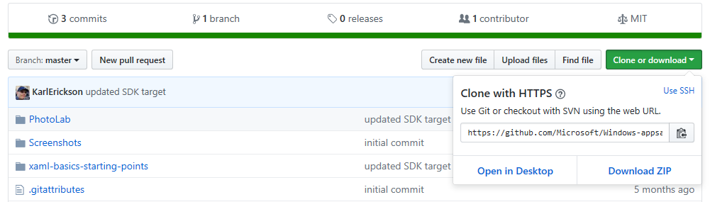
If you're not familiar with GitHub:
a. Select Download ZIP and save the file locally. This action downloads a .zip file that contains all the project files you need.
b. Extract the file. Use File Explorer to browse to the .zip file that you just downloaded, right-click it, and select Extract All....
c. Browse to your local copy of the sample, and go to the
Windows-appsample-photo-lab-master\xaml-basics-starting-points\data-bindingdirectory.If you're familiar with GitHub:
a. Clone the main branch of the repo locally.
b. Browse to the
Windows-appsample-photo-lab\xaml-basics-starting-points\data-bindingdirectory.Double-click
Photolab.slnto open the solution in Visual Studio.
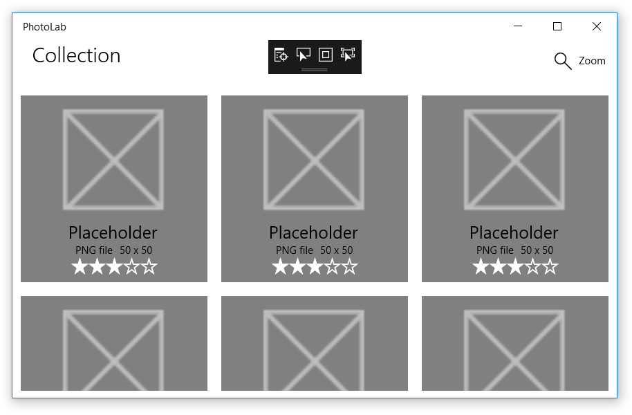
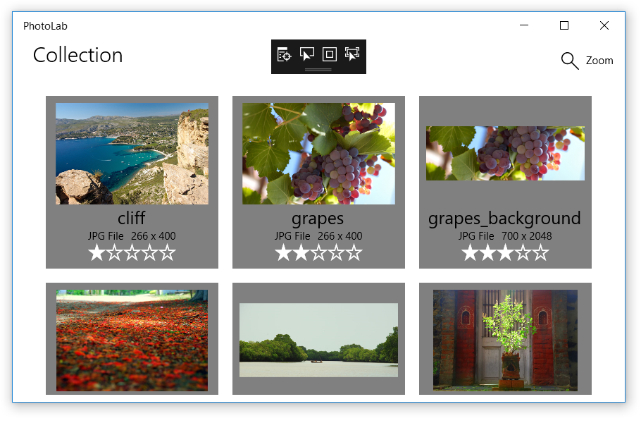
Part 1: Replace the placeholders
In this section, you create one-time bindings in data-template XAML to display real images and image metadata instead of placeholder content.
One-time bindings are for read-only, unchanging data. They're high performance and easy to create, so you can display large data sets in GridView and ListView controls.
Replace the placeholders with one-time bindings
Open the
xaml-basics-starting-points\data-bindingfolder and launch thePhotoLab.slnfile in Visual Studio.Make sure your Solution Platform is set to x86 or x64, not Arm, and then run the app. This step shows the state of the app with UI placeholders, before bindings are added.
Open MainPage.xaml and search for a
DataTemplatenamed ImageGridView_DefaultItemTemplate. You'll update this template to use data bindings.Before:
<DataTemplate x:Key="ImageGridView_DefaultItemTemplate">The
x:Keyvalue is used by theImageGridViewto select this template for displaying data objects.Add an
x:DataTypevalue to the template.After:
<DataTemplate x:Key="ImageGridView_DefaultItemTemplate" x:DataType="local:ImageFileInfo">x:DataTypeindicates which type this template is for. In this case, it's a template for theImageFileInfoclass (wherelocal:indicates the local namespace, as defined in an xmlns declaration near the top of the file).You need
x:DataTypewhen usingx:Bindexpressions in a data template, as described next.In the
DataTemplate, find theImageelement namedItemImageand replace itsSourcevalue as shown.Before:
<Image x:Name="ItemImage"
       Source="/Assets/StoreLogo.png"
       Stretch="Uniform" />
After:
<Image x:Name="ItemImage" Source="{x:Bind ImageSource}" Stretch="Uniform" />x:Nameidentifies a XAML element so you can refer to it elsewhere in the XAML and in the code-behind.x:Bindexpressions supply a value to a UI property by getting the value from a data-object property. In templates, the property indicated is a property of whatever thex:DataTypeis set to. So in this case, the data source is theImageFileInfo.ImageSourceproperty.Note
The
x:Bindvalue also lets the editor know about the data type, so you can use IntelliSense instead of typing in the property name in anx:Bindexpression. Try it on the code you just pasted in: place the cursor just afterx:Bindand press the Spacebar to see a list of properties you can bind to.Replace the values of the other UI controls in the same way. (Try doing this with IntelliSense instead of copy/pasting!)
Before:
<TextBlock Text="Placeholder" ... />
<StackPanel ... >
    <TextBlock Text="PNG file" ... />
    <TextBlock Text="50 x 50" ... />
</StackPanel>
<muxc:RatingControl Value="3" ... />
After:
<TextBlock Text="{x:Bind ImageTitle}" ... />
<StackPanel ... >
    <TextBlock Text="{x:Bind ImageFileType}" ... />
    <TextBlock Text="{x:Bind ImageDimensions}" ... />
</StackPanel>
<muxc:RatingControl Value="{x:Bind ImageRating}" ... />
Run the app to see how it looks so far. No more placeholders! You're off to a good start.
Note
If you want to experiment further, try adding a new TextBlock to the data template, and use the x:Bind IntelliSense trick to find a property to display.
Part 2: Use binding to connect the gallery UI to the images
In this section, you create one-time bindings in page XAML to connect the gallery view to the image collection. These bindings replace the existing procedural code in code-behind. You also create a Delete button to see how the gallery view changes when you remove images from the collection. At the same time, you learn how to bind events to event handlers for more flexibility than traditional event handlers.
All the bindings covered so far are inside data templates and refer to properties of the class indicated by the x:DataType value. What about the rest of the XAML in your page?
x:Bind expressions outside of data templates always bind to the page itself. This means you can reference anything you put in code-behind or declare in XAML, including custom properties and properties of other UI controls on the page (as long as they have an x:Name value).
In the PhotoLab sample, you use a binding like this to connect the main GridView control directly to the collection of images, instead of doing it in code-behind. Later, you see other examples.
Bind the main GridView control to the Images collection
In MainPage.xaml.cs, find the
GetItemsAsyncmethod and remove the code that setsItemsSource.Before:
ImageGridView.ItemsSource = Images;After:
// Replaced with XAML binding:
// ImageGridView.ItemsSource = Images;
In MainPage.xaml, find the
GridViewnamedImageGridViewand add anItemsSourceattribute. For the value, use anx:Bindexpression that refers to theImagesproperty implemented in code-behind.Before:
<GridView x:Name="ImageGridView"After:
<GridView x:Name="ImageGridView"
          ItemsSource="{x:Bind Images}"
The
Imagesproperty is of typeObservableCollection<ImageFileInfo>, so the individual items displayed in theGridVieware of typeImageFileInfo. This type matches thex:DataTypevalue described in Part 1.
All the bindings you saw earlier are one-time, read-only bindings, which is the default behavior for plain x:Bind expressions. The data loads only at initialization, which makes for high-performance bindings - perfect for supporting multiple, complex views of large data sets.
Even the ItemsSource binding you just added is a one-time, read-only binding to an unchanging property value, but there's an important distinction to make here. The unchanging value of the Images property is a single, specific instance of a collection, initialized once as shown here.
private ObservableCollection<ImageFileInfo> Images { get; }
    = new ObservableCollection<ImageFileInfo>();
The Images property value never changes, but because the property is of type ObservableCollection<T>, the contents of the collection can change, and the binding automatically notices the changes and updates the UI.
To test this behavior, temporarily add a button that deletes the currently selected image. This button isn't in the final version because selecting an image takes you to a detail page. However, the behavior of ObservableCollection<T> is still important in the final PhotoLab sample because the XAML initializes in the page constructor (through the InitializeComponent method call), but the Images collection populates later in the GetItemsAsync method.
Add a delete button
In MainPage.xaml, find the
CommandBarnamed MainCommandBar and add a new button before the zoom button. (The zoom controls don't work yet. You'll hook those up in the next part of the tutorial.)<AppBarButton Icon="Delete" Label="Delete selected image" Click="{x:Bind DeleteSelectedImage}" />If you're already familiar with XAML, this
Clickvalue might look unusual. In previous versions of XAML, you had to set this to a method with a specific event-handler signature, typically including parameters for the event sender and an event-specific arguments object. You can still use this technique when you need the event arguments, but withx:Bind, you can connect to other methods, too. For example, if you don't need the event data, you can connect to methods that have no parameters, like we do here.In MainPage.xaml.cs, add the
DeleteSelectedImagemethod.private void DeleteSelectedImage() => Images.Remove(ImageGridView.SelectedItem as ImageFileInfo);This method simply deletes the selected image from the
Imagescollection.
Now run the app and use the button to delete a few images. As you can see, the UI is updated automatically, thanks to data binding and the ObservableCollection<T> type.
Note
This code only deletes the ImageFileInfo instance from the Images collection in the running app. It does not delete the image file from the computer.
Part 3: Set up the zoom slider
In this part, you'll create one-way bindings from a control in the data template to the zoom slider, which is outside the template. You'll also learn that you can use data binding with many control properties, not just the most obvious ones like TextBlock.Text and Image.Source.
Bind the image data template to the zoom slider
Find the
DataTemplatenamedImageGridView_DefaultItemTemplateand replace the**Height**andWidthvalues of theGridcontrol at the top of the template.Before
<DataTemplate x:Key="ImageGridView_DefaultItemTemplate"
              x:DataType="local:ImageFileInfo">
    <Grid Height="200"
          Width="200"
          Margin="{StaticResource LargeItemMargin}">
After
<DataTemplate x:Key="ImageGridView_DefaultItemTemplate"
              x:DataType="local:ImageFileInfo">
    <Grid Height="{Binding Value, ElementName=ZoomSlider}"
          Width="{Binding Value, ElementName=ZoomSlider}"
          Margin="{StaticResource LargeItemMargin}">
Did you notice that these are Binding expressions, and not x:Bind expressions? This is the old way of doing data bindings, and it's mostly obsolete. x:Bind does nearly everything that Binding does, and more. However, when you use x:Bind in a data template, it binds to the type declared in the x:DataType value. So how do you bind something in the template to something in the page XAML or in code-behind? You must use an old-style Binding expression.
Binding expressions don't recognize the x:DataType value, but these Binding expressions have ElementName values that work almost the same way. These tell the binding engine that Binding Value is a binding to the Value property of the specified element on the page (that is, the element with that x:Name value). If you want to bind to a property in code-behind, it would look something like {Binding MyCodeBehindProperty, ElementName=page} where page refers to the x:Name value set in the Page element in XAML.
Note
By default, Binding expressions are one-way, meaning that they will automatically update the UI when the bound property value changes.
In contrast, the default for x:Bind is one-time, meaning that any changes to the bound property are ignored. This is the default because it's the most high-performance option, and most bindings are to static, read-only data.
The lesson here is that if you use x:Bind with properties that can change their values, be sure to add Mode=OneWay or Mode=TwoWay. You'll see examples of this in the next section.
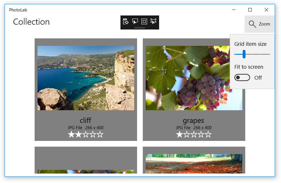
Run the app and use the slider to change the image-template dimensions. As you can see, the effect is pretty powerful without needing much code.
Note
For a challenge, try binding other UI properties to the zoom slider Value property, or to other sliders that you add after the zoom slider. For example, you could bind the FontSize property of the TitleTextBlock to a new slider with a default value of 24. Be sure to set reasonable minimum and maximum values.
Part 4: Improve the zoom experience
In this part, you'll add a custom ItemSize property to code-behind and create one-way bindings from the image template to the new property. The ItemSize value will be updated by the zoom slider and other factors such as the Fit to screen toggle and the window size, making for a more refined experience.
Unlike built-in control properties, your custom properties do not automatically update the UI, even with one-way and two-way bindings. They work fine with one-time bindings, but if you want your property changes to actually show up in your UI, you need to do some work.
Create the ItemSize property so that it updates the UI
In MainPage.xaml.cs, change the signature of the
MainPageclass so that it implements theINotifyPropertyChangedinterface.Before:
public sealed partial class MainPage : PageAfter:
public sealed partial class MainPage : Page, INotifyPropertyChangedThis informs the binding system that
MainPagehas aPropertyChangedevent (added next) that bindings can listen for in order to update the UI.Add a
PropertyChangedevent to theMainPageclass.public event PropertyChangedEventHandler PropertyChanged;This event provides the complete implementation required by the
INotifyPropertyChangedinterface. However, for it to have any effect, you must explicitly raise the event in your custom properties.Add an
ItemSizeproperty and raise thePropertyChangedevent in its setter.public double ItemSize { get => _itemSize; set { if (_itemSize != value) { _itemSize = value; PropertyChanged?.Invoke(this, new PropertyChangedEventArgs(nameof(ItemSize))); } } } private double _itemSize;The
ItemSizeproperty exposes the value of a private_itemSizefield. Using a backing field like this enables the property to check whether a new value is the same as the old value before it raises a potentially unnecessaryPropertyChangedevent.The event itself is raised by the
Invokemethod. The question mark checks whether thePropertyChangedevent is null - that is, whether any event handlers have been added yet. Every one-way or two-way binding adds an event handler behind the scenes, but if no one is listening, nothing more would happen here. IfPropertyChangedisn't null, however, thenInvokeis called with a reference to the event source (the page itself, represented by thethiskeyword) and an event-args object that indicates the name of the property. With this info, any one-way or two-way bindings to theItemSizeproperty will be informed of any changes so they can update the bound UI.In MainPage.xaml, find the
DataTemplatenamedImageGridView_DefaultItemTemplateand replace theHeightandWidthvalues of theGridcontrol at the top of the template. (If you did the control-to-control binding in the previous part of this tutorial, the only changes are to replaceValuewithItemSizeandZoomSliderwithpage. Be sure to do this for bothHeightandWidth!)Before
<DataTemplate x:Key="ImageGridView_DefaultItemTemplate"
              x:DataType="local:ImageFileInfo">
    <Grid Height="{Binding Value, ElementName=ZoomSlider}"
        Width="{Binding Value, ElementName=ZoomSlider}"
        Margin="{StaticResource LargeItemMargin}">
After
<DataTemplate x:Key="ImageGridView_DefaultItemTemplate"
              x:DataType="local:ImageFileInfo">
    <Grid Height="{Binding ItemSize, ElementName=page}"
          Width="{Binding ItemSize, ElementName=page}"
          Margin="{StaticResource LargeItemMargin}">
Now that the UI can respond to ItemSize changes, you need to actually make some changes. As mentioned previously, the ItemSize value is calculated from the current state of various UI controls, but the calculation must be performed whenever those controls change state. To do this, you'll use event binding so that certain UI changes will call a helper method that updates ItemSize.
Update the ItemSize property value
Add the
DetermineItemSizemethod to MainPage.xaml.cs.private void DetermineItemSize() { if (FitScreenToggle != null && FitScreenToggle.IsOn == true && ImageGridView != null && ZoomSlider != null) { // The 'margins' value represents the total of the margins around the // image in the grid item. 8 from the ItemTemplate root grid + 8 from // the ItemContainerStyle * (Right + Left). If those values change, // this value needs to be updated to match. int margins = (int)this.Resources["LargeItemMarginValue"] * 4; double gridWidth = ImageGridView.ActualWidth - (int)this.Resources["DefaultWindowSidePaddingValue"]; double ItemWidth = ZoomSlider.Value + margins; // We need at least 1 column. int columns = (int)Math.Max(gridWidth / ItemWidth, 1); // Adjust the available grid width to account for margins around each item. double adjustedGridWidth = gridWidth - (columns * margins); ItemSize = (adjustedGridWidth / columns); } else { ItemSize = ZoomSlider.Value; } }In MainPage.xaml, navigate to the top of the file and add a
SizeChangedevent binding to thePageelement.Before:
<Page x:Name="page"After:
<Page x:Name="page"
      SizeChanged="{x:Bind DetermineItemSize}"
Find the
SlidernamedZoomSlider(in thePage.Resourcessection) and add aValueChangedevent binding.Before:
<Slider x:Name="ZoomSlider"After:
<Slider x:Name="ZoomSlider"
        ValueChanged="{x:Bind DetermineItemSize}"
Find the
ToggleSwitchnamedFitScreenToggleand add aToggledevent binding.Before:
<ToggleSwitch x:Name="FitScreenToggle"After:
<ToggleSwitch x:Name="FitScreenToggle"
              Toggled="{x:Bind DetermineItemSize}"
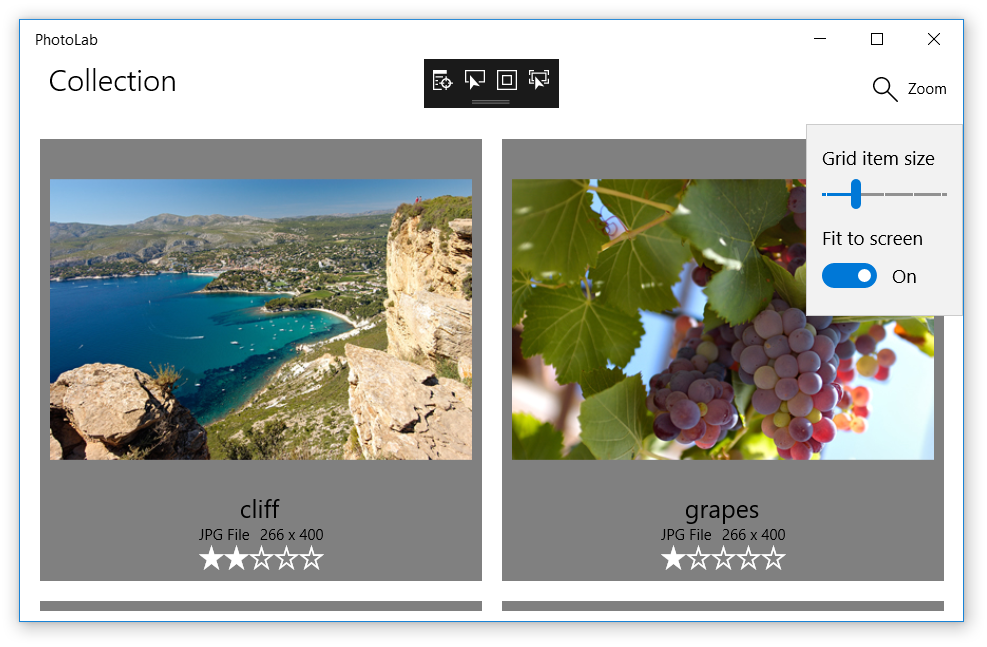
Run the app and use the zoom slider and Fit to screen toggle to change the image-template dimensions. As you can see, the latest changes enable a more refined zoom/resize experience while keeping the code well organized.
Note
For a challenge, try adding a TextBlock after the ZoomSlider and binding the Text property to the ItemSize property. Because it's not in a data template, you can use x:Bind instead of Binding like in the previous ItemSize bindings.
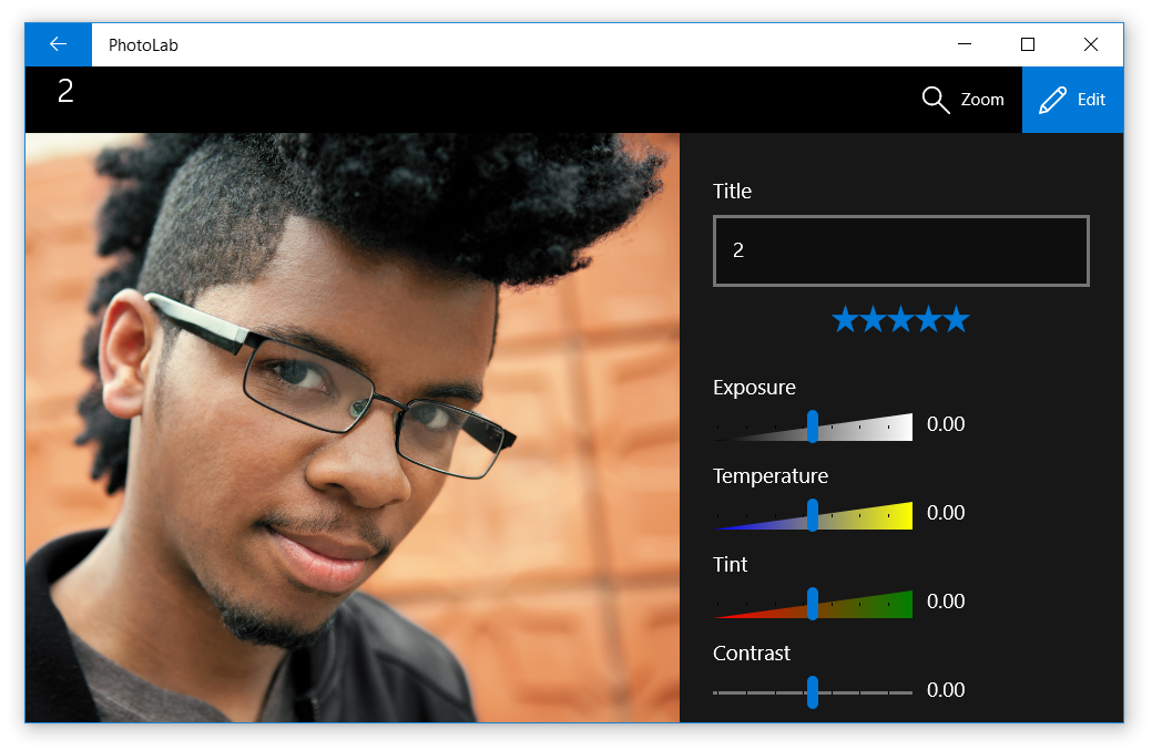
Part 5: Enable user edits
Here, you'll create two-way bindings to enable users to update values, including the image title, rating, and various visual effects.
To achieve this, you'll update the existing DetailPage, which provides a single-image viewer, zoom control, and editing UI.
First, however, you need to attach the DetailPage so that the app navigates to it when the user clicks an image in the gallery view.
Attach the DetailPage
In MainPage.xaml, find the
GridViewnamedImageGridView. To make the items clickable, setIsItemClickEnabledtoTrueand add anItemClickevent handler.Tip
If you type in the change below instead of copy/pasting, you'll see an IntelliSense pop-up that says "<New Event Handler>". If you press the Tab key, it will fill in the value with a default method handler name, and automatically stub out the method shown in the next step. You can then press F12 to navigate to the method in the code-behind.
Before:
<GridView x:Name="ImageGridView">After:
<GridView x:Name="ImageGridView"
          IsItemClickEnabled="True"
          ItemClick="ImageGridView_ItemClick">
Note
We're using a conventional event handler here instead of an x:Bind expression. This is because we need to see the event data, as shown next.
In MainPage.xaml.cs, add the event handler (or fill it in, if you used the tip in the last step).
private void ImageGridView_ItemClick(object sender, ItemClickEventArgs e)
{
    this.Frame.Navigate(typeof(DetailPage), e.ClickedItem);
}
This method simply navigates to the detail page, passing in the clicked item, which is an
ImageFileInfoobject used by DetailPage.OnNavigatedTo for initializing the page. You won't have to implement that method in this tutorial, but you can take a look to see what it does.(Optional) Delete or comment out any controls you added in previous play-points that work with the currently selected image. Keeping them around won't hurt anything, but it's now a lot harder to select an image without navigating to the detail page.
Now that you've connected the two pages, run the app and take a look around. Everything works except the controls on the editing pane, which don't respond when you try to change the values.
As you can see, the title text box does display the title and lets you type in changes. You have to change focus to another control to commit the changes, but the title in the upper-left corner of the screen doesn't update yet.
All the controls are already bound using the plain x:Bind expressions we covered in Part 1. If you recall, this means they are all one-time bindings, which explains why changes to the values aren't registered. To fix this, all we have to do is turn them into two-way bindings.
Make the editing controls interactive
In DetailPage.xaml, find the
TextBlocknamed TitleTextBlock and the RatingControl control after it, and update theirx:Bindexpressions to include Mode=TwoWay.Before:
<TextBlock x:Name="TitleTextBlock"
           Text="{x:Bind item.ImageTitle}"
           ... >
<muxc:RatingControl Value="{x:Bind item.ImageRating}"
                        ... >
After:
<TextBlock x:Name="TitleTextBlock"
           Text="{x:Bind item.ImageTitle, Mode=TwoWay}"
           ... >
<muxc:RatingControl Value="{x:Bind item.ImageRating, Mode=TwoWay}"
                        ... >
Do the same thing for all the effect sliders that come after the rating control.
<Slider Header="Exposure"    ... Value="{x:Bind item.Exposure, Mode=TwoWay}" ...
<Slider Header="Temperature" ... Value="{x:Bind item.Temperature, Mode=TwoWay}" ...
<Slider Header="Tint"        ... Value="{x:Bind item.Tint, Mode=TwoWay}" ...
<Slider Header="Contrast"    ... Value="{x:Bind item.Contrast, Mode=TwoWay}" ...
<Slider Header="Saturation"  ... Value="{x:Bind item.Saturation, Mode=TwoWay}" ...
<Slider Header="Blur"        ... Value="{x:Bind item.Blur, Mode=TwoWay}" ...
The two-way mode, as you might expect, means that the data moves in both directions whenever there are changes on either side.
Like the one-way bindings covered earlier, these two-way bindings will now update the UI whenever the bound properties change, thanks to the INotifyPropertyChanged implementation in the ImageFileInfo class. With two-way binding, however, the values will also move from the UI to the bound properties whenever the user interacts with the control. Nothing more is needed on the XAML side.
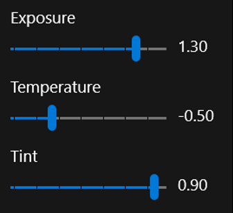
Run the app and try the editing controls. As you can see, when you make a change, it now affects the image values, and those changes persist when you navigate back to the main page.
Part 6: Format values through function binding
One last problem remains. When you move the effect sliders, the labels next to them still don't change.
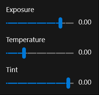
The final part in this tutorial is to add bindings that format the slider values for display.
Bind the effect-slider labels and format the values for display
Find the
TextBlockafter theExposureslider and replace theTextvalue with the binding expression shown here.Before:
<Slider Header="Exposure" ... />
<TextBlock ... Text="0.00" />
After:
<Slider Header="Exposure" ... />
<TextBlock ... Text="{x:Bind item.Exposure.ToString('N', culture), Mode=OneWay}" />
This is called a function binding because you are binding to the return value of a method. The method must be accessible through the page's code-behind or the
x:DataTypetype if you are in a data template. In this case, the method is the familiar .NETToStringmethod, which is accessed through the item property of the page, and then through theExposureproperty of the item. (This illustrates how you can bind to methods and properties that are deeply nested in a chain of connections.)Function binding is an ideal way to format values for display because you can pass in other binding sources as method arguments, and the binding expression will listen for changes to those values as expected with the one-way mode. In this example, the culture argument is a reference to an unchanging field implemented in code-behind, but it could just as easily have been a property that raises
PropertyChangedevents. In that case, any changes to the property value would cause thex:Bindexpression to callToStringwith the new value and then update the UI with the result.Do the same thing for the
TextBlocks that label the other effect sliders.<Slider Header="Temperature" ... /> <TextBlock ... Text="{x:Bind item.Temperature.ToString('N', culture), Mode=OneWay}" /> <Slider Header="Tint" ... /> <TextBlock ... Text="{x:Bind item.Tint.ToString('N', culture), Mode=OneWay}" /> <Slider Header="Contrast" ... /> <TextBlock ... Text="{x:Bind item.Contrast.ToString('N', culture), Mode=OneWay}" /> <Slider Header="Saturation" ... /> <TextBlock ... Text="{x:Bind item.Saturation.ToString('N', culture), Mode=OneWay}" /> <Slider Header="Blur" ... /> <TextBlock ... Text="{x:Bind item.Blur.ToString('N', culture), Mode=OneWay}" />
Now when you run the app, everything works, including the slider labels.
Differences between Binding and x:Bind
When creating data bindings in XAML in your UWP apps, you can choose between Binding and x:Bind. Here are the key differences:
x:Bind: Provides compile-time validation, better performance, and is strongly typed. It is best suited for scenarios where the data structure is known at compile time.Binding: Offers runtime evaluation and greater flexibility for dynamic scenarios, such as when the data structure is determined at runtime.
Scenarios not supported by x:Bind
Although x:Bind is highly efficient, it has limitations in certain scenarios:
- Dynamic data structures:
x:Bindcannot be used when the data structure is determined at runtime. - Element-to-element binding: Direct binding between two UI elements is not supported by
x:Bind. - DataContext inheritance: Unlike
Binding,x:Binddoes not automatically inherit theDataContextof a parent element. - Two-way bindings:
x:Bindsupports two-way bindings, allowing changes to flow from the UI back to the source property. For the UI to update when the source property changes (in either one-way or two-way bindings), you must implementINotifyPropertyChangedon your data objects.
For more details and examples, refer to the following resources:
Conclusion
This tutorial has given you a taste of data binding and shown you some of the functionality available. One word of caution before we wrap up: not everything is bindable, and sometimes the values you try to connect to are incompatible with the properties you are trying to bind. There is a lot of flexibility in binding, but it won't work in every situation.
One example of a problem not addressed by binding is when a control has no suitable properties to bind to, as with the detail page zoom feature. This zoom slider needs to interact with the ScrollViewer that displays the image, but ScrollViewer can only be updated through its ChangeView method. In this case, we use conventional event handlers to keep the ScrollViewer and the zoom slider in sync; see the ZoomSlider_ValueChanged and MainImageScroll_ViewChanged methods in DetailPage for details.
Nonetheless, binding is a powerful and flexible way to simplify your code and keep your UI logic separate from your data logic. This will make it much easier for you to adjust either side of this divide while reducing the risk of introducing bugs on the other side.
One example of UI and data separation is with the ImageFileInfo.ImageTitle property. This property (and the ImageRating property) is slightly different than the ItemSize property you created in Part 4 because the value is stored in the file metadata (exposed through the ImageProperties type) instead of in a field. Additionally, ImageTitle returns the ImageName value (set to the file name) if there is no title in the file metadata.
public string ImageTitle
{
    get => String.IsNullOrEmpty(ImageProperties.Title) ? ImageName : ImageProperties.Title;
    set
    {
        if (ImageProperties.Title != value)
        {
            ImageProperties.Title = value;
            var ignoreResult = ImageProperties.SavePropertiesAsync();
            OnPropertyChanged();
        }
    }
}
As you can see, the setter updates the ImageProperties.Title property and then calls SavePropertiesAsync to write the new value to the file. (This is an async method, but we can't use the await keyword in a property - and you wouldn't want to because property getters and setters should complete immediately. So instead, you would call the method and ignore the Task object it returns.)
Going further
Now that you've completed this lab, you have enough binding knowledge tackle a problem on your own.
As you might have noticed, if you change the zoom level on the details page, it resets automatically when you navigate backward then select the same image again. Can you figure out how to preserve and restore the zoom level for each image individually? Good luck!
You should have all the info you need in this tutorial, but if you need more guidance, the data binding docs are only a click away. Start here: