Contrast themes
Contrast themes use a small palette of colors (with a contrast ratio of at least 7:1) to help make elements in the UI easier to see, reduce eye strain, improve text readability, and accommodate user preferences.
Note
Don't confuse contrast themes with light and dark themes, which support a much larger color palette and don't necessarily increase contrast or make things easier to see. For more on light and dark themes, see Color.
To see how your app behaves with contrast themes, enable and customize them through the Settings > Accessibility > Contrast themes page.
Tip
You can also press the left-Alt key + Shift key + Print screen (PrtScn on some keyboards) to quickly turn contrast themes on or off. If you have not selected a theme previously, the Aquatic theme is used by default (shown in the following image).

Setting HighContrastAdjustment to None
Windows apps have HighContrastAdjustment turned on by default. This sets all text color to white with a solid black highlight behind it, ensuring sufficient contrast against all backgrounds. If you are using brushes correctly, this setting should be turned off.
Detecting high contrast
You can programmatically check if the current theme is a contrast theme through the AccessibilitySettings class (you must call the AccessibilitySettings constructor from a scope where the app is initialized and is already displaying content).
Creating theme dictionaries
A ResourceDictionary.ThemeDictionaries object can indicate theme colors that are different from the system-defined colors by specifying brushes for the Default (Dark), Light, and HighContrast contrast themes.
Tip
Contrast theme refers to the feature in general, while HighContrast refers to the specific dictionary being referenced.
In App.xaml, create a ThemeDictionaries collection with both a Default and a HighContrast ResourceDictionary (a Light ResourceDictionary is not necessary for this example).
In the Default dictionary, create the type of Brush you need (usually a SolidColorBrush). Give it an x:Key name corresponding to its intended use (a StaticResource referencing an existing system brush would also be appropriate).
In the HighContrast ResourceDictionary (shown in the following code snippet), specify an appropriate SystemColor brush. See Contrast colors for details on picking one of the dynamic system HighContrast colors for the SystemColor brush.
<Application.Resources>
    <ResourceDictionary>
        <ResourceDictionary.ThemeDictionaries>
            <!-- Default is a fallback if a more precise theme isn't called
            out below -->
            <ResourceDictionary x:Key="Default">
                <SolidColorBrush x:Key="BrandedPageBackgroundBrush" Color="#E6E6E6" />
            </ResourceDictionary>

            <!-- Optional, Light is used in light theme.
            If included, Default will be used for Dark theme -->
            <ResourceDictionary x:Key="Light">
                <SolidColorBrush x:Key="BrandedPageBackgroundBrush" Color="#E6E6E6" />
            </ResourceDictionary>

            <!-- HighContrast is used in all high contrast themes -->
            <ResourceDictionary x:Key="HighContrast">
                <SolidColorBrush x:Key="BrandedPageBackgroundBrush" Color="{ThemeResource SystemColorWindowColor}" />
            </ResourceDictionary>
        </ResourceDictionary.ThemeDictionaries>
    </ResourceDictionary>
</Application.Resources>
Contrast colors
On the Settings > Ease of access > Contrast themes page (shown in the following image), users can select from four default contrast themes: Aquatic, Desert, Dusk, and Night sky.

After the user selects an option, they can choose to immediately apply it, or they can edit the theme. The following image shows the Edit theme dialog for the Aquatic contrast theme.

This table shows the contrast theme colors and their recommended pairings. Each SystemColor resource is a variable that automatically updates the color when the user switches contrast themes.
| Color swatch | Description |
|---|---|

|
SystemColorWindowColor Background of pages, panes, popups, and windows. Pair with SystemColorWindowTextColor |

|
SystemColorWindowTextColor Headings, body copy, lists, placeholder text, app and window borders, any UI that can't be interacted with. Pair with SystemColorWindowColor |

|
SystemColorHotlightColor Hyperlinks. Pair with SystemColorWindowColor |

|
SystemColorGrayTextColor Inactive (disabled) UI. Pair with SystemColorWindowColor |

|
SystemColorHighlightTextColor Foreground color for text or UI that is in selected, interacted with (hover, pressed), or in progress. Pair with SystemColorHighlightColor |

|
SystemColorHighlightColor Background or accent color for UI that is in selected, interacted with (hover, pressed), or in progress. Pair with SystemColorHighlightTextColor |

|
SystemColorButtonTextColor Foreground color for buttons and any UI that can be interacted with. Pair with SystemColorButtonFaceColor |

|
SystemColorButtonFaceColor Background color for buttons and any UI that can be interacted with. Pair with SystemColorButtonTextColor |
The next table shows how the colors appear when used on a background set to SystemColorWindowColor.
| Example | Values |
|---|---|

|
SystemColorWindowTextColor |

|
SystemColorHotlightColor |

|
SystemColorGrayTextColor |

|
SystemColorHighlightTextColor + SystemColorHighlightColor |

|
SystemColorButtonTextColor + SystemColorButtonFaceColor |
In the following code snippet, we show how to pick a resource for BrandedPageBackgroundBrush. SystemColorWindowColor is a good choice here as BrandedPageBackgroundBrush indicates that it will be used for a background.
<Application.Resources>
    <ResourceDictionary>
        <ResourceDictionary.ThemeDictionaries>
            <!-- Default is a fallback if a more precise theme isn't called
            out below -->
            <ResourceDictionary x:Key="Default">
                <SolidColorBrush x:Key="BrandedPageBackgroundBrush" Color="#E6E6E6" />
            </ResourceDictionary>

            <!-- Optional, Light is used in light theme.
            If included, Default will be used for Dark theme -->
            <ResourceDictionary x:Key="Light">
                <SolidColorBrush x:Key="BrandedPageBackgroundBrush" Color="#E6E6E6" />
            </ResourceDictionary>

            <!-- HighContrast is used in all high contrast themes -->
            <ResourceDictionary x:Key="HighContrast">
                <SolidColorBrush x:Key="BrandedPageBackgroundBrush" Color="{ThemeResource SystemColorWindowColor}" />
            </ResourceDictionary>
        </ResourceDictionary.ThemeDictionaries>
    </ResourceDictionary>
</Application.Resources>
The resource is then assigned to the background of an element.
<Grid Background="{ThemeResource BrandedPageBackgroundBrush}">
We use {ThemeResource} twice in the preceding example, once to reference SystemColorWindowColor and again to reference BrandedPageBackgroundBrush. Both are required for your app to theme correctly at run time. This is a good time to test out the functionality in your app. The Grid background will automatically update as you switch to a high contrast theme. It will also update when switching between different high contrast themes.
Note
WinUI 2.6 and newer
There are eight high contrast system brushes available for referencing through a ResourceKey (see the following example for SystemColorWindowTextColorBrush).
<StaticResource x:Key="MyControlBackground" ResourceKey="SystemColorWindowTextColorBrush" />
The brush names match one of the eight previously mentioned system colors exactly (with "Brush" appended). We recommend using a StaticResource instead of a local SolidColorBrush for performance reasons.
Best practices
Here are some recommendations for customizing the contrast theme colors in your Windows app.
- Test in all four high contrast themes while your app is running.
- Be consistent.
- Make sure HighContrastAdjustment is set to
Nonein your app (it is turned on by default). See Setting HighContrastAdjustment to None. - Do not hard code a color in the HighContrast theme. Instead, use the SystemColor
ColorandColorBrushresources. For more detail, see Hard-coded colors. - Do not mix background/foreground pairs that are not compatible
- Do not choose color resource for aesthetics. Remember, the colors change with the theme.
- Do not use
SystemColorGrayTextColorfor body copy that is secondary or acts as hint text. This is intended for disabled content only. - Do not use
SystemColorHotlightColorand corresponding brush as both are reserved for hyperlinks.
Tip
It's often helpful to look at the WinUI Gallery app to see how common controls use the SystemColor brushes. If installed already, open them by clicking the following links: WinUI 3 Gallery or WinUI 2 Gallery.
If they are not installed, you can download the WinUI 3 Gallery and the WinUI 2 Gallery from the Microsoft Store.
You can also get the source code for both from GitHub (use the main branch for WinUI 3 and the winui2 branch for WinUI 2).
Hard-coded colors
Platform controls provide built-in support for contrast themes, but you should be careful when customizing your application UI. Two of the most common issues occur when either the color of an element is hard-coded or an incorrect SystemColor resource is used.
In the following code snippet, we show a Grid element declared with a background color set to #E6E6E6 (a very light grey). If you hard-code the color in this way, you also override the background color across all themes. For example, if the user selects the Aquatic contrast theme, instead of white text on a near black background, the text color in this app changes to white while the background remains light grey. The very low contrast between text and background could make this app very difficult to use.
<Grid Background="#E6E6E6">
Instead, we recommend using the {ThemeResource} markup extension to reference a color in the ThemeDictionaries collection of a ResourceDictionary. This enables the automatic substitution of colors and brushes based on the user's current theme.
<Grid Background="{ThemeResource BrandedPageBackgroundBrush}">
Borders
Pages, panes, popups, and bars should all use SystemColorWindowColor for their background. Add a contrast theme-only border only where necessary to preserve important boundaries in your UI.
Tip
We recommend using 2px borders for transitory surfaces such as flyouts and dialogs.
The navigation pane and the page both share the same background color in contrast themes. To distinguish them, a contrast theme-only border is essential.

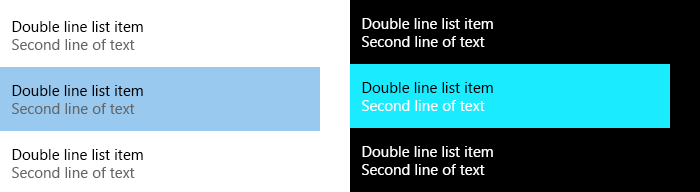
List items with colored text
In contrast themes, items in a ListView have their background set to SystemColorHighlightColor when the user hovers over, presses, or selects them. A common issue with complex list items occurs when the content of the list item fails to invert its color, making the items impossible to read.
Be careful when you set the TextBlock.Foreground in the DataTemplate of the ListView (typically done to establish visual hierarchy). The Foreground property is set on the ListViewItem, and each TextBlock in the DataTemplate inherits the correct Foreground color. Setting Foreground breaks this inheritance.
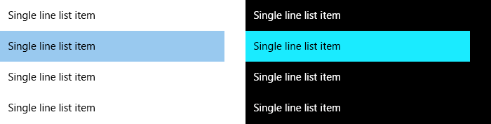
You can resolve this by setting Foreground conditionally through a Style in a ThemeDictionaries collection. As the Foreground is not set by SecondaryBodyTextBlockStyle in HighContrast, the color will invert correctly.
The following code snippet (from an App.xaml file) shows an example ThemeDictionaries collection in a ListView data template.
<ResourceDictionary.ThemeDictionaries>
    <ResourceDictionary x:Key="Default">
        <Style
            x:Key="SecondaryBodyTextBlockStyle"
            TargetType="TextBlock"
            BasedOn="{StaticResource BodyTextBlockStyle}">
            <Setter Property="Foreground"
                Value="{StaticResource SystemControlForegroundBaseMediumBrush}" />
        </Style>
    </ResourceDictionary>

    <ResourceDictionary x:Key="Light">
        <Style
            x:Key="SecondaryBodyTextBlockStyle"
            TargetType="TextBlock"
            BasedOn="{StaticResource BodyTextBlockStyle}">
            <Setter Property="Foreground"
                Value="{StaticResource SystemControlForegroundBaseMediumBrush}" />
        </Style>
    </ResourceDictionary>

    <ResourceDictionary x:Key="HighContrast">
        <!-- The Foreground Setter is omitted in HighContrast -->
        <Style
            x:Key="SecondaryBodyTextBlockStyle"
            TargetType="TextBlock"
            BasedOn="{StaticResource BodyTextBlockStyle}" />
    </ResourceDictionary>
</ResourceDictionary.ThemeDictionaries>

<!-- Usage in your DataTemplate... -->
<DataTemplate>
    <StackPanel>
        <TextBlock Style="{StaticResource BodyTextBlockStyle}" Text="Double line list item" />

        <!-- Note how ThemeResource is used to reference the Style -->
        <TextBlock Style="{ThemeResource SecondaryBodyTextBlockStyle}" Text="Second line of text" />
    </StackPanel>
</DataTemplate>
Examples
Tip
The WinUI 3 Gallery app includes interactive examples of most WinUI 3 controls, features, and functionality. Get the app from the Microsoft Store or get the source code on GitHub
Related topics

Windows developer