Two-pane view
TwoPaneView is a layout control that helps you manage the display of apps that have 2 distinct areas of content, like a list/detail view.
Important
This article describes functionality and guidance that is in public preview and may be substantially modified before it's generally available. Microsoft makes no warranties, express or implied, with respect to the information provided here.
While it works on all Windows devices, the TwoPaneView control is designed to help you take full advantage of dual-screen devices automatically, with no special coding needed. On a dual-screen device, the two-pane view ensures that the user interface (UI) is split cleanly when it spans the gap between screens, so that your content is presented on either side of the gap.
Note
A dual-screen device is a special kind of device with unique capabilities. It's not equivalent to a desktop device with multiple monitors. For more info about dual-screen devices, see Introduction to dual-screen devices. (See Show multiple views for more info about ways you can optimize your app for multiple monitors.)
Get WinUI
The TwoPaneView control is included as part of WinUI, a NuGet package that contains new controls and UI features for Windows apps. For more info, including installation instructions, see WinUI.
WinUI APIs: TwoPaneView class
Tip
Throughout this document, we use the muxc alias in XAML to represent WinUI APIs that we have included in our project. We have added this to our Page element: xmlns:muxc="using:Microsoft.UI.Xaml.Controls"
In the code-behind, we also use the muxc alias in C# to represent WinUI APIs that we have included in our project. We have added this using statement at the top of the file: using muxc = Microsoft.UI.Xaml.Controls;
Is this the right control?
Use the two-pane view when you have 2 distinct areas of content and:
- The content should automatically rearrange and resize to best fit the window.
- The secondary area of content should show/hide based on available space.
- The content should split cleanly between the 2 screens of a dual-screen device.
Examples
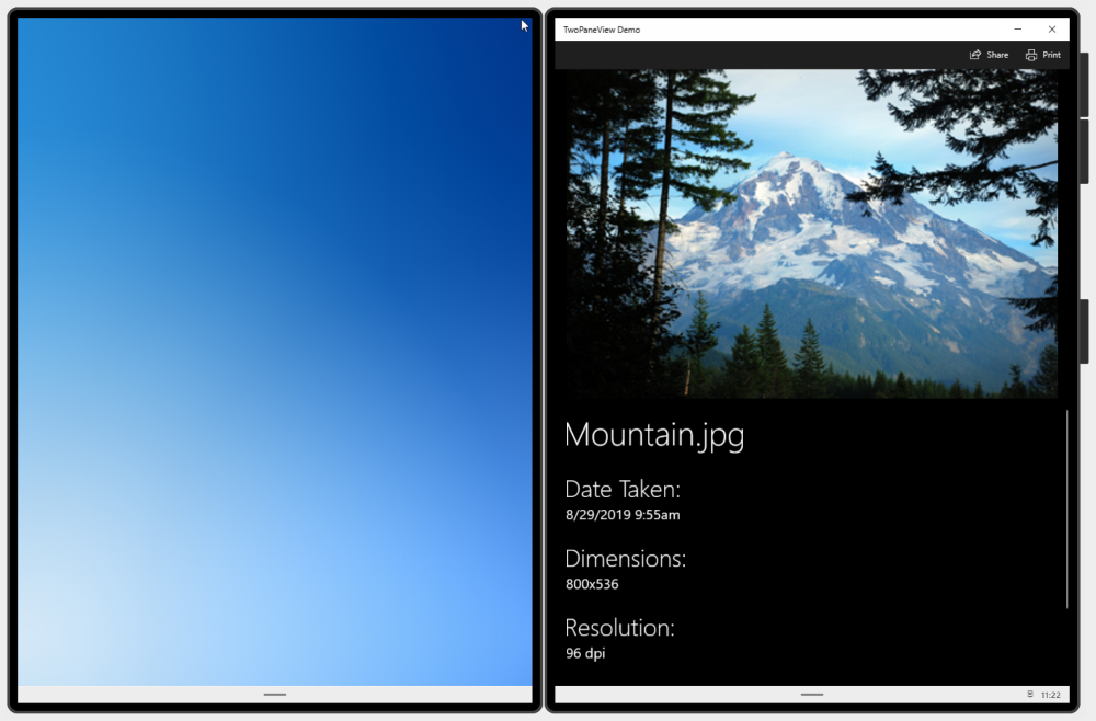
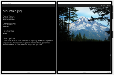
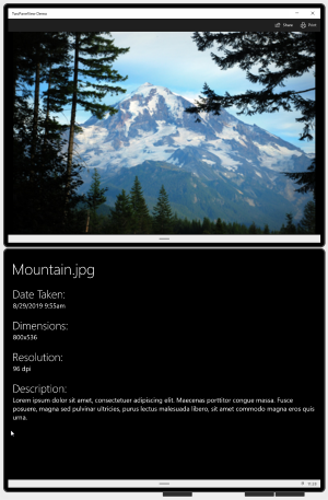
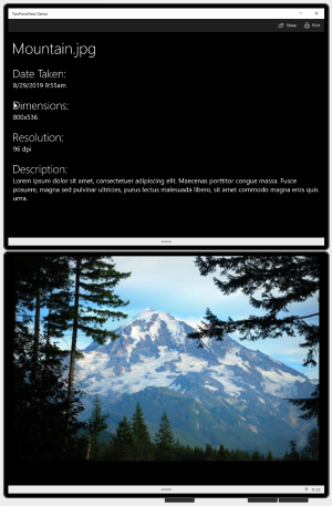
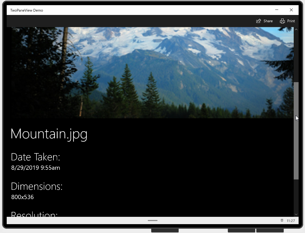
These images show an app running on a single-screen and spanned across dual-screens. The two-pane view adapts the app UI to the various screen configurations.
App on a single-screen.

App spanning a dual-screen device in wide mode.

App spanning a dual-screen device in tall mode.
How it works
The two-pane view has two panes where you place your content. It adjusts the size and arrangement of the panes depending on the space available to the window. The possible pane layouts are defined by the TwoPaneViewMode enumeration:
| Enum value | Description |
|---|---|
SinglePane |
Only one pane is shown, as specified by the PanePriority property. |
Wide |
Panes are shown side-by-side, or a single pane is shown, as specified by the WideModeConfiguration property. |
Tall |
Panes are shown top-bottom, or a single pane is shown, as specified by the TallModeConfiguration property. |
You configure the two-pane view by setting the PanePriority to specify which pane is shown when there is space for only one pane. Then, you specify whether Pane1 is shown on the top or bottom for tall windows, or on the left or right for wide windows.
The two-pane view handles the size and arrangement of the panes, but you still need to make the content inside the pane adapt to the changes in size and orientation. See Responsive layouts with XAML and Layout panels for more info about creating an adaptive UI.
The TwoPaneView manages the display of the panes based on the spanning state of the app.
On a single-screen
When your app is on only a single screen, the
TwoPaneViewadjusts the size and position of its panes based on property settings you specify. We explain these properties in more detail in the next section. The only difference between devices is that some devices, like desktop PCs, allow re-sizable windows, while other devices don't.Spanned across dual-screens
The
TwoPaneViewis designed to make it easy to optimize your UI for spanning on dual-screen devices. The window sizes itself to use all the available space on the screens. When your app spans both screens of a dual-screen device, each screen displays the content of one of the panes and properly spans content across the gap. Spanning-awareness is built-in when you use two-pane view. You only need to set the tall/wide configuration to specify which pane is shown on which screen. The two-pane view takes care of the rest.
How to use the two-pane view control
The TwoPaneView doesn't have to be the root element of your page layout. In fact, you'll often use it inside a NavigationView control that provides the overall navigation for your app. The TwoPaneView adapts appropriately regardless of where it is in the XAML tree; however, we do recommend that you not nest a TwoPaneView inside another TwoPaneView. (If you do, only the outer TwoPaneView is spanning-aware.)
Add content to the panes
Each pane of a two-pane view can hold a single XAML UIElement. To add content, you typically place a XAML layout panel in each pane, and then add other controls and content to the panel. The panes can change size and switch between wide and tall modes, so you need to make sure the content in each pane can adapt to these changes. See Responsive layouts with XAML and Layout panels for more info about creating an adaptive UI.
This example creates the simple picture/info app UI shown previously in the Examples section. When the app is spanned across dual-screens, the picture and the info are shown on separate screens. On a single screen, the content can be shown in two panes, or combined into a single pane, depending on how much space is available. (When there's only space for one pane, you move the content of Pane2 into Pane1, and let the user scroll to see any hidden content. You'll see the code for this later in the Responding to mode changes section.)
<Grid>
    <Grid.RowDefinitions>
        <RowDefinition Height="Auto" MinHeight="40"/>
        <RowDefinition Height="*"/>
    </Grid.RowDefinitions>

    <CommandBar DefaultLabelPosition="Right">
        <AppBarButton x:Name="Share" Icon="Share" Label="Share" Click="Share_Click"/>
        <AppBarButton x:Name="Print" Icon="Print" Label="Print" Click="Print_Click"/>
    </CommandBar>

    <muxc:TwoPaneView
        x:Name="MyTwoPaneView"
        Grid.Row="1"
        MinWideModeWidth="959"
        MinTallModeHeight="863"
        ModeChanged="TwoPaneView_ModeChanged">

        <muxc:TwoPaneView.Pane1>
            <Grid x:Name="Pane1Root">
                <ScrollViewer>
                    <StackPanel x:Name="Pane1StackPanel">
                        <Image Source="Assets\LandscapeImage8.jpg"
                               VerticalAlignment="Top" HorizontalAlignment="Center"
                               Margin="16,0"/>
                    </StackPanel>
                </ScrollViewer>
            </Grid>
        </muxc:TwoPaneView.Pane1>

        <muxc:TwoPaneView.Pane2>
            <Grid x:Name="Pane2Root">
                <ScrollViewer x:Name="DetailsContent">
                    <StackPanel Padding="16">
                        <TextBlock Text="Mountain.jpg" MaxLines="1"
                                       Style="{ThemeResource HeaderTextBlockStyle}"/>
                        <TextBlock Text="Date Taken:"
                                       Style="{ThemeResource SubheaderTextBlockStyle}"
                                       Margin="0,24,0,0"/>
                        <TextBlock Text="8/29/2019 9:55am"
                                       Style="{ThemeResource SubtitleTextBlockStyle}"/>
                        <TextBlock Text="Dimensions:"
                                       Style="{ThemeResource SubheaderTextBlockStyle}"
                                       Margin="0,24,0,0"/>
                        <TextBlock Text="800x536"
                                       Style="{ThemeResource SubtitleTextBlockStyle}"/>
                        <TextBlock Text="Resolution:"
                                       Style="{ThemeResource SubheaderTextBlockStyle}"
                                       Margin="0,24,0,0"/>
                        <TextBlock Text="96 dpi"
                                       Style="{ThemeResource SubtitleTextBlockStyle}"/>
                        <TextBlock Text="Description:"
                                       Style="{ThemeResource SubheaderTextBlockStyle}"
                                       Margin="0,24,0,0"/>
                        <TextBlock Text="Lorem ipsum dolor sit amet, consectetuer adipiscing elit. Maecenas porttitor congue massa. Fusce posuere, magna sed pulvinar ultricies, purus lectus malesuada libero, sit amet commodo magna eros quis urna."
                                       Style="{ThemeResource SubtitleTextBlockStyle}"
                                       TextWrapping="Wrap"/>
                    </StackPanel>
                </ScrollViewer>
            </Grid>
        </muxc:TwoPaneView.Pane2>
    </muxc:TwoPaneView>

    <VisualStateManager.VisualStateGroups>
        <VisualStateGroup x:Name="TwoPaneViewStates">
            <VisualState x:Name="Normal"/>
            <VisualState x:Name="Wide">
                <VisualState.Setters>
                    <Setter Target="MyTwoPaneView.Pane1Length"
                            Value="2*"/>
                </VisualState.Setters>
            </VisualState>
        </VisualStateGroup>
    </VisualStateManager.VisualStateGroups>
</Grid>
Specify which pane to display
When the two-pane view can only display a single pane, it uses the PanePriority property to determine which pane to display. By default, PanePriority is set to Pane1. Here's how you can set this property in XAML or in code.
<muxc:TwoPaneView x:Name="MyTwoPaneView" PanePriority="Pane2">
MyTwoPaneView.PanePriority = Microsoft.UI.Xaml.Controls.TwoPaneViewPriority.Pane2;
Pane sizing
On a single screen, the size of the panes is determined by the Pane1Length and Pane2Length properties. These use GridLength values that support auto and star(*) sizing. See the Layout properties section of Responsive layouts with XAML for an explanation of auto and star sizing.
By default, Pane1Length is set to Auto and it sizes itself to fit its content. Pane2Length is set to * and it uses all the remaining space.
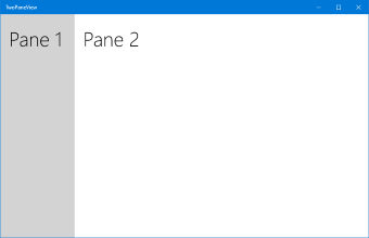
Panes with default sizing
The default values are useful for a typical list/detail layout, where you have a list of items in Pane1, and a lot of details in Pane2. However, depending on your content, you might prefer to divide the space differently. Here, Pane1Length is set to 2* so it gets twice as much space as Pane2.
<muxc:TwoPaneView x:Name="MyTwoPaneView" Pane1Length="2*">
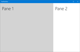
Panes sized 2* and *
Note
As mentioned previously, when the app is spanned across dual-screens, these properties are ignored and each pane fills one of the screens.
If you set a pane to use auto sizing, you can control the size by setting the height and width of the Panel that holds the pane's content. In this case, you might need to handle the ModeChanged event and set the height and width constraints of the content as appropriate for the current mode.
Display in wide or tall mode
On a single screen, the two-pane view's display Mode is determined by the MinWideModeWidth and MinTallModeHeight properties. Both properties have a default value of 641px, the same as NavigationView.CompactThresholdWidth.
This table shows how the Height and Width of the TwoPaneView determine which display mode is used.
| TwoPaneView condition | Mode |
|---|---|
Width > MinWideModeWidth |
Wide mode is used |
Width <= MinWideModeWidth, and Height > MinTallModeHeight |
Tall mode is used |
Width <= MinWideModeWidth, and Height <= MinTallModeHeight |
SinglePane mode is used |
Note
As mentioned previously, when the app is spanned across dual-screens, these properties are ignored and display mode is determined based on the device posture.
Wide configuration options
The two-pane view enters Wide mode when there's a single display that's wider than the MinWideModeWidth property. MinWideModeWidth controls when the two-pane view enters wide mode. The default value is 641px, but you can change it to whatever you want. In general, you should set this property to whatever you want the minimum width of your pane to be.
When the two-pane view is in wide mode, the WideModeConfiguration property determines what to show:
| Enum value | Description |
|---|---|
SinglePane |
A single pane (as determined by PanePriority). The pane takes up the full size of the TwoPaneView (ie, it's star sized in both directions). |
LeftRight |
Pane1 on the left/Pane2 on the right. Both panes are star sized vertically, Pane1's width is autosized, and Pane2's width is star sized. |
RightLeft |
Pane1 on the right/Pane2 on the left. Both panes are star sized vertically, Pane2's width is autosized, and Pane1's width is star sized. |
The default setting is LeftRight.
| LeftRight | RightLeft |
|---|---|
|
 |
TIP: When the device uses a right-to-left (RTL) language, the two-pane view automatically swaps the order:
RightLeftrenders asLeftRight, andLeftRightrenders asRightLeft.
Tall configuration options
The two-pane view enters Tall mode when there's a single display that's narrower than MinWideModeWidth, and taller than MinTallModeHeight. The default value is 641px, but you can change it to whatever you want. In general, you should set this property to whatever you want the minimum height of your pane to be.
When the two-pane view is in tall mode, the TallModeConfiguration property determines what to show:
| Enum value | Description |
|---|---|
SinglePane |
A single pane (as determined by PanePriority). The pane takes up the full size of the TwoPaneView (ie, it's star sized in both directions). |
TopBottom |
Pane1 on the top/Pane2 on the bottom. Both panes are star sized horizontally, Pane1's height is autosized, and Pane2's height is star sized. |
BottomTop |
Pane1 on the bottom/Pane2 on the top. Both panes are star sized horizontally, Pane2's height is autosized, and Pane1's height is star sized. |
The default is TopBottom.
| TopBottom | BottomTop |
|---|---|
 |
 |
Special values for MinWideModeWidth and MinTallModeHeight
You can use the MinWideModeWidth property to prevent the two-pane view from entering Wide mode - just set MinWideModeWidth to Double.PositiveInfinity.
If you set MinTallModeHeight to Double.PositiveInfinity, it prevents the two-pane view from entering Tall mode.
If you set MinTallModeHeight to 0, it prevents the two-pane view from entering SinglePane mode.
Responding to mode changes
You can use the read-only Mode property to get the current display mode. Whenever the two-pane view changes which pane or panes it's displaying, the ModeChanged event occurs before it renders the updated content. You can handle the event to respond to changes in the display mode.
Tip
The ModeChanged event does not occur when the page is initially loaded, so your default XAML should represent the UI as it should appear when first loaded.
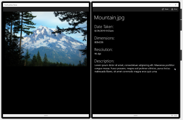
One way you can use this event is to update your app's UI so users can view all the content in SinglePane mode. For example, the example app has a primary pane (the image) and an info pane.
Tall mode
When there's only enough space to display one pane, you can move the content of Pane2 into Pane1 so the user can scroll to see all the content. It looks like this.
SinglePane mode
Remember that the MinWideModeWidth and MinTallModeHeight properties determine when the display mode changes, so you can change when the content is moved between panes by adjusting the values of these properties.
Here's the ModeChanged event handler code that moves the content between Pane1 and Pane2. It also sets a VisualState to constrain the width of the image in Wide mode.
private void TwoPaneView_ModeChanged(Microsoft.UI.Xaml.Controls.TwoPaneView sender, object args)
{
    // Remove details content from it's parent panel.
    ((Panel)DetailsContent.Parent).Children.Remove(DetailsContent);
    // Set Normal visual state.
    Windows.UI.Xaml.VisualStateManager.GoToState(this, "Normal", true);

    // Single pane
    if (sender.Mode == Microsoft.UI.Xaml.Controls.TwoPaneViewMode.SinglePane)
    {
        // Add the details content to Pane1.
        Pane1StackPanel.Children.Add(DetailsContent);
    }
    // Dual pane.
    else
    {
        // Put details content in Pane2.
        Pane2Root.Children.Add(DetailsContent);

        // If also in Wide mode, set Wide visual state
        // to constrain the width of the image to 2*.
        if (sender.Mode == Microsoft.UI.Xaml.Controls.TwoPaneViewMode.Wide)
        {
            Windows.UI.Xaml.VisualStateManager.GoToState(this, "Wide", true);
        }
    }
}
Dos and don'ts
- Do use the two-pane view whenever you can so that your app can take advantage of dual-screens and large screens.
- Don't put a two-pane view inside another two-pane view.
Related articles

Windows developer
Feedback
Coming soon: Throughout 2024 we will be phasing out GitHub Issues as the feedback mechanism for content and replacing it with a new feedback system. For more information see: https://aka.ms/ContentUserFeedback.
Submit and view feedback for