Displaying Contextual Tabs
In a Windows Ribbon framework application, a contextual tab is a hidden Tab control that is displayed in the tab row when an object in the application workspace, such as an image, is selected or highlighted.
Introduction
In contrast to core tabs, which contain various common Commands that are relevant regardless of workspace context, contextual tabs typically contain one or more Commands that are applicable to a selected or highlighted object only.
When an object is selected or highlighted in the application workspace, the type and context of the object might require disparate Commands that do not make organizational or functional sense on one contextual tab. In these cases, multiple contextual tabs, which are contained within a Tab Group, may be required. For example, selecting an image contained in a table cell might require two contextual tabs that expose both table and image functionality.
Note
In addition to multiple contextual tabs, the Ribbon framework also supports multiple Tab Group controls within a ribbon.
When displaying contextual tabs, the Ribbon framework enforces a basic set of behaviors that include:
- Contextual tabs are positioned in the order they are declared and to the right of core tabs in the ribbon tab row.
- When the ribbon is resized, tabs are scaled and tab labels are truncated as space requires. However, visible contextual tabs are given a higher display priority in which they are scaled and truncated last.
- The label for a Tab Group is displayed in the application title bar and spans all associated contextual tabs.
- When multiple Tab Group controls are displayed at the same time, one of five unique colors is assigned to the background of each Tab Group in the application title bar. This color is also used as a highlight color for the contextual tabs in the Tab Group.
- The Tab Group color assignment is based on the order the Tab Group elements are declared in markup. The colors are defined by the framework and cannot be specified by the application.
- The Tab Group colors defined by the framework can be modified indirectly through the Framework Properties property keys. For more information, see Customizing Ribbon Colors.
- When more than five Tab Group controls are displayed at any single time, the framework cycles the associated colors.
- The maximum number of Tab controls in a ribbon is limited to 100. This includes contextual tabs, visible or not.
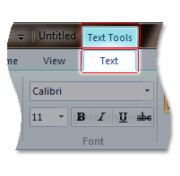
The following screen shot shows a contextual tab from Windows 7 Paint.

Implementing Contextual Tabs
This section discusses the implementation details of Ribbon contextual tabs and walks through how to incorporate them in a Ribbon application.
Markup
The following examples demonstrate the basic markup for a TabGroup element that contains two contextual tabs.
This section of code shows the TabGroup and Tab Command declarations.
<!-- Contextual Tabs -->
<Command Name='cmdContextualTab1'
         LabelTitle='Contextual Tab 1'
         Symbol='ID_CONTEXTUALTAB1'/>
<Command Name='cmdContextualTab2'
         LabelTitle='Contextual Tab 2'
         Symbol='ID_CONTEXTUALTAB2'/>
<Command Name='cmdContextualTabGroup'
         LabelTitle='Contextual Tabs'
         Symbol='ID_CONTEXTUALTAB_GROUP'/>
This section of code shows the control declarations required to display two contextual tabs within a TabGroup.
      <Ribbon.ContextualTabs>
        <TabGroup CommandName='cmdContextualTabGroup'>
          <Tab CommandName='cmdContextualTab1'>
            <!--InRibbonGallery Group-->
            <Group CommandName='cmdInRibbonGalleryGroup'
                   SizeDefinition='OneInRibbonGallery'>
              <InRibbonGallery CommandName='cmdTextSizeGallery3'
                               HasLargeItems='true'
                               ItemHeight='32'
                               ItemWidth='32'
                               MaxColumns='3' >
                <InRibbonGallery.MenuLayout>
                  <FlowMenuLayout Columns='3'
                                  Gripper ='Corner'/>
                </InRibbonGallery.MenuLayout>
              </InRibbonGallery>
            </Group>
            <!--Command Galleries Group-->
            <Group CommandName='cmdCommandGalleriesGroup'
                   SizeDefinition='OneInRibbonGallery'>
              <InRibbonGallery CommandName='cmdCommandGallery1'
                               Type='Commands'
                               MaxRows='3'
                               MaxColumns='3'>
                <InRibbonGallery.MenuLayout>
                  <FlowMenuLayout Columns='3'
                                  Gripper ='Corner'/>
                </InRibbonGallery.MenuLayout>
              </InRibbonGallery>
            </Group>
          </Tab>
          <Tab CommandName='cmdContextualTab2'></Tab>
        </TabGroup>
      </Ribbon.ContextualTabs>
Code
UI_PKEY_ContextAvailable is the single property key defined by the framework for specifying the visibility and state of contextual tabs. When an object is selected in the application workspace, this property can be assigned one of three values from the UI_CONTEXTAVAILABILITY enumeration that define whether a contextual tab exists and, if it does, whether it is shown as the active tab.
An application requests a Tab Group update by invalidating and updating the UI_PKEY_ContextAvailable property when the workspace context changes.
The follow sections of code demonstrate how to display a contextual tab when an image is selected in an application workspace.
// Initialize the image tools contextual tab visibility setting.
UI_CONTEXTAVAILABILITY g_ImageTools = UI_CONTEXTAVAILABILITY_NOTAVAILABLE;

// Called when an image is selected in the application.
void SelectImage()
{
  ...
  g_ImageTools = UI_CONTEXTAVAILABILITY_ACTIVE;

  // Invalidate the UI_PKEY_ContextAvailable property of the image tools
  // contextual tab Command and trigger the UpdatePropery callback function.
  pUIFramework->InvalidateUICommand(
                  cmdImageTabSet,
                  UI_INVALIDATIONS_PROPERTY,
                  UI_PKEY_ContextAvailable);
  ...
}

// Update Tab Group properties.
HRESULT MyTabGroupCommandHandler::UpdateProperty(
                                  UINT nCmdID,
                                  REFPROPERTYKEY key,
                                  const PROPVARIANT* ppropvarCurrentValue,
                                  PROPVARIANT* ppropvarNewValue)
{
  HRESULT hr = E_FAIL;

  if (key == UI_PKEY_ContextAvailable)
  {
    hr = UIInitPropertyFromUInt32(key, g_ImageTools, ppropvarNewValue);
  }
  ...
  return hr;
}
Related topics