Note
Access to this page requires authorization. You can try signing in or changing directories.
Access to this page requires authorization. You can try changing directories.
Controls hosted in the ribbon Command bar are subject to layout rules that are enforced by the Windows Ribbon framework and based on a combination of default behaviors and layout templates (both framework-defined and custom) as declared in the Ribbon markup. These rules define the adaptive layout behaviors of the Ribbon framework that influence how controls in the Command bar adapt to various ribbon sizes at run time.
Introduction
Adaptive layout, as defined by the Ribbon framework, is the ability of all controls within the ribbon UI to dynamically adjust their organization, size, format, and relative scale based on changes to the size of the ribbon at run time.
The framework exposes adaptive layout functionality through a set of markup elements that are dedicated to specifying and customizing various layout behaviors. A collection of templates, called SizeDefinitions, is defined by the framework, each of which support various control and layout scenarios. However, the framework also supports custom templates should the predefined templates not provide the UI experience or layouts required by an application.
To display controls in a preferred layout at a particular ribbon size, both predefined templates and custom templates work in conjunction with the ScalingPolicy element. This element contains a manifest of size preferences that the framework uses as a guide when rendering the ribbon.
Note
The Ribbon framework provides default layout behaviors based on a set of built-in heuristics for the organization and presentation of controls at run time without the need for the predefined SizeDefinition templates. However, this capability is intended for prototyping purposes only.
Ribbon SizeDefinition Templates
The Ribbon framework provides a comprehensive set of SizeDefinition templates that specify size and layout behavior for a Group of Ribbon controls. These templates cover most common scenarios for organizing controls in a Ribbon application.
To enforce a consistent user experience across Ribbon applications, each SizeDefinition template imposes restrictions on the controls or the family of controls it supports.
For example, the button family of controls includes:
- Button
- Toggle Button
- Drop-Down Button
- Split Button
- Drop-Down Gallery
- Split Button Gallery
- Drop-Down Color Picker
While the input family of controls includes:
Check Box and In-Ribbon Gallery do not belong to either the button family or the input family. These two controls can be used only where explicitly indicated in a SizeDefinition template.
The following is a list of the SizeDefinition templates with a description of the layout and controls allowed by each template.
Important
If the controls declared in markup do not map exactly to control type, order, and quantity defined in the associated template, a validation error is logged by the markup compiler and compilation is terminated.
OneButton
One button-family control.
Only Large group size is supported.

TwoButtons
Two button-family controls.
Only Large and Medium group sizes are supported.
ThreeButtons
Three button-family controls.
Only Large and Medium group sizes are supported.
ThreeButtons-OneBigAndTwoSmall
Three button-family controls.
The first button is presented prominently in all three sizes.
ThreeButtonsAndOneCheckBox
Three button-family controls accompanied by a single CheckBox control.
Only Large and Medium group sizes are supported.
FourButtons
Four button-family controls.
FiveButtons
Five button-family controls.
FiveOrSixButtons
Five button-family controls and an optional sixth button.
SixButtons
Six button-family controls.
SixButtons-TwoColumns
Six button-family controls (alternate presentation).
SevenButtons
Seven button-family controls.
EightButtons
Eight button-family controls.
EightButtons-LastThreeSmall
Eight button-family controls (alternate presentation).
Note
All control elements declared with this template must be contained in two ControlGroup elements: one for the first five elements and one for the last three elements.
The following example demonstrates the markup required for this template.
<Group CommandName="cmdSizeDefinitionsGroup"
       SizeDefinition="EightButtons-LastThreeSmall">
  <ControlGroup>
    <Button CommandName="cmdSDButton1" />
    <Button CommandName="cmdSDButton2" />
    <Button CommandName="cmdSDButton3" />
    <Button CommandName="cmdSDButton4" />
    <Button CommandName="cmdSDButton5" />
  </ControlGroup>
  <ControlGroup>
    <Button CommandName="cmdSDButton6" />
    <Button CommandName="cmdSDButton7" />
    <Button CommandName="cmdSDButton8" />
  </ControlGroup>
</Group>
NineButtons
Nine button-family controls.
TenButtons
Ten button-family controls.
ElevenButtons
Eleven button-family controls.
OneFontControl
One FontControl.
Only Large and Medium group sizes are supported.
Important
Including a FontControl within a custom template definition is not supported by the framework.
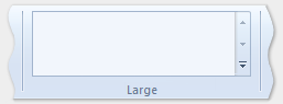
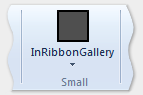
OneInRibbonGallery
One InRibbonGallery control.
Only Large and Small group sizes are supported.
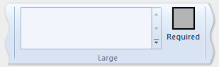
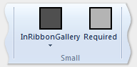
InRibbonGalleryAndBigButton
One InRibbonGallery control and a button-family control.
Only Large and Small group sizes are supported.
InRibbonGalleryAndButtons-GalleryScalesFirst
One In-Ribbon Gallery control and two or three button-family controls.
The gallery collapses to Popup representation in Medium and Small group sizes.
ButtonGroups
A complex arrangement of 32 button-family controls (most of which are optional).
Note
Aside from the optional full-sized button of the large ButtonGroups template, all control elements declared with this template must be contained in ControlGroup elements.
The following example demonstrates the markup required to display all 32 control elements (required and optional) with this template.
<Group CommandName="cmdSizeDefinitionsGroup"
       SizeDefinition="ButtonGroups">
  <!-- Row 1 -->
  <ControlGroup>
    <ControlGroup>
      <Button CommandName="cmdSDButton1" />
      <Button CommandName="cmdSDButton2" />
      <Button CommandName="cmdSDButton3" />
      <Button CommandName="cmdSDButton4" />
      <Button CommandName="cmdSDButton5" />
      <Button CommandName="cmdSDButton6" />
      <Button CommandName="cmdSDButton7" />
      <Button CommandName="cmdSDButton8" />
      <Button CommandName="cmdSDButton9" />
      <Button CommandName="cmdSDButton10" />
    </ControlGroup>
    <ControlGroup>
      <Button CommandName="cmdSDButton11" />
      <Button CommandName="cmdSDButton12" />
    </ControlGroup>
    <ControlGroup>
      <Button CommandName="cmdSDButton13" />
      <Button CommandName="cmdSDButton14" />
    </ControlGroup>
    <ControlGroup>
      <Button CommandName="cmdSDButton15" />
    </ControlGroup>
    <ControlGroup>
      <Button CommandName="cmdSDButton16" />
    </ControlGroup>
    <ControlGroup>
      <Button CommandName="cmdSDButton17" />
      <Button CommandName="cmdSDButton18" />
    </ControlGroup>
  </ControlGroup>
  <!-- Row 2 -->
  <ControlGroup>
    <ControlGroup>
      <Button CommandName="cmdSDButton19" />
      <Button CommandName="cmdSDButton20" />
      <Button CommandName="cmdSDButton21" />
      <Button CommandName="cmdSDButton22" />
      <Button CommandName="cmdSDButton23" />
      <Button CommandName="cmdSDButton24" />
      <Button CommandName="cmdSDButton25" />
      <Button CommandName="cmdSDButton26" />
      <Button CommandName="cmdSDButton27" />
      <Button CommandName="cmdSDButton28" />
    </ControlGroup>
    <ControlGroup>
      <Button CommandName="cmdSDButton29" />
    </ControlGroup>
    <ControlGroup>
      <Button CommandName="cmdSDButton30" />
      <Button CommandName="cmdSDButton31" />
    </ControlGroup>
  </ControlGroup>
  <Button CommandName="cmdSDButton32" />
</Group>
ButtonGroupsAndInputs
Two input-family controls (the second is optional) followed by a complex arrangement of 29 button-family controls (most of which are optional).
Only Large and Medium group sizes are supported.
Note
All control elements declared with this template must be contained in ControlGroup elements.
The following example demonstrates the markup required to display all control elements (required and optional) with this template.
<Group CommandName="cmdSizeDefinitionsGroup"
       SizeDefinition="ButtonGroupsAndInputs">
  <!-- Row 1 -->
  <ControlGroup>
    <ControlGroup>
      <ComboBox CommandName="cmdSDComboBox" />
      <Spinner CommandName="cmdSDSpinner" />
    </ControlGroup>
    <ControlGroup>
      <Button CommandName="cmdSDButton1" />
      <Button CommandName="cmdSDButton2" />
      <Button CommandName="cmdSDButton3" />
      <Button CommandName="cmdSDButton4" />
      <Button CommandName="cmdSDButton5" />
      <Button CommandName="cmdSDButton6" />
      <Button CommandName="cmdSDButton7" />
      <Button CommandName="cmdSDButton8" />
      <Button CommandName="cmdSDButton9" />
    </ControlGroup>
    <ControlGroup>
      <Button CommandName="cmdSDButton10" />
    </ControlGroup>
    <ControlGroup>
      <Button CommandName="cmdSDButton11" />
      <Button CommandName="cmdSDButton12" />
    </ControlGroup>
    <ControlGroup>
      <Button CommandName="cmdSDButton13" />
    </ControlGroup>
    <ControlGroup>
      <Button CommandName="cmdSDButton14" />
    </ControlGroup>
  </ControlGroup>
  <!-- Row 2 -->
  <ControlGroup>
    <ControlGroup>
      <Button CommandName="cmdSDButton15" />
      <Button CommandName="cmdSDButton16" />
      <Button CommandName="cmdSDButton17" />
      <Button CommandName="cmdSDButton18" />
      <Button CommandName="cmdSDButton19" />
      <Button CommandName="cmdSDButton20" />
      <Button CommandName="cmdSDButton21" />
      <Button CommandName="cmdSDButton22" />
      <Button CommandName="cmdSDButton23" />
      <Button CommandName="cmdSDButton24" />
    </ControlGroup>
    <ControlGroup>
      <Button CommandName="cmdSDButton25" />
      <Button CommandName="cmdSDButton26" />
    </ControlGroup>
    <ControlGroup>
      <Button CommandName="cmdSDButton27" />
      <Button CommandName="cmdSDButton28" />
    </ControlGroup>
    <ControlGroup>
      <Button CommandName="cmdSDButton29" />
    </ControlGroup>
  </ControlGroup>
</Group>
BigButtonsAndSmallButtonsOrInputs
Two button-family controls (both optional) followed by two or three button or input-family controls.
Only Large and Medium group sizes are supported.

Basic SizeDefinition Example
The following code example provides a basic demonstration of how to declare a SizeDefinition template in Ribbon markup.
The OneInRibbonGallery SizeDefinition is used for this particular example, but all framework templates are specified in a similar fashion.
<!-- InRibbonGallery -->
<Group CommandName="cmdInRibbonGalleryGroup" SizeDefinition="OneInRibbonGallery">
  <InRibbonGallery CommandName="cmdInRibbonGallery"
                   MaxColumns="10"
                   MaxColumnsMedium="5"
                   MinColumnsLarge="5"
                   MinColumnsMedium="3"
                   Type="Items">
    <InRibbonGallery.MenuLayout>
      <VerticalMenuLayout Rows="2"
                          Gripper="Vertical"/>
    </InRibbonGallery.MenuLayout>
    <InRibbonGallery.MenuGroups>
      <MenuGroup>
        <Button CommandName="cmdButton1"></Button>
        <Button CommandName="cmdButton2"></Button>
      </MenuGroup>
      <MenuGroup>
        <Button CommandName="cmdButton3"></Button>
      </MenuGroup>
    </InRibbonGallery.MenuGroups>
  </InRibbonGallery>
</Group>
Complex SizeDefinition Example with Scaling Policies
The collapsing behavior of SizeDefinition templates can be controlled through the use of scaling policies in the Ribbon markup.
The ScalingPolicy element contains a manifest of ScalingPolicy.IdealSizes and Scale declarations that specify adaptive layout preferences for one or more Group elements when the Ribbon is resized.
Note
It is highly recommended that adequate scaling policy detail be specified such that most, if not all, Group elements are associated with a Scale element where the Size attribute is equal to Popup. Doing so allows the framework to render the ribbon at the smallest size possible, and support the broadest range of display devices, before automatically introducing a scrolling mechanism.
The following code example demonstrates a ScalingPolicy manifest that specifies a ScalingPolicy.IdealSizes SizeDefinition preference for each of four groups of controls on a Home tab. In addition, Scale elements are specified to influence the collapsing behavior, in descending size order, of each group.
<Tab CommandName="Home">
  <Tab.ScalingPolicy>
    <ScalingPolicy>
      <ScalingPolicy.IdealSizes>
        <Scale Group="GroupClipboard" Size="Medium"/>
        <Scale Group="GroupView" Size="Large"/>
        <Scale Group="GroupFont" Size="Large"/>
        <Scale Group="GroupParagraph" Size="Large"/>
      </ScalingPolicy.IdealSizes>
      <Scale Group="GroupClipboard" Size="Small"/>
      <Scale Group="GroupClipboard" Size="Popup"/>
      <Scale Group="GroupFont" Size="Medium"/>
      <Scale Group="GroupFont" Size="Popup"/>
      <Scale Group="GroupParagraph" Size="Medium"/>
      <Scale Group="GroupParagraph" Size="Popup"/>
      <!--
        GroupView group is associated with the OneButton SizeDefinition.
        Since this template is constrained to one size (Large) there
        is no need to declare further scaling preferences.
      -->
    </ScalingPolicy>
  </Tab.ScalingPolicy>

  <Group CommandName="GroupClipboard" SizeDefinition="FourButtons">
    <Button CommandName="Paste"/>
    <Button CommandName="Cut"/>
    <Button CommandName="Copy"/>
    <Button CommandName="SelectAll"/>
  </Group>

  <Group CommandName="GroupFont"  ApplicationModes="1">
    <FontControl CommandName="Font" FontType="FontWithColor" />
  </Group>

  <Group CommandName="GroupParagraph"  ApplicationModes="1" SizeDefinition="ButtonGroups">
    <ControlGroup>
      <ControlGroup>
        <ToggleButton CommandName="Numbered" />
        <ToggleButton CommandName="Bulleted" />
      </ControlGroup>
    </ControlGroup>
    <ControlGroup>
      <ControlGroup>
        <ToggleButton CommandName="LeftJustify" />
        <ToggleButton CommandName="CenterJustify" />
        <ToggleButton CommandName="RightJustify" />
      </ControlGroup>
      <ControlGroup/>
      <ControlGroup>
        <Button CommandName="Outdent" />
        <Button CommandName="Indent" />
      </ControlGroup>
    </ControlGroup>
  </Group>

  <Group CommandName="GroupView" SizeDefinition="OneButton" >
    <ToggleButton CommandName="ViewSource"/>
  </Group>

</Tab>
Custom Templates
If the default layout behaviors and the predefined SizeDefinition templates do not offer the flexibility or support for a particular layout scenario, custom templates are supported by the Ribbon framework through the Ribbon.SizeDefinitions element.
Custom templates can be declared in two ways: a standalone method using the Ribbon.SizeDefinitions element for declaring reusable, named templates or an inline method that is Group-specific.
Standalone Template
The following code example illustrates a basic, reusable custom template.
<Ribbon.SizeDefinitions>
  <SizeDefinition Name="CustomTemplate">
    <GroupSizeDefinition Size="Large">
      <ControlSizeDefinition ImageSize="Large" IsLabelVisible="true" />
    </GroupSizeDefinition>
    <GroupSizeDefinition Size="Medium">
      <ControlSizeDefinition ImageSize="Small" IsLabelVisible="false" />
    </GroupSizeDefinition>
    <GroupSizeDefinition Size="Small">
      <ControlSizeDefinition ImageSize="Small" IsLabelVisible="false" />
    </GroupSizeDefinition>
  </SizeDefinition>
</Ribbon.SizeDefinitions>
Inline Template
The following code examples illustrate a basic inline custom template for a group of four buttons.
This section of code shows the Command declarations for a group of buttons. Large and small image resources are also specified here.
<!-- Button -->
<Command Name="cmdButtonGroup"
         Symbol="cmdButtonGroup"
         Comment="Button Group"
         LabelTitle="ButtonGroup"/>
<Command Name="cmdButton1"
         Symbol="cmdButton1"
         Comment="Button1"
         LabelTitle="Button1"/>
<Command Name="cmdButton2"
         Symbol="cmdButton2"
         Comment="Button2"
         LabelTitle="Button2"/>
<Command Name="cmdButton3"
         Symbol="cmdButton3"
         Comment="Button3"
         LabelTitle="Button3"/>
<Command Name="cmdButtonGroup2"
         Symbol="cmdButtonGroup2"
         Comment="Button Group2"
         LabelTitle="ButtonGroup2"/>
<Command Name="cmdButtonG21"
         Symbol="cmdButtonG21"
         Comment="ButtonG21"
         LabelTitle="ButtonG21">
  <Command.LargeImages>
    <Image Source="res/large.bmp"/>
  </Command.LargeImages>
  <Command.SmallImages>
    <Image Source="res/small.bmp"/>
  </Command.SmallImages>
</Command>
<Command Name="cmdButtonG22"
         Symbol="cmdButtonG22"
         Comment="ButtonG22"
         LabelTitle="ButtonG22">
  <Command.LargeImages>
    <Image Source="res/large.bmp"/>
  </Command.LargeImages>
  <Command.SmallImages>
    <Image Source="res/small.bmp"/>
  </Command.SmallImages>
</Command>
<Command Name="cmdButtonG23"
         Symbol="cmdButtonG23"
         Comment="ButtonG23"
         LabelTitle="ButtonG23">
  <Command.LargeImages>
    <Image Source="res/large.bmp"/>
  </Command.LargeImages>
  <Command.SmallImages>
    <Image Source="res/small.bmp"/>
  </Command.SmallImages>
</Command>
<Command Name="cmdButtonG24"
         Symbol="cmdButtonG24"
         Comment="ButtonG24"
         LabelTitle="ButtonG24">
  <Command.LargeImages>
    <Image Source="res/large.bmp"/>
  </Command.LargeImages>
  <Command.SmallImages>
    <Image Source="res/small.bmp"/>
  </Command.SmallImages>
</Command>
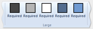
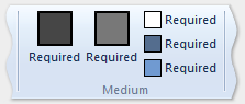
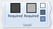
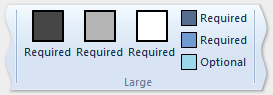
This section of code demonstrates how to define large, medium, and small GroupSizeDefinition templates to display the four buttons at various sizes and layouts. The ScalingPolicy declaration for the tab defines which template is used for a group of controls based on the ribbon size and space required by the active tab.
        <Tab CommandName="cmdTab6">
          <Tab.ScalingPolicy>
            <ScalingPolicy>
              <ScalingPolicy.IdealSizes>
                <Scale Group="cmdButtonGroup"
                       Size="Large"/>
                <Scale Group="cmdButtonGroup2"
                       Size="Large"/>
                <Scale Group="cmdToggleButtonGroup"
                       Size="Large"/>
              </ScalingPolicy.IdealSizes>
              <Scale Group="cmdButtonGroup"
                     Size="Medium"/>
              <Scale Group="cmdButtonGroup2"
                     Size="Medium"/>
              <Scale Group="cmdButtonGroup2"
                     Size="Small"/>
              <Scale Group="cmdButtonGroup2"
                     Size="Popup"/>
            </ScalingPolicy>
          </Tab.ScalingPolicy>

          <Group CommandName="cmdButtonGroup2">
            <SizeDefinition>
              <ControlNameMap>
                <ControlNameDefinition Name="button1"/>
                <ControlNameDefinition Name="button2"/>
                <ControlNameDefinition Name="button3"/>
                <ControlNameDefinition Name="button4"/>
              </ControlNameMap>
              <GroupSizeDefinition Size="Large">
                <ControlGroup>
                  <ControlSizeDefinition ControlName="button1"
                                         ImageSize="Large"
                                         IsLabelVisible="true" />
                  <ControlSizeDefinition ControlName="button2"
                                         ImageSize="Large"
                                         IsLabelVisible="true" />
                </ControlGroup>
                <ColumnBreak ShowSeparator="true"/>
                <ControlGroup>
                  <ControlSizeDefinition ControlName="button3"
                                         ImageSize="Large"
                                        IsLabelVisible="true" />
                  <ControlSizeDefinition ControlName="button4"
                                        ImageSize="Large"
                                        IsLabelVisible="true" />
                </ControlGroup>
              </GroupSizeDefinition>
              <GroupSizeDefinition Size="Medium">
                <Row>
                  <ControlSizeDefinition ControlName="button1"
                                         ImageSize="Small"
                                         IsLabelVisible="true" />
                  <ControlSizeDefinition ControlName="button3"
                                         ImageSize="Small"
                                         IsLabelVisible="true" />
                </Row>
                <Row>
                  <ControlSizeDefinition ControlName="button2"
                                         ImageSize="Small"
                                         IsLabelVisible="true" />
                  <ControlSizeDefinition ControlName="button4"
                                         ImageSize="Small"
                                         IsLabelVisible="true" />
                </Row>
              </GroupSizeDefinition>
              <GroupSizeDefinition Size="Small">
                <Row>
                  <ControlSizeDefinition ControlName="button1"
                                         ImageSize="Small"
                                         IsLabelVisible="true" />
                  <ControlSizeDefinition ControlName="button3"
                                         ImageSize="Small"
                                         IsLabelVisible="false" />
                </Row>
                <Row>
                  <ControlSizeDefinition ControlName="button2"
                                         ImageSize="Small"
                                         IsLabelVisible="true" />
                  <ControlSizeDefinition ControlName="button4"
                                         ImageSize="Small"
                                         IsLabelVisible="false" />
                </Row>
              </GroupSizeDefinition>
            </SizeDefinition>
            <Button CommandName="cmdButtonG21"></Button>
            <Button CommandName="cmdButtonG22"></Button>
            <Button CommandName="cmdButtonG23"></Button>
            <Button CommandName="cmdButtonG24"></Button>
          </Group>
          <Group CommandName="cmdCheckBoxGroup">
            <CheckBox CommandName="cmdCheckBox"></CheckBox>
          </Group>
          <Group CommandName="cmdToggleButtonGroup"
                 SizeDefinition="OneButton">
            <ToggleButton CommandName="cmdToggleButton"></ToggleButton>
          </Group>
          <Group CommandName="cmdButtonGroup"
                 SizeDefinition="ThreeButtons">
            <Button CommandName="cmdButton1"></Button>
            <Button CommandName="cmdButton2"></Button>
            <Button CommandName="cmdButton3"></Button>
          </Group>
        </Tab>
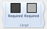
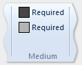
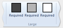
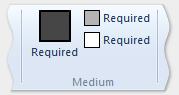
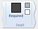
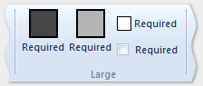
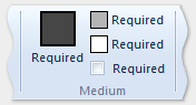
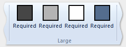
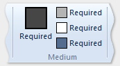
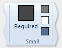
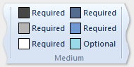
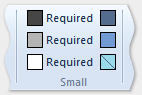
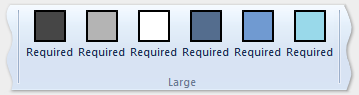
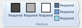
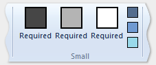
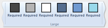
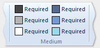
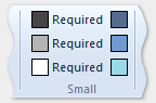
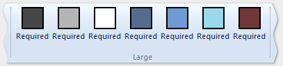
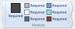
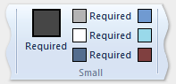
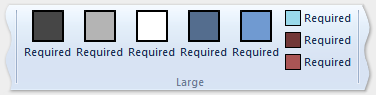
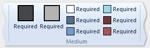
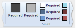
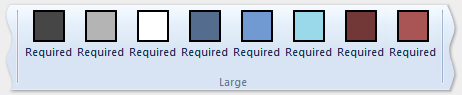
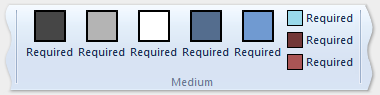
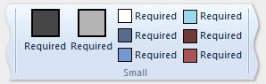
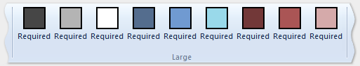
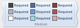
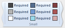
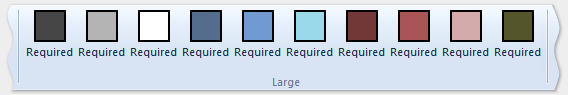
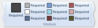
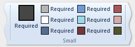
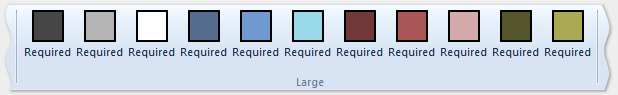
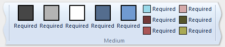
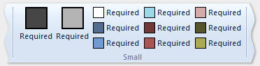
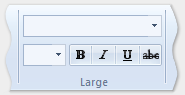
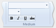
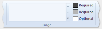
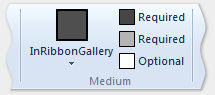
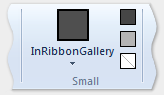
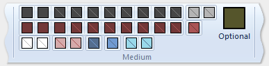
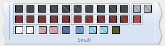
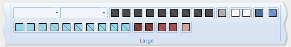
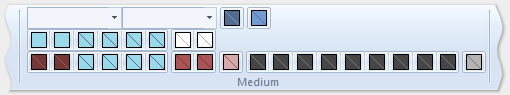
The following images show how the templates from the previous example are applied to the ribbon UI to accommodate a decrease in ribbon size.
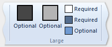
| Type | Image |
|---|---|
| Large | 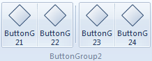 |
| Medium | 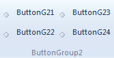 |
| Small | 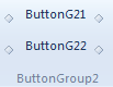 |
| Popup | 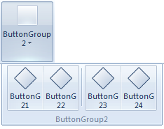 |