ProgressRing Class
Definition
Important
Some information relates to prerelease product that may be substantially modified before it’s released. Microsoft makes no warranties, express or implied, with respect to the information provided here.
Represents a control that indicates the progress of an operation. The typical visual appearance is a ring-shaped "spinner".
This documentation applies to WinUI 2 for UWP (for WinUI in the Windows App SDK, see the Windows App SDK namespaces).
/// [Microsoft.UI.Xaml.CustomAttributes.MUXContractProperty(version=0)]
/// [Windows.Foundation.Metadata.MarshalingBehavior(Windows.Foundation.Metadata.MarshalingType.Agile)]
/// [Windows.Foundation.Metadata.Threading(Windows.Foundation.Metadata.ThreadingModel.Both)]
/// [Windows.Foundation.Metadata.Version(1)]
class ProgressRing : Control
/// [Windows.Foundation.Metadata.MarshalingBehavior(Windows.Foundation.Metadata.MarshalingType.Agile)]
/// [Windows.Foundation.Metadata.Threading(Windows.Foundation.Metadata.ThreadingModel.Both)]
/// [Windows.Foundation.Metadata.ContractVersion(Microsoft.UI.Xaml.XamlContract, 65536)]
class ProgressRing : Control[Microsoft.UI.Xaml.CustomAttributes.MUXContractProperty(version=0)]
[Windows.Foundation.Metadata.MarshalingBehavior(Windows.Foundation.Metadata.MarshalingType.Agile)]
[Windows.Foundation.Metadata.Threading(Windows.Foundation.Metadata.ThreadingModel.Both)]
[Windows.Foundation.Metadata.Version(1)]
public class ProgressRing : Control[Windows.Foundation.Metadata.MarshalingBehavior(Windows.Foundation.Metadata.MarshalingType.Agile)]
[Windows.Foundation.Metadata.Threading(Windows.Foundation.Metadata.ThreadingModel.Both)]
[Windows.Foundation.Metadata.ContractVersion(typeof(Microsoft.UI.Xaml.XamlContract), 65536)]
public class ProgressRing : ControlPublic Class ProgressRing
Inherits Control- Inheritance
-
ProgressRing
- Attributes
-
Microsoft.UI.Xaml.CustomAttributes.MUXContractPropertyAttribute MarshalingBehaviorAttribute ThreadingAttribute VersionAttribute ContractVersionAttribute
Examples
Tip
For more info, design guidance, and code examples, see Progress controls.
The WinUI 3 Gallery and WinUI 2 Gallery apps include interactive examples of most WinUI 3 and WinUI 2 controls, features, and functionality.
If installed already, open them by clicking the following links: WinUI 3 Gallery or WinUI 2 Gallery.
If they are not installed, you can download the WinUI 3 Gallery and the WinUI 2 Gallery from the Microsoft Store.
You can also get the source code for both from GitHub (use the main branch for WinUI 3 and the winui2 branch for WinUI 2).
Tip
For more info, design guidance, and code examples, see Progress controls.
The WinUI 2 Gallery app includes interactive examples of most WinUI 2 controls, features, and functionality. Get the app from the Microsoft Store or get the source code on GitHub.
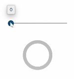
This example shows how to set the IsActive property of a ProgressRing in code. A ToggleSwitch is used to turn theProgressRing control on or off.
<StackPanel>
   <muxc:ProgressRing IsActive="{x:Bind ProgressToggle.IsOn, Mode=OneWay}" />
   <ToggleSwitch x:Name="ProgressToggle" Header="Toggle work" OffContent="Do work" OnContent="Working" IsOn="True" />
</StackPanel>
This example shows how to set the IsIndeterminate property in code to show a progress ring filling based on the value property.
<StackPanel>
   <muxc:ProgressRing IsIndeterminate="false">
   <muxc:NumberBox x:Name="ProgressValue" Minimum="0" Maximum="100" SpinButtonPlacementMode="Inline" ValueChanged="ProgressValue_ValueChanged"/>
</StackPanel>
 private void ProgressValue_ValueChanged(Microsoft.UI.Xaml.Controls.NumberBox sender, Microsoft.UI.Xaml.Controls.NumberBoxValueChangedEventArgs args)
{
   if (!sender.Value.IsNaN())
   {
         ProgressRing2.Value = sender.Value;
   }
   else
   {
         sender.Value = 0;
   }
}
Remarks
ProgressRing is a control that visually indicates progress of an operation with one of two styles: a ring that repeatedly animates, or a ring that fills based on a value.

Use a ProgressRing to visually indicate that an operation is in progress. Set the IsActive property to turn the ProgressRing on or off. If IsActive is false, the ProgressRing is not shown, but space is reserved for it in the UI layout. To not reserve space for the ProgressRing, set its Visibility property to Collapsed.
The IsIndeterminate property determines the appearence of a ProgressRing.
- Set IsIndeterminate to true to display a repeating animation. (This is the default)
- Set IsIndeterminate to false to fill the bar based on a value. When IsIndeterminate is false, you specify the range with the Minimum and Maximum properties. By default Minimum is 0 and Maximum is 100. To specify the progress value, you set the Value property.
Control style and template
You can modify the default Style and ControlTemplate to give the control a unique appearance. For information about modifying a control's style and template, see XAML styles. The default style, template, and resources that define the look of the control are included in the generic.xaml file. For design purposes, generic.xaml is installed with the WinUI (Microsoft.UI.Xaml) NuGet package. By default, this location is \Users\<username>\.nuget\packages\microsoft.ui.xaml\<version>\lib\uap10.0\Microsoft.UI.Xaml\Themes\generic.xaml. Styles and resources from different versions of WinUI might have different values.
XAML also includes resources that you can use to modify the colors of a control in different visual states without modifying the control template (modifying these resources is preferred to setting properties). For more info, see the Light-weight styling section of the XAML styles article.
Constructors
| ProgressRing() |
Initializes a new instance of the ProgressRing class. This documentation applies to WinUI 2 for UWP (for WinUI in the Windows App SDK, see the Windows App SDK namespaces). |
Properties
| DeterminateSource | |
| DeterminateSourceProperty |
Identifies the DeterminateSource dependency property. (Not supported.) This documentation applies to WinUI 2 for UWP (for WinUI in the Windows App SDK, see the Windows App SDK namespaces). |
| IndeterminateSource | |
| IndeterminateSourceProperty |
Identifies the IndeterminateSource dependency property. (Not supported.) This documentation applies to WinUI 2 for UWP (for WinUI in the Windows App SDK, see the Windows App SDK namespaces). |
| IsActive |
Gets or sets a value that indicates whether the ProgressRing is showing progress. This documentation applies to WinUI 2 for UWP (for WinUI in the Windows App SDK, see the Windows App SDK namespaces). |
| IsActiveProperty |
Identifies the IsActive dependency property. This documentation applies to WinUI 2 for UWP (for WinUI in the Windows App SDK, see the Windows App SDK namespaces). |
| IsIndeterminate |
Gets or sets a value that indicates whether the progress ring reports generic progress with a repeating pattern or reports progress based on the Value property. This documentation applies to WinUI 2 for UWP (for WinUI in the Windows App SDK, see the Windows App SDK namespaces). |
| IsIndeterminateProperty |
Identifies the IsIndeterminate dependency property. This documentation applies to WinUI 2 for UWP (for WinUI in the Windows App SDK, see the Windows App SDK namespaces). |
| Maximum |
Gets or sets the highest allowed Value of the range element. This documentation applies to WinUI 2 for UWP (for WinUI in the Windows App SDK, see the Windows App SDK namespaces). |
| MaximumProperty |
Identifies the Maximum dependency property. This documentation applies to WinUI 2 for UWP (for WinUI in the Windows App SDK, see the Windows App SDK namespaces). |
| Minimum |
Gets or sets the minimum allowed Value of the range element. This documentation applies to WinUI 2 for UWP (for WinUI in the Windows App SDK, see the Windows App SDK namespaces). |
| MinimumProperty |
Identifies the Minimum dependency property. This documentation applies to WinUI 2 for UWP (for WinUI in the Windows App SDK, see the Windows App SDK namespaces). |
| TemplateSettings |
Gets an object that provides calculated values that can be referenced as TemplateBinding sources when defining templates for a ProgressRing control. This documentation applies to WinUI 2 for UWP (for WinUI in the Windows App SDK, see the Windows App SDK namespaces). |
| Value |
Gets or sets the current magnitude of the progress ring. This documentation applies to WinUI 2 for UWP (for WinUI in the Windows App SDK, see the Windows App SDK namespaces). |
| ValueProperty |
Identifies the Value dependency property. This documentation applies to WinUI 2 for UWP (for WinUI in the Windows App SDK, see the Windows App SDK namespaces). |