ColorPicker Class
Definition
Important
Some information relates to prerelease product that may be substantially modified before it’s released. Microsoft makes no warranties, express or implied, with respect to the information provided here.
Represents a control that lets a user pick a color using a color spectrum, sliders, or text input.
This documentation applies to WinUI 2 for UWP (for WinUI in the Windows App SDK, see the Windows App SDK namespaces).
/// [Microsoft.UI.Xaml.MUXContractProperty(version=5)]
/// [Windows.Foundation.Metadata.MarshalingBehavior(Windows.Foundation.Metadata.MarshalingType.Agile)]
/// [Windows.Foundation.Metadata.Threading(Windows.Foundation.Metadata.ThreadingModel.Both)]
/// [Windows.Foundation.Metadata.Version(1)]
class ColorPicker : Control
/// [Windows.Foundation.Metadata.MarshalingBehavior(Windows.Foundation.Metadata.MarshalingType.Agile)]
/// [Windows.Foundation.Metadata.Threading(Windows.Foundation.Metadata.ThreadingModel.Both)]
/// [Windows.Foundation.Metadata.Version(1)]
/// [Microsoft.UI.Xaml.CustomAttributes.MUXContractProperty(version=5)]
/// [Microsoft.UI.Xaml.CustomAttributes.MUXPropertyChangedCallback(enable=true)]
/// [Microsoft.UI.Xaml.CustomAttributes.MUXPropertyChangedCallbackMethodName(value="OnPropertyChanged")]
class ColorPicker : Control/// [Windows.Foundation.Metadata.MarshalingBehavior(Windows.Foundation.Metadata.MarshalingType.Agile)]
/// [Windows.Foundation.Metadata.Threading(Windows.Foundation.Metadata.ThreadingModel.Both)]
/// [Microsoft.UI.Xaml.CustomAttributes.MUXPropertyChangedCallback(enable=true)]
/// [Microsoft.UI.Xaml.CustomAttributes.MUXPropertyChangedCallbackMethodName(value="OnPropertyChanged")]
/// [Windows.Foundation.Metadata.ContractVersion(Microsoft.UI.Xaml.XamlContract, 65536)]
class ColorPicker : Control[Microsoft.UI.Xaml.MUXContractProperty(version=5)]
[Windows.Foundation.Metadata.MarshalingBehavior(Windows.Foundation.Metadata.MarshalingType.Agile)]
[Windows.Foundation.Metadata.Threading(Windows.Foundation.Metadata.ThreadingModel.Both)]
[Windows.Foundation.Metadata.Version(1)]
public class ColorPicker : Control[Windows.Foundation.Metadata.MarshalingBehavior(Windows.Foundation.Metadata.MarshalingType.Agile)]
[Windows.Foundation.Metadata.Threading(Windows.Foundation.Metadata.ThreadingModel.Both)]
[Windows.Foundation.Metadata.Version(1)]
[Microsoft.UI.Xaml.CustomAttributes.MUXContractProperty(version=5)]
[Microsoft.UI.Xaml.CustomAttributes.MUXPropertyChangedCallback(enable=true)]
[Microsoft.UI.Xaml.CustomAttributes.MUXPropertyChangedCallbackMethodName(value="OnPropertyChanged")]
public class ColorPicker : Control[Windows.Foundation.Metadata.MarshalingBehavior(Windows.Foundation.Metadata.MarshalingType.Agile)]
[Windows.Foundation.Metadata.Threading(Windows.Foundation.Metadata.ThreadingModel.Both)]
[Microsoft.UI.Xaml.CustomAttributes.MUXPropertyChangedCallback(enable=true)]
[Microsoft.UI.Xaml.CustomAttributes.MUXPropertyChangedCallbackMethodName(value="OnPropertyChanged")]
[Windows.Foundation.Metadata.ContractVersion(typeof(Microsoft.UI.Xaml.XamlContract), 65536)]
public class ColorPicker : ControlPublic Class ColorPicker
Inherits Control<ColorPicker .../>
- Inheritance
-
ColorPicker
- Attributes
-
Microsoft.UI.Xaml.MUXContractPropertyAttribute MarshalingBehaviorAttribute ThreadingAttribute VersionAttribute Microsoft.UI.Xaml.CustomAttributes.MUXContractPropertyAttribute Microsoft.UI.Xaml.CustomAttributes.MUXPropertyChangedCallbackAttribute Microsoft.UI.Xaml.CustomAttributes.MUXPropertyChangedCallbackMethodNameAttribute ContractVersionAttribute
Examples
Tip
For more info, design guidance, and code examples, see Color picker.
The WinUI 2 Gallery app includes interactive examples of most WinUI 2 controls, features, and functionality. Get the app from the Microsoft Store or get the source code on GitHub.
Remarks
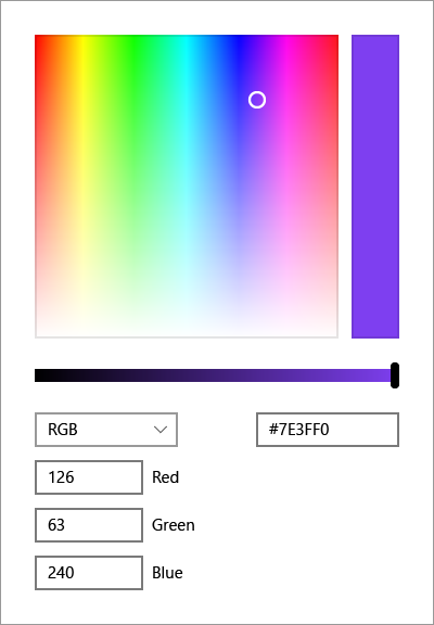
A color picker is used to browse through and select colors. By default, it lets a user navigate through colors on a color spectrum, or specify a Red-Green-Blue (RGB), Hue-Saturation-Value (HSV), or hexadecimal color value in a text box.
For more info about the ColorPicker control, see Color picker.
Control style and template
You can modify the default Style and ControlTemplate to give the control a unique appearance. For information about modifying a control's style and template, see XAML styles. The default style, template, and resources that define the look of the control are included in the generic.xaml file. For design purposes, generic.xaml is installed with the WinUI (Microsoft.UI.Xaml) NuGet package. By default, this location is \Users\<username>\.nuget\packages\microsoft.ui.xaml\<version>\lib\uap10.0\Microsoft.UI.Xaml\Themes\generic.xaml. Styles and resources from different versions of WinUI might have different values.
XAML also includes resources that you can use to modify the colors of a control in different visual states without modifying the control template. Modifying these resources is preferred to setting properties such as Background and Foreground. For more info, see the Light-weight styling section of the XAML styles article.
Constructors
| ColorPicker() |
Initializes a new instance of the ColorPicker class. This documentation applies to WinUI 2 for UWP (for WinUI in the Windows App SDK, see the Windows App SDK namespaces). |
Properties
| Color |
Gets or sets the current color value. This documentation applies to WinUI 2 for UWP (for WinUI in the Windows App SDK, see the Windows App SDK namespaces). |
| ColorProperty |
Identifies the Color dependency property. This documentation applies to WinUI 2 for UWP (for WinUI in the Windows App SDK, see the Windows App SDK namespaces). |
| ColorSpectrumComponents |
Gets or sets a value that indicates how the Hue-Saturation-Value (HSV) color components are mapped onto the ColorSpectrum. This documentation applies to WinUI 2 for UWP (for WinUI in the Windows App SDK, see the Windows App SDK namespaces). |
| ColorSpectrumComponentsProperty |
Identifies the ColorSpectrumComponents dependency property. This documentation applies to WinUI 2 for UWP (for WinUI in the Windows App SDK, see the Windows App SDK namespaces). |
| ColorSpectrumShape |
Gets or sets a value that indicates whether the ColorSpectrum is shown as a square or a circle. This documentation applies to WinUI 2 for UWP (for WinUI in the Windows App SDK, see the Windows App SDK namespaces). |
| ColorSpectrumShapeProperty |
Identifies the ColorSpectrumShape dependency property. This documentation applies to WinUI 2 for UWP (for WinUI in the Windows App SDK, see the Windows App SDK namespaces). |
| IsAlphaEnabled |
Gets or sets a value that indicates whether the alpha channel can be modified. This documentation applies to WinUI 2 for UWP (for WinUI in the Windows App SDK, see the Windows App SDK namespaces). |
| IsAlphaEnabledProperty |
Identifies the IsAlphaEnabled dependency property. This documentation applies to WinUI 2 for UWP (for WinUI in the Windows App SDK, see the Windows App SDK namespaces). |
| IsAlphaSliderVisible |
Gets or sets a value that indicates whether the slider control for the alpha channel is shown. This documentation applies to WinUI 2 for UWP (for WinUI in the Windows App SDK, see the Windows App SDK namespaces). |
| IsAlphaSliderVisibleProperty |
Identifies the IsAlphaSliderVisible dependency property. This documentation applies to WinUI 2 for UWP (for WinUI in the Windows App SDK, see the Windows App SDK namespaces). |
| IsAlphaTextInputVisible |
Gets or sets a value that indicates whether the text input box for the alpha channel is shown. This documentation applies to WinUI 2 for UWP (for WinUI in the Windows App SDK, see the Windows App SDK namespaces). |
| IsAlphaTextInputVisibleProperty |
Identifies the IsAlphaTextInputVisible dependency property. This documentation applies to WinUI 2 for UWP (for WinUI in the Windows App SDK, see the Windows App SDK namespaces). |
| IsColorChannelTextInputVisible |
Gets or sets a value that indicates whether the text input boxes for the color channels are shown. This documentation applies to WinUI 2 for UWP (for WinUI in the Windows App SDK, see the Windows App SDK namespaces). |
| IsColorChannelTextInputVisibleProperty |
Identifies the IsColorChannelTextInputVisible dependency property. This documentation applies to WinUI 2 for UWP (for WinUI in the Windows App SDK, see the Windows App SDK namespaces). |
| IsColorPreviewVisible |
Gets or sets a value that indicates whether the color preview bar is shown. This documentation applies to WinUI 2 for UWP (for WinUI in the Windows App SDK, see the Windows App SDK namespaces). |
| IsColorPreviewVisibleProperty |
Identifies the IsColorPreviewVisible dependency property. This documentation applies to WinUI 2 for UWP (for WinUI in the Windows App SDK, see the Windows App SDK namespaces). |
| IsColorSliderVisible |
Gets or sets a value that indicates whether the slider control for the color value is shown. This documentation applies to WinUI 2 for UWP (for WinUI in the Windows App SDK, see the Windows App SDK namespaces). |
| IsColorSliderVisibleProperty |
Identifies the IsColorSliderVisible dependency property. This documentation applies to WinUI 2 for UWP (for WinUI in the Windows App SDK, see the Windows App SDK namespaces). |
| IsColorSpectrumVisible |
Gets or sets a value that indicates whether the color spectrum control is shown. This documentation applies to WinUI 2 for UWP (for WinUI in the Windows App SDK, see the Windows App SDK namespaces). |
| IsColorSpectrumVisibleProperty |
Identifies the IsColorSpectrumVisible dependency property. This documentation applies to WinUI 2 for UWP (for WinUI in the Windows App SDK, see the Windows App SDK namespaces). |
| IsHexInputVisible |
Gets or sets a value that indicates whether the text input box for a HEX color value is shown. This documentation applies to WinUI 2 for UWP (for WinUI in the Windows App SDK, see the Windows App SDK namespaces). |
| IsHexInputVisibleProperty |
Identifies the IsHexInputVisible dependency property. This documentation applies to WinUI 2 for UWP (for WinUI in the Windows App SDK, see the Windows App SDK namespaces). |
| IsMoreButtonVisible |
Gets or sets a value that indicates whether the 'more' button is shown. This documentation applies to WinUI 2 for UWP (for WinUI in the Windows App SDK, see the Windows App SDK namespaces). |
| IsMoreButtonVisibleProperty |
Identifies the IsMoreButtonVisible dependency property. This documentation applies to WinUI 2 for UWP (for WinUI in the Windows App SDK, see the Windows App SDK namespaces). |
| MaxHue |
Gets or sets the maximum Hue value in the range 0-359. This documentation applies to WinUI 2 for UWP (for WinUI in the Windows App SDK, see the Windows App SDK namespaces). |
| MaxHueProperty |
Identifies the MaxHue dependency property. This documentation applies to WinUI 2 for UWP (for WinUI in the Windows App SDK, see the Windows App SDK namespaces). |
| MaxSaturation |
Gets or sets the maximum Saturation value in the range 0-100. This documentation applies to WinUI 2 for UWP (for WinUI in the Windows App SDK, see the Windows App SDK namespaces). |
| MaxSaturationProperty |
Identifies the MaxSaturation dependency property. This documentation applies to WinUI 2 for UWP (for WinUI in the Windows App SDK, see the Windows App SDK namespaces). |
| MaxValue |
Gets or sets the maximum Value value in the range 0-100. This documentation applies to WinUI 2 for UWP (for WinUI in the Windows App SDK, see the Windows App SDK namespaces). |
| MaxValueProperty |
Identifies the MaxValue dependency property. This documentation applies to WinUI 2 for UWP (for WinUI in the Windows App SDK, see the Windows App SDK namespaces). |
| MinHue |
Gets or sets the minimum Hue value in the range 0-359. This documentation applies to WinUI 2 for UWP (for WinUI in the Windows App SDK, see the Windows App SDK namespaces). |
| MinHueProperty |
Identifies the MinHue dependency property. This documentation applies to WinUI 2 for UWP (for WinUI in the Windows App SDK, see the Windows App SDK namespaces). |
| MinSaturation |
Gets or sets the minimum Saturation value in the range 0-100. This documentation applies to WinUI 2 for UWP (for WinUI in the Windows App SDK, see the Windows App SDK namespaces). |
| MinSaturationProperty |
Identifies the MinSaturation dependency property. This documentation applies to WinUI 2 for UWP (for WinUI in the Windows App SDK, see the Windows App SDK namespaces). |
| MinValue |
Gets or sets the minimum Value value in the range 0-100. This documentation applies to WinUI 2 for UWP (for WinUI in the Windows App SDK, see the Windows App SDK namespaces). |
| MinValueProperty |
Identifies the MinValue dependency property. This documentation applies to WinUI 2 for UWP (for WinUI in the Windows App SDK, see the Windows App SDK namespaces). |
| Orientation |
Gets or sets the orientation of the editing controls in the ColorPicker. This documentation applies to WinUI 2 for UWP (for WinUI in the Windows App SDK, see the Windows App SDK namespaces). |
| OrientationProperty |
Identifies the Orientation dependency property. This documentation applies to WinUI 2 for UWP (for WinUI in the Windows App SDK, see the Windows App SDK namespaces). |
| PreviousColor |
Gets or sets the previous color. This documentation applies to WinUI 2 for UWP (for WinUI in the Windows App SDK, see the Windows App SDK namespaces). |
| PreviousColorProperty |
Identifies the PreviousColor dependency property. This documentation applies to WinUI 2 for UWP (for WinUI in the Windows App SDK, see the Windows App SDK namespaces). |
Events
| ColorChanged |
Occurs when the Color property has changed. This documentation applies to WinUI 2 for UWP (for WinUI in the Windows App SDK, see the Windows App SDK namespaces). |
Applies to
See also
Feedback
Coming soon: Throughout 2024 we will be phasing out GitHub Issues as the feedback mechanism for content and replacing it with a new feedback system. For more information see: https://aka.ms/ContentUserFeedback.
Submit and view feedback for