RadioButtons.Header Property
Definition
Important
Some information relates to prerelease product that may be substantially modified before it’s released. Microsoft makes no warranties, express or implied, with respect to the information provided here.
Gets or sets the content for the group header.
This documentation applies to WinUI 2 for UWP (for WinUI in the Windows App SDK, see the Windows App SDK namespaces).
public:
 property Platform::Object ^ Header { Platform::Object ^ get(); void set(Platform::Object ^ value); };
IInspectable Header();
void Header(IInspectable value);public object Header { get; set; }Public Property Header As ObjectProperty Value
The content of the group header. The default is null.
Examples
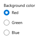
This example shows a RadioButtons group with its Header set to "Background color".
<!-- xmlns:muxc="using:Microsoft.UI.Xaml.Controls -->
<muxc:RadioButtons Header="Background color">
    <x:String>Red</x:String>
    <x:String>Green</x:String>
    <x:String>Blue</x:String>
</muxc:RadioButtons>
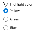
This example shows a RadioButtons group with it a complex header with an icon and text.
<!-- xmlns:muxc="using:Microsoft.UI.Xaml.Controls -->
<muxc:RadioButtons>
    <muxc:RadioButtons.Header>
        <StackPanel Orientation="Horizontal">
            <SymbolIcon Symbol="Highlight"/>
            <TextBlock Text="Highlight color" Margin="8,0,0,0"/>
        </StackPanel>
    </muxc:RadioButtons.Header>
    <x:String>Yellow</x:String>
    <x:String>Green</x:String>
    <x:String>Pink</x:String>
</muxc:RadioButtons>
Remarks
For more info, design guidance, and code examples, see Radio buttons.
You typically use a string for the header, which is displayed as a text label above the radio buttons group. Other objects can also be used instead of a string.
You can set a data template for the header by using the HeaderTemplate property. If the HeaderTemplate property is set, it is used for the header and the Header property is ignored.