Note
Access to this page requires authorization. You can try signing in or changing directories.
Access to this page requires authorization. You can try changing directories.
Users who use screen readers, or have mobility issues, can have difficulty using applications that don't provide appropriate keyboard access. Xamarin.Forms applications can have an expected tab order specified to improve their usability and accessibility. Specifying a tab order for controls enables keyboard navigation, prepares application pages to receive input in a particular order, and permits screen readers to read focusable elements to the user.
By default, the tab order of controls is the same order in which they are listed in XAML, or programmatically added to a child collection. This order is the order in which the controls will be navigated through with a keyboard and read by screen readers, and often this default order is the best order. However, the default order is not always the same as the expected order, as shown in the following XAML code example:
<Grid>
    <Grid.ColumnDefinitions>
        <ColumnDefinition Width="0.5*" />
        <ColumnDefinition Width="0.5*" />
    </Grid.ColumnDefinitions>
    <Grid.RowDefinitions>
        <RowDefinition Height="Auto" />
        <RowDefinition Height="Auto" />
        <RowDefinition Height="Auto" />
    </Grid.RowDefinitions>
    <Label Text="You"
           HorizontalOptions="Center" />
    <Label Grid.Column="1"
           Text="Manager"
           HorizontalOptions="Center" />
    <Entry Grid.Row="1"
           Placeholder="Enter forename" />
    <Entry Grid.Column="1"
           Grid.Row="1"
           Placeholder="Enter forename" />
    <Entry Grid.Row="2"
           Placeholder="Enter surname" />
    <Entry Grid.Column="1"
           Grid.Row="2"
           Placeholder="Enter surname" />
</Grid>
The following screenshot shows the default tab order for this code example:

The tab order here is row-based, and is the order the controls are listed in the XAML. Therefore, pressing the Tab key navigates through forename Entry instances, followed by surname Entry instances. However, a more intuitive experience would be to use a column-first tab navigation, so that pressing the Tab key navigates through forename-surname pairs. This can be achieved by specifying the tab order of the input controls.
Note
On the Universal Windows Platform, keyboard shortcuts can be defined that provide an intuitive way for users to quickly navigate and interact with the application's visible UI through a keyboard instead of via touch or a mouse. For more information, see Setting VisualElement Access Keys.
Setting the tab order
The VisualElement.TabIndex property is used to indicate the order in which VisualElement instances receive focus when the user navigates through controls by pressing the Tab key. The default value of the property is 0, and it can be set to any int value.
The following rules apply when using the default tab order, or setting the TabIndex property:
VisualElementinstances with aTabIndexequal to 0 are added to the tab order based on their declaration order in XAML or child collections.VisualElementinstances with aTabIndexgreater than 0 are added to the tab order based on theirTabIndexvalue.VisualElementinstances with aTabIndexless than 0 are added to the tab order and appear before any zero value.- Conflicts on a
TabIndexare resolved by declaration order.
After defining a tab order, pressing the Tab key will cycle the focus through controls in ascending TabIndex order, wrapping around to the beginning once the final control is reached.
Warning
On the Universal Windows Platform, the TabIndex property of each control must be set to int.MaxValue for the tab order to be identical to the control declaration order.
The following XAML example shows the TabIndex property set on input controls to enable column-first tab navigation:
<Grid>
    <Grid.ColumnDefinitions>
        <ColumnDefinition Width="0.5*" />
        <ColumnDefinition Width="0.5*" />
    </Grid.ColumnDefinitions>
    <Grid.RowDefinitions>
        <RowDefinition Height="Auto" />
        <RowDefinition Height="Auto" />
        <RowDefinition Height="Auto" />
    </Grid.RowDefinitions>
    <Label Text="You"
           HorizontalOptions="Center" />
    <Label Grid.Column="1"
           Text="Manager"
           HorizontalOptions="Center" />
    <Entry Grid.Row="1"
           Placeholder="Enter forename"
           TabIndex="1" />
    <Entry Grid.Column="1"
           Grid.Row="1"
           Placeholder="Enter forename"
           TabIndex="3" />
    <Entry Grid.Row="2"
           Placeholder="Enter surname"
           TabIndex="2" />
    <Entry Grid.Column="1"
           Grid.Row="2"
           Placeholder="Enter surname"
           TabIndex="4" />
</Grid>
The following screenshot shows the tab order for this code example:
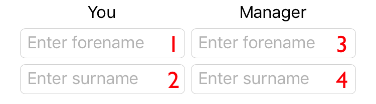
The tab order here is column-based. Therefore, pressing the Tab key navigates through forename-surname Entry pairs.
Important
Screen readers on iOS and Android will respect the TabIndex of a VisualElement when reading the accessible elements on the screen.
Excluding controls from the tab order
In addition to setting the tab order of controls, it may be necessary to exclude controls from the tab order. One way of achieving this is by setting the IsEnabled property of controls to false, because disabled controls are excluded from the tab order.
However, it may be necessary to exclude controls from the tab order even when they aren't disabled. This can be achieved with the VisualElement.IsTabStop property, which indicates whether a VisualElement is included in tab navigation. Its default value is true, and when its value is false the control is ignored by the tab-navigation infrastructure, irrespective if a TabIndex is set.
Supported controls
The TabIndex and IsTabStop properties are supported on the following controls, which accept keyboard input on one or more platforms:
ButtonDatePickerEditorEntryNavigationPagePickerProgressBarSearchBarSliderStepperSwitchTabbedPageTimePicker
Note
Each of these controls isn't tab focusable on every platform.