Note
Access to this page requires authorization. You can try signing in or changing directories.
Access to this page requires authorization. You can try changing directories.
This Android platform-specific controls whether Xamarin.Forms buttons use the default padding and shadow values of Android buttons. It's consumed in XAML by setting the Button.UseDefaultPadding and Button.UseDefaultShadow attached properties to boolean values:
<ContentPage ...
            xmlns:android="clr-namespace:Xamarin.Forms.PlatformConfiguration.AndroidSpecific;assembly=Xamarin.Forms.Core">
    <StackLayout>
        ...
        <Button ...
                android:Button.UseDefaultPadding="true"
                android:Button.UseDefaultShadow="true" />
    </StackLayout>
</ContentPage>
Alternatively, it can be consumed from C# using the fluent API:
using Xamarin.Forms.PlatformConfiguration;
using Xamarin.Forms.PlatformConfiguration.AndroidSpecific;
...

button.On<Android>().SetUseDefaultPadding(true).SetUseDefaultShadow(true);
The Button.On<Android> method specifies that this platform-specific will only run on Android. The Button.SetUseDefaultPadding and Button.SetUseDefaultShadow methods, in the Xamarin.Forms.PlatformConfiguration.AndroidSpecific namespace, are used to control whether Xamarin.Forms buttons use the default padding and shadow values of Android buttons. In addition, the Button.UseDefaultPadding and Button.UseDefaultShadow methods can be used to return whether a button uses the default padding value and default shadow value, respectively.
The result is that Xamarin.Forms buttons can use the default padding and shadow values of Android buttons:
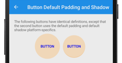
Note that in the screenshot above each Button has identical definitions, except that the right-hand Button uses the default padding and shadow values of Android buttons.