Note
Access to this page requires authorization. You can try signing in or changing directories.
Access to this page requires authorization. You can try changing directories.
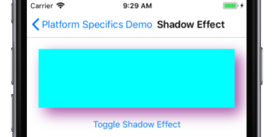
This iOS platform-specific is used to enable a drop shadow on a VisualElement. It's consumed in XAML by setting the VisualElement.IsShadowEnabled attached property to true, along with a number of additional optional attached properties that control the drop shadow:
<ContentPage ...
             xmlns:ios="clr-namespace:Xamarin.Forms.PlatformConfiguration.iOSSpecific;assembly=Xamarin.Forms.Core">
    <StackLayout Margin="20">
        <BoxView ...
                 ios:VisualElement.IsShadowEnabled="true"
                 ios:VisualElement.ShadowColor="Purple"
                 ios:VisualElement.ShadowOpacity="0.7"
                 ios:VisualElement.ShadowRadius="12">
            <ios:VisualElement.ShadowOffset>
                <Size>
                    <x:Arguments>
                        <x:Double>10</x:Double>
                        <x:Double>10</x:Double>
                    </x:Arguments>
                </Size>
            </ios:VisualElement.ShadowOffset>
         </BoxView>
        ...
    </StackLayout>
</ContentPage>
Alternatively, it can be consumed from C# using the fluent API:
using Xamarin.Forms.PlatformConfiguration;
using Xamarin.Forms.PlatformConfiguration.iOSSpecific;
...

var boxView = new BoxView { Color = Color.Aqua, WidthRequest = 100, HeightRequest = 100 };
boxView.On<iOS>()
       .SetIsShadowEnabled(true)
       .SetShadowColor(Color.Purple)
       .SetShadowOffset(new Size(10,10))
       .SetShadowOpacity(0.7)
       .SetShadowRadius(12);
The VisualElement.On<iOS> method specifies that this platform-specific will only run on iOS. The VisualElement.SetIsShadowEnabled method, in the Xamarin.Forms.PlatformConfiguration.iOSSpecific namespace, is used to control whether a drop shadow is enabled on the VisualElement. In addition, the following methods can be invoked to control the drop shadow:
SetShadowColor– sets the color of the drop shadow. The default color isColor.Default.SetShadowOffset– sets the offset of the drop shadow. The offset changes the direction the shadow is cast, and is specified as aSizevalue. TheSizestructure values are expressed in device-independent units, with the first value being the distance to the left (negative value) or right (positive value), and the second value being the distance above (negative value) or below (positive value). The default value of this property is (0.0, 0.0), which results in the shadow being cast around every side of theVisualElement.SetShadowOpacity– sets the opacity of the drop shadow, with the value being in the range 0.0 (transparent) to 1.0 (opaque). The default opacity value is 0.5.SetShadowRadius– sets the blur radius used to render the drop shadow. The default radius value is 10.0.
Note
The state of a drop shadow can be queried by calling the GetIsShadowEnabled, GetShadowColor, GetShadowOffset, GetShadowOpacity, and GetShadowRadius methods.
The result is that a drop shadow can be enabled on a VisualElement: