Note
Access to this page requires authorization. You can try signing in or changing directories.
Access to this page requires authorization. You can try changing directories.
The Artificial Intelligence sample contains a report for a fictitious company named Contoso. The Contoso sales manager created this report to understand their products and regions' key contributors for revenue won/loss, identify the highest or lowest breakdown of revenue, and determine if there are anomalies in their data. This sample is part of a series that shows how you can use Power BI with business-oriented data, reports, and dashboards.

This tutorial explores the Artificial Intelligence Sample in the Power BI service. Because the report experience might be similar in Power BI Desktop and in the service, you can also follow along by downloading the sample .pbix file in Power BI Desktop.
Prerequisites
You don't need a Power BI license to explore the samples in Power BI Desktop. You just need a Fabric free license to explore the sample in the Power BI service, and save it to your My workspace.
Get the sample
Before you can use the sample, get the sample in one of the following ways:
- Get the built-in sample in the service.
- Get the built-in sample, then download it as a .pbix file.
Get the built-in sample
Open the Power BI service (
app.powerbi.com), and make sure you're in the Power BI experience.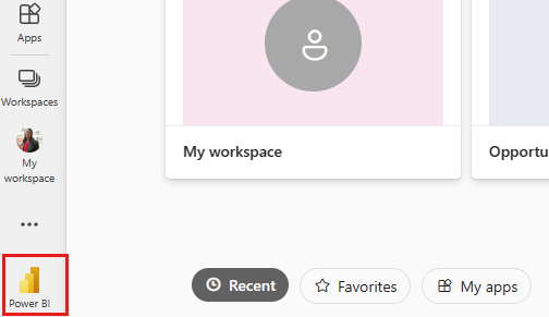
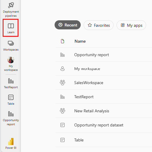
Select Learn in the navigation pane.
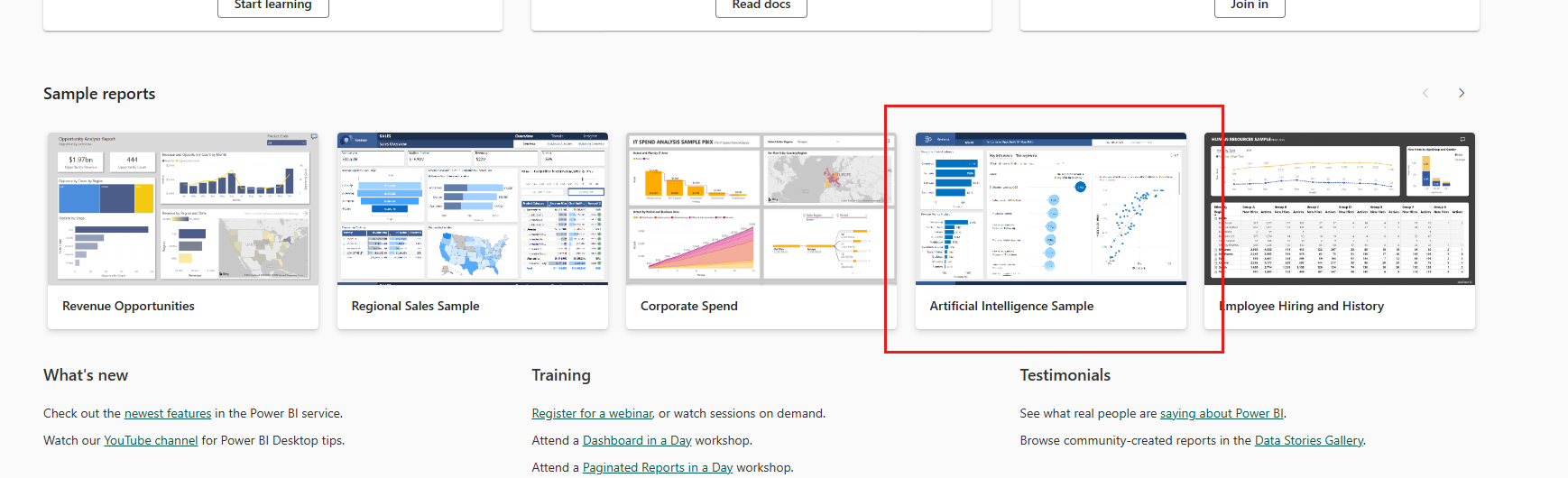
On the Learning center page, under Sample reports, scroll horizontally until you see the Artificial Intelligence Sample. Select the sample.
Power BI saves the report and dataset to your My workspace.
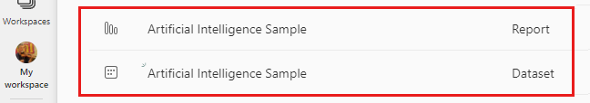
Select the report to view the sample report.
Get the .pbix file for this sample
Alternatively, after you've saved it to My workspace, you can download the report from the service and save it as a .pbix file. Then you can open it in Power BI Desktop.
Open the report in the Power BI service.
On the File menu, select Download this file.
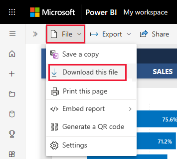
In the What do you want to download? dialog, select A copy of your report and data (.pbix) and choose Download.
It's saved to your Downloads folder, and you can open it with Power BI Desktop.
For more information, see Download a report from the service to Power BI Desktop.
Explore the Artificial Intelligence sample report
The sample report has three pages, Key Influencers, Decomposition Tree, and Anomaly Detection, to demonstrate how people can discover new insights and inform their decision making with easy-to-use artificial intelligence visuals.
Key Influencers page
The first report page to explore is Key Influencers, where you analyze your data to understand the effect and influence of key contributors on your results.
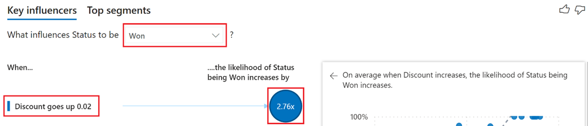
What are your top contributors for wins and losses
Start by reviewing the top contributors that resulted in a Status of Won using the Key influencers visual in the center of your report. From the visual, notice that the top contributor is when the Discount goes up 2%, you're 2.76x more likely to win new revenue.
Select the 2.76x indicator. Power BI displays a scatter chart next to it, showing the correlation between your Discount and % Status is Won for this influencer.
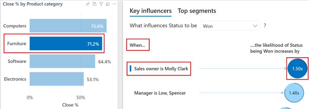
As you interact with slicers, filters, and other visuals, the Key influencers visual reruns its analysis based on the updated choice. From the Close % by Product category stacked bar chart, select the Furniture category to generate new insights based upon the updated selection. You see that when the Product category is Furniture and when the Sales owner is Molly Clark, you're 1.50x more likely to win new revenue.
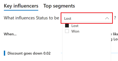
To review the top contributors for when your Status changes, from the dropdown, select the Lost option to generate new insights based upon the updated selection. You can now answer the question, “What is the top contributor when a loss occurs?"
To learn more, see Key influencers visuals.
Decomposition Tree page
The second report page to explore is Decomposition Tree, where you conduct root cause and ad hoc analysis to understand the effect of Sales Opportunities across the different fields within your data.
Who is the top sales owner and largest opportunity path for computer sales
From the Decomposition tree visual in the center of your report, select the Computers option within the Category breakdown to rerun the analysis.
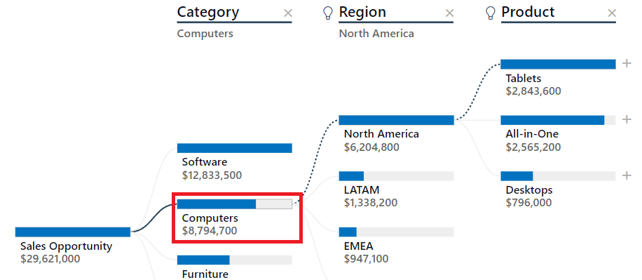
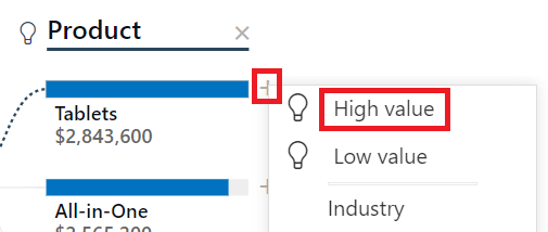
With your updated analysis, you can use artificial intelligence splits to determine the path to the next highest sales opportunities in your data. Select the + symbol next to Tablets and the High value option.
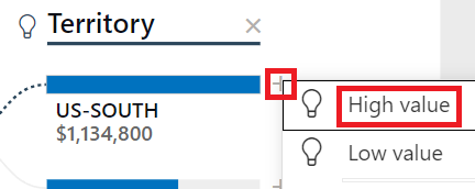
The tree determines that the Territory field as the next path for sales opportunity, with the US-SOUTH being the largest. Select the + symbol next to US-SOUTH, then select the High value option. From the updated selection, you can now answer the question, "Who is the top sales owner?"
To learn more, see Decomposition tree visuals.
Anomaly Detection page
The final report page to explore is Anomaly Detection, where you combine several artificial intelligence capabilities to detect anomalies in your results, generate dynamic text summaries, and use your own natural language to ask questions and get answers from your data.
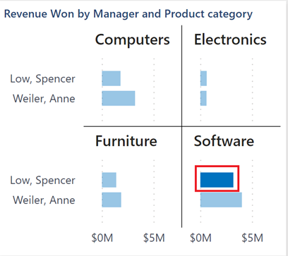
Why the sharp decline in software revenue
The clustered bar chart in the top right of the page is divided into multiple versions of itself (small multiples) to compare data across the Manager and Product category fields. In the Software multiple, select the bar for Low, Spencer to dynamically filter the rest of the page to Spencer's specific results.
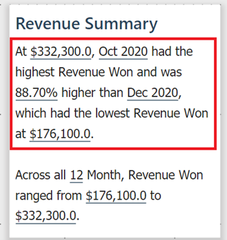
On the right side of the page, Power BI has generated a dynamic summary based on the updated selection. The text summary describes the highest and lowest calendar months for Revenue Won.
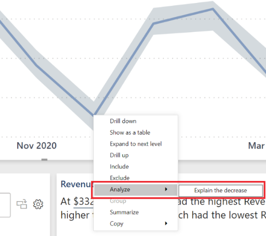
Within the line chart in the center of the page, right-click the December 2020 data point. Within the menu options, select Analyze > Explain the decrease to answer "Why the sharp decline in revenue in December 2020?" using quick insights.
To learn more, see Smart narratives and Apply insights to explain fluctuations in visuals.
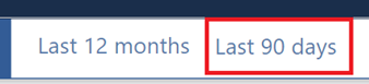
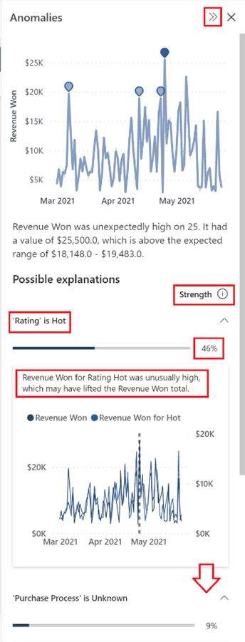
Why the unexpected increase in revenue over the last 90 days
In the top right of the page, select the Last 90 days to view Revenue Won displayed as individual days.
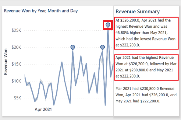
The button has preserved the Low, Spencer and Software selections from earlier steps. It has also rewritten the Revenue Summary based upon the last 90 days filter, which you can review for new insights. In the line chart, there are also visual anomaly indicators. Select the April 25th indicator for a possible explanation as to "Why?" an anomaly was detected.
The Anomalies pane is now displayed on the right side of your report page. It includes Possible explanations, a Strength score, which means that higher scores might have had a greater effect, and possibly more explanations if you scroll down. From your highest possible explanation score, you can answer the question, "Why the increase in revenue?". When finished, collapse the Anomalies pane using the double arrows >> at the top of the pane.
To learn more, see Anomaly detection.
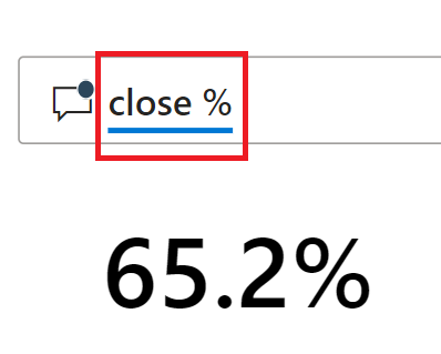
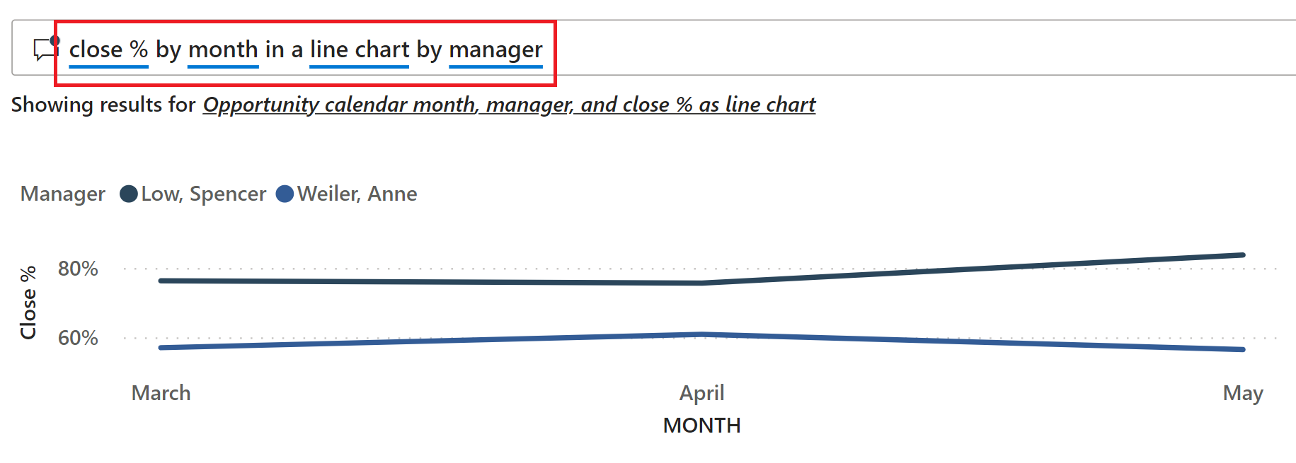
Which manager had the highest close percentage and in what month
In the bottom right of the page, type the question close % in the Ask a question about your data field to return a single value.
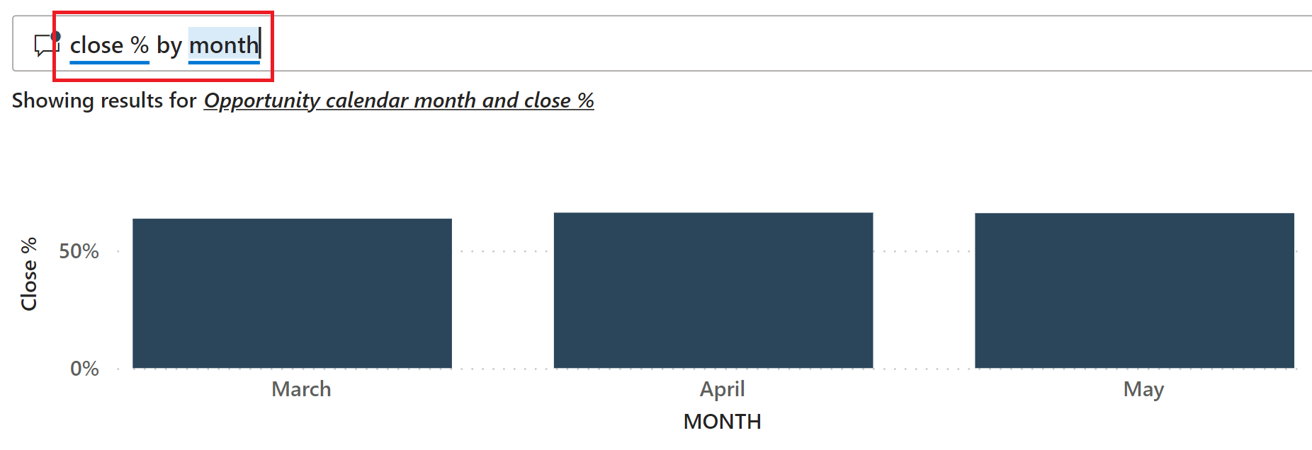
To segment the close % results by month, modify the current question to close % by month to visually display the results in a clustered column chart.
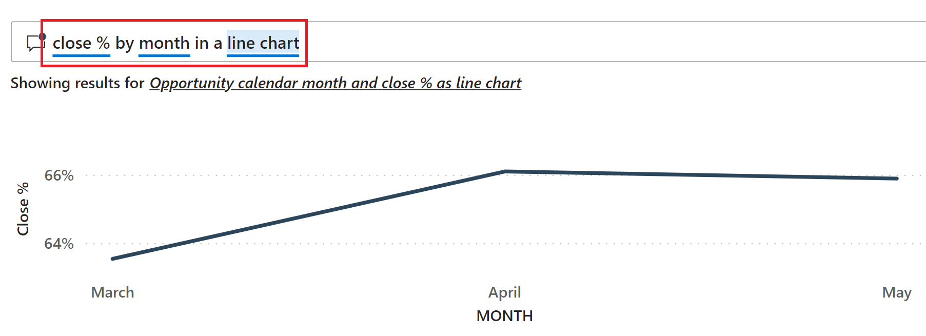
While columns can be great for comparing one item to another, they aren't as useful when displaying movement over time. Update the original text to close % by month in a line chart.
And to answer the question of Which manager had the highest close percentage? update the question to close % by month in a line chart by manager and compare the final results.
Related content
This environment is a safe one to play in, because you can choose not to save your changes. But if you do save them, you can always return to the Learning center for a new copy of this sample.
We hope this tour has shown how the artificial intelligence capabilities in Power BI can provide insights into data. Now it's your turn. Connect to your own data. With Power BI, you can connect to a wide variety of data sources. To learn more, see Get started with the Power BI service.