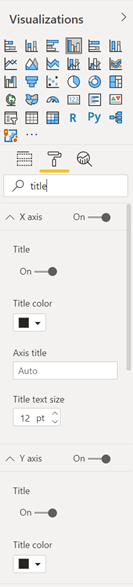
The updated Format and Visualizations panes in Power BI
APPLIES TO: ![]() Power BI Desktop
Power BI Desktop ![]() Power BI service
Power BI service
The redesigned Format pane is now generally available and on by default in both Power BI Desktop and the Power BI service. This article explains the biggest changes we’ve made, to improve usability and consistency across visual and non-visual elements.
This article also explains our work redistributing the Visualizations pane functionality, moving it to on-object menus and the Format pane instead. Currently, this functionality is in preview and only available in Power BI Desktop.
Thank you for providing feedback throughout the preview. We’re still interested in your comments. Submit feedback on the Power BI Ideas site.
March 2023: Visual container improvements
With this release, we introduce four key features to help you customize visual containers.
Subtitle
You can turn on a subtitle to add extra context to your visuals. The new Subtitle toggle is in the Title settings card of the Format pane.
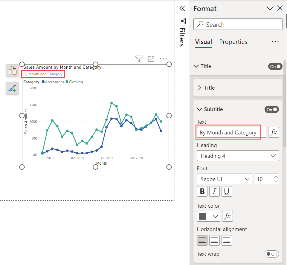
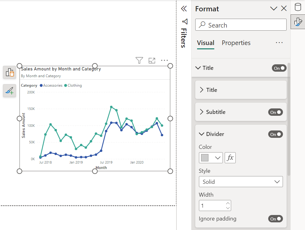
Divider
To visually separate the visual header from its contents, you can add a divider line. You can find the Divider option in the Title settings card of the Format pane, below the new Subtitle.
Here’s the visual container with Subtitle and Divider:
Spacing
In addition to the Subtitle and Divider on your visual container, you can control the space below each component. The Spacing setting at the bottom of the Title settings card of the Format pane.
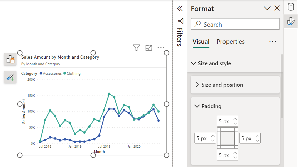
Padding
You can now control the container's margin to create a negative space making the visuals look more professional and appealing. The Padding option is in the Format pane Visual card > Size and style.
March 2023: Moving Visualizations pane functionality (preview)
To see the Visualizations and other pane functionality changes, you need to turn on this month's preview features. See Turn on preview features in the on-object interaction article for details.
Pane switcher
We've removed the Visualizations pane in favor of on-object menus. In doing so, we introduced a pane switcher to align to the Microsoft Office pattern of one pane at a time, to give more real estate to the canvas.
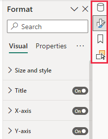
As you open panes, you see them added to the switcher on the right. If you accidentally close a pane, you can bring it back from the View tab in the ribbon.
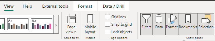
If you prefer to have the panes side by side like before, right-click the pane you’d like and choose Open in new pane.
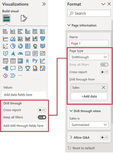
Drillthrough and tooltip page setup
Drillthrough and tooltip page settings moved from the Visualizations pane into the Format page settings.
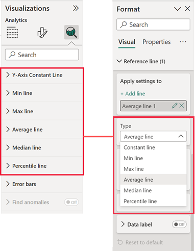
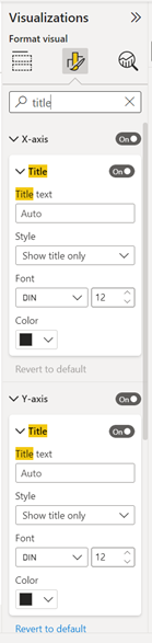
Analytics pane merged with Format pane
Analytics features were on their own tab in the Visualizations pane. With the removal of the Visualizations pane, we've added the analytics features to the Format pane as elements to add to your visual.
Past updates
December 2022
Slicer formatting has moved to the Format pane.
- Settings that used to be in the header of the slicer visual are now in the Format pane.
- The horizontal format has been renamed to the tile format, based on customer feedback.
- The mobile formatting options now have access to this tile setting, too.
See the article Slicers in Power BI for details.
June 2022
Improvements this month:
- When you change Canvas settings > Type to Tooltip, we automatically set Allow use as tooltip to On to save you a step.
- Fixed a blocking bug to ensure that the Analytics pane works for custom visuals, where applicable.
- Fixed a bug that removed log scale applied to the horizontal axis. This affected line, area, stacked area, combo, or scatter charts set prior to April 2022 reports. The issue has now been resolved.
May 2022
Here are the improvements we added in May 2022:
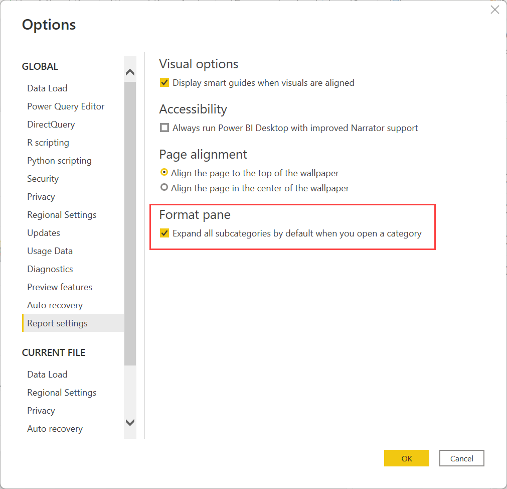
- We added a user preference setting to expand all subcategories when you open a category card. Go to Options > Report settings, and under Format pane, select Expand all subcategories by default when you open a category.
- We readded Analytics pane support for custom visuals.
- We readded No fill for Title background, Tooltips background, and Header icons Help tooltip background color pickers.
- We added color back to all color swatches for easier searching.
- We readded the Conditional formatting card for the decomposition tree visual.
- To help with adjusting to the new naming conventions, we added an alias for the renamed Conditional formatting card, which is now called Cell elements. When you search for “conditional formatting” for a matrix or table, we display the Cell elements.
April 2022
Here are the improvements we added in April 2022:
- Shape map custom color has been reintroduced.
- Scatter chart show blank values toggle has been reintroduced.
- Slicers with slider type (between, before, after) responsive toggle has been reintroduced.
- Button icon size setting has been reintroduced.
- Issue causing delay in cursor position for text input boxes is resolved.
February 2022
Here are the improvements we added in February 2022:
- Ability to toggle axis title independent of axis has been readded.
- Ability to add shade area to combo charts has been readded.
- Ability to customize marker shape by series for scatter charts has been readded.
- Outline settings for matrix and table have been readded.
- Minor reordering of the field wells within the Build pane to match the order of the new Format pane cards for pie chart, donut chart, and scatter chart.
New pivot icons
We’ve updated the format tab icon and added a descriptive subtitle to make it easier to find the Format pane. Previously, it was hard to find the format page settings. We’ve added a new Format page icon that you see when you haven't selected any visuals, and the canvas is ready for formatting.
| Old Format pane | New Format pane |
|---|---|
|
|
|
Moving the Visualization types gallery
To address the limited vertical space on the Format pane, we’ve moved the Visualization types gallery to be present only on the Build tab.
| Old Format pane | New Format pane |
|---|---|
|
|
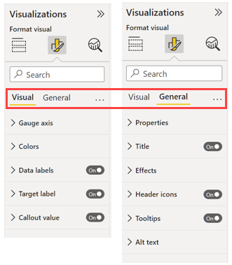
Splitting specific vs. general settings
We've split the long list of formatting cards into two categories: visual specific vs. general settings. The general settings contain cards that affect the visual container and are consistent across all visual types. The visual specific settings contain cards that pertain only to the visual type you’re currently working with. This change allows for easier adjustment of general settings when you click across visuals, better scannability and discovery of visual specific cards, and helps new users learn where to find what.
| Old Format pane | New Format pane |
|---|---|
|
|
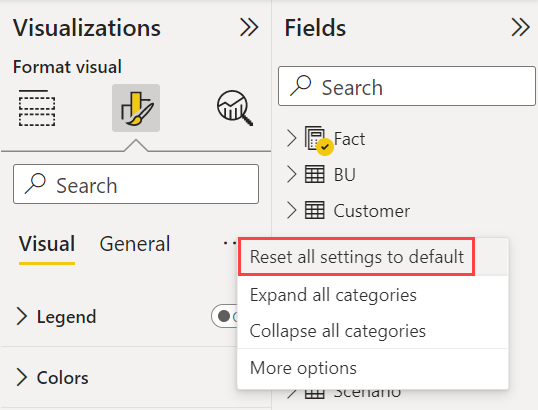
New global reset to default
On the More options (...) menu, you can return all settings back to default. This option is especially helpful when you want your visuals to reflect your theme styling.
Expand subcategories
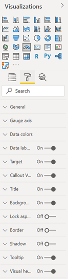
You’ll notice that within the cards we've broken up the settings further into subcategories. Breaking them up improves readability and allows you to focus on specific parts of a card at a time. We’ve also added a new context menu for navigating these new subcategories. You can right-click a card to expand all the subcategories at once, or collapse them all for quick scanning and scrolling.
In the Format pane, select More options.
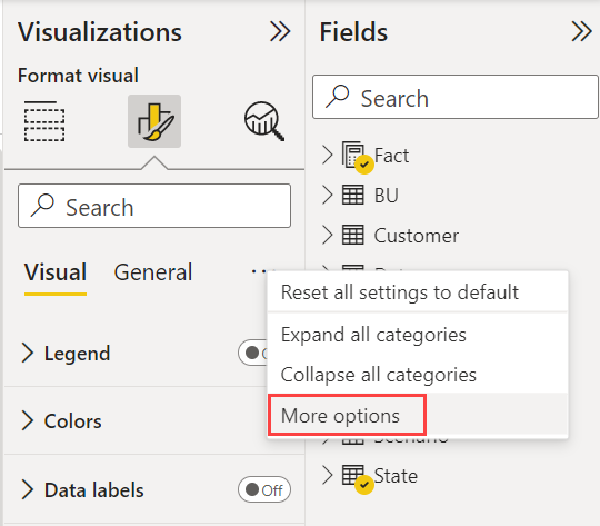
Select Expand all subcategories by default when you open a category.
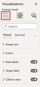
All cards exposed
We expose all cards for visuals, whether you can set them or not. They have helpful tooltips on what actions to take to enable the cards.
Merged font settings
Across the Format pane, we’ve merged font family and font size onto a single line. Again, we want to reduce vertical space and to better align with Office.
| Old Format pane | New Format pane |
|---|---|
|
|
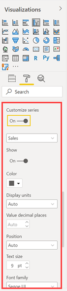
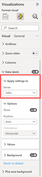
Customize series mechanism
The old Format pane repeated the same list of settings after toggling Customize series to On. We've consolidated this list into an Apply settings to dropdown that lets you easily switch between updating the settings for all series or a particular series without having to scroll.
| Old Format pane | New Format pane |
|---|---|
|
|
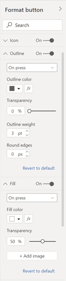
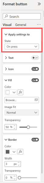
Button states mechanism
Similar to customizing a series, we’ve consolidated the button style cards. Consolidation allows us to use one Apply settings to dropdown to easily toggle between button states and update various aspects of the style.
| Old Format pane | New Format pane |
|---|---|
|
|
Highlighting match in search
In a small but mighty change, we’ve added the same yellow highlight you see in the Fields list and Filter pane to the Format pane search results. When in search mode, results will reflect contents from both the visual and general pivots.
| Old Format pane | New Format pane |
|---|---|
|
|
Order, naming, and hierarchy
Through the years, the Format pane has received many new additions but they haven't always been added consistently. It’s hard, especially for new users, to learn where things are when cards and settings constantly jump around. Or the name of a setting in one visual is called something entirely different in another. We’ve rearranged, renamed, added missing units, and consolidated cards/settings to behave consistently across visuals.
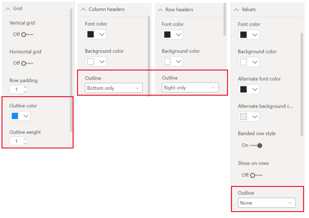
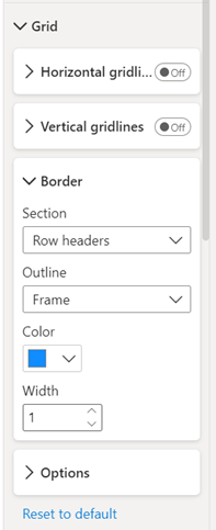
Consolidated outline settings for matrix and table
We consolidated the outline settings for matrix and tables, so you can set them from the Grid card. Previously users had to use the Grid card to set the color and width, then navigate to each section of the matrix to adjust the border location. With this update, you can adjust the borders for the whole matrix and refine each section from the same place within the Grid card.
| Old behavior | New behavior |
|---|---|
|
|
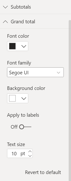
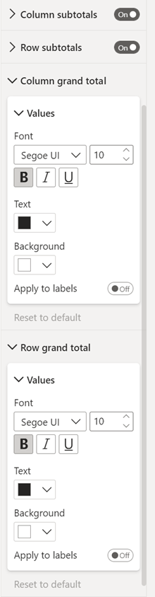
Split column and row grand totals
In the previous Format pane settings, changing grand totals for a matrix would affect both rows and columns. In the new Format pane, you can format each separately.
| Old behavior | New behavior |
|---|---|
|
|
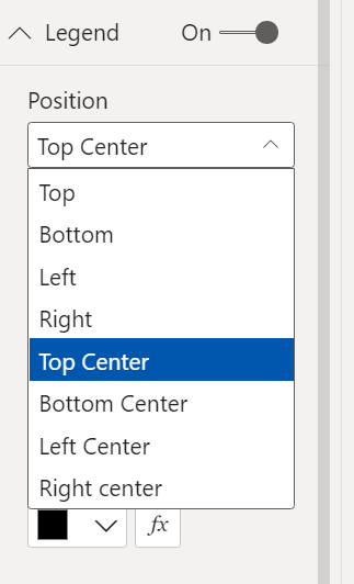
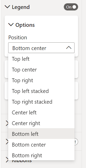
Legend location options
With the new Format pane, you can be more precise about legend location.
| Old behavior | New behavior |
|---|---|
|
|
Considerations and limitations
Some features aren't available yet in the current version of the new Format pane.
- Some visuals, such as Azure maps, Esri maps, Power Automate, and decomposition tree, haven't been updated with subcategories yet.