Sneak Preview of Visual Studio 11 and .NET Framework 4.5 Beta
Today we’re giving a “sneak peek” into the upcoming beta release of Visual Studio 11 and .NET Framework 4.5. Soma has announced on his blog that the beta will be released on February 29th! We look forward to seeing what you will build with the release, and will be including a “Go Live” license with the beta, so that it can be used in production environments.
Visual Studio 11 Beta features a clean, professional developer experience. These improvements were brought about through a thoughtful reduction of the user interface, and a simplification of common developer workflows. They were also based upon insights gathered by our user experience research team. I think you will find it both easier to discover and navigate code, as well as search assets in this streamlined environment. For more information, please visit the Visual Studio team blog.
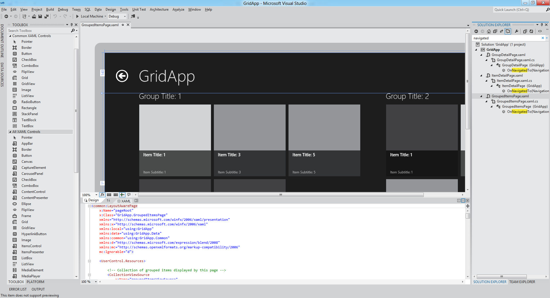
In preparation for the beta, today we’re also announcing the Visual Studio 11 Beta product lineup, which will be available for download next week. You can learn about these products on the Visual Studio product website. One new addition you will notice is Team Foundation Server Express Beta, which is free collaboration software that we’re making available for small teams. Please see Brian Harry’s blog for the complete announcement and more details on this new product.
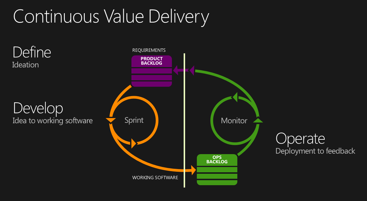
In the Visual Studio 11 release, we’re providing a continuous flow of value, allowing teams to use agile processes, and gather feedback early and often. Storyboarding and Feedback Manager enable development teams to react rapidly to change, allowing stakeholder requirements to be captured and traced throughout the entire delivery cycle. Visual Studio 11 also introduces support for teams working together in the DevOps cycle. IntelliTrace in production allows teams to debug issues that occur on production servers, which is a key capability for software teams delivering services.
I encourage you to view the presspass story with additional footage from today’s news events, including a highlight video and product screenshots. Then stay tuned for an in-depth overview of the release with the general availability announcement on February 29th.
Enjoy!
Follow me at twitter.com/jlzander .
Comments
Anonymous
February 23, 2012
Will you merge all different versions of Visual Studio in 1 ISO, so that i can decide which version i want to install and it would be better to handle just version. Like the Office and Windows team already did. Chose during install and the key would decide. best regards and i can't wait to try this release outAnonymous
February 23, 2012
Hi, Why windows title are in uppercase, like SERVER EXPLORER, TOOLBOX, etc?Anonymous
February 23, 2012
The comment has been removedAnonymous
February 23, 2012
Will there be an option to choose different themes? Gosh this is ugly, it looks like it's Visual Studio for Windows 3.11 (but WORSE). Visual Studio 2010 looks really good, VS11 Dev Preview looks even better, but this.. I hope VS is extensible enough to bring back VS2010 look back with an extension.Anonymous
February 23, 2012
Looking Good!Anonymous
February 23, 2012
I don't see "additional footage from today's news events" or "a highlight video" on the PressPass page. I was looking forward to that, too.Anonymous
February 23, 2012
Regarding all cap titles, I tend to know where to go by muscle memory, not by reading. The uppercase titles do stand out more to me but more like they're screaming. I'd prefer they stand out a lot less, like when they are lowercase. Lowercase feels more refined to me as well.Anonymous
February 23, 2012
@VS_User - thanks for regards, we can't wait to hear your feedback! Our installation process will be very similar to what we shipped with VS2010 with some updated UI and under the covers work. Thanks for the suggestion on how you'd like to see things in the future @Donatas - there is indeed theme support. Built in is Light and Dark mode. I've actually been using dark mode internally for months and I love it. There is a lot of additional material on the new user experience on the VS Team Blog (blogs.msdn.com/.../introducing-the-new-developer-experience.aspx). @techSage - stay tuned, we did a recording this morning for members of the press and the studio has been cranking through the encoding. You should see things fill in as the day goes on.Anonymous
February 23, 2012
I don't like being negative, but this is one of the /ugliest/ UIs I have ever soon. You guys did such a wonderful job on VS 2010, and now we are moving to monochrome mess?Anonymous
February 23, 2012
The comment has been removedAnonymous
February 23, 2012
Please lose the All Caps in the UI. Your UI experts should know that all caps reduces the shape contrast, making the text harder to comprehend at a glance. uxmovement.com/.../all-caps-hard-for-users-to-readAnonymous
February 23, 2012
Where have all the colors gone?? The UI has taken a BIG step backward into the 1990's! This makes me want to cry! :-(Anonymous
February 23, 2012
I'm really looking forward to VS11 as there's so many great things coming up like async, and loads of great new features in the Entity Framework. However, I have to say I'm really disappointed with the IDE theme changes. All that grey is terribly depressing. Please bring back the colour icons, there was absolutely nothing wrong with them. I can't believe anyone has actually been calling out for these kinds of changes to the IDE that we've seen.Anonymous
February 23, 2012
Have to agree when the general consensus here in that the UI theme is possibly one of the worst I have ever seen since Windows 3.1 days.Anonymous
February 23, 2012
I have to agree, that grey theme is very depressing and the ALLCAPS titles looks awful.Anonymous
February 23, 2012
Are there any plans to support edit and continue under 64 bit Windows in Visual Studio 11?Anonymous
February 23, 2012
LOOKS LIKE A GREY SLAB OF BOREDOMAnonymous
February 23, 2012
The UI is really UGLY!!!Anonymous
February 23, 2012
I can understand the desire to bring the content to the foreground, I think that works for a designer tool such as Blend where you're doing a lot of visual stuff all the time, however in VS i'm 90% spending time on text. I don't see the need to have our text stand out so that the IDE itself is a really bland monochrome UI. But in the end, performance and getting work done is what I look for in an IDE, if it does that then I'll be happy with it.Anonymous
February 23, 2012
The comment has been removedAnonymous
February 23, 2012
@techSage Thanks for your interest in the event! The presspass story with additional footage is available here: www.microsoft.com/.../02-23VisualStudioBetaPreview.mspx The Visual Studio 11 Beta screenshots are available here: www.microsoft.com/.../imagegallery.aspx Finally, the video is now available here: www.microsoft.com/.../VideoGallery.aspx Cheers, Lisa Feigenbaum Senior Program Manager Visual Studio CommunityAnonymous
February 23, 2012
This UX is a design nightmare. The WingDing style icons in the menus are hard to make out. My visual memory cannot map to this monochrome madness, so there is a productivity loss right off the bat. Bring back the colour. Text in CAPS should not be used for structure it is hard enough to read without being turned through 90 degrees. Lack of emphasis of the code was never an issue in Visual Studio. Expression Blend does a superb job of allowing the UI to get out of the way of the design. For Visual Studio this makes no sense if the UI gets out of the way for, what? Colour coded code. Please rethink.Anonymous
February 23, 2012
The lack of colour will make this hard to navigate, it's somewhat harping back to the original Visual Studio .NET too. You should leave some colour in the solution explorer at least, otherwise all the elements merge into one and it's not easy to see. We have colour perception with our eyes, you should use it (maybe stick to pastel colours to suit whatever your design requirements are but still, the folders at least need to be more visible) - in fact our peripheral vision is predominantly colour based which draws our attention and provides a nice stopping point for our eyes when seeking something out. I thought you guys had eye tracking and usability labs?!? It's also not possible to see edges on the toolbars easily (and lets face it, the toolbars in VS need moving around a lot as there's so many options a ribbon would be appropriate) and the all-caps toolbox titles look completely out of place; uppercase in that style simply seems too aggressive - why not invent a new associative styling mechanism like underlining or similar to associate them with their role instead.Anonymous
February 23, 2012
A couple of questions Jason, if I may; Will VS2011 have C++/CLI intellisense and Brief editor emulation?Anonymous
February 23, 2012
This is pure madness. What will be next: removing icons and code colors?Anonymous
February 23, 2012
It looks so ugly, it seems that every release of VS is a back step! Please keep back the VS2010 UI that has nothing wrong and spend your time to increase performance. P.S. Uppercase tool windows title is just unreadable!Anonymous
February 23, 2012
An honest question. Did you get any comments from developers that said, "There are just too many COLORS in this app!" Honestly? Because on visualstudio.uservoice.com/.../121579-visual-studio the only suggestions that mention color are the ones asking you to add color to VS 11.Anonymous
February 23, 2012
I look forward to the new Visual Studio however please do away with the CAPS. It looks terrible. And the coloring is so dullboring compared to previous versions...so boring. Solution explorer already made me fall asleep...everything looks so monotonous.Anonymous
February 23, 2012
The reaction around our office to the initial look is quite negative.Anonymous
February 24, 2012
The comment has been removedAnonymous
February 24, 2012
The comment has been removedAnonymous
February 24, 2012
Well, why don't we just go back to the Windows 95 look and feel. I hope this is some really bad and really early April fools day joke or something like that...Anonymous
February 24, 2012
The comment has been removedAnonymous
February 24, 2012
Looks hideous, especially the icons. People uses color as well as shape to identify them. Massive step backwards!Anonymous
February 24, 2012
I can't believe anyone thought that this new look is an improvement, gray and depressing. The icons are awful (especially the white ones on the dark theme, looks like they were created in MS paint), stick with the VS 2010 ones, they are vastly superior. Mono icons just don't work.Anonymous
February 24, 2012
Oh dear, what a mess! How this possibly passed the UI study I don't know, the tests must have been flawed. I can't imagine working with that, definitely wouldn't upgrade. What were they thinking?Anonymous
February 24, 2012
The comment has been removedAnonymous
February 24, 2012
The scroll bars in dark theme should be dark, they are exactly the same as the light theme toolbars currently.Anonymous
February 24, 2012
The comment has been removedAnonymous
February 24, 2012
@Rory O'Donnell, about C++/CLI IntelliSense: yes, it will be there as it is already in the Developer Preview released last September (the announcement of the comeback was made last year: blogs.msdn.com/.../10136696.aspx)Anonymous
February 24, 2012
I Agree with @VS_User, CAPS LOCK looks something odd, Waiting to try thanks and best regards,Anonymous
February 24, 2012
Does this MS Visual Studio 11 Beta Preview supports installation on MS Windows Vista ?Anonymous
February 24, 2012
Unlike others new themes look good to me. Looking forward to dark one. (Already used in Expression Web, so not a problem for me)Anonymous
February 25, 2012
how many languages will VS11Beta be localized in ?Anonymous
February 25, 2012
@WalkingCat - In addition to English, the Visual Studio 11 Beta will also be available for download on February 29th in Japanese, Chinese (Simplified), French and German. Jeff Beehler - VSAnonymous
February 26, 2012
The comment has been removedAnonymous
February 26, 2012
Is this a port of the original Blue Screen DOS version? Seriously, it looks absolutely awful. This is very frustrating for me, as I use this product all day every day and unfortunately, I won't be able to charge my customers more for the extra time it's going to add to the development cycle. Please unfix it.Anonymous
February 26, 2012
I just compared the editions of VS11 and noticed, that you require a MSDN subscription to use the TFS Server. Do i also need a MSDN subscription to use the TFS Express Server? And therefore can i use the TFS Express Server with the VS11 Professional edition without a MSDN subscription?Anonymous
February 27, 2012
@n0x30n MSDN is not required to use VS11 TFS or TFS Express. We will adjust our content to ensure it effectively communicates that this is not a requirement.Anonymous
February 27, 2012
So THAT'S where the Oslo Quadrant developers went.Anonymous
February 27, 2012
regarding VS packages and extensions, are there new extension points in VS11?Anonymous
February 27, 2012
The comment has been removedAnonymous
February 27, 2012
One more thing: telemetry says what people do. It says nothing about what their needs or desires are. Whilst some needs could be derived from analysing telemetry data, it is not a substitute for real, live people volunteering their time and experience - as they are doing here - and telling you what they want, based on how they work.Anonymous
February 27, 2012
I never thought I cared much about looks, but I will not install the beta version if it looks like this. The color-less icons are absolutely unusable.Anonymous
February 28, 2012
The comment has been removedAnonymous
February 28, 2012
The comment has been removedAnonymous
February 28, 2012
The comment has been removedAnonymous
February 28, 2012
THANK YOU Sir - I currently have a dual boot (Windows 7 & Windows 8 Developers Preview) on a 2007 Lenovo ThinkPad X61 Tablet (early multi-touch) - it runs great - but, I can not wait to dump the Win8 Developer Preview and install the Win 8 Consumer Preview (this weekend) - I am running with 4 GB Ram and a 128 GB Intel SSD - Win 8 is faster than Win 7 - but a bit difficult getting used to driving it - I see a lot of new hardware purchases comming for everybody later this fall and winter - on Intel Ivy-Bridge processors, which begin to ship sometime very soon. I am looking for a new 12" multi-touch tablet with 1920x1200 resolution, SSD, Pen, etc. Everybody wants one - good for engineering school, business and art schools.Anonymous
February 28, 2012
@Jeff M - good luck with the upgrades. Having been user of both recent builds of Win8 and VS11, I think you'll be very happy with the upgrade. It's certainly the best Beta release of Visual Studio that I've seen in a long time...definitely ready for you to kick the tires and give us feedback prior to the final build. Thanks! jeffAnonymous
February 28, 2012
It becoming obvious. MS just copies whatever Apple does now. This looks just like XCode IDE which is terrible to use compared to VS. Tiny buttons that are hard to hit with a mouse and a drab icon that all look the same so you have to really look each time you want to hit a button. Great job. The only positive I see is the reduction of toolbar buttons by default.Anonymous
February 28, 2012
I've looked at a few screen shots, I'm still indifferent about the all caps stuff, but the new style, is actually growing on me, I think I like it. I'm excited for the beta! I haven't seen any word if we'll be able to deploy to Azure with the beta? I'm hoping the answer is yes, because I REALLY want to use spatial data without 12 workarounds.Anonymous
March 01, 2012
The comment has been removedAnonymous
March 01, 2012
Backwards compability? Can we go on working with our VS10 projects in the VS11 environment? Or do we have to start all over (again)?Anonymous
March 01, 2012
Luckily enough I found this answer by googling: You can now open Visual Studio 2010 solutions in Visual Studio 11, work on them and then open them again in Visual Studio 2010.Anonymous
March 02, 2012
@ Gunnar & Visual Studio 10 -> 11: Yes, you can open your Visual Studio 2010 projects in Visual Studio 11, and then continue working on them in Visual Studio 2010 SP1. You can find more information on this topic here: msdn.microsoft.com/.../hh266747(v=vs.110).aspx Cheers, Lisa Feigenbaum Community Program Manager Microsoft Visual StudioAnonymous
March 02, 2012
@dsghi For now, you will need to use Visual Studio 2010 for Azure development, which can be done side-by-side with Visual Studio 11 on the same machine. Detailed steps are here: www.windowsazure.com/.../vs11. Native support for the Azure SDK in Visual Studio 11 is coming in the future. Cheers, Lisa Feigenbaum Community Program Manager Microsoft Visual StudioAnonymous
March 03, 2012
Sorry guys, but I also feel that lack of colors in controls of IDE is BAD. No doubt, it looks quite nice, OK, but, this is not some art but tool for hardworkers. Its really(!) strange that todays world is definitelly ONLY driven by fasion, marketing. Sorry, I am not 4%! Please, allow VS2010 theme at least, pplleeaassee :-)Anonymous
March 03, 2012
I agree with what others have said here. It definitely feels like a Beta. The lack of color makes me think it is unfinished and ALLCAPS looks unprofessional. I showed this to a friend and he said, "No one is re-introducing Black & White TV's. I like less toolbar icons but I would like to see more color."