Manifesto: a new fluid UI for desktop/LOB data-entry
I'm fed up with clunky dialog-based UIs.
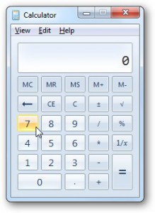
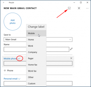
Here are two apps, the Windows 7 Calculator and Windows 10 People App. How many of you use Calculator by clicking on buttons with the mouse? And how many do free-form typing with the keyboard? answer: everyone prefers the keyboard. I think that free-form typing is the Holy Grail of LOB apps. Dialogs look cluttered and force users to waste their time on UI rather than directly on data entry.
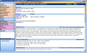
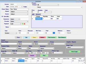
How about medical record software? Whenever I'm at the doctor's office, I peer over shoulders to see what they're using. In the consulting room, nurses and doctors usually seem to use free-form text entry to edit a template. The reception/billing system is usually a clunky dialog filled with too many buttons.
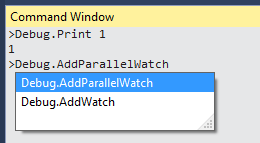
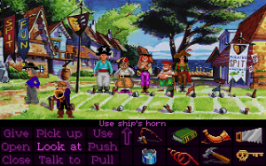
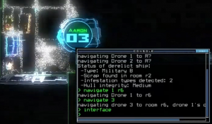
I want free-form text-based data entry. (As for free-form text-based commanding, that's already popular. Here are some examples. The final one is an exciting new indie game called Duskers where you control droids by text-based commanding.)
Example of free-form text-based data entry
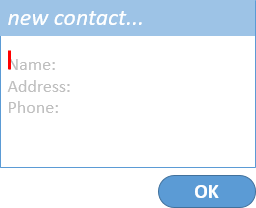
Let's re-imagine the Windows 10 People app. How could it get away from dialogs, and embrace free-form text entry? Here's my attempt...
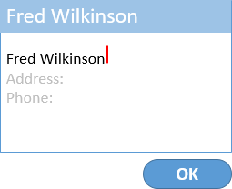
(1) A simple text-entry dialog with grayed out suggestions for what to type:
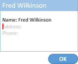
(2) While you're typing, heuristics in the editor (e.g. "this line has overtyped the grey Name suggestion") infer that this is the name. The caption is updated to reflect this live while you type:
(3) When you hit ENTER to commit a line, the editor pretty-prints it. Pretty-printing is important to show what's been inferred:
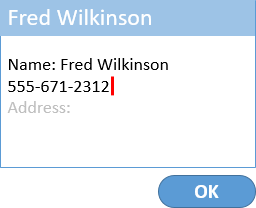
(4) While I type the next line, more heuristics in the editor (e.g. "typing what looks like a phone number even though it's in the Address field") infer that this is the telephone number:
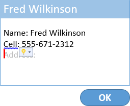
(5) When you hit ENTER, the editor pretty-prints it. In this case there are several kinds of phone number available, but the editor picked the most likely one and offered a way to change that (using the mouse or hitting Ctrl+Dot):
(6) I haven't shown any examples, but I'd also like the editor to show an intellisense completion list with suggestions of what it would expect and understand for you to type right now.
Manifesto: fluid UIs for text-based data entry
We should abandon clunky forms with lots of fields.
We should embrace free-form text entry.
This requires a smart text editor with natural language processing, heuristics, and most importantly intellisense.
What's next? My friend Klaus Löffelman had a great insight. He observed that the same characteristics that make for free-form text entry are also well suited to dictation and voice control. You could use them for Cortana/Siri/Alexa. You'd actually use the same heuristics, NLP and AI in for free-form data entry as you do bots in Skype or Facebook Messenger.
Update: there was some discussion on reddit. I appreciated this comment from @grauenwolf: "I have built several medical record applications over the years, and I can say without hesitation that there are lots of places where this would have been a perfect fit. "
Comments
- Anonymous
June 14, 2016
Nice idea. Maybe a lot of UIs will look like that when machine learning is able to smartly infer any practically occurring format. - Anonymous
June 14, 2016
Great stuff! When will you be finished with building the user control? ;) - Anonymous
June 14, 2016
Great idea! This will be implement in my next LOB app. Thank you for sharing this. - Anonymous
June 15, 2016
This reminds me of the "Bot Framework" demos at build (but less conversational). Could something like this be build using the innards of their FormFlow and LUIS stuff?http://docs.botframework.com/sdkreference/csharp/forms.htmlhttp://docs.botframework.com/builder/node/guides/understanding-natural-language/ - Anonymous
June 15, 2016
I've impressed with your idea. Great. This should be included to the work item list of Win10 RS2! :) - Anonymous
June 15, 2016
Not suitable for everything. You would end up with unstructured free form data which is very difficult to process automatically. To pick up on one of your examples, do you want the medical records at your doctors to be quick to enter, or accurate? The phone number and blood type to be easily extractable, or to require a human to skim read some free text.- Anonymous
June 16, 2016
I could see this being really effective for medical records. You type in the diagnosis code first, with Intellisense-like auto-complete of course. Then it lays out the other fields relevant to the diagnosis as soon as you press enter.Field selection will vary in complexity of course, but a lot of the time you don't use the same units more than once. For example, when entering patient vitals you type:130 lbs5' 6"180/14042Clearly the first three are weight, height, and blood pressure. The last one is a guess, but if age hasn't been picked that's the most obvious one.- Anonymous
December 19, 2016
The age could also be resolved by having the user type in a unit: 42 yearsand the system could also recognize variants:42 y/o42 yrsage: 42
- Anonymous
- Anonymous
- Anonymous
June 16, 2016
Yep, I gotta have this. - Anonymous
June 16, 2016
Lucian, this is such a great idea, thank you for verbalising it! - Anonymous
June 17, 2016
The comment has been removed - Anonymous
December 22, 2016
http://www.commitstrip.com/en/2016/12/22/terminal-forever/ LW's idea represented as a comic
