Toolbox and Window Management
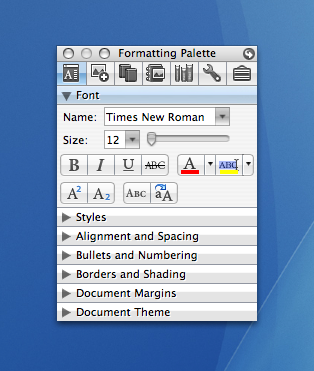
The Toolbox is a useful new collection of tools that was introduced in Office 2004. The primary concept was to prevent the possibility of many palettes being opened at once causing a window management problem for users. In general, it worked fairly well, however, it often collides with the Formatting Palette. In such instances, users have mentioned that they have to manage these two windows and that they take up a lot of valuable screen real estate. I personally find it annoying, especially when I am working on my laptop.
To address this primary problem of the Formatting Palette and the Toolbox windows taking up valuable screen real estate, we decided to integrate the Formatting Palette into the Toolbox as another client. Whew! Much nicer! In 2008, there is only one tool palette window... the Toolbox. Now, the first tool in the Toolbox is the Formatting Palette.

I think this brings all our palette-based tools together in a synergistic way. All tools are available in one location. Plus, now there is one less window that you have to manage and move around. For 2008, one of our goals was to streamline the user interface and this helps by reclaiming some of that valuable screen real estate.
Some customers have said they are distracted by the Fade feature, which turns the Formatting Palette partially transparent upon inactivity. The effect is cool and some people really like it. For me, I find it a bit distracting as I keep my desktop very cluttered and I end up turning it off. For 2008, we have added a new Collapse feature to the Toolbox. Users can click the Zoom/Resize button (the green button near the red Close button in the Title Bar) to collapse the Toolbox window to just the Title Bar and the Navigation Bar using a nice window-shade style roll-up effect. Clicking the button again will expand, or roll down, the Toolbox to full size. It is a relatively simple feature, but it allows you to get the Toolbox out of your way without completely closing it and, again helping to maximize screen real estate.
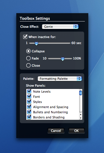
To make it even easier, we have added an automatic collapse mechanism as well. By clicking the arrow button in the top right of the palette title bar, the Toolbox flips over to display the Toolbox Settings where you can set the Toolbox to Collapse after N seconds. The assumption is that if you haven’t used the Toolbox in a while, we can help by freeing up real estate.

Once the Toolbox has collapsed, you can click on any button in the Navigation Bar or the Zoom/Resize button to expand it back to full size. You can also double-click the Title Bar to collapse or expand the window, just like the ever-popular OS 9 WindowShade control panel feature. This automatic collapse feature will hopefully help prevent distraction and desktop clutter, while still providing a clearly visible Toolbox for the user to re-expand.
I know it may not sound like a lot, but we are really trying to think about how to improve the work environment. I am excited that we have been able to work on small details like this that help in refining the experience. Moving the Formatting Palette into the Toolbox and adding window-shade style collapsing has made a big difference for me and many customers testing the product. I find it easier to get to my tools now that they are located in the same place. Hopefully this will improve the experience for you.
Comments
Anonymous
October 05, 2007
PingBack from http://www.artofbam.com/wordpress/?p=5636Anonymous
October 05, 2007
Those screenshots (especially the last one), those are all jokes, right? Minimizing the UI footprint by replacing it with a hideously hideous mixture of UIs that don't work together, that's got to be a joke. Please tell me it's a joke.Anonymous
October 05, 2007
Please tell us this is placeholder art. You’re not actually planning to mix large, small and mini standard controls with outsized custom flat ones and small bevelled custom ones, are you?Anonymous
October 06, 2007
Couldn't you just get rid of this and integrate into the Ribbon UI? I'd think it would be much better.Anonymous
October 06, 2007
"I know it may not sound like a lot, but we are really trying to think about how to improve the work environment." Don't be so modest, Bart. This is a useful change - I really like genuine interface improvements that make the program easier to use.Anonymous
October 06, 2007
The comment has been removedAnonymous
October 06, 2007
Want to improve the work environment? Give us an Outlook client like the pc users have.Anonymous
October 06, 2007
Soooo when are you releasing officeAnonymous
October 06, 2007
"Soooo when are you releasing office" "... Microsoft marketing manager Amanda Lefebvre said that the company remains on track with its revised schedule, with plans to wrap up the code in December and make the final product generally available to consumers and businesses in the U.S. on January 15. Other language versions will be released over the course of the first quarter..." (http://www.news.com/Microsoft-sets-pricing-on-Office-2008-for-Mac/2100-1012_3-6209269.html)Anonymous
October 07, 2007
The comment has been removedAnonymous
October 07, 2007
Please change the icons in the Formatting Palette. I am not able to quickly recognise them. Make them more clear and use some colors. :)Anonymous
October 07, 2007
Thanks! Looks like a great improvement.Anonymous
October 07, 2007
I always admired the Formatting palette and wondered why the Office for Windows Team never added such a feature to the Office Task Pane which was introduced in Office XP. Its convenient to the Office for Mac UI, but I don't really see much of a relevance to Office for Windows since the Fluent basically offers a more superior logical approach handling and manipulating your data. Organization is more attractive with Office Fluent too.Anonymous
October 08, 2007
This is pretty cool! A small change but good enough for me.Anonymous
October 08, 2007
Every improvement helps, no matter how small. Now..... how about letting the cat out on some big improvements ;?)Anonymous
October 08, 2007
This is a definte, if small, step forward. (mumble mumble full exchange support mumble)Anonymous
October 08, 2007
The top row of icons in the Toolbox could use some color. They look out of place compared to the updated icons throughout the rest of Office. Great looking suite otherwise.Anonymous
October 08, 2007
Stephen, regarding your comment about the white drop shadow on the text in the Formatting Palette... Good eye! This is something that has been on our list and we plan to address. Thanks for the constructive feedback.Anonymous
October 08, 2007
Rosyna, regarding the "hideous mixture of UIs that don't work together"... The Toolbox Settings window (black UI) is the back, or flip side, of the Toolbox. This different UI was chosen as a way to indicate to users that it is the back side of the primary Toolbox UI, so as to help eliminate user confusion. This is a Mac-like concept and UI. To see how the Toolbox flips over to the Toolbox Settings window and how the front and back UI work together, check out the Toolbox preview: http://www.macoffice2008.com/#os_tbAnonymous
October 09, 2007
Praising people for "constructive" feedback... Try supporting your out of date application in a a work environment and tell me how positive you feel when you won't even address real enchantments in the product. Keep on patting yourselves on the back for being a full year behind schedule and tooting your horn on minor UI updates. Where is the meat and potatoes of this product? In my business when I produce like the MacBU I get fired. Get a clue.Anonymous
October 11, 2007
Wow, some people are really inconsiderate! I think that things are looking great; from the previews I've seen, I think that the Office 2008 UI is a big step forward. It looks classier and more Mac-like, you've definitely kicked it up a notch design-wise. Keep up the nice work, it's really appreciated.
