Data Visualization And the Art of Simplification
"Clutter and confusion are failures of design, not attributes of information." - Edward Tufte
I recently had the opportunity to speak with two groups quite different from my usual audience of experienced analysts and business intelligence professionals. The first was freshman journalism students at Stanford, and the second, also students, were quants beginning internships at one of my government customers. In both cases, I had been invited to provide an introduction to the fundamentals of data visualization to these fresh audiences.
I was honored and enthusiastic about these presentations. I began to reflect on how to make the experience as beneficial for both groups of students, who would apply their knowledge of BI and data visualization in very different ways: the journalists to make their articles more impactful, the quants to influence public sector policy and decisions.
I had to boil the concepts down to their essence. I spent several weeks thinking through solutions I've implemented, presentations I've given, and past customer conversations searching for common themes and threads.
To me…it all comes down to this:
Know your audience. Tell a good story. Simplify accordingly.
Know your audience
A C-level executive cares about different things than a line level manager. A line level manager cares about different things than an analyst. Painfully obvious, I know that. Nonetheless, I often see dashboards that look like the author forgot that the ultimate goal is to help inform the viewer...not to show off their particular tool's vast capabilities. Also, realize that the best data visualizations are interactive, so you have to consider not only how the visualization looks when you publish it, you have to anticipate how different users will interact with it.
Take for example, a dashboard intended to give a city council member a glimpse into the state of their district. Council members are very busy, may not be very technical, and probably won't attend training for data visualization tools. Perhaps a simple visualization like this is in order:
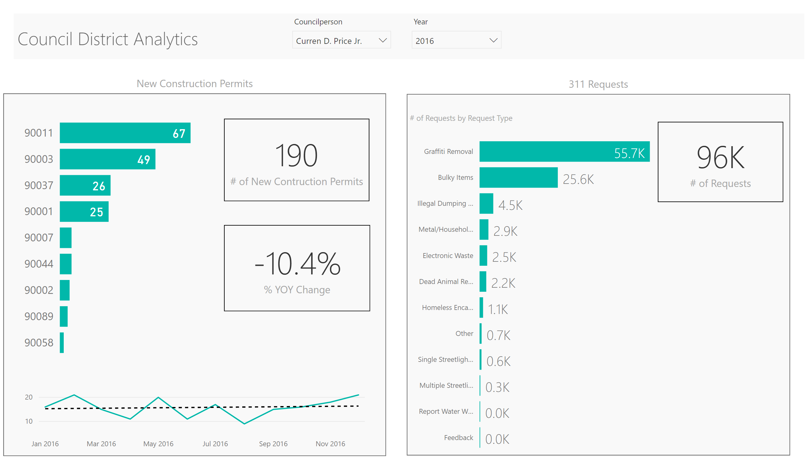
For those that want more detail, you could allow them to optionally drill through to detail:
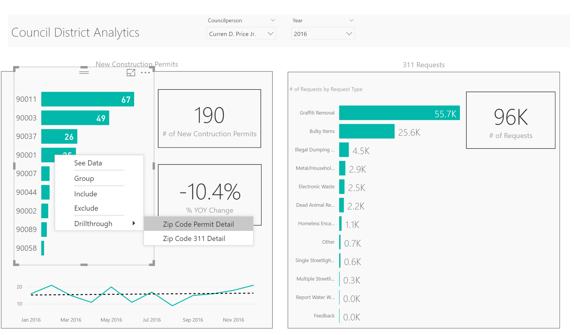
This drill through could take them to a more detailed analysis of permits by zip code:
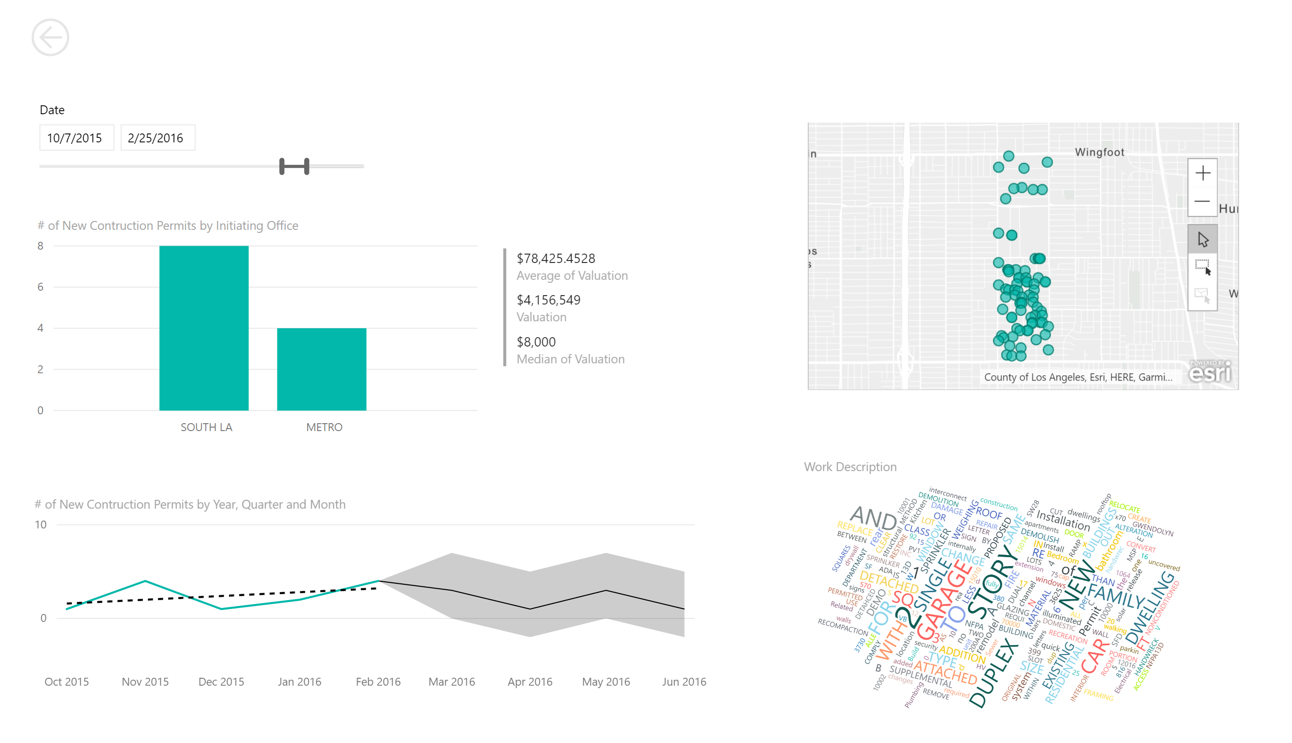
This last visualization, while informative to an interested data analyst, might be TMI for the council member who simply wanted to know basic permit and 311 request levels. But, providing an intuitive path to this detail is a key element of modern data visualization design.
Tell a good story
Sometimes you know what the story is...new construction permits are up and illegal dumping is down in areas targeted with a revitalization campaign. In those cases, sometimes you just want to hit them over the head with your point...I call this "USA Today Style". (Below example is made up)

In these cases, my advice is to take the advice of my high-school English teacher and Have A Clearly-Stated Thesis. Yes, I liked math better than English, but I attribute much of my moderate career success to two really good English teachers...a blog for another day.
Sometimes you don't know what the story is, and you've been tasked with enabling others to find that story. Again, this is another blog for another day, but for inspiration, check out the way my colleague guides the viewer through a process. The below visualization is interactive...feel free to interact.
Simplify accordingly
I am striving to inform, not to impress. When I create data visualizations for customers, I obsess over eliminating clutter. Gridlines, titles, borders, data labels...often they are necessary to convey information. Often they are redundant and simply clutter the screen.
As an example, let's take the default display for a Bar Chart in Power BI.

Looks ok, right? It's easy to accept those defaults and move on. However, some simple changes will clean that up dramatically. Why require the eye to move off to the left to read the # of requests...let's eliminate the Y axis and put that data values right on those bars.
1) Click on the data visualization, and in the Visualization Pane, click on the paintbrush (format) and toggle the Y-Axis to off

2) Toggle Data labels to On and Increase the Font Size
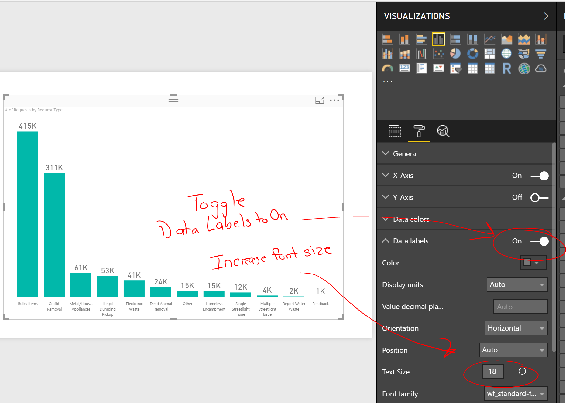
3) If the intent of this visualization is to highlight the most common request types, perhaps you limit the visualization to Top 5.

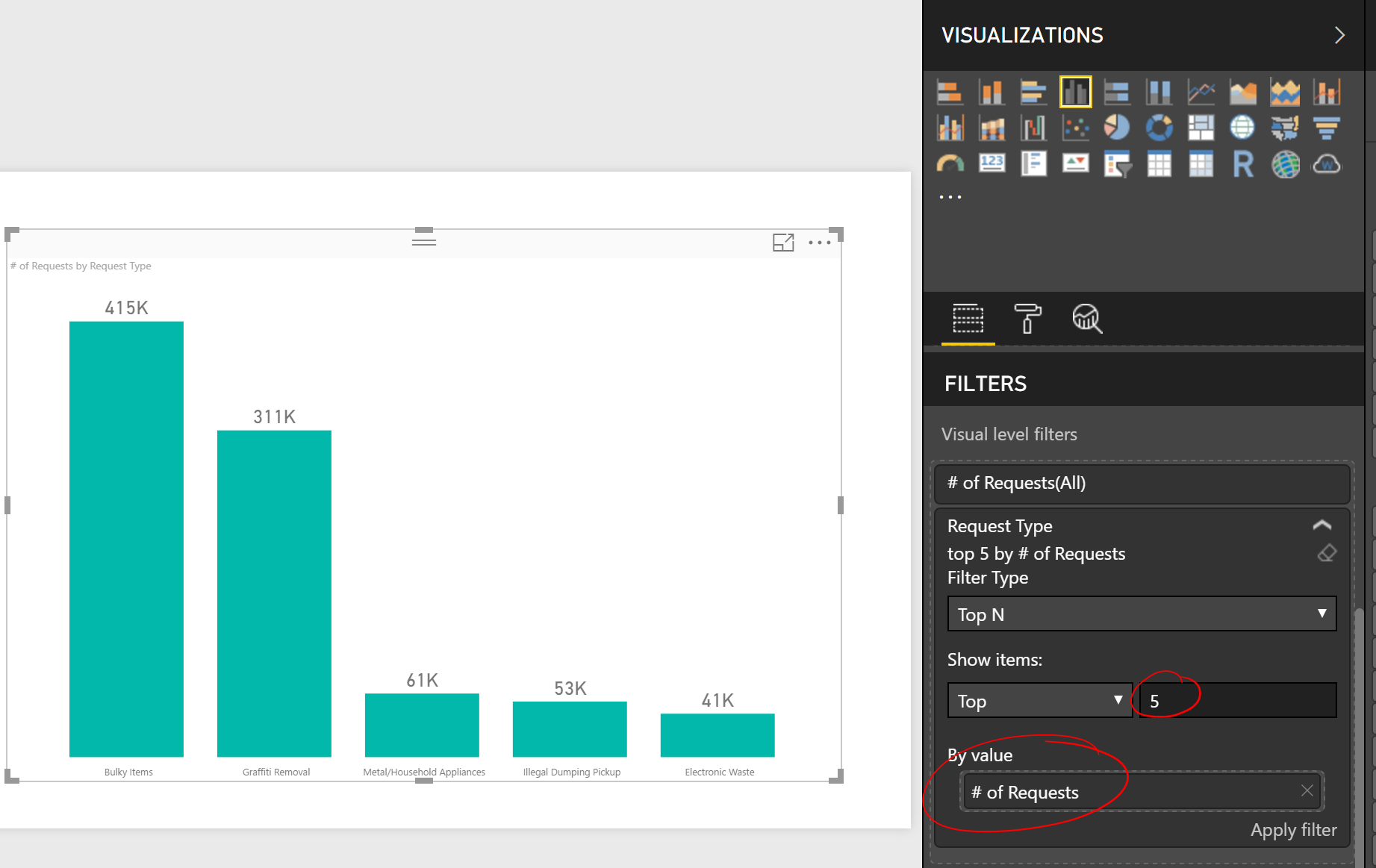
4) Don't forget to change the title. I like to center the title and increase the font
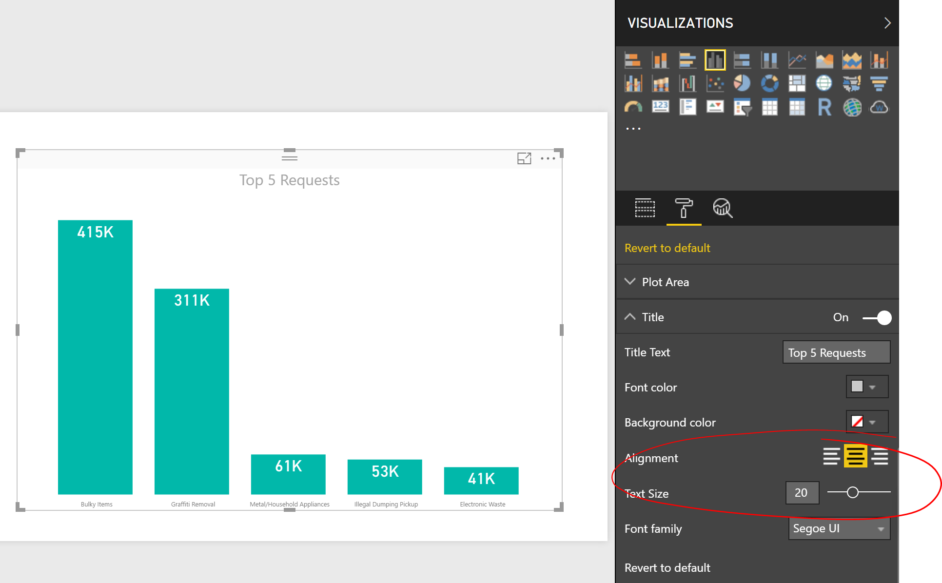
As you can see, a few simple steps can dramatically simplify a visualization. While this isn't always the best approach, my point is to take a good look at your visualization and eliminate anything that doesn't provide additional value.
In summary
Know your audience.
Imagine yourself explaining your observations to your audience. Are they impatient? Are they asking you to drill into the next layer of data? Do they have natural curiosity about the data or do they just want a topline observation? Always remember, not everyone is excited about data as we are.
Tell a good story.
Why are YOU excited about the data? Why does your data matter to your audience? That's your thesis. Make sure that it is clear and concise. Make sure that any supporting data is easily accessible within your data visualization environment through user-interaction. Default interactions and drill-through actions in Power BI are good ways to provide this interactivity.
More on interactions here.
More on drill-through here.
Simplify accordingly.
Take a good look at the elements in your data visualization. Can you eliminate gridlines? Can you eliminate axis labels or values? Can you apply any "Top N" filters to eliminate elements that don't add value? Can a wise use of text help inform the audience?
Additional Reading
If I was a college professor teaching this subject, I would put the following required readings on the syllabus.
The Visual Display of Quantitative Information by Tufte, Edward
Story Telling With Data by Cole Nussbaumer Knaffic
The Truthful Art: Data, Charts, and Maps for Communication by Alberto Cairo