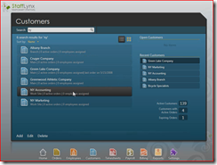
Billy Hollis on Getting Smart with WPF
 Thanks to Jonas for sending me a link to this video of Billy Hollis presenting a great WPF business application:
Billy Hollis on Getting Smart with WPF
The first ~20 minutes of the video walks you through the UI design and talks about how various WPF features have been used to produce some great results that are not just engaging, but help with usability and productivity as well. In particular, look out for:
- Progressive screen builds (like the initial screen after login) that make the experience much more organic.
- Examples of templating standard controls (like list boxes and tab controls) to give them appearance and behaviour specific to the application.
Of course it's a screen grab video, so some of the transitions come across as a little jerky, but even so it's a great example of practical user experience design for business applications. Imagine how nice those transitions must be in the flesh!