Going Mobile with Silverlight
 For me, 2010 will remain in history as the year when Silverlight really went mobile. Sure we had seen some early experiments, but this time Microsoft went full scale: Silverlight is the platform of choice to develop applications on Windows Phone 7. The other available development platform, XNA, is privileged for games.
This created an interesting situation for Silverlight developers everywhere; overnight, we became mobile developers. This was facilitated by the fact that Silverlight is a known platform; since 2008 Silverlight has been used to create applications, and a large active community of developers has grown around it. Since the very first public CTP of the Windows Phone 7 tools was released, we’ve seen many blog posts, videos, conferences and tutorials around Silverlight for WP7. The community was enthusiastic and impatient, and this created an environment where learning became fun.
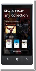
For firms like IdentityMine, accustomed to developing with Windows Presentation Foundation, Silverlight, XAML, the designer-developer workflow, Visual Studio 2010, and Expression Blend 4, jumping into Windows Phone 7 development was natural. Our designers, developers and integrators (Blend specialists) leveraged their skills to create several diverse and exciting applications. In a very limited time our team produced apps ranging from the official client for the well-known Internet Movie Database, IMDb, to Twitter (the official WP7 client for the popular short messaging system), from Graphic.ly (a comic book reader relying on the Deep Zoom technology) to SBB Mobile (a timetable and e-ticketing app tailored for the Swiss public transportation system) and HISTORY HERE™ (an app allowing you to discover historic facts about your location). 
All these apps are deeply connected to The Cloud, to download rich content and data. Some of them use multimedia content that creates a super-rich experience. The devices’ sensors are also frequently used, such as the GPS that helps to detect a user’s location to adapt the content to the geography, or the accelerometer that acts as an additional input mechanism: simply shake the device to reveal enhanced functionality (such as selecting a random movie in IMDb, or showing the current e-ticket to the train inspector in SBB Mobile).
Of course, not everything was perfect during the development. We had to overcome some challenges, notably around the performance of the processor and graphics. Even though the devices are offering more power than we could dream of a few years ago, handling large quantities of data like the Twitter app does (with complex templates including pictures, texts in various styles, hyperlinks and more) pushes the hardware to its limits. We had to tweak the performance, simplify the visual trees, use lazy loading of images and other tricks to create a satisfying experience. In the IMDb app, the huge quantities of images required all of our developers’ craft to create great UX. But these two extreme examples prove the point: We knew what to do to make it better, because in the end, this is “just Silverlight”. This is a known platform, for which we use known tools, known patterns. When something is not working like we want, we know how to handle it.
Interestingly, because of the aggressive development times we had for these apps, the teams did not have much time to stop, regroup and talk about their experience. This inevitably led to some duplication of effort, and to “reinventing the wheel” for some specific scenarios. For example, we came up with ways to preserve the state of the app when it is “put to sleep”. This process (also called “tombstoning”) as well as the “rehydration” that follows when the app is activated again can be solved in various manners. Because multiple teams solved the same issue at the same time, this now allows us to handpick the best approach to that common problem (and others), and to create a common framework of functions that we will use on future projects. Because the development times were short (and because we were so enthusiastic for this new platform), the duplication didn’t cause pain. Instead we were able to test a variety of solutions.
A unique aspect to mobile app development is that the public understands and relates to it. It was a new and awesome experience to show the apps we made to family and friends, and to suddenly see them understand what it is that we do. Sure, I had demoed Silverlight and WPF applications to them before, and tried to explain what UX means, and how we strive to make the user’s life better with our skills. However, when I put a phone in their hands and started the SBB Mobile app, I really saw their eyes light up. This is the difference that makes mobile development so exciting: Everyone “gets it”, from my 6 year old daughter to my grandma who has a mobile phone and loves sending us text messages.
For me personally, the feeling I will always remember is how connected I felt to my teams and to the community at large, this fantastic feeling of belonging, and of living an adventure. Whatever happens in the future, we have this to be proud of: Using Silverlight, we created awesome apps, made them beautiful, and we love them. From the many comments I get from the community of Silverlight developers, this feeling is not just ours, but every developer who creates for the Windows Phone 7 feels that excitement, and that pride. This is indeed a great moment to develop software!
 @lbugnion – Laurent Bugnion, Director of UX Integration Development for
IdentityMine