Nota
El acceso a esta página requiere autorización. Puede intentar iniciar sesión o cambiar directorios.
El acceso a esta página requiere autorización. Puede intentar cambiar los directorios.
La experiencia en tiempo de diseño de un control personalizado se puede mejorar mediante la creación de un diseñador personalizado asociado.
Precaución
Este contenido se escribió para .NET Framework. Si usa .NET 6 o una versión posterior, use este contenido con precaución. El sistema de diseñador ha cambiado para Windows Forms y es importante que revise los cambios del diseñador desde el artículo de .NET Framework .
En este artículo se muestra cómo crear un diseñador personalizado para un control personalizado. Implementará un MarqueeControl tipo y una clase de diseñador asociada denominada MarqueeControlRootDesigner.
El MarqueeControl tipo implementa una pantalla similar a una marquesina de teatro con luces animadas y texto parpadeante.
El diseñador de este control interactúa con el entorno de diseño para proporcionar una experiencia personalizada en tiempo de diseño. Con el diseñador personalizado, puede ensamblar una implementación personalizada MarqueeControl con luces animadas y texto parpadeante en muchas combinaciones. Puede usar el control ensamblado en un formulario como cualquier otro control de Windows Forms.
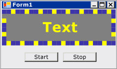
Cuando haya terminado con este tutorial, el control personalizado tendrá un aspecto similar al siguiente:
Para obtener la lista de código completa, vea Cómo crear un control de Windows Forms que aproveche las características de Design-Time.
Prerrequisitos
Para completar este tutorial, necesitará Visual Studio.
Creación del proyecto
El primer paso es crear el proyecto de aplicación. Usará este proyecto para compilar la aplicación que hospeda el control personalizado.
En Visual Studio, cree un nuevo proyecto de aplicación de Windows Forms y asígneles el nombre MarqueeControlTest.
Creación del proyecto de biblioteca de controles
Agregue un proyecto de biblioteca de controles de Windows Forms a la solución. Asigne al proyecto el nombre MarqueeControlLibrary.
Con el Explorador de soluciones, elimine el control predeterminado del proyecto eliminando el archivo de código fuente denominado "UserControl1.cs" o "UserControl1.vb", en función del idioma que prefiera.
Agregue un nuevo UserControl elemento al
MarqueeControlLibraryproyecto. Asigne al nuevo archivo de origen un nombre base de MarqueeControl.Con el Explorador de soluciones, cree una carpeta en el
MarqueeControlLibraryproyecto.Haga clic con el botón derecho en la carpeta Diseño y agregue una nueva clase. Asígne el nombre MarqueeControlRootDesigner.
Tendrá que usar tipos del ensamblado de System.Design, por lo que debe agregar esta referencia al
MarqueeControlLibraryproyecto.
Hacer referencia al proyecto de control personalizado
Usará el MarqueeControlTest proyecto para probar el control personalizado. El proyecto de prueba reconocerá el control personalizado al agregar una referencia de proyecto al MarqueeControlLibrary ensamblaje.
En el proyecto MarqueeControlTest, agregue una referencia de proyecto al ensamblaje MarqueeControlLibrary. Asegúrese de usar la pestaña Proyectos en el cuadro de diálogo Agregar referencia en lugar de hacer referencia al MarqueeControlLibrary ensamblado directamente.
Definir un control personalizado y su diseñador personalizado
El control personalizado se derivará de la UserControl clase . Esto permite que el control contenga otros controles y proporciona a su control una gran cantidad de funcionalidad predeterminada.
El control personalizado tendrá un diseñador personalizado asociado. Esto le permite crear una experiencia de diseño única adaptada específicamente para su control personalizado.
El control se asocia con su diseñador mediante la DesignerAttribute clase . Dado que está desarrollando todo el comportamiento durante el tiempo de diseño de su control personalizado, el diseñador del control personalizado implementará la interfaz IRootDesigner.
Para definir un control personalizado y su diseñador personalizado
Abra el
MarqueeControlarchivo de código fuente en el Editor de código. En la parte superior del fichero, importe los siguientes namespaces:using System; using System.Collections; using System.ComponentModel; using System.ComponentModel.Design; using System.Drawing; using System.Windows.Forms; using System.Windows.Forms.Design;Imports System.Collections Imports System.ComponentModel Imports System.ComponentModel.Design Imports System.Drawing Imports System.Windows.Forms Imports System.Windows.Forms.DesignAgregue DesignerAttribute a la declaración de clase
MarqueeControl. Esto asocia el control personalizado a su diseñador.[Designer( typeof( MarqueeControlLibrary.Design.MarqueeControlRootDesigner ), typeof( IRootDesigner ) )] public class MarqueeControl : UserControl {<Designer(GetType(MarqueeControlLibrary.Design.MarqueeControlRootDesigner), _ GetType(IRootDesigner))> _ Public Class MarqueeControl Inherits UserControlAbra el
MarqueeControlRootDesignerarchivo de código fuente en el Editor de código. En la parte superior del fichero, importe los siguientes namespaces:using System; using System.Collections; using System.ComponentModel; using System.ComponentModel.Design; using System.Diagnostics; using System.Drawing.Design; using System.Windows.Forms; using System.Windows.Forms.Design;Imports System.Collections Imports System.ComponentModel Imports System.ComponentModel.Design Imports System.Diagnostics Imports System.Drawing.Design Imports System.Windows.Forms Imports System.Windows.Forms.DesignCambie la declaración de
MarqueeControlRootDesignerpara que herede de la clase DocumentDesigner. Utilice el ToolboxItemFilterAttribute para especificar la interacción del diseñador con el Cuadro de herramientas.Nota:
La definición de la
MarqueeControlRootDesignerclase se ha incluido en un espacio de nombres denominado MarqueeControlLibrary.Design. Esta declaración coloca el diseñador en un espacio de nombres especial reservado para tipos relacionados con el diseño.namespace MarqueeControlLibrary.Design { [ToolboxItemFilter("MarqueeControlLibrary.MarqueeBorder", ToolboxItemFilterType.Require)] [ToolboxItemFilter("MarqueeControlLibrary.MarqueeText", ToolboxItemFilterType.Require)] public class MarqueeControlRootDesigner : DocumentDesigner {Namespace MarqueeControlLibrary.Design <ToolboxItemFilter("MarqueeControlLibrary.MarqueeBorder", _ ToolboxItemFilterType.Require), _ ToolboxItemFilter("MarqueeControlLibrary.MarqueeText", _ ToolboxItemFilterType.Require)> _ Public Class MarqueeControlRootDesigner Inherits DocumentDesignerDefina el constructor para la
MarqueeControlRootDesignerclase . Inserte una WriteLine instrucción en el cuerpo del constructor. Esto será útil para la depuración.public MarqueeControlRootDesigner() { Trace.WriteLine("MarqueeControlRootDesigner ctor"); }Public Sub New() Trace.WriteLine("MarqueeControlRootDesigner ctor") End Sub
Creación de una instancia del control personalizado
Agregue un nuevo UserControl elemento al
MarqueeControlTestproyecto. Asigne al nuevo archivo de origen un nombre base de DemoMarqueeControl.Abra el
DemoMarqueeControlarchivo en el Editor de código. En la parte superior del archivo, importa elMarqueeControlLibrarynamespace.Imports MarqueeControlLibraryusing MarqueeControlLibrary;Cambie la declaración de
DemoMarqueeControlpara que herede de la claseMarqueeControl.Compile el proyecto.
Abra Form1 en el Diseñador de Windows Forms.
Busque la pestaña MarqueeControlTest Components (Componentes de MarqueeControlTest ) en el Cuadro de herramientas y ábralo. Arrastre un
DemoMarqueeControlelemento desde el Cuadro de herramientas hasta el formulario.Compile el proyecto.
Configurar el proyecto para la depuración de Design-Time
Al desarrollar una experiencia personalizada en tiempo de diseño, será necesario depurar los controles y los componentes. Hay una manera sencilla de configurar su proyecto para permitir la depuración durante el tiempo de diseño. Para obtener más información, vea Tutorial: Depuración de controles personalizados de Formularios Windows Forms en tiempo de diseño.
Haga clic con el botón derecho en el
MarqueeControlLibraryproyecto y seleccione Propiedades.En el cuadro de diálogo Páginas de Propiedades de MarqueeControlLibrary, seleccione la página Depurar.
En la sección Iniciar acción , seleccione Iniciar programa externo. Va a depurar una instancia independiente de Visual Studio, por lo que debe hacer clic en los puntos suspensivos (
 ) para buscar el IDE de Visual Studio. El nombre del archivo ejecutable es devenv.exey, si instaló en la ubicación predeterminada, su ruta de acceso es %ProgramFiles(x86)%\Microsoft Visual Studio\2019\<edition>\Common7\IDE\devenv.exe.
Haga clic en Aceptar para cerrar el cuadro de diálogo.
Haga clic con el botón derecho en el proyecto MarqueeControlLibrary y seleccione Establecer como proyecto de inicio para habilitar esta configuración de depuración.
Punto de control
Ya estás listo para depurar el comportamiento durante el diseño de tu control personalizado. Una vez que haya verificado que el entorno de depuración está correctamente configurado, procederá a probar la vinculación entre el control personalizado y el diseñador personalizado.
Para probar el entorno de depuración y la colaboración del diseñador
Abra el archivo de código fuente MarqueeControlRootDesigner en el Editor de código y coloque un punto de interrupción en la WriteLine instrucción .
Presione F5 para iniciar la sesión de depuración.
Se crea una nueva instancia de Visual Studio.
En la nueva instancia de Visual Studio, abra la solución MarqueeControlTest. Para encontrar fácilmente la solución, seleccione Proyectos recientes en el menú Archivo . El archivo de solución MarqueeControlTest.sln se mostrará como el archivo usado más recientemente.
Abra el
DemoMarqueeControlen el diseñador.La instancia de depuración de Visual Studio adquiere el enfoque y la ejecución se detiene en el punto de interrupción. Presione F5 para continuar con la sesión de depuración.
En este punto, todo está preparado para que desarrolles y depures tu control personalizado y su diseñador personalizado asociado. El resto de este artículo se centra en los detalles de la implementación de las características del control y el diseñador.
Implementar el control personalizado
MarqueeControl es un UserControl con un poco de personalización. Expone dos métodos: Start, que inicia la animación de marca y Stop, que detiene la animación. Dado que MarqueeControl contiene controles secundarios que implementan la interfaz IMarqueeWidget, Start y Stop enumeran cada control secundario y llaman a los métodos StartMarquee y StopMarquee, respectivamente, en cada control secundario que implementa IMarqueeWidget.
La apariencia de los controles MarqueeBorder y MarqueeText depende del diseño, por lo que MarqueeControl invalida el método OnLayout y llama a PerformLayout en los controles secundarios de este tipo.
Este es el alcance de las MarqueeControl personalizaciones. Las características en tiempo de ejecución se implementan mediante los MarqueeBorder controles y MarqueeText , y las características en tiempo de diseño se implementan mediante las MarqueeBorderDesigner clases y MarqueeControlRootDesigner .
Para implementar el control personalizado
Abra el
MarqueeControlarchivo de código fuente en el Editor de código. Implemente los métodosStartyStop.public void Start() { // The MarqueeControl may contain any number of // controls that implement IMarqueeWidget, so // find each IMarqueeWidget child and call its // StartMarquee method. foreach( Control cntrl in this.Controls ) { if( cntrl is IMarqueeWidget ) { IMarqueeWidget widget = cntrl as IMarqueeWidget; widget.StartMarquee(); } } } public void Stop() { // The MarqueeControl may contain any number of // controls that implement IMarqueeWidget, so find // each IMarqueeWidget child and call its StopMarquee // method. foreach( Control cntrl in this.Controls ) { if( cntrl is IMarqueeWidget ) { IMarqueeWidget widget = cntrl as IMarqueeWidget; widget.StopMarquee(); } } }Public Sub Start() ' The MarqueeControl may contain any number of ' controls that implement IMarqueeWidget, so ' find each IMarqueeWidget child and call its ' StartMarquee method. Dim cntrl As Control For Each cntrl In Me.Controls If TypeOf cntrl Is IMarqueeWidget Then Dim widget As IMarqueeWidget = CType(cntrl, IMarqueeWidget) widget.StartMarquee() End If Next cntrl End Sub Public Sub [Stop]() ' The MarqueeControl may contain any number of ' controls that implement IMarqueeWidget, so find ' each IMarqueeWidget child and call its StopMarquee ' method. Dim cntrl As Control For Each cntrl In Me.Controls If TypeOf cntrl Is IMarqueeWidget Then Dim widget As IMarqueeWidget = CType(cntrl, IMarqueeWidget) widget.StopMarquee() End If Next cntrl End SubInvalide el OnLayout método .
protected override void OnLayout(LayoutEventArgs levent)
{
    base.OnLayout (levent);

    // Repaint all IMarqueeWidget children if the layout
    // has changed.
    foreach( Control cntrl in this.Controls )
    {
        if( cntrl is IMarqueeWidget )
        {
            Control control = cntrl as Control;

            control.PerformLayout();
        }
    }
}
Protected Overrides Sub OnLayout(ByVal levent As LayoutEventArgs) MyBase.OnLayout(levent) ' Repaint all IMarqueeWidget children if the layout ' has changed. Dim cntrl As Control For Each cntrl In Me.Controls If TypeOf cntrl Is IMarqueeWidget Then Dim widget As IMarqueeWidget = CType(cntrl, IMarqueeWidget) cntrl.PerformLayout() End If Next cntrl End Sub
Crear un control secundario para el control personalizado
El MarqueeControl alojará dos tipos de controles secundarios: el control MarqueeBorder y el control MarqueeText.
MarqueeBorder: este control pinta un borde de "luces" alrededor de sus bordes. Las luces parpadean en secuencia, por lo que parecen estar moviéndose alrededor del borde. La velocidad a la que las luces parpadean se controla mediante una propiedad denominadaUpdatePeriod. Otras propiedades personalizadas determinan otros aspectos de la apariencia del control. Dos métodos, llamadosStartMarqueeyStopMarquee, controlan cuando la animación se inicia y se detiene.MarqueeText: este control pinta una cadena parpadeante. Al igual que elMarqueeBordercontrol , la velocidad a la que el texto parpadea se controla mediante laUpdatePeriodpropiedad . El controlMarqueeTexttambién tiene los métodosStartMarqueeyStopMarqueeen común con el controlMarqueeBorder.
En tiempo de diseño, MarqueeControlRootDesigner permite que estos dos tipos de control se agreguen a una MarqueeControl en cualquier combinación.
Las características comunes de los dos controles se factorizarán en una interfaz denominada IMarqueeWidget. Esto permite al MarqueeControl detectar cualquier control secundario relacionado con el elemento 'Marquee' y ofrecerles un tratamiento especial.
Para implementar la característica de animación periódica, utilizará BackgroundWorker objetos del espacio de nombres System.ComponentModel. Puede usar Timer objetos, pero cuando hay muchos IMarqueeWidget objetos presentes, es posible que el subproceso de interfaz de usuario único no pueda mantenerse al día con la animación.
Para crear un control secundario para el control personalizado
Agregue un nuevo elemento de clase al
MarqueeControlLibraryproyecto. Asigne al nuevo archivo de origen un nombre base de "IMarqueeWidget".Abra el
IMarqueeWidgetarchivo de código fuente en el Editor de código y cambie la declaración declassainterface:// This interface defines the contract for any class that is to // be used in constructing a MarqueeControl. public interface IMarqueeWidget {' This interface defines the contract for any class that is to ' be used in constructing a MarqueeControl. Public Interface IMarqueeWidgetAgregue el código siguiente a la
IMarqueeWidgetinterfaz para exponer dos métodos y una propiedad que manipule la animación de marquesina:// This interface defines the contract for any class that is to // be used in constructing a MarqueeControl. public interface IMarqueeWidget { // This method starts the animation. If the control can // contain other classes that implement IMarqueeWidget as // children, the control should call StartMarquee on all // its IMarqueeWidget child controls. void StartMarquee(); // This method stops the animation. If the control can // contain other classes that implement IMarqueeWidget as // children, the control should call StopMarquee on all // its IMarqueeWidget child controls. void StopMarquee(); // This method specifies the refresh rate for the animation, // in milliseconds. int UpdatePeriod { get; set; } }' This interface defines the contract for any class that is to ' be used in constructing a MarqueeControl. Public Interface IMarqueeWidget ' This method starts the animation. If the control can ' contain other classes that implement IMarqueeWidget as ' children, the control should call StartMarquee on all ' its IMarqueeWidget child controls. Sub StartMarquee() ' This method stops the animation. If the control can ' contain other classes that implement IMarqueeWidget as ' children, the control should call StopMarquee on all ' its IMarqueeWidget child controls. Sub StopMarquee() ' This method specifies the refresh rate for the animation, ' in milliseconds. Property UpdatePeriod() As Integer End InterfaceAgregue un nuevo elemento Control Personalizado al proyecto
MarqueeControlLibrary. Asigne al nuevo archivo de origen un nombre base de "MarqueeText".Arrastre un BackgroundWorker componente desde el Cuadro de herramientas al
MarqueeTextcontrol. Este componente permitirá que elMarqueeTextcontrol se actualice de forma asincrónica.En la ventana Propiedades, establezca las propiedades BackgroundWorker y
WorkerReportsProgressdel componente WorkerSupportsCancellation en verdadero. Esta configuración permite que el BackgroundWorker componente genere periódicamente el ProgressChanged evento y cancele las actualizaciones asincrónicas.Para obtener más información, vea BackgroundWorker Component.
Abra el
MarqueeTextarchivo de código fuente en el Editor de código. En la parte superior del fichero, importe los siguientes namespaces:using System; using System.ComponentModel; using System.ComponentModel.Design; using System.Diagnostics; using System.Drawing; using System.Threading; using System.Windows.Forms; using System.Windows.Forms.Design;Imports System.ComponentModel Imports System.ComponentModel.Design Imports System.Diagnostics Imports System.Drawing Imports System.Threading Imports System.Windows.Forms Imports System.Windows.Forms.DesignCambie la declaración para que herede de
MarqueeTexte implemente la interfaz Label.[ToolboxItemFilter("MarqueeControlLibrary.MarqueeText", ToolboxItemFilterType.Require)] public partial class MarqueeText : Label, IMarqueeWidget {<ToolboxItemFilter("MarqueeControlLibrary.MarqueeText", _ ToolboxItemFilterType.Require)> _ Partial Public Class MarqueeText Inherits Label Implements IMarqueeWidgetDeclare las variables de instancia que corresponden a las propiedades expuestas e inicialícelas en el constructor. El
isLitcampo determina si el texto se va a pintar en el color proporcionado por laLightColorpropiedad .// When isLit is true, the text is painted in the light color; // When isLit is false, the text is painted in the dark color. // This value changes whenever the BackgroundWorker component // raises the ProgressChanged event. private bool isLit = true; // These fields back the public properties. private int updatePeriodValue = 50; private Color lightColorValue; private Color darkColorValue; // These brushes are used to paint the light and dark // colors of the text. private Brush lightBrush; private Brush darkBrush; // This component updates the control asynchronously. private BackgroundWorker backgroundWorker1; public MarqueeText() { // This call is required by the Windows.Forms Form Designer. InitializeComponent(); // Initialize light and dark colors // to the control's default values. this.lightColorValue = this.ForeColor; this.darkColorValue = this.BackColor; this.lightBrush = new SolidBrush(this.lightColorValue); this.darkBrush = new SolidBrush(this.darkColorValue); }' When isLit is true, the text is painted in the light color; ' When isLit is false, the text is painted in the dark color. ' This value changes whenever the BackgroundWorker component ' raises the ProgressChanged event. Private isLit As Boolean = True ' These fields back the public properties. Private updatePeriodValue As Integer = 50 Private lightColorValue As Color Private darkColorValue As Color ' These brushes are used to paint the light and dark ' colors of the text. Private lightBrush As Brush Private darkBrush As Brush ' This component updates the control asynchronously. Private WithEvents backgroundWorker1 As BackgroundWorker Public Sub New() ' This call is required by the Windows.Forms Form Designer. InitializeComponent() ' Initialize light and dark colors ' to the control's default values. Me.lightColorValue = Me.ForeColor Me.darkColorValue = Me.BackColor Me.lightBrush = New SolidBrush(Me.lightColorValue) Me.darkBrush = New SolidBrush(Me.darkColorValue) End SubImplemente la
IMarqueeWidgetinterfaz.Los métodos
StartMarqueeyStopMarqueeinvocan los métodos BackgroundWorker y RunWorkerAsync del componente CancelAsync para iniciar y detener la animación.Los Category atributos y Browsable se aplican a la
UpdatePeriodpropiedad, por lo que aparece en una sección personalizada de la ventana Propiedades denominada "Marquee".public virtual void StartMarquee() { // Start the updating thread and pass it the UpdatePeriod. this.backgroundWorker1.RunWorkerAsync(this.UpdatePeriod); } public virtual void StopMarquee() { // Stop the updating thread. this.backgroundWorker1.CancelAsync(); } [Category("Marquee")] [Browsable(true)] public int UpdatePeriod { get { return this.updatePeriodValue; } set { if (value > 0) { this.updatePeriodValue = value; } else { throw new ArgumentOutOfRangeException("UpdatePeriod", "must be > 0"); } } }Public Overridable Sub StartMarquee() _ Implements IMarqueeWidget.StartMarquee ' Start the updating thread and pass it the UpdatePeriod. Me.backgroundWorker1.RunWorkerAsync(Me.UpdatePeriod) End Sub Public Overridable Sub StopMarquee() _ Implements IMarqueeWidget.StopMarquee ' Stop the updating thread. Me.backgroundWorker1.CancelAsync() End Sub <Category("Marquee"), Browsable(True)> _ Public Property UpdatePeriod() As Integer _ Implements IMarqueeWidget.UpdatePeriod Get Return Me.updatePeriodValue End Get Set(ByVal Value As Integer) If Value > 0 Then Me.updatePeriodValue = Value Else Throw New ArgumentOutOfRangeException("UpdatePeriod", "must be > 0") End If End Set End PropertyImplemente los descriptores de acceso de propiedad. Expondrá dos propiedades a los clientes:
LightColoryDarkColor. Los Category atributos y Browsable se aplican a estas propiedades, por lo que las propiedades aparecen en una sección personalizada de la ventana Propiedades denominada "Marquee".[Category("Marquee")] [Browsable(true)] public Color LightColor { get { return this.lightColorValue; } set { // The LightColor property is only changed if the // client provides a different value. Comparing values // from the ToArgb method is the recommended test for // equality between Color structs. if (this.lightColorValue.ToArgb() != value.ToArgb()) { this.lightColorValue = value; this.lightBrush = new SolidBrush(value); } } } [Category("Marquee")] [Browsable(true)] public Color DarkColor { get { return this.darkColorValue; } set { // The DarkColor property is only changed if the // client provides a different value. Comparing values // from the ToArgb method is the recommended test for // equality between Color structs. if (this.darkColorValue.ToArgb() != value.ToArgb()) { this.darkColorValue = value; this.darkBrush = new SolidBrush(value); } } }<Category("Marquee"), Browsable(True)> _ Public Property LightColor() As Color Get Return Me.lightColorValue End Get Set(ByVal Value As Color) ' The LightColor property is only changed if the ' client provides a different value. Comparing values ' from the ToArgb method is the recommended test for ' equality between Color structs. If Me.lightColorValue.ToArgb() <> Value.ToArgb() Then Me.lightColorValue = Value Me.lightBrush = New SolidBrush(Value) End If End Set End Property <Category("Marquee"), Browsable(True)> _ Public Property DarkColor() As Color Get Return Me.darkColorValue End Get Set(ByVal Value As Color) ' The DarkColor property is only changed if the ' client provides a different value. Comparing values ' from the ToArgb method is the recommended test for ' equality between Color structs. If Me.darkColorValue.ToArgb() <> Value.ToArgb() Then Me.darkColorValue = Value Me.darkBrush = New SolidBrush(Value) End If End Set End PropertyImplemente los controladores para los eventos BackgroundWorker y DoWork del componente ProgressChanged.
El DoWork controlador de eventos espera durante el número de milisegundos especificados por
UpdatePeriody luego genera el evento ProgressChanged, hasta que tu código detenga la animación llamando a CancelAsync.El ProgressChanged controlador de eventos alterna el texto entre su estado claro y oscuro para dar la apariencia de parpadear.
// This method is called in the worker thread's context,
// so it must not make any calls into the MarqueeText control.
// Instead, it communicates to the control using the
// ProgressChanged event.
//
// The only work done in this event handler is
// to sleep for the number of milliseconds specified
// by UpdatePeriod, then raise the ProgressChanged event.
private void backgroundWorker1_DoWork(
    object sender,
    System.ComponentModel.DoWorkEventArgs e)
{
    BackgroundWorker worker = sender as BackgroundWorker;

    // This event handler will run until the client cancels
    // the background task by calling CancelAsync.
    while (!worker.CancellationPending)
    {
        // The Argument property of the DoWorkEventArgs
        // object holds the value of UpdatePeriod, which
        // was passed as the argument to the RunWorkerAsync
        // method.
        Thread.Sleep((int)e.Argument);

        // The DoWork eventhandler does not actually report
        // progress; the ReportProgress event is used to
        // periodically alert the control to update its state.
        worker.ReportProgress(0);
    }
}

// The ProgressChanged event is raised by the DoWork method.
// This event handler does work that is internal to the
// control. In this case, the text is toggled between its
// light and dark state, and the control is told to
// repaint itself.
private void backgroundWorker1_ProgressChanged(object sender, System.ComponentModel.ProgressChangedEventArgs e)
{
    this.isLit = !this.isLit;
    this.Refresh();
}
' This method is called in the worker thread's context, ' so it must not make any calls into the MarqueeText control. ' Instead, it communicates to the control using the ' ProgressChanged event. ' ' The only work done in this event handler is ' to sleep for the number of milliseconds specified ' by UpdatePeriod, then raise the ProgressChanged event. Private Sub backgroundWorker1_DoWork( _ ByVal sender As Object, _ ByVal e As System.ComponentModel.DoWorkEventArgs) _ Handles backgroundWorker1.DoWork Dim worker As BackgroundWorker = CType(sender, BackgroundWorker) ' This event handler will run until the client cancels ' the background task by calling CancelAsync. While Not worker.CancellationPending ' The Argument property of the DoWorkEventArgs ' object holds the value of UpdatePeriod, which ' was passed as the argument to the RunWorkerAsync ' method. Thread.Sleep(Fix(e.Argument)) ' The DoWork eventhandler does not actually report ' progress; the ReportProgress event is used to ' periodically alert the control to update its state. worker.ReportProgress(0) End While End Sub ' The ProgressChanged event is raised by the DoWork method. ' This event handler does work that is internal to the ' control. In this case, the text is toggled between its ' light and dark state, and the control is told to ' repaint itself. Private Sub backgroundWorker1_ProgressChanged( _ ByVal sender As Object, _ ByVal e As System.ComponentModel.ProgressChangedEventArgs) _ Handles backgroundWorker1.ProgressChanged Me.isLit = Not Me.isLit Me.Refresh() End SubInvalide el OnPaint método para habilitar la animación.
protected override void OnPaint(PaintEventArgs e)
{
    // The text is painted in the light or dark color,
    // depending on the current value of isLit.
    this.ForeColor =
        this.isLit ? this.lightColorValue : this.darkColorValue;

    base.OnPaint(e);
}
Protected Overrides Sub OnPaint(ByVal e As PaintEventArgs) ' The text is painted in the light or dark color, ' depending on the current value of isLit. Me.ForeColor = IIf(Me.isLit, Me.lightColorValue, Me.darkColorValue) MyBase.OnPaint(e) End SubPresione F6 para compilar la solución.
Creación del control secundario MarqueeBorder
El MarqueeBorder control es ligeramente más sofisticado que el MarqueeText control. Tiene más propiedades y la animación en el OnPaint método está más implicada. En principio, es bastante similar al MarqueeText control.
Dado que el MarqueeBorder control puede tener controles secundarios, debe ser consciente de los eventos de Layout.
Para crear el control MarqueeBorder
Agregue un nuevo elemento Control Personalizado al proyecto
MarqueeControlLibrary. Asigne al nuevo archivo de origen un nombre base de "MarqueeBorder".Arrastre un BackgroundWorker componente desde el Cuadro de herramientas al
MarqueeBordercontrol. Este componente permitirá que elMarqueeBordercontrol se actualice de forma asincrónica.En la ventana Propiedades, establezca las propiedades BackgroundWorker y
WorkerReportsProgressdel componente WorkerSupportsCancellation en verdadero. Esta configuración permite que el BackgroundWorker componente genere periódicamente el ProgressChanged evento y cancele las actualizaciones asincrónicas. Para obtener más información, vea BackgroundWorker Component.En la ventana Propiedades , seleccione el botón Eventos . Adjunte controladores para los eventos DoWork y ProgressChanged.
Abra el
MarqueeBorderarchivo de código fuente en el Editor de código. En la parte superior del fichero, importe los siguientes namespaces:using System; using System.ComponentModel; using System.ComponentModel.Design; using System.Diagnostics; using System.Drawing; using System.Drawing.Design; using System.Threading; using System.Windows.Forms; using System.Windows.Forms.Design;Imports System.ComponentModel Imports System.ComponentModel.Design Imports System.Diagnostics Imports System.Drawing Imports System.Drawing.Design Imports System.Threading Imports System.Windows.Forms Imports System.Windows.Forms.DesignCambie la declaración de
MarqueeBorderpara heredar de Panel e implementar la interfazIMarqueeWidget.[Designer(typeof(MarqueeControlLibrary.Design.MarqueeBorderDesigner ))] [ToolboxItemFilter("MarqueeControlLibrary.MarqueeBorder", ToolboxItemFilterType.Require)] public partial class MarqueeBorder : Panel, IMarqueeWidget {<Designer(GetType(MarqueeControlLibrary.Design.MarqueeBorderDesigner)), _ ToolboxItemFilter("MarqueeControlLibrary.MarqueeBorder", _ ToolboxItemFilterType.Require)> _ Partial Public Class MarqueeBorder Inherits Panel Implements IMarqueeWidgetDeclare dos enumeraciones para administrar el
MarqueeBorderestado del control:MarqueeSpinDirection, que determina la dirección en la que las luces "giran" alrededor del borde yMarqueeLightShape, que determina la forma de las luces (cuadradas o circulares). Coloque estas declaraciones antes de la declaración de claseMarqueeBorder.// This defines the possible values for the MarqueeBorder // control's SpinDirection property. public enum MarqueeSpinDirection { CW, CCW } // This defines the possible values for the MarqueeBorder // control's LightShape property. public enum MarqueeLightShape { Square, Circle }' This defines the possible values for the MarqueeBorder ' control's SpinDirection property. Public Enum MarqueeSpinDirection CW CCW End Enum ' This defines the possible values for the MarqueeBorder ' control's LightShape property. Public Enum MarqueeLightShape Square Circle End EnumDeclare las variables de instancia que corresponden a las propiedades expuestas e inicialícelas en el constructor.
public static int MaxLightSize = 10;

// These fields back the public properties.
private int updatePeriodValue = 50;
private int lightSizeValue = 5;
private int lightPeriodValue = 3;
private int lightSpacingValue = 1;
private Color lightColorValue;
private Color darkColorValue;
private MarqueeSpinDirection spinDirectionValue = MarqueeSpinDirection.CW;
private MarqueeLightShape lightShapeValue = MarqueeLightShape.Square;

// These brushes are used to paint the light and dark
// colors of the marquee lights.
private Brush lightBrush;
private Brush darkBrush;

// This field tracks the progress of the "first" light as it
// "travels" around the marquee border.
private int currentOffset = 0;

// This component updates the control asynchronously.
private System.ComponentModel.BackgroundWorker backgroundWorker1;

public MarqueeBorder()
{
    // This call is required by the Windows.Forms Form Designer.
    InitializeComponent();

    // Initialize light and dark colors
    // to the control's default values.
    this.lightColorValue = this.ForeColor;
    this.darkColorValue = this.BackColor;
    this.lightBrush = new SolidBrush(this.lightColorValue);
    this.darkBrush = new SolidBrush(this.darkColorValue);

    // The MarqueeBorder control manages its own padding,
    // because it requires that any contained controls do
    // not overlap any of the marquee lights.
    int pad = 2 * (this.lightSizeValue + this.lightSpacingValue);
    this.Padding = new Padding(pad, pad, pad, pad);

    SetStyle(ControlStyles.OptimizedDoubleBuffer, true);
}
Public Shared MaxLightSize As Integer = 10 ' These fields back the public properties. Private updatePeriodValue As Integer = 50 Private lightSizeValue As Integer = 5 Private lightPeriodValue As Integer = 3 Private lightSpacingValue As Integer = 1 Private lightColorValue As Color Private darkColorValue As Color Private spinDirectionValue As MarqueeSpinDirection = MarqueeSpinDirection.CW Private lightShapeValue As MarqueeLightShape = MarqueeLightShape.Square ' These brushes are used to paint the light and dark ' colors of the marquee lights. Private lightBrush As Brush Private darkBrush As Brush ' This field tracks the progress of the "first" light as it ' "travels" around the marquee border. Private currentOffset As Integer = 0 ' This component updates the control asynchronously. Private WithEvents backgroundWorker1 As System.ComponentModel.BackgroundWorker Public Sub New() ' This call is required by the Windows.Forms Form Designer. InitializeComponent() ' Initialize light and dark colors ' to the control's default values. Me.lightColorValue = Me.ForeColor Me.darkColorValue = Me.BackColor Me.lightBrush = New SolidBrush(Me.lightColorValue) Me.darkBrush = New SolidBrush(Me.darkColorValue) ' The MarqueeBorder control manages its own padding, ' because it requires that any contained controls do ' not overlap any of the marquee lights. Dim pad As Integer = 2 * (Me.lightSizeValue + Me.lightSpacingValue) Me.Padding = New Padding(pad, pad, pad, pad) SetStyle(ControlStyles.OptimizedDoubleBuffer, True) End SubImplemente la
IMarqueeWidgetinterfaz.Los métodos
StartMarqueeyStopMarqueeinvocan los métodos BackgroundWorker y RunWorkerAsync del componente CancelAsync para iniciar y detener la animación.Dado que el
MarqueeBordercontrol puede contener controles secundarios, elStartMarqueemétodo enumera todos los controles secundarios y llama aStartMarqueeen los que implementanIMarqueeWidget. ElStopMarqueemétodo tiene una implementación similar.public virtual void StartMarquee() { // The MarqueeBorder control may contain any number of // controls that implement IMarqueeWidget, so find // each IMarqueeWidget child and call its StartMarquee // method. foreach (Control cntrl in this.Controls) { if (cntrl is IMarqueeWidget) { IMarqueeWidget widget = cntrl as IMarqueeWidget; widget.StartMarquee(); } } // Start the updating thread and pass it the UpdatePeriod. this.backgroundWorker1.RunWorkerAsync(this.UpdatePeriod); } public virtual void StopMarquee() { // The MarqueeBorder control may contain any number of // controls that implement IMarqueeWidget, so find // each IMarqueeWidget child and call its StopMarquee // method. foreach (Control cntrl in this.Controls) { if (cntrl is IMarqueeWidget) { IMarqueeWidget widget = cntrl as IMarqueeWidget; widget.StopMarquee(); } } // Stop the updating thread. this.backgroundWorker1.CancelAsync(); } [Category("Marquee")] [Browsable(true)] public virtual int UpdatePeriod { get { return this.updatePeriodValue; } set { if (value > 0) { this.updatePeriodValue = value; } else { throw new ArgumentOutOfRangeException("UpdatePeriod", "must be > 0"); } } }Public Overridable Sub StartMarquee() _ Implements IMarqueeWidget.StartMarquee ' The MarqueeBorder control may contain any number of ' controls that implement IMarqueeWidget, so find ' each IMarqueeWidget child and call its StartMarquee ' method. Dim cntrl As Control For Each cntrl In Me.Controls If TypeOf cntrl Is IMarqueeWidget Then Dim widget As IMarqueeWidget = CType(cntrl, IMarqueeWidget) widget.StartMarquee() End If Next cntrl ' Start the updating thread and pass it the UpdatePeriod. Me.backgroundWorker1.RunWorkerAsync(Me.UpdatePeriod) End Sub Public Overridable Sub StopMarquee() _ Implements IMarqueeWidget.StopMarquee ' The MarqueeBorder control may contain any number of ' controls that implement IMarqueeWidget, so find ' each IMarqueeWidget child and call its StopMarquee ' method. Dim cntrl As Control For Each cntrl In Me.Controls If TypeOf cntrl Is IMarqueeWidget Then Dim widget As IMarqueeWidget = CType(cntrl, IMarqueeWidget) widget.StopMarquee() End If Next cntrl ' Stop the updating thread. Me.backgroundWorker1.CancelAsync() End Sub <Category("Marquee"), Browsable(True)> _ Public Overridable Property UpdatePeriod() As Integer _ Implements IMarqueeWidget.UpdatePeriod Get Return Me.updatePeriodValue End Get Set(ByVal Value As Integer) If Value > 0 Then Me.updatePeriodValue = Value Else Throw New ArgumentOutOfRangeException("UpdatePeriod", _ "must be > 0") End If End Set End PropertyImplemente los descriptores de acceso de propiedad. El
MarqueeBordercontrol tiene varias propiedades para controlar su apariencia.[Category("Marquee")] [Browsable(true)] public int LightSize { get { return this.lightSizeValue; } set { if (value > 0 && value <= MaxLightSize) { this.lightSizeValue = value; this.DockPadding.All = 2 * value; } else { throw new ArgumentOutOfRangeException("LightSize", "must be > 0 and < MaxLightSize"); } } } [Category("Marquee")] [Browsable(true)] public int LightPeriod { get { return this.lightPeriodValue; } set { if (value > 0) { this.lightPeriodValue = value; } else { throw new ArgumentOutOfRangeException("LightPeriod", "must be > 0 "); } } } [Category("Marquee")] [Browsable(true)] public Color LightColor { get { return this.lightColorValue; } set { // The LightColor property is only changed if the // client provides a different value. Comparing values // from the ToArgb method is the recommended test for // equality between Color structs. if (this.lightColorValue.ToArgb() != value.ToArgb()) { this.lightColorValue = value; this.lightBrush = new SolidBrush(value); } } } [Category("Marquee")] [Browsable(true)] public Color DarkColor { get { return this.darkColorValue; } set { // The DarkColor property is only changed if the // client provides a different value. Comparing values // from the ToArgb method is the recommended test for // equality between Color structs. if (this.darkColorValue.ToArgb() != value.ToArgb()) { this.darkColorValue = value; this.darkBrush = new SolidBrush(value); } } } [Category("Marquee")] [Browsable(true)] public int LightSpacing { get { return this.lightSpacingValue; } set { if (value >= 0) { this.lightSpacingValue = value; } else { throw new ArgumentOutOfRangeException("LightSpacing", "must be >= 0"); } } } [Category("Marquee")] [Browsable(true)] [EditorAttribute(typeof(LightShapeEditor), typeof(System.Drawing.Design.UITypeEditor))] public MarqueeLightShape LightShape { get { return this.lightShapeValue; } set { this.lightShapeValue = value; } } [Category("Marquee")] [Browsable(true)] public MarqueeSpinDirection SpinDirection { get { return this.spinDirectionValue; } set { this.spinDirectionValue = value; } }<Category("Marquee"), Browsable(True)> _ Public Property LightSize() As Integer Get Return Me.lightSizeValue End Get Set(ByVal Value As Integer) If Value > 0 AndAlso Value <= MaxLightSize Then Me.lightSizeValue = Value Me.DockPadding.All = 2 * Value Else Throw New ArgumentOutOfRangeException("LightSize", _ "must be > 0 and < MaxLightSize") End If End Set End Property <Category("Marquee"), Browsable(True)> _ Public Property LightPeriod() As Integer Get Return Me.lightPeriodValue End Get Set(ByVal Value As Integer) If Value > 0 Then Me.lightPeriodValue = Value Else Throw New ArgumentOutOfRangeException("LightPeriod", _ "must be > 0 ") End If End Set End Property <Category("Marquee"), Browsable(True)> _ Public Property LightColor() As Color Get Return Me.lightColorValue End Get Set(ByVal Value As Color) ' The LightColor property is only changed if the ' client provides a different value. Comparing values ' from the ToArgb method is the recommended test for ' equality between Color structs. If Me.lightColorValue.ToArgb() <> Value.ToArgb() Then Me.lightColorValue = Value Me.lightBrush = New SolidBrush(Value) End If End Set End Property <Category("Marquee"), Browsable(True)> _ Public Property DarkColor() As Color Get Return Me.darkColorValue End Get Set(ByVal Value As Color) ' The DarkColor property is only changed if the ' client provides a different value. Comparing values ' from the ToArgb method is the recommended test for ' equality between Color structs. If Me.darkColorValue.ToArgb() <> Value.ToArgb() Then Me.darkColorValue = Value Me.darkBrush = New SolidBrush(Value) End If End Set End Property <Category("Marquee"), Browsable(True)> _ Public Property LightSpacing() As Integer Get Return Me.lightSpacingValue End Get Set(ByVal Value As Integer) If Value >= 0 Then Me.lightSpacingValue = Value Else Throw New ArgumentOutOfRangeException("LightSpacing", _ "must be >= 0") End If End Set End Property <Category("Marquee"), Browsable(True), _ EditorAttribute(GetType(LightShapeEditor), _ GetType(System.Drawing.Design.UITypeEditor))> _ Public Property LightShape() As MarqueeLightShape Get Return Me.lightShapeValue End Get Set(ByVal Value As MarqueeLightShape) Me.lightShapeValue = Value End Set End Property <Category("Marquee"), Browsable(True)> _ Public Property SpinDirection() As MarqueeSpinDirection Get Return Me.spinDirectionValue End Get Set(ByVal Value As MarqueeSpinDirection) Me.spinDirectionValue = Value End Set End PropertyImplemente los controladores para los eventos BackgroundWorker y DoWork del componente ProgressChanged.
El DoWork controlador de eventos espera durante el número de milisegundos especificados por
UpdatePeriody luego genera el evento ProgressChanged, hasta que tu código detenga la animación llamando a CancelAsync.El ProgressChanged controlador de eventos incrementa la posición de la luz "base", desde la que se determina el estado claro/oscuro de las otras luces y llama al Refresh método para que el control se vuelva a pintar.
// This method is called in the worker thread's context,
// so it must not make any calls into the MarqueeBorder
// control. Instead, it communicates to the control using
// the ProgressChanged event.
//
// The only work done in this event handler is
// to sleep for the number of milliseconds specified
// by UpdatePeriod, then raise the ProgressChanged event.
private void backgroundWorker1_DoWork(object sender, System.ComponentModel.DoWorkEventArgs e)
{
    BackgroundWorker worker = sender as BackgroundWorker;

    // This event handler will run until the client cancels
    // the background task by calling CancelAsync.
    while (!worker.CancellationPending)
    {
        // The Argument property of the DoWorkEventArgs
        // object holds the value of UpdatePeriod, which
        // was passed as the argument to the RunWorkerAsync
        // method.
        Thread.Sleep((int)e.Argument);

        // The DoWork eventhandler does not actually report
        // progress; the ReportProgress event is used to
        // periodically alert the control to update its state.
        worker.ReportProgress(0);
    }
}

// The ProgressChanged event is raised by the DoWork method.
// This event handler does work that is internal to the
// control. In this case, the currentOffset is incremented,
// and the control is told to repaint itself.
private void backgroundWorker1_ProgressChanged(
    object sender,
    System.ComponentModel.ProgressChangedEventArgs e)
{
    this.currentOffset++;
    this.Refresh();
}
' This method is called in the worker thread's context, ' so it must not make any calls into the MarqueeBorder ' control. Instead, it communicates to the control using ' the ProgressChanged event. ' ' The only work done in this event handler is ' to sleep for the number of milliseconds specified ' by UpdatePeriod, then raise the ProgressChanged event. Private Sub backgroundWorker1_DoWork( _ ByVal sender As Object, _ ByVal e As System.ComponentModel.DoWorkEventArgs) _ Handles backgroundWorker1.DoWork Dim worker As BackgroundWorker = CType(sender, BackgroundWorker) ' This event handler will run until the client cancels ' the background task by calling CancelAsync. While Not worker.CancellationPending ' The Argument property of the DoWorkEventArgs ' object holds the value of UpdatePeriod, which ' was passed as the argument to the RunWorkerAsync ' method. Thread.Sleep(Fix(e.Argument)) ' The DoWork eventhandler does not actually report ' progress; the ReportProgress event is used to ' periodically alert the control to update its state. worker.ReportProgress(0) End While End Sub ' The ProgressChanged event is raised by the DoWork method. ' This event handler does work that is internal to the ' control. In this case, the currentOffset is incremented, ' and the control is told to repaint itself. Private Sub backgroundWorker1_ProgressChanged( _ ByVal sender As Object, _ ByVal e As System.ComponentModel.ProgressChangedEventArgs) _ Handles backgroundWorker1.ProgressChanged Me.currentOffset += 1 Me.Refresh() End SubImplemente los métodos auxiliares
IsLityDrawLight.El
IsLitmétodo determina el color de una luz en una posición determinada. Las luces que se "iluminan" se dibujan en el color proporcionado por laLightColorpropiedad y las que son "oscuras" se dibujan en el color proporcionado por laDarkColorpropiedad .El
DrawLightmétodo dibuja una luz utilizando el color, la forma y la posición adecuados.// This method determines if the marquee light at lightIndex // should be lit. The currentOffset field specifies where // the "first" light is located, and the "position" of the // light given by lightIndex is computed relative to this // offset. If this position modulo lightPeriodValue is zero, // the light is considered to be on, and it will be painted // with the control's lightBrush. protected virtual bool IsLit(int lightIndex) { int directionFactor = (this.spinDirectionValue == MarqueeSpinDirection.CW ? -1 : 1); return ( (lightIndex + directionFactor * this.currentOffset) % this.lightPeriodValue == 0 ); } protected virtual void DrawLight( Graphics g, Brush brush, int xPos, int yPos) { switch (this.lightShapeValue) { case MarqueeLightShape.Square: { g.FillRectangle(brush, xPos, yPos, this.lightSizeValue, this.lightSizeValue); break; } case MarqueeLightShape.Circle: { g.FillEllipse(brush, xPos, yPos, this.lightSizeValue, this.lightSizeValue); break; } default: { Trace.Assert(false, "Unknown value for light shape."); break; } } }' This method determines if the marquee light at lightIndex ' should be lit. The currentOffset field specifies where ' the "first" light is located, and the "position" of the ' light given by lightIndex is computed relative to this ' offset. If this position modulo lightPeriodValue is zero, ' the light is considered to be on, and it will be painted ' with the control's lightBrush. Protected Overridable Function IsLit(ByVal lightIndex As Integer) As Boolean Dim directionFactor As Integer = _ IIf(Me.spinDirectionValue = MarqueeSpinDirection.CW, -1, 1) Return (lightIndex + directionFactor * Me.currentOffset) Mod Me.lightPeriodValue = 0 End Function Protected Overridable Sub DrawLight( _ ByVal g As Graphics, _ ByVal brush As Brush, _ ByVal xPos As Integer, _ ByVal yPos As Integer) Select Case Me.lightShapeValue Case MarqueeLightShape.Square g.FillRectangle( _ brush, _ xPos, _ yPos, _ Me.lightSizeValue, _ Me.lightSizeValue) Exit Select Case MarqueeLightShape.Circle g.FillEllipse( _ brush, _ xPos, _ yPos, _ Me.lightSizeValue, _ Me.lightSizeValue) Exit Select Case Else Trace.Assert(False, "Unknown value for light shape.") Exit Select End Select End SubInvalide los métodos OnLayout y OnPaint.
El OnPaint método dibuja las luces a lo largo de los bordes del
MarqueeBordercontrol.Dado que el OnPaint método depende de las dimensiones del
MarqueeBordercontrol, debe llamarlo cada vez que cambie el diseño. Para lograrlo, invalide OnLayout y llame a Refresh.protected override void OnLayout(LayoutEventArgs levent) { base.OnLayout(levent); // Repaint when the layout has changed. this.Refresh(); } // This method paints the lights around the border of the // control. It paints the top row first, followed by the // right side, the bottom row, and the left side. The color // of each light is determined by the IsLit method and // depends on the light's position relative to the value // of currentOffset. protected override void OnPaint(PaintEventArgs e) { Graphics g = e.Graphics; g.Clear(this.BackColor); base.OnPaint(e); // If the control is large enough, draw some lights. if (this.Width > MaxLightSize && this.Height > MaxLightSize) { // The position of the next light will be incremented // by this value, which is equal to the sum of the // light size and the space between two lights. int increment = this.lightSizeValue + this.lightSpacingValue; // Compute the number of lights to be drawn along the // horizontal edges of the control. int horizontalLights = (this.Width - increment) / increment; // Compute the number of lights to be drawn along the // vertical edges of the control. int verticalLights = (this.Height - increment) / increment; // These local variables will be used to position and // paint each light. int xPos = 0; int yPos = 0; int lightCounter = 0; Brush brush; // Draw the top row of lights. for (int i = 0; i < horizontalLights; i++) { brush = IsLit(lightCounter) ? this.lightBrush : this.darkBrush; DrawLight(g, brush, xPos, yPos); xPos += increment; lightCounter++; } // Draw the lights flush with the right edge of the control. xPos = this.Width - this.lightSizeValue; // Draw the right column of lights. for (int i = 0; i < verticalLights; i++) { brush = IsLit(lightCounter) ? this.lightBrush : this.darkBrush; DrawLight(g, brush, xPos, yPos); yPos += increment; lightCounter++; } // Draw the lights flush with the bottom edge of the control. yPos = this.Height - this.lightSizeValue; // Draw the bottom row of lights. for (int i = 0; i < horizontalLights; i++) { brush = IsLit(lightCounter) ? this.lightBrush : this.darkBrush; DrawLight(g, brush, xPos, yPos); xPos -= increment; lightCounter++; } // Draw the lights flush with the left edge of the control. xPos = 0; // Draw the left column of lights. for (int i = 0; i < verticalLights; i++) { brush = IsLit(lightCounter) ? this.lightBrush : this.darkBrush; DrawLight(g, brush, xPos, yPos); yPos -= increment; lightCounter++; } } }Protected Overrides Sub OnLayout(ByVal levent As LayoutEventArgs) MyBase.OnLayout(levent) ' Repaint when the layout has changed. Me.Refresh() End Sub ' This method paints the lights around the border of the ' control. It paints the top row first, followed by the ' right side, the bottom row, and the left side. The color ' of each light is determined by the IsLit method and ' depends on the light's position relative to the value ' of currentOffset. Protected Overrides Sub OnPaint(ByVal e As PaintEventArgs) Dim g As Graphics = e.Graphics g.Clear(Me.BackColor) MyBase.OnPaint(e) ' If the control is large enough, draw some lights. If Me.Width > MaxLightSize AndAlso Me.Height > MaxLightSize Then ' The position of the next light will be incremented ' by this value, which is equal to the sum of the ' light size and the space between two lights. Dim increment As Integer = _ Me.lightSizeValue + Me.lightSpacingValue ' Compute the number of lights to be drawn along the ' horizontal edges of the control. Dim horizontalLights As Integer = _ (Me.Width - increment) / increment ' Compute the number of lights to be drawn along the ' vertical edges of the control. Dim verticalLights As Integer = _ (Me.Height - increment) / increment ' These local variables will be used to position and ' paint each light. Dim xPos As Integer = 0 Dim yPos As Integer = 0 Dim lightCounter As Integer = 0 Dim brush As Brush ' Draw the top row of lights. Dim i As Integer For i = 0 To horizontalLights - 1 brush = IIf(IsLit(lightCounter), Me.lightBrush, Me.darkBrush) DrawLight(g, brush, xPos, yPos) xPos += increment lightCounter += 1 Next i ' Draw the lights flush with the right edge of the control. xPos = Me.Width - Me.lightSizeValue ' Draw the right column of lights. 'Dim i As Integer For i = 0 To verticalLights - 1 brush = IIf(IsLit(lightCounter), Me.lightBrush, Me.darkBrush) DrawLight(g, brush, xPos, yPos) yPos += increment lightCounter += 1 Next i ' Draw the lights flush with the bottom edge of the control. yPos = Me.Height - Me.lightSizeValue ' Draw the bottom row of lights. 'Dim i As Integer For i = 0 To horizontalLights - 1 brush = IIf(IsLit(lightCounter), Me.lightBrush, Me.darkBrush) DrawLight(g, brush, xPos, yPos) xPos -= increment lightCounter += 1 Next i ' Draw the lights flush with the left edge of the control. xPos = 0 ' Draw the left column of lights. 'Dim i As Integer For i = 0 To verticalLights - 1 brush = IIf(IsLit(lightCounter), Me.lightBrush, Me.darkBrush) DrawLight(g, brush, xPos, yPos) yPos -= increment lightCounter += 1 Next i End If End Sub
Crear un diseñador personalizado para sombras y filtrar propiedades
La MarqueeControlRootDesigner clase proporciona la implementación para el diseñador raíz. Además de este diseñador, que funciona en MarqueeControl, necesitará un diseñador personalizado que esté específicamente asociado al control MarqueeBorder. Este diseñador proporciona un comportamiento personalizado adecuado en el contexto del diseñador raíz personalizado.
En concreto, el MarqueeBorderDesigner replicará y filtrará determinadas propiedades del control MarqueeBorder, cambiando su interacción con el entorno de diseño.
La interceptación de llamadas al descriptor de acceso de propiedad de un componente se conoce como "sombreado". Permite que un diseñador realice un seguimiento del valor establecido por el usuario y, opcionalmente, pase ese valor al componente que se está diseñando.
En este ejemplo, las propiedades Visible y Enabled serán ocultadas por MarqueeBorderDesigner, lo que impide que el usuario pueda hacer invisible o deshabilitar el control durante el tiempo de diseño MarqueeBorder.
Los diseñadores también pueden agregar y quitar propiedades. En este ejemplo, la Padding propiedad se eliminará en tiempo de diseño, ya que el MarqueeBorder control configura programáticamente el espaciado en función del tamaño de las luces especificadas por la LightSize propiedad.
La clase base de MarqueeBorderDesigner es ComponentDesigner, que tiene métodos que pueden cambiar los atributos, las propiedades y los eventos expuestos por un control en tiempo de diseño:
Al cambiar la interfaz pública de un componente mediante estos métodos, siga estas reglas:
Agregar o quitar elementos solo en los
PreFiltermétodosModificación de elementos existentes solo en los
PostFiltermétodosLlame siempre a la implementación base primero en los métodos.
PreFilterLlame siempre a la implementación base por última vez en los métodos.
PostFilter
Cumplir estas reglas garantiza que todos los diseñadores del entorno en tiempo de diseño tengan una vista coherente de todos los componentes que se están diseñando.
La ComponentDesigner clase proporciona un diccionario para administrar los valores de las propiedades sombreadas, lo que le alivia la necesidad de crear variables de instancia específicas.
Para crear un diseñador personalizado para sombrear y filtrar propiedades
Haga clic con el botón derecho en la carpeta Diseño y agregue una nueva clase. Asigne al archivo de origen un nombre base de MarqueeBorderDesigner.
Abra el archivo de código fuente MarqueeBorderDesigner en el Editor de código. En la parte superior del fichero, importe los siguientes namespaces:
using System;
using System.Collections;
using System.ComponentModel;
using System.ComponentModel.Design;
using System.Diagnostics;
using System.Windows.Forms;
using System.Windows.Forms.Design;
Imports System.Collections Imports System.ComponentModel Imports System.ComponentModel.Design Imports System.Diagnostics Imports System.Windows.Forms Imports System.Windows.Forms.DesignCambie la declaración de
MarqueeBorderDesignerpara que herede de ParentControlDesigner.Dado que
MarqueeBorderpuede contener controles secundarios,MarqueeBorderDesignerhereda de ParentControlDesigner, que maneja la interacción entre controles primarios y secundarios.namespace MarqueeControlLibrary.Design { public class MarqueeBorderDesigner : ParentControlDesigner {Namespace MarqueeControlLibrary.Design Public Class MarqueeBorderDesigner Inherits ParentControlDesignerInvalide la implementación base de PreFilterProperties.
protected override void PreFilterProperties(IDictionary properties)
{
    base.PreFilterProperties(properties);

    if (properties.Contains("Padding"))
    {
        properties.Remove("Padding");
    }

    properties["Visible"] = TypeDescriptor.CreateProperty(
        typeof(MarqueeBorderDesigner),
        (PropertyDescriptor)properties["Visible"],
        new Attribute[0]);

    properties["Enabled"] = TypeDescriptor.CreateProperty(
        typeof(MarqueeBorderDesigner),
        (PropertyDescriptor)properties["Enabled"],
        new Attribute[0]);
}
Protected Overrides Sub PreFilterProperties( _ ByVal properties As IDictionary) MyBase.PreFilterProperties(properties) If properties.Contains("Padding") Then properties.Remove("Padding") End If properties("Visible") = _ TypeDescriptor.CreateProperty(GetType(MarqueeBorderDesigner), _ CType(properties("Visible"), PropertyDescriptor), _ New Attribute(-1) {}) properties("Enabled") = _ TypeDescriptor.CreateProperty(GetType(MarqueeBorderDesigner), _ CType(properties("Enabled"), _ PropertyDescriptor), _ New Attribute(-1) {}) End SubImplemente las Enabled propiedades y Visible . Estas implementaciones sombrean las propiedades del control.
public bool Visible
{
    get
    {
        return (bool)ShadowProperties["Visible"];
    }
    set
    {
        this.ShadowProperties["Visible"] = value;
    }
}

public bool Enabled
{
    get
    {
        return (bool)ShadowProperties["Enabled"];
    }
    set
    {
        this.ShadowProperties["Enabled"] = value;
    }
}
Public Property Visible() As Boolean Get Return CBool(ShadowProperties("Visible")) End Get Set(ByVal Value As Boolean) Me.ShadowProperties("Visible") = Value End Set End Property Public Property Enabled() As Boolean Get Return CBool(ShadowProperties("Enabled")) End Get Set(ByVal Value As Boolean) Me.ShadowProperties("Enabled") = Value End Set End Property
Controlar los cambios del componente
La MarqueeControlRootDesigner clase proporciona una experiencia de personalización en tiempo de diseño para sus MarqueeControl instancias. La mayoría de la funcionalidad en tiempo de diseño se hereda de la clase DocumentDesigner. El código implementará dos personalizaciones específicas: controlar los cambios de componente y agregar verbos del diseñador.
A medida que los usuarios diseñan sus MarqueeControl instancias, el diseñador raíz realizará un seguimiento de los cambios al MarqueeControl y sus controles secundarios. El entorno en tiempo de diseño ofrece un servicio práctico, IComponentChangeService, para seguir los cambios en el estado del componente.
Para adquirir una referencia a este servicio, consulte el entorno con el método GetService. Si la consulta se realiza correctamente, el diseñador puede adjuntar un controlador para el ComponentChanged evento y realizar las tareas necesarias para mantener un estado coherente en tiempo de diseño.
En el caso de la MarqueeControlRootDesigner clase, llamará al Refresh método en cada IMarqueeWidget objeto contenido por el MarqueeControl. Esto hará que el IMarqueeWidget objeto se repinte correctamente cuando se cambien propiedades como las de su padre Size.
Para gestionar los cambios de los componentes
Abra el
MarqueeControlRootDesignerarchivo de código fuente en el Editor de código e invalide el Initialize método . Llame a la implementación base de Initialize y solicite el IComponentChangeService.base.Initialize(component); IComponentChangeService cs = GetService(typeof(IComponentChangeService)) as IComponentChangeService; if (cs != null) { cs.ComponentChanged += new ComponentChangedEventHandler(OnComponentChanged); }MyBase.Initialize(component) Dim cs As IComponentChangeService = _ CType(GetService(GetType(IComponentChangeService)), _ IComponentChangeService) If (cs IsNot Nothing) Then AddHandler cs.ComponentChanged, AddressOf OnComponentChanged End IfImplemente el controlador de OnComponentChanged eventos. Pruebe el tipo del componente de envío y, si es un
IMarqueeWidget, llame a su método Refresh.private void OnComponentChanged( object sender, ComponentChangedEventArgs e) { if (e.Component is IMarqueeWidget) { this.Control.Refresh(); } }Private Sub OnComponentChanged( _ ByVal sender As Object, _ ByVal e As ComponentChangedEventArgs) If TypeOf e.Component Is IMarqueeWidget Then Me.Control.Refresh() End If End Sub
Añadir Verbos del Diseñador a su Diseñador Personalizado
Un verbo del diseñador es un comando de menú vinculado a un controlador de eventos. Los verbos del diseñador se agregan al menú contextual de un componente en tiempo de diseño. Para obtener más información, consulte DesignerVerb.
Agregará dos verbos de diseñador a los diseñadores: Ejecutar prueba y detener prueba. Estos verbos le permitirán ver el comportamiento en tiempo de ejecución de MarqueeControl en tiempo de diseño. Estos verbos se agregarán a MarqueeControlRootDesigner.
Cuando se invoca Run Test, el controlador de eventos del verbo llamará al método StartMarquee en el MarqueeControl. Cuando se invoca Stop Test, el manejador del evento de verbo llamará al método StopMarquee en MarqueeControl. La implementación de los métodos StartMarquee y StopMarquee llama a estos métodos en controles contenidos que implementan IMarqueeWidget, de manera que cualquier control contenido IMarqueeWidget también participará en la prueba.
Para agregar verbos de diseño a tus diseñadores personalizados
En la
MarqueeControlRootDesignerclase , agregue controladores de eventos denominadosOnVerbRunTestyOnVerbStopTest.private void OnVerbRunTest(object sender, EventArgs e) { MarqueeControl c = this.Control as MarqueeControl; c.Start(); } private void OnVerbStopTest(object sender, EventArgs e) { MarqueeControl c = this.Control as MarqueeControl; c.Stop(); }Private Sub OnVerbRunTest( _ ByVal sender As Object, _ ByVal e As EventArgs) Dim c As MarqueeControl = CType(Me.Control, MarqueeControl) c.Start() End Sub Private Sub OnVerbStopTest( _ ByVal sender As Object, _ ByVal e As EventArgs) Dim c As MarqueeControl = CType(Me.Control, MarqueeControl) c.Stop() End SubConecte estos controladores de eventos a sus verbos de diseñador correspondientes.
MarqueeControlRootDesignerhereda un DesignerVerbCollection elemento de su clase base. Creará dos nuevos objetos DesignerVerb y los agregará a esta colección en el método Initialize.this.Verbs.Add( new DesignerVerb("Run Test", new EventHandler(OnVerbRunTest)) ); this.Verbs.Add( new DesignerVerb("Stop Test", new EventHandler(OnVerbStopTest)) );Me.Verbs.Add(New DesignerVerb("Run Test", _ New EventHandler(AddressOf OnVerbRunTest))) Me.Verbs.Add(New DesignerVerb("Stop Test", _ New EventHandler(AddressOf OnVerbStopTest)))
Creación de un uiTypeEditor personalizado
Al crear una experiencia personalizada en tiempo de diseño para los usuarios, a menudo es conveniente crear una interacción personalizada con la ventana Propiedades. Puede lograr esto creando un UITypeEditor.
El MarqueeBorder control expone varias propiedades en la ventana Propiedades. Dos de estas propiedades MarqueeSpinDirection y MarqueeLightShape se representan mediante enumeraciones. Para ilustrar el uso de un editor de tipos de interfaz de usuario, la MarqueeLightShape propiedad tendrá una clase asociada UITypeEditor .
Para crear un editor de tipos de interfaz de usuario personalizado
Abra el
MarqueeBorderarchivo de código fuente en el Editor de código.En la definición de la
MarqueeBorderclase , declare una clase denominadaLightShapeEditorque deriva de UITypeEditor.// This class demonstrates the use of a custom UITypeEditor. // It allows the MarqueeBorder control's LightShape property // to be changed at design time using a customized UI element // that is invoked by the Properties window. The UI is provided // by the LightShapeSelectionControl class. internal class LightShapeEditor : UITypeEditor {' This class demonstrates the use of a custom UITypeEditor. ' It allows the MarqueeBorder control's LightShape property ' to be changed at design time using a customized UI element ' that is invoked by the Properties window. The UI is provided ' by the LightShapeSelectionControl class. Friend Class LightShapeEditor Inherits UITypeEditorDeclare una IWindowsFormsEditorService variable de instancia denominada
editorService.private IWindowsFormsEditorService editorService = null;Private editorService As IWindowsFormsEditorService = NothingInvalide el GetEditStyle método . Esta implementación devuelve DropDown, que indica al entorno de diseño cómo mostrar el
LightShapeEditor.public override UITypeEditorEditStyle GetEditStyle( System.ComponentModel.ITypeDescriptorContext context) { return UITypeEditorEditStyle.DropDown; }Public Overrides Function GetEditStyle( _ ByVal context As System.ComponentModel.ITypeDescriptorContext) _ As UITypeEditorEditStyle Return UITypeEditorEditStyle.DropDown End FunctionInvalide el EditValue método . Esta implementación consulta el entorno de diseño de un IWindowsFormsEditorService objeto . Si se ejecuta correctamente, crea un
LightShapeSelectionControl. El método DropDownControl se invoca para iniciarLightShapeEditor. El valor devuelto de esta invocación se devuelve al entorno de diseño.public override object EditValue( ITypeDescriptorContext context, IServiceProvider provider, object value) { if (provider != null) { editorService = provider.GetService( typeof(IWindowsFormsEditorService)) as IWindowsFormsEditorService; } if (editorService != null) { LightShapeSelectionControl selectionControl = new LightShapeSelectionControl( (MarqueeLightShape)value, editorService); editorService.DropDownControl(selectionControl); value = selectionControl.LightShape; } return value; }Public Overrides Function EditValue( _ ByVal context As ITypeDescriptorContext, _ ByVal provider As IServiceProvider, _ ByVal value As Object) As Object If (provider IsNot Nothing) Then editorService = _ CType(provider.GetService(GetType(IWindowsFormsEditorService)), _ IWindowsFormsEditorService) End If If (editorService IsNot Nothing) Then Dim selectionControl As _ New LightShapeSelectionControl( _ CType(value, MarqueeLightShape), _ editorService) editorService.DropDownControl(selectionControl) value = selectionControl.LightShape End If Return value End Function
Crear un control de vista para el uiTypeEditor personalizado
La MarqueeLightShape propiedad admite dos tipos de formas ligeras: Square y Circle. Creará un control personalizado utilizado únicamente para mostrar gráficamente estos valores en la ventana Propiedades. El usuario usará UITypeEditor este control personalizado para interactuar con la ventana Propiedades.
Para crear un control de vista para el editor de tipos de interfaz de usuario personalizado
Agregue un nuevo UserControl elemento al
MarqueeControlLibraryproyecto. Asigne al nuevo archivo de origen un nombre base de LightShapeSelectionControl.Arrastre dos Panel controles desde el Cuadro de herramientas a .
LightShapeSelectionControlNómbralossquarePanelycirclePanel. Organícelas en paralelo. Establezca la Size propiedad de ambos Panel controles en (60, 60) . Establezca la Location propiedad delsquarePanelcontrol en (8, 10). Establezca la Location propiedad delcirclePanelcontrol en (80, 10). Por último, establezca la propiedad Size deLightShapeSelectionControlen (150, 80).Abra el
LightShapeSelectionControlarchivo de código fuente en el Editor de código. En la parte superior del archivo, importa el System.Windows.Forms.Design namespace.Imports System.Windows.Forms.Designusing System.Windows.Forms.Design;Implemente controladores de eventos para los controles Click y
squarePanel. Estos métodos invocan CloseDropDown para finalizar la sesión de edición personalizada UITypeEditor .private void squarePanel_Click(object sender, EventArgs e) { this.lightShapeValue = MarqueeLightShape.Square; this.Invalidate( false ); this.editorService.CloseDropDown(); } private void circlePanel_Click(object sender, EventArgs e) { this.lightShapeValue = MarqueeLightShape.Circle; this.Invalidate( false ); this.editorService.CloseDropDown(); }Private Sub squarePanel_Click( _ ByVal sender As Object, _ ByVal e As EventArgs) Me.lightShapeValue = MarqueeLightShape.Square Me.Invalidate(False) Me.editorService.CloseDropDown() End Sub Private Sub circlePanel_Click( _ ByVal sender As Object, _ ByVal e As EventArgs) Me.lightShapeValue = MarqueeLightShape.Circle Me.Invalidate(False) Me.editorService.CloseDropDown() End SubDeclare una IWindowsFormsEditorService variable de instancia denominada
editorService.Private editorService As IWindowsFormsEditorServiceprivate IWindowsFormsEditorService editorService;Declare una
MarqueeLightShapevariable de instancia denominadalightShapeValue.private MarqueeLightShape lightShapeValue = MarqueeLightShape.Square;Private lightShapeValue As MarqueeLightShape = MarqueeLightShape.SquareEn el
LightShapeSelectionControlconstructor, adjunte los Click controladores de eventos a los eventos de los controlessquarePanelycirclePanelClick. Además, defina una sobrecarga de constructor que asigne elMarqueeLightShapevalor del entorno de diseño allightShapeValuecampo.// This constructor takes a MarqueeLightShape value from the // design-time environment, which will be used to display // the initial state. public LightShapeSelectionControl( MarqueeLightShape lightShape, IWindowsFormsEditorService editorService ) { // This call is required by the designer. InitializeComponent(); // Cache the light shape value provided by the // design-time environment. this.lightShapeValue = lightShape; // Cache the reference to the editor service. this.editorService = editorService; // Handle the Click event for the two panels. this.squarePanel.Click += new EventHandler(squarePanel_Click); this.circlePanel.Click += new EventHandler(circlePanel_Click); }' This constructor takes a MarqueeLightShape value from the ' design-time environment, which will be used to display ' the initial state. Public Sub New( _ ByVal lightShape As MarqueeLightShape, _ ByVal editorService As IWindowsFormsEditorService) ' This call is required by the Windows.Forms Form Designer. InitializeComponent() ' Cache the light shape value provided by the ' design-time environment. Me.lightShapeValue = lightShape ' Cache the reference to the editor service. Me.editorService = editorService ' Handle the Click event for the two panels. AddHandler Me.squarePanel.Click, AddressOf squarePanel_Click AddHandler Me.circlePanel.Click, AddressOf circlePanel_Click End SubEn el Dispose método, desasocie los Click controladores de eventos.
protected override void Dispose( bool disposing )
{
    if( disposing )
    {
        // Be sure to unhook event handlers
        // to prevent "lapsed listener" leaks.
        this.squarePanel.Click -=
            new EventHandler(squarePanel_Click);
        this.circlePanel.Click -=
            new EventHandler(circlePanel_Click);

        if(components != null)
        {
            components.Dispose();
        }
    }
    base.Dispose( disposing );
}
Protected Overrides Sub Dispose(ByVal disposing As Boolean) If disposing Then ' Be sure to unhook event handlers ' to prevent "lapsed listener" leaks. RemoveHandler Me.squarePanel.Click, AddressOf squarePanel_Click RemoveHandler Me.circlePanel.Click, AddressOf circlePanel_Click If (components IsNot Nothing) Then components.Dispose() End If End If MyBase.Dispose(disposing) End SubEn el Explorador de soluciones, haga clic en el botón Mostrar todos los archivos . Abra el archivo LightShapeSelectionControl.Designer.cs o LightShapeSelectionControl.Designer.vb y quite la definición predeterminada del Dispose método .
Implemente la
LightShapepropiedad .// LightShape is the property for which this control provides // a custom user interface in the Properties window. public MarqueeLightShape LightShape { get { return this.lightShapeValue; } set { if( this.lightShapeValue != value ) { this.lightShapeValue = value; } } }' LightShape is the property for which this control provides ' a custom user interface in the Properties window. Public Property LightShape() As MarqueeLightShape Get Return Me.lightShapeValue End Get Set(ByVal Value As MarqueeLightShape) If Me.lightShapeValue <> Value Then Me.lightShapeValue = Value End If End Set End PropertyInvalide el OnPaint método . Esta implementación dibujará un cuadrado y un círculo rellenos. También resaltará el valor seleccionado dibujando un borde alrededor de una forma u otra.
protected override void OnPaint(PaintEventArgs e)
{
    base.OnPaint (e);

    using(
        Graphics gSquare = this.squarePanel.CreateGraphics(),
        gCircle = this.circlePanel.CreateGraphics() )
    {
        // Draw a filled square in the client area of
        // the squarePanel control.
        gSquare.FillRectangle(
            Brushes.Red,
            0,
            0,
            this.squarePanel.Width,
            this.squarePanel.Height
            );

        // If the Square option has been selected, draw a
        // border inside the squarePanel.
        if( this.lightShapeValue == MarqueeLightShape.Square )
        {
            gSquare.DrawRectangle(
                Pens.Black,
                0,
                0,
                this.squarePanel.Width-1,
                this.squarePanel.Height-1);
        }

        // Draw a filled circle in the client area of
        // the circlePanel control.
        gCircle.Clear( this.circlePanel.BackColor );
        gCircle.FillEllipse(
            Brushes.Blue,
            0,
            0,
            this.circlePanel.Width,
            this.circlePanel.Height
            );

        // If the Circle option has been selected, draw a
        // border inside the circlePanel.
        if( this.lightShapeValue == MarqueeLightShape.Circle )
        {
            gCircle.DrawRectangle(
                Pens.Black,
                0,
                0,
                this.circlePanel.Width-1,
                this.circlePanel.Height-1);
        }
    }
}
Protected Overrides Sub OnPaint(ByVal e As PaintEventArgs) MyBase.OnPaint(e) Dim gCircle As Graphics = Me.circlePanel.CreateGraphics() Try Dim gSquare As Graphics = Me.squarePanel.CreateGraphics() Try ' Draw a filled square in the client area of ' the squarePanel control. gSquare.FillRectangle( _ Brushes.Red, _ 0, _ 0, _ Me.squarePanel.Width, _ Me.squarePanel.Height) ' If the Square option has been selected, draw a ' border inside the squarePanel. If Me.lightShapeValue = MarqueeLightShape.Square Then gSquare.DrawRectangle( _ Pens.Black, _ 0, _ 0, _ Me.squarePanel.Width - 1, _ Me.squarePanel.Height - 1) End If ' Draw a filled circle in the client area of ' the circlePanel control. gCircle.Clear(Me.circlePanel.BackColor) gCircle.FillEllipse( _ Brushes.Blue, _ 0, _ 0, _ Me.circlePanel.Width, _ Me.circlePanel.Height) ' If the Circle option has been selected, draw a ' border inside the circlePanel. If Me.lightShapeValue = MarqueeLightShape.Circle Then gCircle.DrawRectangle( _ Pens.Black, _ 0, _ 0, _ Me.circlePanel.Width - 1, _ Me.circlePanel.Height - 1) End If Finally gSquare.Dispose() End Try Finally gCircle.Dispose() End Try End Sub
Probar el control personalizado en el diseñador
En este momento, puede compilar el proyecto MarqueeControlLibrary. Pruebe la implementación mediante la creación de un control que herede de la MarqueeControl clase y su uso en un formulario.
Para crear una implementación personalizada de MarqueeControl
Abra
DemoMarqueeControlen el Diseñador de Windows Forms. Esto crea una instancia delDemoMarqueeControltipo y la muestra en una instancia delMarqueeControlRootDesignertipo .En el Cuadro de herramientas, abra la pestaña MarqueeControlLibrary Components (Componentes de MarqueeControlLibrary). Verá los
MarqueeBordercontroles yMarqueeTextdisponibles para la selección.Arrastre una instancia del
MarqueeBordercontrol a la superficie deDemoMarqueeControldiseño. Acopla esteMarqueeBordercontrol al control primario.Arrastre una instancia del
MarqueeTextcontrol a la superficie deDemoMarqueeControldiseño.Compile la solución.
Haga clic con el
DemoMarqueeControlbotón derecho en y, en el menú contextual, seleccione la opción Ejecutar prueba para iniciar la animación. Haga clic en Detener prueba para detener la animación.Abra Form1 en la vista Diseño.
Coloque dos Button controles en el formulario. Asígneles los nombres
startButtonystopButton, y cambie los valores de las propiedades Text a Start y Stop, respectivamente.Implemente Click controladores de eventos para ambos Button controles.
En el Cuadro de herramientas, abra la pestaña MarqueeControlTest Components (Componentes de MarqueeControlTest). Verá la
DemoMarqueeControlopción disponible para la selección.Arrastre una instancia de
DemoMarqueeControla la superficie de diseño de Form1.En los Click controladores de eventos, invoque los métodos
StartyStopen elDemoMarqueeControl.Private Sub startButton_Click(sender As Object, e As System.EventArgs) Me.demoMarqueeControl1.Start() End Sub 'startButton_Click Private Sub stopButton_Click(sender As Object, e As System.EventArgs) Me.demoMarqueeControl1.Stop() End Sub 'stopButton_Clickprivate void startButton_Click(object sender, System.EventArgs e) { this.demoMarqueeControl1.Start(); } private void stopButton_Click(object sender, System.EventArgs e) { this.demoMarqueeControl1.Stop(); }Establezca el
MarqueeControlTestproyecto como proyecto de inicio y ejecútelo. Verá el formulario que muestra suDemoMarqueeControl. Seleccione el botón Iniciar para iniciar la animación. Debería ver el texto parpadeando y las luces moviéndose alrededor del borde.
Pasos siguientes
MarqueeControlLibrary muestra una implementación sencilla de controles personalizados y diseñadores asociados. Puede hacer que este ejemplo sea más sofisticado de varias maneras:
Cambie los valores de propiedad del
DemoMarqueeControlen el diseñador. Agregue másMarqueBordercontroles y acóplelos dentro de sus instancias de origen para crear un efecto anidado. Experimente con diferentes configuraciones para laUpdatePeriody las propiedades relacionadas con la luz.Cree sus propias implementaciones de
IMarqueeWidget. Por ejemplo, podría crear un "signo de neón" parpadeante o un signo animado con varias imágenes.Personalice aún más la experiencia en el momento del diseño. Puede intentar sombrear más propiedades que Enabled y Visible, y podría agregar nuevas propiedades. Agregue nuevos verbos de diseñador para simplificar tareas comunes, como acoplar controles secundarios.
Conceda la licencia a
MarqueeControl.Controlar cómo se serializan los controles y cómo se genera código para ellos. Para obtener más información, consulte Generación y compilación dinámicas de código fuente.
Consulte también
Colaborar con nosotros en GitHub
El origen de este contenido se puede encontrar en GitHub, donde también puede crear y revisar problemas y solicitudes de incorporación de cambios. Para más información, consulte nuestra guía para colaboradores.
.NET Desktop feedback