Managing the browser viewport in Windows Phone 7
As web browsing on mobile devices continues to grow, having sites that are designed to be used on phone and that match the look and feel of other applications on the device becomes more important every day.
In this post I would like to expand on what Joe wrote a few months ago about the mobile viewport support on Windows Phone , but before getting started though I would like to introduce myself; My name is Jorge Peraza and I’m a Program Manager on the Windows Phone Browser team and I’m happy to come back as an active blogger now on the IE Mobile’s team blog.
Between Screens, Windows and Viewports…
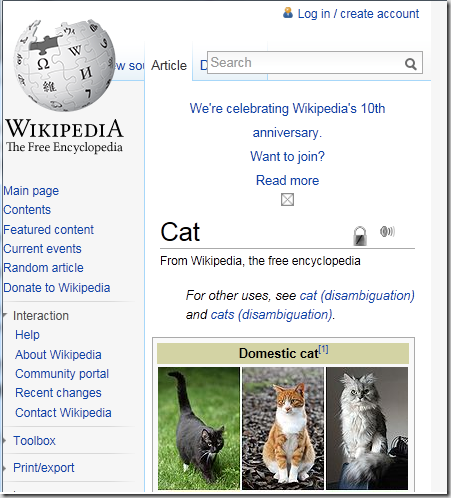
Once upon a time, when browsers only lived on desktop computers, the web content “canvas” (a.k.a. the area on the screen that the web site can draw things on) was tied nicely with the size of the browser window which is convenient, predictable and works very well. Then the rich mobile browsers grew in functionality to the point where the same sites could be displayed on the mobile screen as well… unfortunately for us that old model did not work really well since phone screens generally have a smaller pixel count and are primarily held in portrait. The end result was that the layout of a number of sites was “compressed” as you can see here:
The solution was to decouple the “canvas” from the window into a “Layout viewport” used to for all layout calculations and the “Visual viewport” used to represent the visible portion of the site.
PPK has a very interesting post on this topic for more details.
Controlling the viewport
On Windows Phone 7 all sites, by default, have a layout viewport of 1024 pixels wide; the browser then selects the appropriate zoom level that is needed so the layout viewport fits horizontally the screen before rendering any content. This is what gives the user a “thumbnail” view of the website when it is initial loaded.
Developers and designers have control over the layout viewport width by utilizing a special META tag called viewport. If this tag is present the browser will assume the content is optimized for mobile so it will also disable all the optimization the browser makes to enhance the readability of desktop sites, this means that the content will be rendered exactly as specified by the markup.
Note: The height of the document is always calculated based on the phone orientation and the desired viewport width so it is at least a tall as the visual viewport.
Now, lets dig in into the details on how this tag works on WP7. First lest create an HTML document with four rectangles of different sizes as follows:
 <!DOCTYPE html PUBLIC "-//W3C//DTD XHTML 1.0 Transitional//EN" "https://www.w3.org/TR/xhtml1/DTD/xhtml1-transitional.dtd">
<html xmlns="https://www.w3.org/1999/xhtml">

<head>
<meta content="text/html; charset=utf-8" http-equiv="Content-Type" />
<title>Viewport Test</title>
<style type="text/css">
.auto-style1 {
    font-size: large;
    color:white;
}
</style>
</head>

<body>
<div style="position:absolute;top:0px;left:0px;width:1024px;height:1024px;background-color:gray">
    <p style="text-align:right" class="auto-style1">1024px</p>
</div>
<div style="position:absolute;top:0px;left:0px;width:480px;height:480px;background-color:green">
    <p style="text-align:right" class="auto-style1">480px</p>
</div>
<div style="position:absolute;top:0px;left:0px;width:320px;height:320px;background-color:maroon">
    <p style="text-align:right" class="auto-style1">320px</p>
</div>
<div style="position:absolute;top:0px;left:0px;width:240px;height:240px;background-color:navy">
    <p style="text-align:right" class="auto-style1">240px</p>
</div>
</body>

</html>
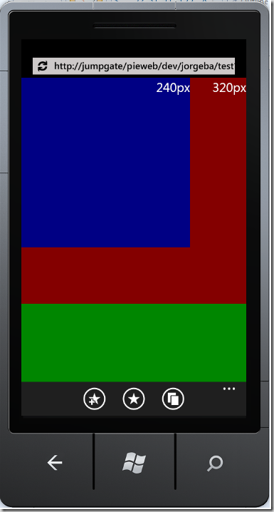
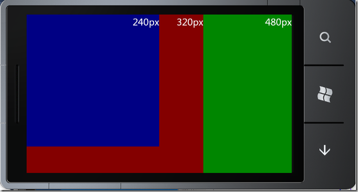
This document when loaded on Windows Phone 7 will look like this:
Specifying a constant viewport size
When your site is designed for a specific viewport width, having a hard-coded value on the viewport tag will always produce the expected behavior independently of which device or screen orientation used to access it. The browser will adjust the initial zoom factor so the content is fit to the specific device visual viewport.
For example, on the example site if we use:
<meta name="viewport" content="width=320" />
The site will look like this on portrait:
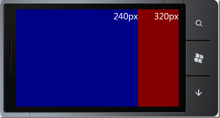
And, after rotating the device to landscape, the content is zoomed-in to allow the viewport width to remain constant:
but if we change the tag to be:
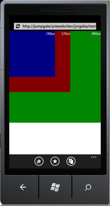
<meta name="viewport" content="width=480" />
The page will instead look like this:
Dynamic viewport sizing
To allow IE to select the viewport size you can use the special value ‘device-width’. This value tells the browser that the site is designed to handle multiple resolutions and will be ready to change its layout on the fly as a result of orientation changes.
Internally Windows Phone 7 will resolve device-width to 320px when on portrait and 480px on landscape. Those values were chosen because the majority of mobile web sites currently deployed were not ready to scale to the higher DPI screens we use on our phones which will the experience for our end users less than ideal. This is consistent with how other platforms are doing this today though I would encourage all web developers to only use dynamic sizing if their site can scale to different device configurations.
Lets put this to practice now by modifying the viewport META tag to use dynamic sizing
<meta name="viewport" content="width=device-width" />
And then load it on Windows Phone:
And after rotating the screen we the document gets resized as expected:
Alternative ways for changing the size of the viewport
Windows Phone 7 will also automatically resize the layout viewport if it determines that the content would be better rendered as a mobile optimized page. This include sites that use the XHTML Mobile profile, use the MobileOptimized or the HandheldFriendly META tags.
As always, any feedback is appreciated and also, please let us know if there are any topics you would like us to cover on the near future = ]
Jorge
Comments
Anonymous
January 21, 2011
I'm not sure I understand the last section. Let's say I have a page with the html5 doctype that specifies: <meta name="viewport" content="width=device-width" /> Does it behave differently if the page also specifies either of these? <meta name="HandheldFriendly" content="true" /> <meta name="MobileOptimized" content="width" /> (where width is some value) Should these be omitted if viewport is set? Does viewport override them or vice versa? Additionally, does Windows Phone 7 support user-scalable in viewport as well? The November post doesn't seem clear on this, or whether commas or semicolons should delimitate viewport content values. Thanks for the continuing posts, they help a lot!Anonymous
January 24, 2011
The comment has been removedAnonymous
January 24, 2011
The comment has been removedAnonymous
February 01, 2011
Can I just query whether you guys actually realise how behind this all is in relation to webkit based browsers like that of iOS, android, and BB? I had to spend hours just to get WP7 IE just to play nicely with my layout. It really shouldn't be like that. Why microsoft insists on holding onto IE purely for its legacy is beyond me, the only legacy it has is being sh*t!Anonymous
February 01, 2011
Hello Dan, The viewport META tag overrides any other viewport settings from HandheldFreindly or MobileOptimized. The priority order of the tags as implemented on 7 is: 1) Viewport 2) MobileOptimized 3) HandheldFriendly For the second question, I will be posting more on user-scalable but yes, it is supported, and we use "," as the option separator.Anonymous
February 01, 2011
Hello Stefan Both iOS 4 and Android behave in similar ways with respect to device-width. Android does support a separate setting for the viewport meta tag to override this behavior called "target-densityDpi" but we currently don't support it JorgeAnonymous
February 09, 2011
It would be great if you could get the W3C to write down this Viewport in some spec. They barely have a sentence on their site: www.w3.org/.../mwabp about it. You showed that android has target-densityDpi. You also noted that you did not like the experience that your users get since the page is at 320px instead of their native resolution. What is the plan for the future? Do you support switching the viewport tag values through JavaScript? Is there a JS api to get the dpi density so that you know what the target one should be for the phone? Thanks for the postAnonymous
April 03, 2011
The comment has been removed
