HTML5 / JavaScript: Reflections and Skew Effects
In carousel and coverflow type controls, you often see a “reflection” type effect. This is normally done by transforming an image to mirror the original then applying an alpha gradient to this (i.e. progressively increasing the transparency of the image). I recently attempted to recreate this effect in HTML5 / JavaScript.
It appears that you cannot have alpha gradients on canvas images in HTML 5 / JavaScript. The workaround to this is to overlay a solid colour rectangle that matches the background colour and vary the alpha transparency over a gradient. The code below demonstrates how to achieve this effect.
  1: <!DOCTYPE html>
  2: <html>
  3:   <head>
  4:     <title>HTML5 JS Reflections</title>
  5:       <script>
  1:
  2:
  3:         function DrawImageWithReflection(currentContext, itemPath, xPos, yPos) {
  4:             var mainImage = new Image();
  5:             mainImage.src = itemPath;
  6:
  7:             mainImage.onload = function () {
  8:
  9:                 var imgWidth = mainImage.width;
  10:                 var imgHeight = mainImage.height;
  11:
  12:                 // Draw main image
  13:                 currentContext.drawImage(mainImage, xPos, yPos, imgWidth, imgHeight);
  14:
  15:                 // Setup a reflection (via reversing scale in y-direction around an axis that is two times the height of the image)
  16:                 currentContext.translate(0, yPos + (2 * imgHeight));
  17:                 currentContext.scale(1, -1);
  18:                 currentContext.drawImage(mainImage, xPos, 0, imgWidth, imgHeight);
  19:
  20:                 // Revert transform and scale
  21:                 currentContext.translate(0, yPos + (2 * imgHeight));
  22:                 currentContext.scale(1, -1);
  23:
  24:                 // Reflection image overlay (to created fade out effect)
  25:                 // Our gradient starts with 0.85 opacity, then goes to 1.
  26:                 var alphaGradient = currentContext.createLinearGradient(xPos, yPos + imgHeight, xPos, yPos + (2 * imgHeight));
  27:                 alphaGradient.addColorStop(0, "rgba(255, 255, 255, 0.85)");
  28:                 alphaGradient.addColorStop(0.75, "rgba(255, 255, 255, 1)");
  29:                 currentContext.fillStyle = alphaGradient;
  30:                 currentContext.fillRect(xPos, yPos + imgHeight, imgWidth, imgHeight);
  31:             }
  32:         }
  33:
  34:         this.window.onload = function () {
  35:             var canvas = document.getElementById('myCanvas');
  36:             var context = canvas.getContext('2d');
  37:             DrawImageWithReflection(context, "images/image1.jpg", 50, 50);
  38:             DrawImageWithReflection(context, "images/image2.jpg", 200, 125);
  39:             DrawImageWithReflection(context, "images/image3.jpg", 350, 200);
  40:         }
  41:
 </script>
  6:   </head>
  7:   <body>
  8:     <canvas id="myCanvas" width="800" height="800" style="border: 1px solid #000; background-color: #FFF" />
  9:   </body>
  10: </html>
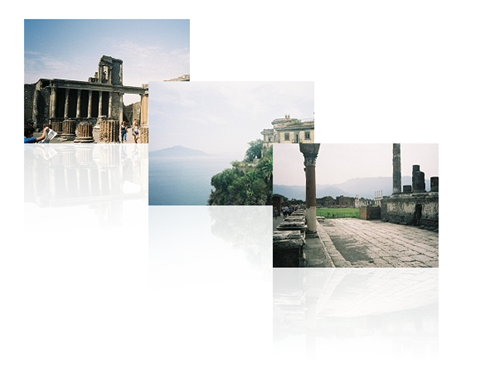
This method has the limitation that the background colour of the canvas must be solid and must obviously match the colour of the rectangle used to apply the fade effect. The final result is as follows:
Skew Effects
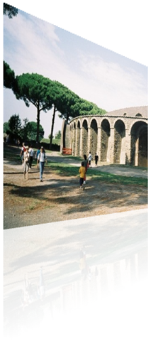
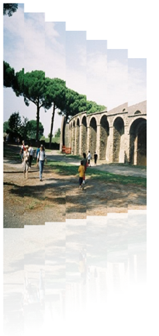
I was also interested in creating skew type effects (as commonly seen on coverflow type applications). Unfortunately, you can only apply affine transforms in HTML5, so you cannot easily perform perspective effects. I did, however come across an interesting method to simulate this effect. The method involves taking an image and dividing it into a series of slices, such that the height of each slice is scaled down progressively. A more detailed explanation is outlined at https://stackoverflow.com/questions/3836036/mode7-like-perspective-transform-in-canvas.
I created some experimental code to test this (also with the above reflection effect). The following shows and example with my slice width set to 5px and 25px respectively.
Written by Rob Nowik


