SharePoint: Advanced Page Viewer Web Part
Pulling through specific web page content
Recently I’ve been working on developing dashboard application for a team portal site in SharePoint 2010. As any familiar with dashboard design and development knows, you often find yourself pulling in various nuggets of information that are dotted around the web. There are certain circumstances where pulling through a view of a particular web page is desired, and this is precisely why the Page Viewer Web Part was created. However, with the majority of out of the box content your options can quickly become limited when more intricate customisation is necessary.
I’ve read through numerous forum threads inquiring about disabling scrolling, setting a view offset and other fine control points that cannot be realised via web page editing interface.
For the project I was working on I wanted to focus in a basic summary section of the page and nothing else. When using the default Page Viewer Web Part (Fig 1) I was able to see the desired section, but being unable to set a view offset or control scrolling settings screen real-estate was being wasted, which is in precious demand in dashboard design.![image_2_018D564B[1] image_2_018D564B[1]](https://msdntnarchive.z22.web.core.windows.net/media/MSDNBlogsFS/prod.evol.blogs.msdn.com/CommunityServer.Blogs.Components.WeblogFiles/00/00/01/34/14/metablogapi/3681.image_2_018D564B1_thumb_52DF811B.png)
Fig. 1: Page Viewer Web Part
By inserting a content editor web part, however, with some custom HTML and CSS (Fig 3) a much neater display can be provided (Fig 2). NB: All values shown in red can and should be modified to your situation .
Fig. 2: Advanced Page Viewer Web Part
 <div style="width: 450px; height: 285px; overflow: hidden">
<iframe src="https://mywebsite" scrolling="no"
    style="margin-top: -160px; width: 1000px; height: 1000px; margin-left: -10px">
</iframe>
</div>
Fig. 3: Frame properties
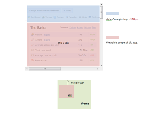
Here the width and the height of the div are used to set the scope of the viewable area. The overflow is hidden so that the content is clipped and will not be visible. On iframe itself the content is pulled through and its margins are altered such that the desired section of the screen appears within the viewable scope of the div tag. The width and height of the iframe are set such that all content is displayed within the frame – i.e. no scrolling is necessary.
Fig. 4: CSS effects
Finally, I added an invisible div tag over the iframe to redirect users to the shown page when clicked upon. (Fig 5)
 <a href=" https://mywebsite">
<div style="cursor: hand; position: absolute; top: 0; left: 0; width: 450px; height: 285px;
    background-color: white; z-index: 2; opacity: 0.4; filter: alpha(opacity = 0)">
</div>
</a>
Fig. 5: Link div tag
This is by no means a perfect solution, for example; if the content moves on the original page the values will need to be modified to shift or change the viewable area. However, this remains a neat little solution for presenting static content.
Written by Mark Newman and Martin Grayson
Comments
Anonymous
April 11, 2011
"By inserting a content editor web part..." Inserting it where? Into the PageViewer Web Part? Or skip the PageViewer web part and use the Content Editor web part instead?Anonymous
April 17, 2011
Hey. Here we're using our own code placed inside the Content Editor to mimic the behaviour of the PageViewer web part and get past some of it's restrictions - just go with the Content Editor. Hopefully that's a little clearer :)Anonymous
May 05, 2011
I used Content Editor Web Part to resolve this issues with the help of Java Script. Go here to find the steps and Code; virtualizesharepoint.com/.../resize-sharepoint-20072010-pageviewer-webpart-heightAnonymous
January 20, 2012
use content editior web partAnonymous
March 04, 2013
This was AWESOME! I actually scroll to true, and was still able to restrict what was visible in the iFrame so that the part of the page I didn't want people to see never displays. Sure, folks have to scroll down to see the full list, but that's fine for me, and it makes the page look really, really cool. Thanks very much, HUGELY helpful tip!Anonymous
June 03, 2013
Simply Superb!!! Thanks a lot for the code snippet here.Anonymous
July 15, 2013
love it. very helpful.Anonymous
December 02, 2013
Excellent stuff! Thankyou so much for posting this tutorial a great help for slowly migrating old utilities from one sharepoint site to another.Anonymous
September 10, 2014
Just shows the text, not the desired resultAnonymous
January 16, 2015
Thanks so much for this idea. I was able to pull in multiple news feeds, from subsites, to add three comment boxes to a single page.Anonymous
January 27, 2015
Dears , KIndly regarding part 5 <a href=" http://mywebsite"> <div style="cursor: hand; position: absolute; top: 0; left: 0; width: 450px; height: 285px; background-color: white; z-index: 2; opacity: 0.4; filter: alpha(opacity = 0)"> </div> </a> is this mean the code will be like this ? <div style="width: 450px; height: 285px; overflow: hidden"> <iframe src="http://mywebsite" scrolling="no" style="margin-top: -160px; width: 1000px; height: 1000px; margin-left: -10px"> <a href=" http://mywebsite"> <div style="cursor: hand; position: absolute; top: 0; left: 0; width: 450px; height: 285px; background-color: white; z-index: 2; opacity: 0.4; filter: alpha(opacity = 0)"> </div> </a> </iframe> </div>Anonymous
October 23, 2015
Not sure who to thank, all who commented and blog author, thank you.

