Creating a grid of data-bound buttons in a Windows Phone 8 app – templates and styles, oh my!
Recently I started working on a new coding project. My long-term goal is to create a word game that targets Windows Phone and Windows, optimizing code reuse through Portable Class Libraries (PCL). I thought starting with the UI would be a nice break from writing about all things CLR/BCL, which is my latest gig here at MS, and I chose the Windows Phone UI as my starting point.
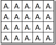
For my game, I want to create a 5x5 grid of buttons that are bound to a list of letters that display a character value and a point value. Something like this:
I was surprised that there wasn’t more examples of how to display a bunch of bound buttons in a grid, as this seems to be a pretty common scenario. I was also surprised at how quickly I was deep into setting styles, data templates and control templates, so I thought I would share how I created my UI.
The Data
Since I need to display letters, I created a simple letter object that stores a character value, a base point value (my game increments the points during play), and a count for how many of each letter are contained in my list.
    1:
    2: public class Letter
    3: {
    4:     public Char Character { get; set; }
    5:     public int BaseValue { get; set; }
    6:     public int Count { get; set; }
    7: }
In my code behind, I created a property on my Page named LetterList, which is an ObservableCollection of letters. I set the list as my data context for the Page.
1: this.DataContext = LetterList;
So I had my data, I just needed to figure out the UI.
Changing the appearance of the default Button
Out of the box, a Windows Phone button looks like this.
I wanted something like this:
I needed a couple of changes for the button to look how I want.
- The border needs to move closer to the actual edge of the button (I am pretty sure this violates some style rule, but that’s what I wanted)
- The letter character should display in the center, in a large font, and the point value for the character to the lower right of the letter character.
I thought Changing #2 was easy. I created a DataTemplate for Button that set the set the Content property to a StackPanel and the StackPanel contains two TextBlock controls, one to display the character value, and one to display the point value.
But there is some layering here that is a little tricky.
- A DataTemplate is a reusable resource that sets the structure for the data it contains. That said; you can also apply a style to the data in the template, which I did, to establish the height and width for the button, and the color and thickness of the button border.
- I discovered that I needed to alter the ControlTemplate to change the border Margin, and therefore display the border at the outside edge of the button. This property is a dependency property but it is not template-bound, meaning I can’t set it directly and have it override the default property like I did with the border color and thickness.
- The control template is a property of the Style. There is probably a good reason for this, in the sense that the original button author did not want me messing with the border margin of a button, but I want to show you how to do it regardless. This article describes the basics of dependency properties and value precedence if you want some more information.
In summary, this means I need to set the control template in the style, which is set in the data template. Got that?
I remembered how to do all the DataTemplate stuff. I create two text block controls, set their font size and text alignment how I want and bind them to the letter character and value. I also set the style to my custom style, which I’ll show a bit later. Here’s how my data template looks:
    1: <DataTemplate x:Name="buttonTemplate" >
    2:     <Button Style="{StaticResource LetterButton}" Click="Button_Click_1" >
    3:         <Button.Content>
    4:             <StackPanel  Orientation="Horizontal">
    5:                 <TextBlock Text="{Binding Character}"  TextAlignment="Left"
    6:                    VerticalAlignment="Top" HorizontalAlignment="Left" FontSize="35" >
    7:                 </TextBlock>
    8:                 <TextBlock Text="{Binding BaseValue}" TextAlignment="Right"
    9:                   FontSize="15"  VerticalAlignment="Bottom" HorizontalAlignment="Right"/>
   10:             </StackPanel>
   11:         </Button.Content>
   12:     </Button>
   13: </DataTemplate>
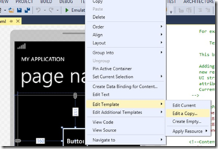
Next I needed to tackle the control template, which frankly intimidated me. The control template contains the entire visual tree for a control, and usually trying to create one that contains all of the behavior the original control author included is difficult. Imagine my happy surprise when I discovered how easy it is to change a control template in Visual Studio these days. I selected my button, right clicked and saw the following menu choices.
I chose to edit a copy of the template and simply adjusted the property that I cared about, the Margin for the border.
Following is my control template, style and data template. I’ve omitted most of the control template, just showing the portion I modified. You’ll see that most of the properties of the ButtonBackground border are specified as TemplateBinding, which exposes them to be set locally.
You will also see that the Style contains and sets the ControlTemplate, and the DataTemplate sets the Style.
    1: <ControlTemplate x:Key="ButtonBaseControlTemplate1" TargetType="ButtonBase">
    2:     <Grid>
    3:
    4:        <!--Unchanged portions omitted for brevity-->
    5:         <Border x:Name="ButtonBackground"
    6:             BorderBrush="{TemplateBinding BorderBrush}"
    7:             BorderThickness="{TemplateBinding BorderThickness}"
    8:             CornerRadius="4" Background="{TemplateBinding Background}" Margin="0" >
    9:             <ContentControl x:Name="ContentContainer"
   10:             Foreground="{TemplateBinding Foreground}"
   11:             HorizontalContentAlignment="{TemplateBinding HorizontalContentAlignment}"
   12:             VerticalContentAlignment="{TemplateBinding VerticalContentAlignment}"
   13:             Padding="{TemplateBinding Padding}" Content="{TemplateBinding Content}"
   14:             ContentTemplate="{TemplateBinding ContentTemplate}"/>
   15:         </Border>
   16:     </Grid>
   17: </ControlTemplate>
   18: <Style TargetType="Button" x:Name="LetterButton" >
   19:     <Setter Property="Template" Value="{StaticResource ButtonBaseControlTemplate1}" />
   20:     <Setter Property="Height" Value="88" />
   21:     <Setter Property="Width" Value="88" />
   22:     <Setter Property="BorderBrush" Value="White" />
   23:     <Setter Property="BorderThickness" Value="3" />
   24: </Style>
   25:
   26: <DataTemplate x:Name="buttonTemplate" >
   27:     <Button Style="{StaticResource LetterButton}" Click="Button_Click_1" >
   28:         <Button.Content>
   29:             <StackPanel  Orientation="Horizontal">
   30:                 <TextBlock Text="{Binding Character}"  TextAlignment="Left"
   31:                    VerticalAlignment="Top" HorizontalAlignment="Left" FontSize="35" >
   32:                 </TextBlock>
   33:                 <TextBlock Text="{Binding BaseValue}" TextAlignment="Right"
   34:                   FontSize="15"  VerticalAlignment="Bottom" HorizontalAlignment="Right"/>
   35:             </StackPanel>
   36:         </Button.Content>
   37:     </Button>
   38: </DataTemplate>
Using WrapPanel to get the look of a Grid
My button looks good, so the next step is to lay it out in a grid, and bind it to my list of letters. I first tried a Grid layout, but I couldn’t get my data binding to work properly. I was pretty sure the buttons needed to be displayed in some type of list control to get the data binding right. ListBox appeared to be the control I needed, but I didn’t know how to display a ListBox so it looked like a grid.
I poked around and discovered the WrapPanel control in the Windows phone toolkit, which is available through NuGet.
The layout for the ListBox is also a little tricky. In order for my ListBoxItems to display correctly, I needed to set the ItemTemplate, which determines the visual structure of each ListBoxItem contained in the ListBox, to the data template I showed previously. This mean each list box item will have contain a button, which in turn contains two text blocks with my letter character and point value.
Finally, to layout my items in a grid-like way, I set the ListBox.ItemsPanelTemplate to a WrapPanel. The ItemsPanelTemplate property determines the layout of each item in the ListBox control.
I turned off scrolling on my ListBox, by setting the ScrollViewer.VerticalScrollBarVisibility property to disabled so just my 5x5 grid displays on the screen.
My XAML for the ContentPanel of my phone page looks like this:
    1: <Grid x:Name="ContentPanel" Grid.Row="1" Margin="12,0,12,0" ShowGridLines="True" >
    2:         <ListBox Height="440"  Name="ButtonList"
    3:            ItemsSource="{Binding}"
    4:            ItemTemplate="{StaticResource buttonTemplate}"
    5:            ScrollViewer.VerticalScrollBarVisibility="Disabled">
    6:             <ListBox.ItemsPanel>
    7:                 <ItemsPanelTemplate>
    8:                     <toolkit:WrapPanel Width="440"  />
    9:                 </ItemsPanelTemplate>
   10:             </ListBox.ItemsPanel>
   11:         </ListBox>
   12: </Grid>
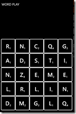
And finally, when I ran my app, I saw success:
I am sure this code will continue to evolve as I create my app, but for now, I am happy with the progress I’ve made.
Comments
- Anonymous
April 14, 2014
It's hard to understand. Please make your post specifically by adding more code for each element. Thanks


