My RIA art...
12:33 AM and I'm currently putting together my power point deck for an upcoming internal conference (Seattle - February 4th - 15th). I typically like to use as many visuals as possible, as I've sort of decided that I'd prefer all my presentations going forward have a bit more "bang" associated to it.
The 3rd deck in is where I introduce myself and my title. I typically had a boring slide with basic text but I thought about it a bit more and decided to open up Adobe Photoshop CS3 and go to town on producing a better intro slide.
These are the results so far and putting them on a blog is not nearly as good as seeing them on a 24" iMAC at night.
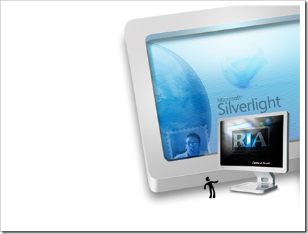
Intro 01 - White..
I left some room to the left so I can put my details (name, email). I'm also thinking of designing a "digital passport" as being a RIA Evangelist I get to see cool UX day in day out.. so I think it's important that should I use a medium like PowerPoint that it represents this at the very least - in static form.
Intro 02 - Black (Favourite)
This is my favourite so far, as in a dark room it really comes up nice. The vision or story behind is that the words RIA are in the middle, which appear to be "popping" out of a monitor to indicate well, rich user experience. I've also tagged it with "Lighting up the web" which is a play on Silverlight's tag line "Light up the web"
I'm Proud
I'm proud to wear the title "RIA Evangelist" here at Microsoft as I think it's in many ways a first of many more titles to come that focus on our UX Platform. We are building a UX Platform made up of many pieces of connecting software along with looking to deploy such software on many devices going forward. I think we also have a really strong pedigree of designers on our payroll and the more I uncover them the more I am blown away by some of the upcoming idea's, solutions or products being produced.
Inspired by this, I thought it was time I also jumped in and added my own composition of art.
Now gimme a hug.... as have you hugged a designer today?
Comments
- Anonymous
January 26, 2008
hug I like how the two slides transition, as if you were zooming into the monitor on the first slide. Ooh powerpoint, if only... I bet you could do something like that in StandOut http://www.erain.com/products/standout/

