UX lessons from game design
I just attended the Seattle Chapter of Interaction Design Association (IxDA). Tonight the topic was "UX lessons from game design".
It was an awesome event and you can catch the video later this week. What struck me as really great about this, was the discussion of how to map some of the lessons in Game design with Software in general.
I've talked about this many times in the past, that exploratory learning is something I have high hopes RIA will crack wide open. In that, if the users continue to explore the software parts are revealed or rewards are given, that sort of thing.
An example of putting the fun in software, is the Postpone dialogue when Windows Vista updates. This occurred during one of the presentations so it got me thinking about the concept of what it represents and why.
In that, firstly, why does it ask me to restart? Is it that important I need to be prompted to restart Windows Vista? Why is it important that operating system tell me this anyway, to me, I really don't care just do what you have to do whenever you restart later.
It's a frustration point for me, and it was kind of an annoyance when the person is also in "Presenter" mode. What if, we had fun with the dialogue, what if we gave Windows a personality, a bit of emotion and fun:
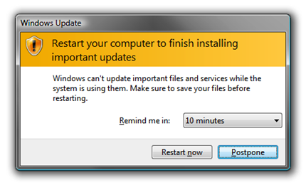
Seems very serious right, let's click on Postpone shall we.
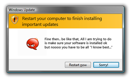
Oooh, I've upset Windows Vista.. I mean, I didn't mean, to, what's going on, somethings not right here.. Let's talk this out Vista, tell me more..
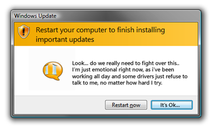
Who's fighting, I understand. Sometimes the Drivers aren't certified by Microsoft and no matter how hard you try to be nice to them, they simply ignore your polite advances. I now understand what your needs are..
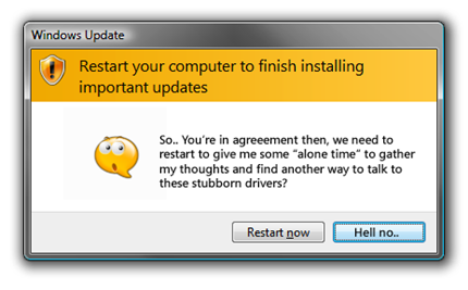
I agree, we should restart... But Not right now.. I mean, you're a computer..as if I'm going to stop what I'm doing to keep you happy, suck it up and let me get back to work..
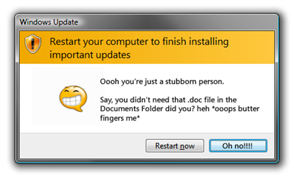
So on..
Obviously this would be very painful user experience, but the point is you can take a serious situation and give it personality, keep it minimal but slowly expand on the situation, interrupt the mainstream and see what the end users will enjoy vs hate. I'd wager the conservative approach isn't always right.
Related Posts:
- RIA Hopeful: Chore Wars.
- RIA can change context.
- RIA User Interfaces, how much space do you waste?
- Learn from Video Games.
Comments
Anonymous
October 23, 2008
Hmmm... This reminds me of the Office paper clip.Anonymous
October 24, 2008
You really have way too much time on your hands... :) its funny though... heheheAnonymous
October 24, 2008
I agree that it's sometimes helpful when UI has 'personality,' But I think that, largely, anthropomorphising an application is annoying for users. For instance, I feel like XP has a distinct personality, but it is NOT the personality of the stupid puppy dog that shows up when I try to perform a search. Maybe the challenge is, by good UX design, to give the app or OS an implicit personality. Hopefully one that's enjoyable to interact with. :)Anonymous
October 25, 2008
The comment has been removedAnonymous
October 27, 2008
The comment has been removedAnonymous
October 30, 2008
Great post! Did you create the personified speech bubble images yourself? I'm just curious about how you went about doing that. I have no graphic design experience and I'm trying to get better at things like that.Anonymous
October 30, 2008
The comment has been removedAnonymous
January 23, 2009
Where's the link to the talk? Thanks