Follow-up #4: Can I customize the path that the Narrator screen reader takes when moving to the “next” or “previous” element in my UWP app’s UI?
This post describes a question arising from the discussion detailed at More tips on building accessible Windows apps, including a couple of things introduced with the Windows 10 Anniversary Update.
The majority of your customers using the Narrator screen reader at your UI will control the screen reader via the keyboard. As your customers move keyboard focus through the UI, by default Narrator will follow keyboard focus. Once in a while, you may feel that you need to override the default flow for keyboard focus as your customers press the Tab key, (particularly when you have custom controls in the UI,) so for XAML apps IsTabStop and TabIndex , or for HTML apps tabIndex, might be able to help.
But what about the path that Narrator takes through your UI when it’s not being driven by the keyboard focus moving? That is, where will Narrator move to when your customer wants to go to the “next” or “previous” UI element via CapsLock+Right/LeftArrow or a swipe right/left touch gesture?
In that situation, by default, Narrator’s navigation logic is heavily dependent on the element hierarchy in the Control view of the UI Automation (UIA) tree. Often the target element is the element that you assume it would be when you look at that hierarchy with the Inspect SDK tool. (When using the Inspect SDK tool, make sure you know whether you’re looking at the Control view or the Raw view of the UIA tree.) When Narrator moves to the “next” or “previous” element, it will usually move to sibling elements in the UIA tree, and move up or down through the tree if appropriate. Narrator does have some additional logic relating to such things as an element’s ControlType and the UIA patterns that it supports, and that can mean that Narrator might not navigate to some elements in the tree, but in general the elements in the Control view are of interest to Narrator.
XAML builds up the hierarchy of elements in the UIA tree based on the layout of the XAML UI that you created. So if you move chunks of XAML around, you’ll find matching impact on the UIA tree hierarchy. Often the default UIA hierarchy generated from your app’s XAML will provide an intuitive navigation path for your customers using Narrator. But periodically you might feel that you want to change that default navigation path.
For example, say following some customer action, you reveal UI on a page that was previously not shown. On the screen, that revealed UI might appear close to some other UI with a logical connection, but in your XAML, those two pieces of UI happened to be defined far from each other. This means your customer won’t be able to move Narrator “next” or “previous” between the two pieces of the UI. When you do find the default UIA hierarchy doesn’t lead to the navigation path that you’d like to deliver, the first thing to consider is whether it’s practical to rearrange the XAML such that it does lead to a navigation path that’s more to your liking.
If rearranging the XAML isn’t practical in some situations, another option that might be practical is to take advantage of the FlowsTo and FlowsFrom properties available in a UWP XAML app. These properties allow an app dev to specify the preferred screen reader navigation path for a UI element. So when Narrator moves “next” or “previous” from an element, it will use the FlowsTo and FlowsFrom properties respectively to find the target element.
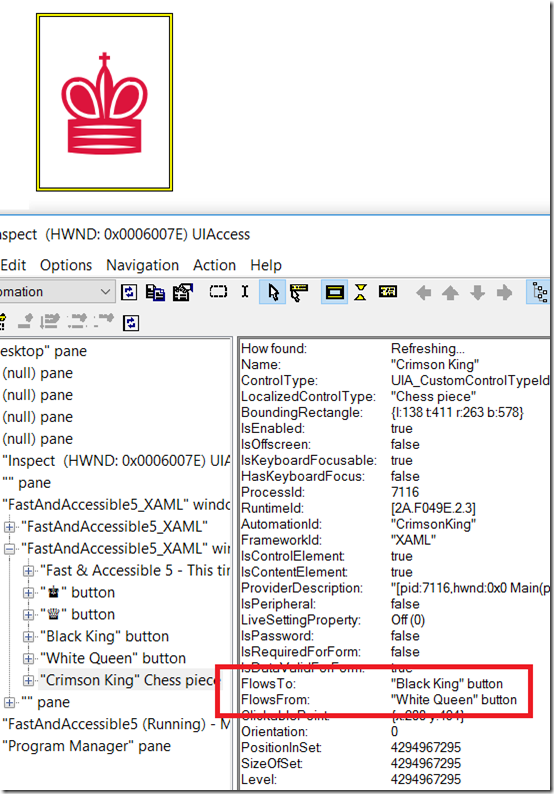
As a test of this, I updated my demo app to have Narrator move in a custom direction from the CrimsonKing button.
Figure 1: Inspect showing that the FlowsTo and FlowsFrom properties have been set on the Crimson King button.
And sure enough, when I now point Narrator to the button, and do CapsLock+Right/LeftArrow or a right/left swipe gesture, Narrator moves to the targets specified by the FlowsTo and FlowsFrom properties.
As far as implementation goes, there are two ways to achieve this in a UWP XAML app, both in code-behind. The first approach is to access the list of elements associated with a button’s FlowsTo or FlowsFrom properties. (By default these lists will be empty.) Then add your elements to the lists.
var flowsTo = AutomationProperties.GetFlowsTo(CrimsonKing);
flowsTo.Add(WhiteQueen);
var flowsFrom = AutomationProperties.GetFlowsFrom(CrimsonKing);
flowsFrom.Add(BlackKing);
The second approach is to update the custom AutomationPeer that I’d already created in the app, and override the GetFlowsToCore() and GetFlowsFromCore() methods.
AutomationPeer flowsToAP;
AutomationPeer flowsFromAP;
protected override IEnumerable<AutomationPeer> GetFlowsToCore()
{
List<AutomationPeer> list = new List<AutomationPeer>();
list.Add(this.flowsToAP);
return list;
}
protected override IEnumerable<AutomationPeer> GetFlowsFromCore()
{
List<AutomationPeer> list = new List<AutomationPeer>();
list.Add(this.flowsFromAP);
return list;
}
For that second approach, elsewhere in the code I’d set the flowsToAP and flowsFromAP members with the AutomationPeers of the target elements. For example, to get the target for one navigation direction:
FrameworkElementAutomationPeer.FromElement(BlackKing));
For a UWP HTML app, similar results can be achieved by adding specific HTML markup. I did this in the HTML version of my demo app by adding the following markup to the button:
aria-flowto="WhiteQueenButton"
x-ms-aria-flowfrom="BlackKingButton"
So if you need to change the path that Narrator takes through your UI when your customer moves “next” or “previous” through the UI, first consider rearranging the XAML or HTML in such a way that both keyboard navigation and Narrator’s next/previous navigation are intuitive for your customers. If that doesn’t lead to the desired UX, consider whether the FlowsTo and FlowsFrom properties might also be able to help.
Guy
Posts in this series:
Follow-up #2: How do I have access keys shown on buttons in my UWP XAML app?
