View Azure Maps API usage metrics
This article shows you how to view the API usage metrics, for your Azure Maps account, in the Azure portal. The metrics are shown in a convenient graph format along a customizable time duration.
View metric snapshot
You can see some common metrics on the Overview page of your Maps account. It currently shows Total Requests, Total Errors, and Availability over a selectable time duration.
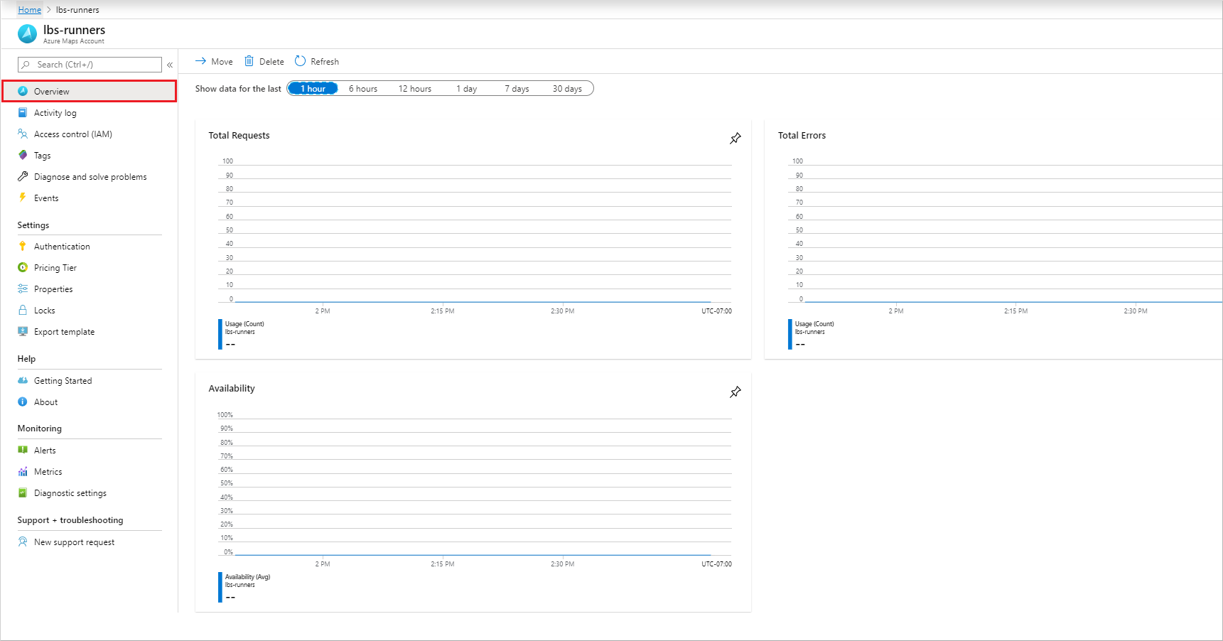
Continue to the next section if you need to customize these graphs for your particular analysis.
View detailed metrics
Sign in to the Azure portal.
Select the All resources menu item on the left-hand side and navigate to your Azure Maps Account.
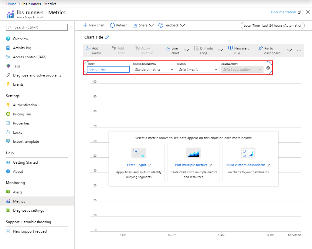
Once your Maps account is open, select the Metrics menu on the left.
On the Metrics pane, choose one of the following options:
Availability - which shows the Average of API availability over a period of time.
Usage - which shows how the usage Count for your account.
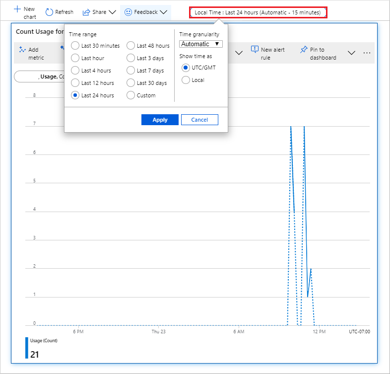
Next, you may select the Time range by selecting Last 24 hours (Automatic). By default, the time range is set to 24 hours. After clicking, you'll see all selectable time ranges. You can select the Time granularity and choose to show the time as local or GMT in the same drop-down. Click Apply.
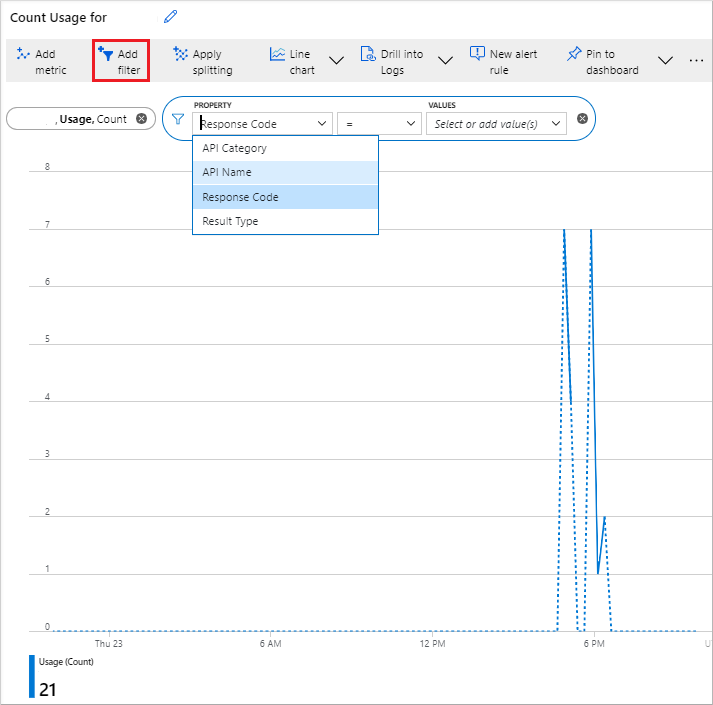
Once you add your metric, you can Add filter from the properties relevant to that metric. Then, select the value of the property that you want to see reflected on the graph.
You may also Apply splitting for your metric based on your selected metric property. It allows the graph to be split into multiple graphs, for each value of that property. In the following picture, the color of each graph corresponds to the property value shown at the bottom of the graph.
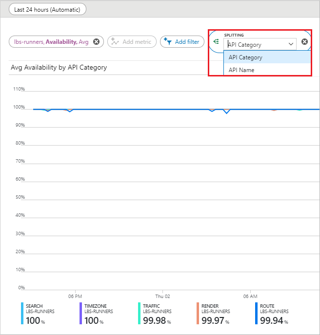
You may also observe multiple metrics on the same graph, by selecting the Add metric button.
Next steps
Learn more about the Azure Maps APIs you want to track usage for: