Summary dashboard in commercial marketplace analytics
This article provides information on the Summary dashboard in Partner Center. This dashboard displays graphs, trends, and values of aggregate data that summarize marketplace activity for your offers.
Note
For detailed definitions of analytics terminology, see Commercial marketplace analytics terminology and common questions.
Summary dashboard
The Summary dashboard presents an overview of Azure Marketplace and Microsoft AppSource offers’ business performance. The dashboard provides a broad overview of the following in order:
- Marketplace Insights: Trend around customers engagement in Azure storefronts
- Customers: Trend around active and churned customers
- Orders and subscription: Trend around active and canceled subscriptions
- Usage: Trend around usage for your offers
- Retained customers: Trend around customer retention
- Deployment by status: Trend around customer deployment of your Azure apps
- License: Trend around provisioned and assigned licenses
- Ratings: Ratings and reviews for your offers published in marketplace
- Geographical spread: Geographical spread on different parameters
Marketplace Insights
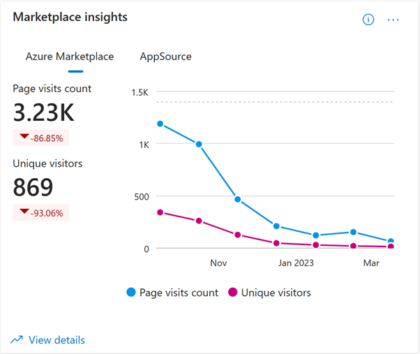
This widget shows the number of users who have visited your offers’ pages in Azure Marketplace and AppSource. Page visit count shows a summary of commercial marketplace web analytics that enables publishers to measure customer engagement for their respective product detail pages (PDP) listed on the commercial marketplace online stores: Microsoft AppSource and Azure Marketplace.
The widget displays a count and trend of total page visits and unique visitors during the selected month range. Select the tab of each storefront in which your offers are listed
Select the ellipsis (three dots) to copy the widget image, download aggregated widget data as a CSV file, and download the image as a PDF.
You can also go to the Marketplace Insights report by selecting the View Details link in the lower-left corner of the widget.
Customers
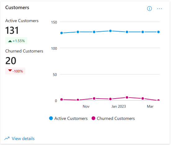
This widget displays a count and trend of total number of active (including new and existing) and churned customers during the selected month range. The percentage value represents the amount of growth.
Select the ellipsis (three dots) to copy the widget image, download aggregated widget data as a CSV file, and download the image as a PDF.
You can also go to the detailed Customers report by selecting the View details link in the lower-left corner of the widget.
Subscriptions
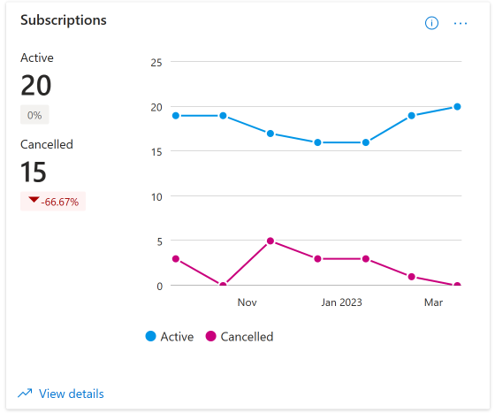
The widget displays count of all active and canceled subscription purchases for the selected month range. The percentage value represents the change in active and canceled subscriptions.
Active indicates latest count of subscriptions currently in use. Canceled indicates total subscriptions canceled for the selected month range.
Select the ellipsis (three dots) to copy the widget image, download aggregated widget data as a CSV file, and download the image as a PDF.
You can also go to the Orders report by selecting the View details link in the lower-left corner of the widget.
Usage
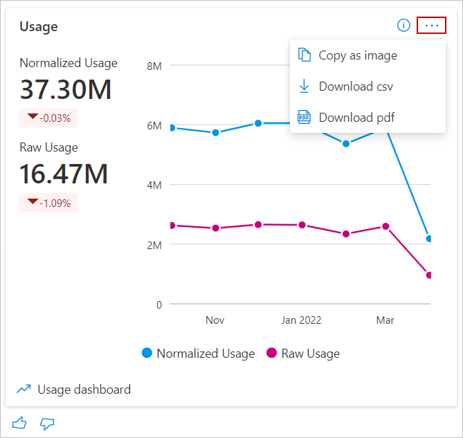
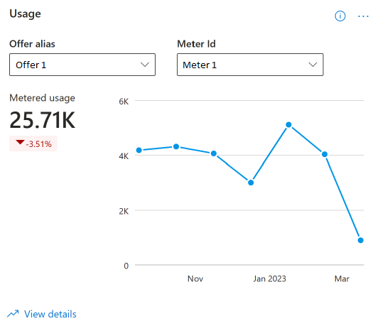
This widget represents the total customers' usage. For Azure Virtual Machine (VM) offers, it represents normalized and raw usage hours. For offers with custom meters, it represents the metered usage of an Offer and a Meter ID. The widget displays a count and trend of total usage units for the selected month range.
The usage summary table displays the customer usage hours for all offers they've purchased.
- Normalized usage hours are defined as the usage hours normalized to account for the number of VM vCPU ([number of VM vCPU] x [hours of raw usage]). VMs designated as "SHAREDCORE" use 1/6 (or 0.1666) as the [number of VM vCPU] multiplier.
- Raw usage hours are defined as the number of time VMs have been running in terms of hours.
- Metered usage is defined as the number of units consumed for a specific MeterId
The percentage value below the total usage hours represents the amount of growth in usage hours during the selected computation period.
Select the ellipsis (three dots) to copy the widget image, download aggregated widget data as a CSV file, and download the image as a PDF.
You can also go to the Usage report by selecting the View details link in the lower-left corner of the widget.
Retained customers
Note
This widget shows insights only if you have Azure Virtual Machines published offers in Azure marketplace storefronts.
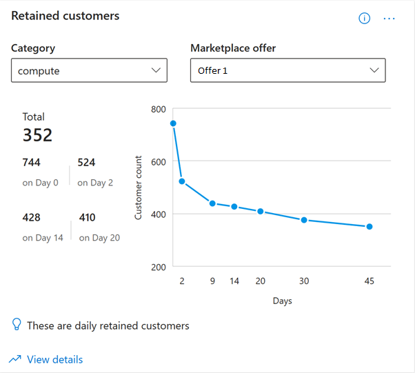
Select a marketplace category and a corresponding VM offer. The total represents the total count of the customers using the VM offer.
It also shows the count of customers who were active or using the selected offer on different milestones - Day 0, Day 2, Day 14, Day 20 of their usage journey. The line graph represents the same information visually.
Select the ellipsis (three dots) to copy the widget image, download aggregated widget data as a CSV file, and download the image as a PDF.
You can also go to the Customer retention report by selecting the View details link in the lower-left corner of the widget.
Deployment by status
Note
This widget shows insights only if customers have deployed your Azure application offers listed in marketplace storefronts.
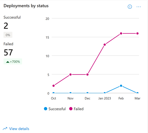
This widget represents the quality of service provided to your customers. It shows the count and the trend of successful and failed deployments of Azure applications for the selected month range. The metrics are calculated for both solution templates and managed applications.
Select the ellipsis (three dots) to copy the widget image, download aggregated widget data as a CSV file, and download the image as a PDF.
You can also go to the Quality of Service report by selecting the View details link in the lower-left corner of the widget.
License
Note
This widget shows insights around licenses only for Power BI and Dynamics 365 offers.
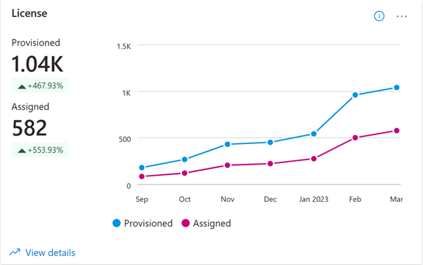
This widget shows the total and the monthly trend of provisioned and assigned licenses of your offers listed in marketplace storefronts.
Select the ellipsis (three dots) to copy the widget image, download aggregated widget data as a CSV file, and download the image as a PDF.
You can also go to the License report by selecting the View details link in the lower-left corner of the widget.
Ratings
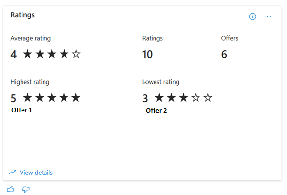
This widget shows the average rating, total number of ratings, and count of all offers listed in the marketplace storefronts - AppSource and AzureMarketplace. The widget also shows the name and ratings of the highest and lowest rated offers
Select the ellipsis (three dots) to copy the widget image, download aggregated widget data as a CSV file, and download the image as a PDF.
You can also go to the Ratings and reviews report by selecting the View details link in the lower-left corner of the widget.
Geographical spread
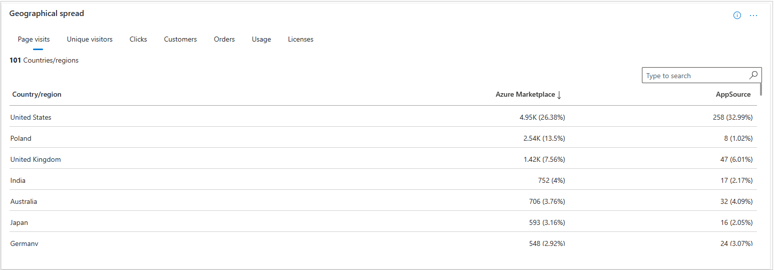
For the selected computation period, the geographical spread table displays the information against different country/region. You can view the data against these metrics:
- Page visits
- Unique visitors
- Clicks
- Customers
- Orders
- Usage
- Licenses
Select each tab to view metrics for each of the different dimensions.
Select the ellipsis (three dots) to copy the widget image, download aggregated widget data as a CSV file, and download the image as a PDF.
Related content
- For an overview of analytics reports available in the commercial marketplace, see Access analytic reports for the commercial marketplace in Partner Center.
- For frequently asked questions about commercial marketplace analytics and for a comprehensive dictionary of data terms, see Commercial marketplace analytics terminology and common questions.
