Pin an entire report page to a Power BI dashboard as a live tile
APPLIES TO:
Power BI Desktop
Power BI service
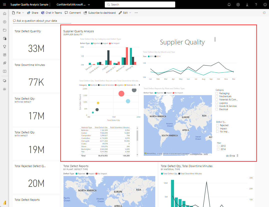
Another way to add a new dashboard tile is by pinning an entire report page. This method allows you to pin more than one visualization at a time. Also, when you pin an entire page, the tiles are live; you can interact with them right there on the dashboard. Changes you make to any of the visualizations back in the report editor, like adding a filter or changing the fields used in the chart, are reflected in the dashboard tile as well.
Pinning live tiles from reports to dashboards is only available in the Power BI service (app.powerbi.com).
Note
You can't pin tiles from reports that are shared with you.
Pin a report page
Follow these step-by-step instructions to try pinning a live report to a dashboard for yourself.
Open a report in Editing view.
With no visualizations selected, from the menu bar, select the Pin icon.

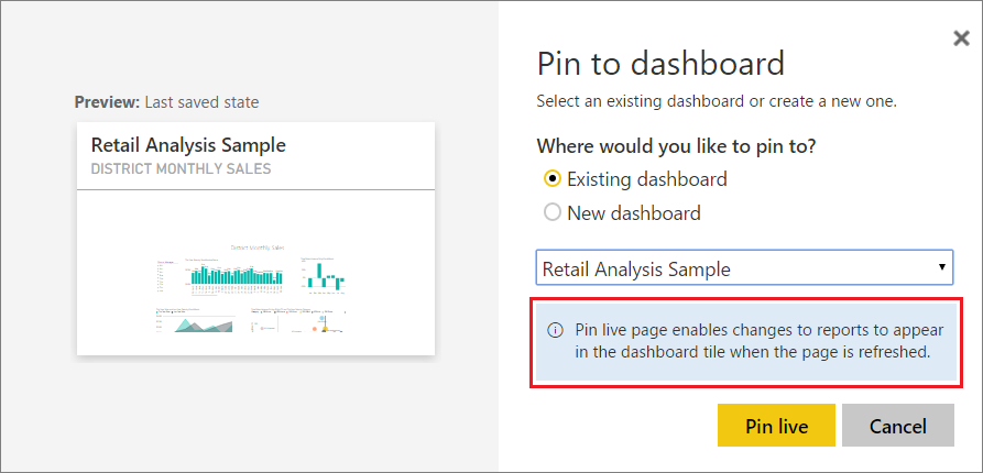
Pin the tile to an existing dashboard or to a new dashboard. Notice the highlighted text: Pin live page enables changes to reports to appear in the dashboard tile when the page is refreshed.
Select Pin live. A Success message (near the top right corner) lets you know the page was added as a tile to your dashboard.
Pinned live tile on the dashboard
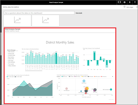
Open the dashboard to see the pinned live tile:
From the nav pane, select the dashboard with the new live tile. There you can do things like rename, resize, link, and move the pinned report page.
Interact with the live tile. In the following screenshot, you can see how selecting a bar on the column chart cross-filters and cross-highlights the other visualizations on the tile.
Note
Report tiles aren't interactive when viewed in the Power BI mobile apps.
Related content
More questions? Ask the Power BI Community.


