Understanding true and false
The concept of true and false is important to become familiar with when using Microsoft Power Apps. When you design your app, the ability to effectively use and apply true and false concepts allow you to build a better overall app.
When you want to evaluate conditions in your app with the If function, the results are either true or false. Take, for example our formula we used for the Visible property our "Retake test" button in the previous unit:
If(ThisItem.TestScore = "A" or ThisItem.TestScore = "B", false, true)
This formula evaluated to true or false, depending on the TestScore value. We could shorten this in our formula to simply:
ThisItem.TestScore = "A" or ThisItem.TestScore = "B"
The formula evaluates the same either way. The point is that Power Apps expected a value of either true or false, and it didn't care how we fed in that information.
A place we regularly use a condition like this is in filtering data. We set a filtering condition, and if the data matches the condition it passes through the filter. Power Apps includes/excludes each row of data based on whether a condition is true or false.
Going back to our Visible property, every control that you insert in Power Apps has a Visible property. Visibility, by default, is set to true. If you wanted to hide a control on the screen, you could set the Visible property to false. The control remains on the screen and is a part of the app, but users can't see it.
Important
When referencing true or false in Power Apps it is always lower case. True and False with upper case are incorrect and Power Apps will evaluate those as an error. These values must be lower case, without quotes.
As we demonstrated in the last unit, a common use of true and false is setting the visible property of a control based on a user's input. The following example shows how to hide an icon control based on the value of a slider control. A slider control provides a great way to make an easier to use input, especially on mobile apps.
Insert a Slider control onto an app screen (you can input "slider" into the insert search field to find it).
The slider control lets users move a slider to define a number value. By default, it shows the value above the control input as users interact with it.
Insert an Emoji-Smile Icon control. Name it: icnSmile
Set the Visible property of the icon control to:
Slider1.Value >= 50Preview the app and move the slider left and right. Notice that when the value is greater than or equal to 50, the Emoji-Smile Icon appears.
Notice you didn't have to use an If function to control the value. The reason is the formula Slider1.Value \>= 50 evaluates to true or false. The Visible property accepts true or false, so there's no need to check if the formula was true or false.
As you use true and false, another valuable function to incorporate is the Not function. The Not function returns the opposite of the evaluation (if true, returns false and vice versa). Use the following example to better understand this concept:
- 2 + 2 = 4 evaluates to true
- Not(2 + 2 = 4) evaluates to false
2 + 2 = 4 evaluates to true. The same way that 2 + 2 = 5 evaluates to false. The Not function takes the outcome of the provided logic and provides the opposite value. It's an awkward concept at first, but it allows you to build logic without complex code as you become more comfortable with it.
Note
When using Not in your formula, you can use an exclamation point (!) as shorthand for Not. In your code "!" means the same as "Not".
The following example builds on the previous Emoji-Smile icon example to broaden your understanding of how to apply true and false logic to your app.
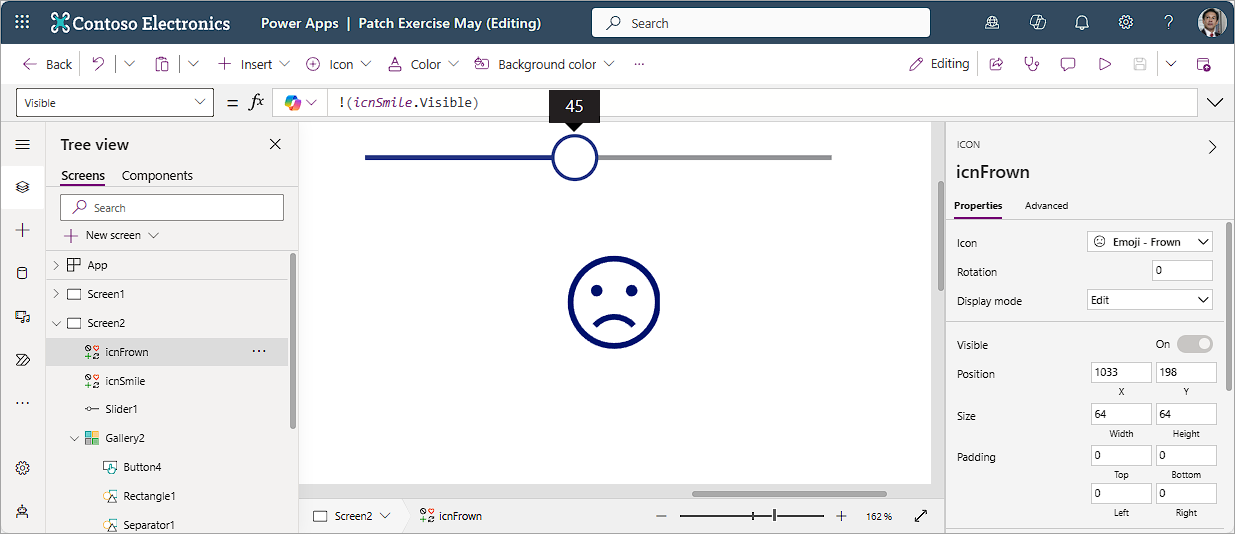
On the same canvas, insert an Emoji-Frown Icon control. Name it icnFrown.
Set the Visible property to:
Not(icnSmile.Visible)Preview the app and move the slider value. When the value is greater than or equal to 50, the Emoji-Smile Icon is visible and the Emoji-Frown icon is hidden. If the value is less than 50, the Emoji-Frown shows and Emoji-Smile is hidden.
Change your formula for the Emoji-Frown to:
!(icnSmile.Visible)Preview the app and you should see no change in the behavior. You can overlap the two icons in the same space, and it appears that the same icon smiles or frowns based on the slider position.
You can use true or false with visibility to overlap controls. As long as they inhabit the same space, the visible control acts like it's on the top of the stack. This is all based on understanding true and false. We also learned about the Not (!) function, and the ability to reference the value of another control. These are important tools to master as you create your own solution.
