Custom assets for Touch Adaptation Layouts
Providing semantic icons on the controls in your touch adaptation layouts is an effective way to communicate to players of your game what each of the controls are meant to do. While players familiar with an Xbox controller will quickly understand the common A, B, X, Y buttons, other players may find it easier to understand your touch controls if they show the actions that those controls will trigger. For instance, instead of having a button with the Xbox A on it, a button with an image of a person jumping can help players understand what action each control will perform.
While you can select from a built-in set of icons for your controls, you can also customize them with artwork that matches the visual aesthetic of your game. Doing this allows your game's touch controls to feel like a much more integral part of your game, and therefore makes the experience of playing your game feel more native to mobile.
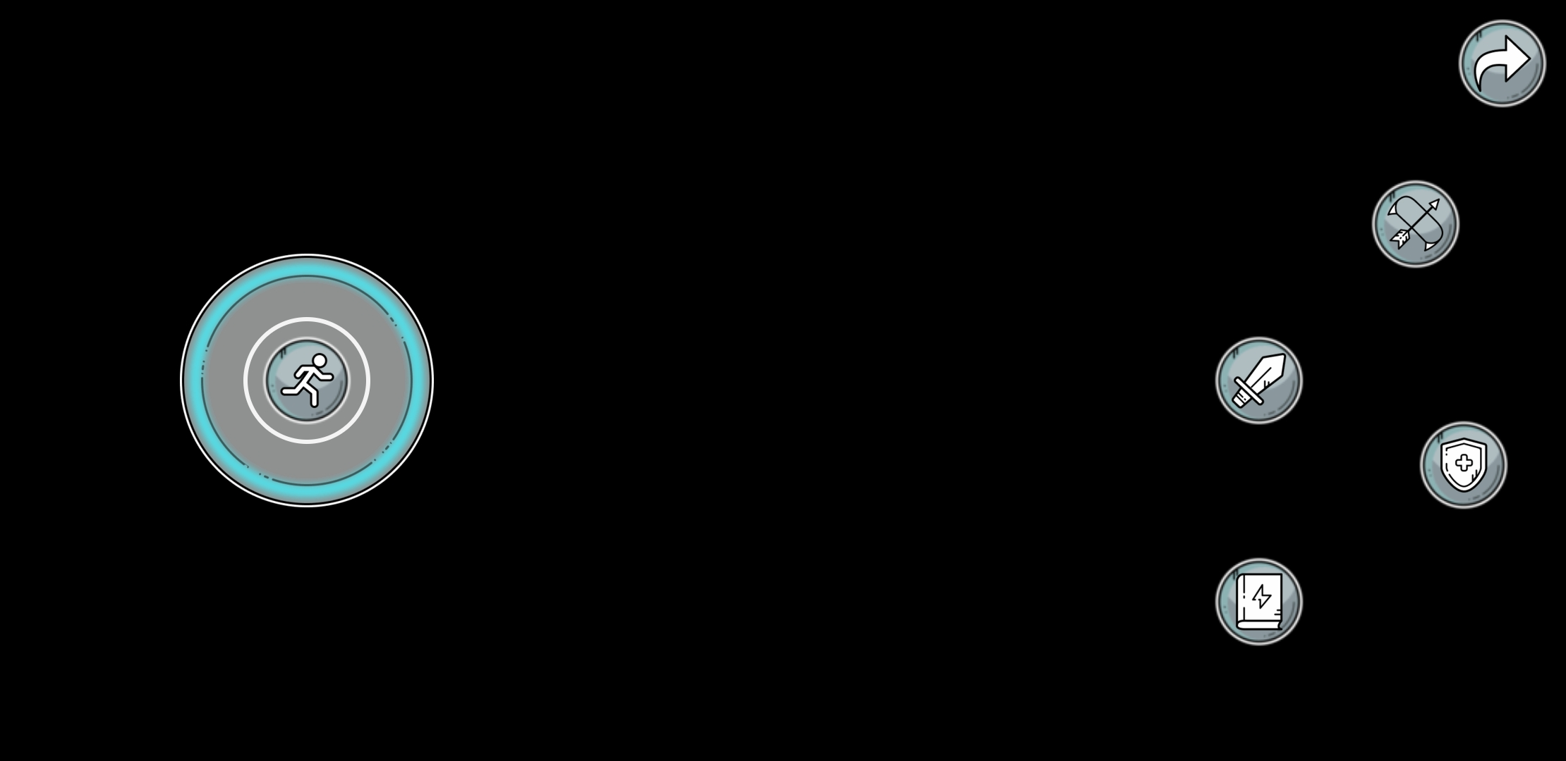
For example, here is a layout which was built using standard icons:
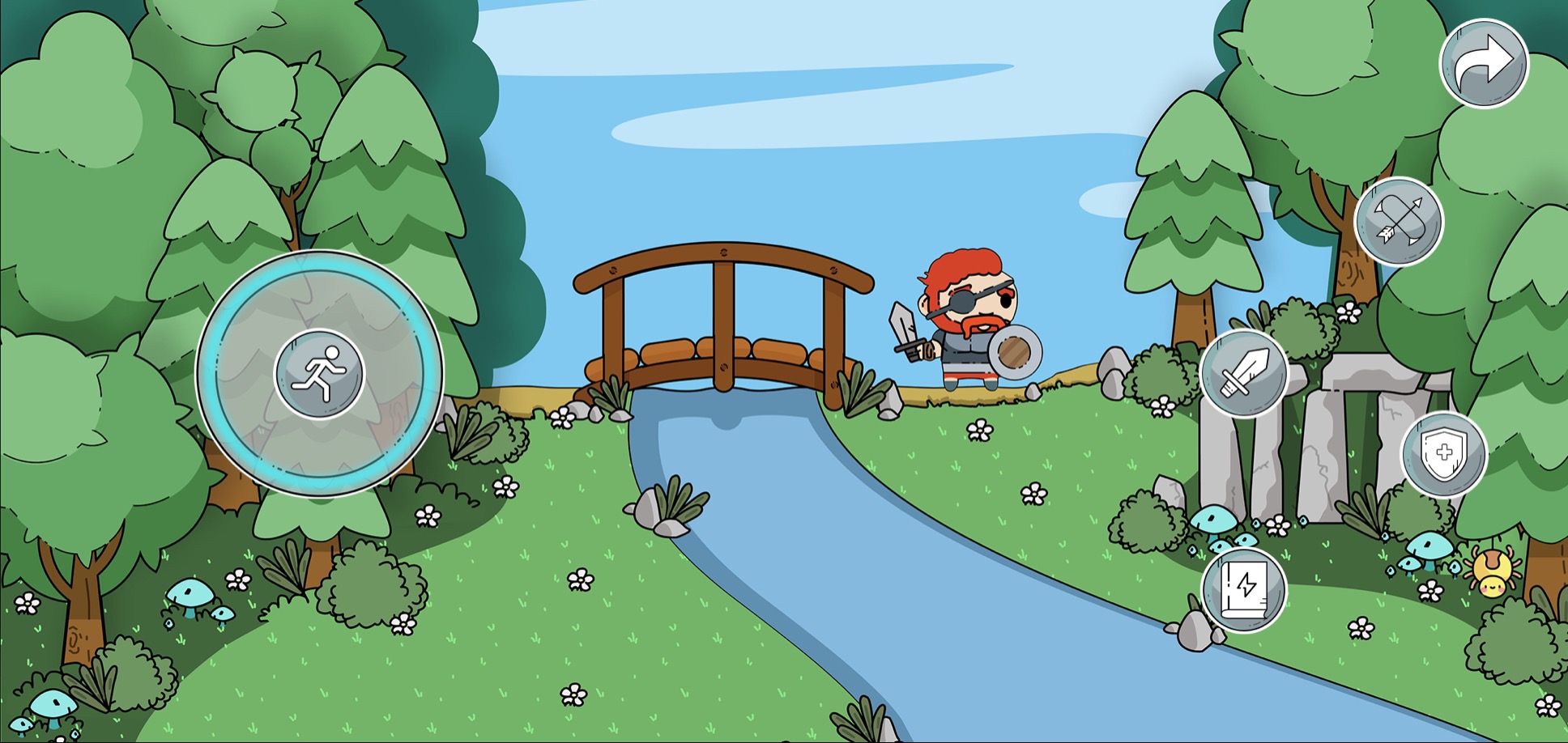
And here is the same layout using custom artwork:
When this layout is loaded over its game, the custom artwork helps to tie the visual style of the touch controls to the visual style of the game.
Asset Files
Assets are PNG files, which are required to be provided at a base resolution and at 1.5x, 2.0x, 3.0x, and 4.0x scales of that base resolution. This allows the game streaming app to select the best version of your asset to display based upon the DPI of the device that the game is being streamed on. The base resolution for each asset type is listed below.
The touch adaptation kit supports localization of assets, which enables you to provide different assets depending upon the language of the device that your game is being streamed to. Each localized version of an asset must include all the required resolutions.
When laying out your assets on disk, the file structure is organized first by language and then by asset scale. So for example, your file structure might look something like this:
assets/
    neutral/
        @1.0x/
            JoystickBackground.png
            JoystickKnobBackground.png
            JoystickKnobForeground.png
        @1.5x/
            JoystickBackground.png
            JoystickKnobBackground.png
            JoystickKnobForeground.png
        @2.0x/
            JoystickBackground.png
            JoystickKnobBackground.png
            JoystickKnobForeground.png
        @3.0x/
            JoystickBackground.png
            JoystickKnobBackground.png
            JoystickKnobForeground.png
        @4.0x/
            JoystickBackground.png
            JoystickKnobBackground.png
            JoystickKnobForeground.png
    fr/
        fr-CA/
            @1.0x/
                JoystickKnobForeground.png
            @1.5x/
                JoystickKnobForeground.png
            @2.0x/
                JoystickKnobForeground.png
            @3.0x/
                JoystickKnobForeground.png
            @4.0x/
                JoystickKnobForeground.png
        @1.0x/
            JoystickKnobBackground.png
        @1.5x/
            JoystickKnobBackground.png
        @2.0x/
            JoystickKnobBackground.png
        @3.0x/
            JoystickKnobBackground.png
        @4.0x/
            JoystickKnobBackground.png
In this setup, Canadian French would use a fr-CA JoystickKnobForeground asset, the fr JoystickKnobBackground asset, and the netural JoystickBackground asset. France French would use the fr asset for both JoystickKnobForeground and JoystickKnobBackground, and the neutral asset for JoystickBackground. All other languages would use neutral assets for everything.
Referencing Assets From Layouts
Assets are referenced from within the style section of the control that the asset is being applied to. In order to reference the asset, the type of the item being styled should be "asset" and the value should be the name of the asset file without the PNG extension. For example, a joystick styled with the assets from above might be configured like this:
{
  "type": "joystick",
  "styles": {
    "default": {
      "background": {
        "type": "asset",
        "value": "JoystickBackground"
      },
      "knob": {
        "faceImage": {
          "type": "asset",
          "value": "JoystickKnobForeground"
        },
        "background": {
          "type": "asset",
          "value": "JoystickKnobBackground"
        }
      }
    }
  }
}
Given this style, for each of the three assets being used for the joystick, the touch adaptation kit will use the language and DPI of the player's device to find the best matching asset for the layout to use. Therefore, the layout does not specify either a language or an asset scale to use, as the touch adaptation kit will automatically find the best matching asset.
Using Assets with Variable Replacement
It is also possible to change the asset being used by a layout at runtime using the XGameStreamingUpdateTouchControlsStateOnClient API. In order to do this, the list of potential assets for the control must be defined in the context.json file for your touch adaptation bundle.
context.json:
{
    "$schema": "https://raw.githubusercontent.com/microsoft/xbox-game-streaming-tools/main/touch-adaptation-kit/schemas/context/v3.3/context.json",
    "definitions": {
      "potionButtonImages": [
        "Empty",
        "Healing",
        "Invisibility",
        "Mana"
      ]
    },
    "state": {
      "potionButtonFaceImage": "Empty"
    },
    "allowedStateValues": {
      "potionButtonFaceImage": {
        "$ref": "#/definitions/potionButtonImages"
      }
    }
  }
}
This sets up the context for the bundle to allow any of Empty.png, Healing.png, Invisibility.png, or Mana.png to be used for the potion button image in a layout. The currently selected image is stored in the state variable potionButtonFaceImage. The button itself would be configured with a reference to this context:
layout.json:
{
  "type": "button",
  "styles": {
    "default": {
      "faceImage": {
        "type": "asset",
        "value": {
          "$ref": "../../context.json#/state/potionButtonFaceImage"
        }
      }
    }
  }
}
This tells the button to use whatever asset is currently stored in the context's potionButtonFaceImage state variable as its face image.
Finally, when the game wants to change which image is currently displayed on this button, it would use code such as:
HRESULT ChangePotion(XGameStreamingClientId client, const char* potionName)
{
    XGameStreamingTouchControlsStateOperation updateOperations[1] = {};
    updateOperations[0].operationKind = XGameStreamingTouchControlsStateOperationKind::Replace;
    updateOperations[0].path = "/potionButtonFaceImage";
    updateOperations[0].value.valueKind = XGameStreamingTouchControlsStateValueKind::String;

    // potionName is one of "Empty", "Healing", "Invisibility", "Mana"
    updateOperations[0].value.stringValue = potionName;

    return XGameStreamingUpdateTouchControlsStateOnClient(client, _countof(updateOperations), updateOperations);
}
This code changes the name of the asset stored in the potionButtonFaceImage state variable, which will then cause the newly selected asset to appear in any layout which is referencing this state in its styles.
Custom Asset Sizes
The following table summarizes the elements on each control which can have a custom asset applied, and what the maximum pixel sizes are for the 1.0x scale of each asset.
| Control | Styleable Element | @1.0x Pixel Size |
|---|---|---|
| ArcadeButton | background | 60 x 60 |
| faceImage | 60 x 60 | |
| Button | background | 60 x 60 |
| faceImage | 60 x 60 | |
| DirectionalPad | background | 60 x 60 |
| Joystick | background | 120 x 120 |
| knob/background | 60 x 60 | |
| knob/faceImage | 60 x 60 | |
| Throttle | knob/background | 60 x 60 |
| knob/faceImage | 60 x 60 | |
| Touchpad | background (renderAsButton = true) | 60 x 60 |
| background (renderAsButton = false) | 120 x 120 | |
| faceImage | 60 x 60 |
Pixel sizes for ArcadeButton faceImage, Button faceImage, Joystick knob faceImage, Throttle knob faceImage, and Touchpad faceImage assets are:
| Scale | Pixel Size |
|---|---|
| @1.0x | 60 x 60 |
| @1.5x | 90 x 90 |
| @2.0x | 120 x 120 |
| @3.0x | 180 x 180 |
| @4.0x | 240 x 240 |
Pixel sizes for ArcadeButton background, Button background, DirectonalPad background, Joystick knob background, Throttle knob background, and Touchpad (with renderAsButton=true) background assets are:
| Scale | Pixel Size |
|---|---|
| @1.0x | 60 x 60 |
| @1.5x | 90 x 90 |
| @2.0x | 120 x 120 |
| @3.0x | 180 x 180 |
| @4.0x | 240 x 240 |
Pixel sizes for Joysitck background, and Touchpad (with renderAsButton=false) background assets are:
| Scale | Pixel Size |
|---|---|
| @1.0x | 120 x 120 |
| @1.5x | 180 x 180 |
| @2.0x | 240 x 240 |
| @3.0x | 360 x 360 |
| @4.0x | 480 x 480 |
Image Quantization
When building a touch adaptation bundle, the TAK CLI will perform quantization on the provided PNGs in order to reduce the size of the produced .takx file. While the quantization should not affect the appearance of the assets, it is still a good idea to verify that the assets as they appear in a touch layout match what you believed they would look like when creating the images.
If the quantization process is affecting the way your images are rendering, it may be disabled by passing the --no-asset-optimization option to the TAK CLI when building your bundle.