Changing the color theme for Outlook 2013
If you’ve upgraded to Outlook 2013 and are struggling with the new softer look, and missing the older higher contrast look in the reading view, you may be wondering about changing the themes. Outlook does have a few themes that can be changed, however they really only change the perimeter, and don’t change the email list.
I'm told to give the new themes some time, and they will grow on you, and perhaps they will, and perhaps I'll give them a try, but for now, I've got way too much email, and I feel like I'm straining to read and find relevant content. so, here’s an quick way to at least get a higher contrast, black on white email list:
| Outlook 2013 Default Theme (Blue on white) | Modified View to Black on White |
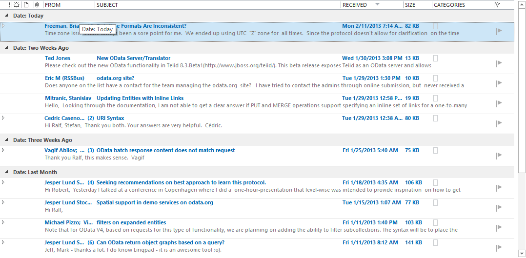 |
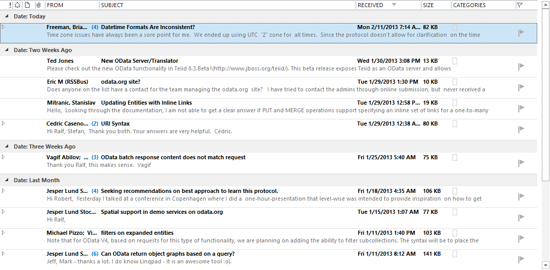 |
To Change the email:
- In the Ribbon, select View
- Within the View tab, select Change View
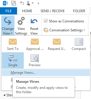
- In the Manage All Views dialog, select <Current view settings>, then select [Modify…]
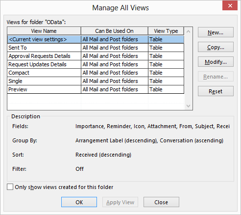
- Select [Conditional Formatting…]
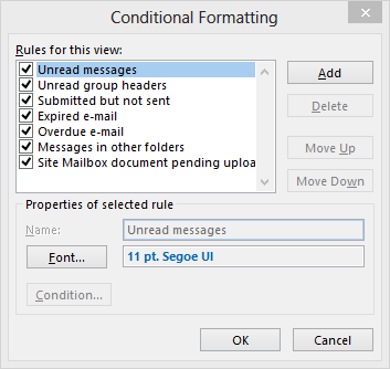
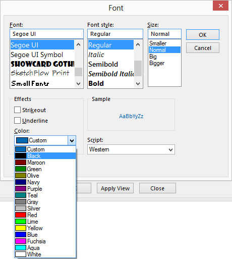
- Notice the [Font…] configuration, with the nice soft blue font color
- Simply select Color and change from Custom to Black
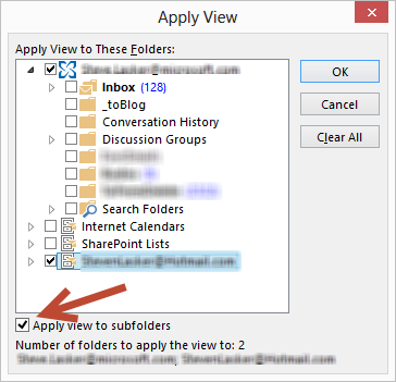
- Apply the view to all folders
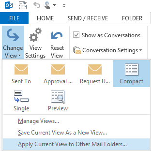
- From the same view menu, select Change View
- Select Apply Current View to Other Mail Folders…
- Simply select the folders you wish to update, and check the Apply view to subfolders checkbox if you’d like as well.
While this doesn't change all the elements back to the 2010 theme, like the folder icons in the navigation, it at least provides a little more contrast to view way too much email.
Steve
Comments
Anonymous
March 15, 2013
With your suggestions, I was able to change my view to be a slight bit better. After hours of playing with themes and searching on the internet, your suggestions worked the best. Thank you!Anonymous
March 27, 2013
Thank you for this tip, it helps somewhat. Hopefully some themes get released soon.Anonymous
April 04, 2013
Thanks. This helped me make changes and improve my Outlook view!Anonymous
April 15, 2013
THANKS FOR THAT it was driving me mad I hated the new colourAnonymous
April 23, 2013
Thanks. I wish there're more changes to the themes, because all that white color is blinding!Anonymous
April 26, 2013
Thanks, this was the most helpful of all the online advice I found - changed a little so at least can see new emails more easily (I went for bold red!)Anonymous
April 29, 2013
Thanks for the tips! Easy to change with your directions.Anonymous
May 01, 2013
Thank you. I also did not like the custom color.Anonymous
May 29, 2013
I think one should just roll back. The person who designed the new look and feel of the outlook part of the new office was depressed. Working whole day on emails is now such a boring experience...Anonymous
June 06, 2013
A nice step towards making Outlook 2013 more bearable. I still miss my Blue Theme dearly - is there really no way to create new themes, like for VS2012?Anonymous
June 28, 2013
My bet is 'they' will eventually provide more options and improve this functionality? I am certain this light on light dumb and basic rule breaking setting will not grow on me or many others. Thank for the useful tutorial ! FCAnonymous
July 02, 2013
Thank you, thank you, thank you! I want contrasts and I want BOLD! What were they thinking? I have no problem with them making their "custom" view one of a set of options, just so I can customize the way I want it to look. I paid a lot of money for this software and, at the very least, I should be able to customize the colors.Anonymous
July 18, 2013
Thank you!!!!Anonymous
July 30, 2013
Thanks!!Anonymous
August 01, 2013
The person who designed this must be under 30 because anyone older than that can't read a thing without contrast. Changing the font and color really does very little once you've read the emails, goes back to black.Anonymous
August 04, 2013
This has really helped. Before I read this, viewing mails in outlook 2013 had become a nightmare!!Anonymous
August 05, 2013
Wow, this will be an easy fix for an install base of a 1000 users. Managing IT is hard enough, now we have a new version that puts us back 10 years. This is great. Thanks Microsoft....your UI is horrible.Anonymous
August 12, 2013
Thanks!!!! This worked wonders!!!!Anonymous
August 13, 2013
The comment has been removedAnonymous
August 20, 2013
What a bunch of blithering idiots at MicroSoft. Idiots. Stupendous, vile, inconsiderate and remarkably dense, idiots.Anonymous
September 10, 2013
The comment has been removedAnonymous
September 11, 2013
You Sir, saved my life. thank you for uploading this quick solutionAnonymous
September 26, 2013
The comment has been removedAnonymous
September 27, 2013
good fix... MS once again trashes a nice product Office 2010 which I loved compared to the rest... now I have a partially readable setup with ALL CAPS in the TABS... if I did not have to support this POS, i would go back to 2010, but with MS, 2 steps forward 3 steps back....Anonymous
October 08, 2013
The 2013 format is absolutely awful! The Microsoft designers should all be fired. This is a cruel joke on us all.Anonymous
October 12, 2013
The comment has been removedAnonymous
October 13, 2013
I agree with you completely. I've given 2013 a pretty long time, and I would switch back to 2010 in a heartbeat based purely on the appearance. The "softer" look is actually much harder on the vision. Not being able to modify the "skin" is a huge step backwards for Office.Anonymous
October 14, 2013
Thanks Steve, it was really a good suggestion. Its really frustrating when microsoft does make such sort of changes.Anonymous
October 23, 2013
The new themes grow on you like cancer - it does not get better with time! Eye strain is prevalent with our office on the new stuff. I've been asked to repurchase old software to relieve the eyes. These suggestions are good but unfortunately MS has messed up. The person who came up with this should be fired or given a job in the basement shoveling coal into the furnace to keep real workers comfortable.Anonymous
October 27, 2013
Go to "Files" then click "Office Account". You can change the background theme and the background color. I chose Dark Grey but I used Steve's method above for changing the font.Anonymous
October 27, 2013
Thank you for providing a simple, easy to follow solution to my eye strain. When I opened Outlook for the first time after the change, I was definitely unhappy but now I'm able to deal with the new format much better!Anonymous
October 28, 2013
That is about as close as we are going to get! Thanks a lot for this. Even the minor change is much easier on the eyesAnonymous
October 31, 2013
You can also go to the More Commands Tab, click on General and change the Office Theme to a darger Gray instead of white. It seemed to help with the contrasting of the Bold fonts.Anonymous
November 01, 2013
Thanks for that, and I will put my vote in on yes, I don't like the colors or the ability to change them, the contrast is NOT good.Anonymous
November 05, 2013
I really don't know what all these people are complaining about. It really is not that bad. The simplistic UI design is the trend almost all companies, including Apple and Google are using. The 3D button with drop shadows look is a thing of the past. It is slow and and wastes resources.Anonymous
November 08, 2013
THANK YOU!!!.. I couldnt stand the soft blue look, the emails were not standing outAnonymous
November 08, 2013
You saved the day! I followed your directions setting all to black. Then I went back and set only the unread messages to black, bold. Wow. So much better. Who at microsoft is making these decisions? Did they test 2013 at all? It's bizarre. Between Windows 8 and this, the future doesn't look bright. (Or bold!? LOL) Thanks again.Anonymous
November 11, 2013
Being colour blind i struggled to determine which messages were read / unread... Thank you so much.Anonymous
November 15, 2013
Thanks for the info, it is great. Especially for a 67 year old like me. Seems like the kids at Redmond doesn't realize what us elders have to contend with. Hey, kids wake up!Anonymous
November 19, 2013
The comment has been removedAnonymous
November 26, 2013
Thanks for this post, it helped. One more useful change is to the Office Theme, which can be found at File->Options->General->Office Theme. Changing this to Dark Gray really helped improve the contrast.Anonymous
December 05, 2013
Thanks for the tip. APdidy gave the other good advice for breaking up the white noise.Anonymous
December 27, 2013
Thank you, so much! I'm not sure how anyone could get used to the new washed-out default view. It's terrible and very stressful on the eye!Anonymous
January 06, 2014
Thanks a lot.........Anonymous
January 06, 2014
I am still with Windows Outlook 2010 and staying due to colors of 2013Anonymous
January 14, 2014
Shame on you microsoft. We pay you to blind usAnonymous
January 16, 2014
Thanks for this, our entire department is relieved (both emotionally and ocularly) by this solution!Anonymous
January 17, 2014
The comment has been removedAnonymous
January 19, 2014
General speaking , this version is not good at all . and we all we will end up to be blind very soonAnonymous
January 29, 2014
Thank you Mr. Lasker; my anxiety is cured now....many sleepless nights about this.Anonymous
February 02, 2014
Microsoft has lost their mind! The changes they are making are pathetic and short sighted. They spend their time revamping what they have and there is no real product innovation. I mean Outlook was just fine...if they wanted to improve it, make the changes work with tablet versions only...Getting rid of the Start Menu...that ought to make a few million users happy!Anonymous
February 03, 2014
Thanks for trying to help us. This is the worst version ever! I am switching to Thunderbird and Open Office!Anonymous
February 03, 2014
It really needs some darker color selections. Does anyone from MS like to comment?Anonymous
February 05, 2014
The comment has been removedAnonymous
February 05, 2014
The comment has been removedAnonymous
February 05, 2014
Thanks for the help. Good grief Microsoft you can do better than this!!Anonymous
February 05, 2014
Just can't look at it any longer. Going to sell my copy of 2013 and go back to 2010...Anonymous
February 05, 2014
Finally....I tried using the new theme thinking I would get accustomed to it, but I just could not get to where I liked it at all. This helps tremendously. Thank you.Anonymous
February 06, 2014
Thanks! Your suggestions worked well. Still dumbfounded by what Microsoft was thinking with the changes to Outlook and the removal of contrast settings.Anonymous
February 06, 2014
I followed every step EXACTLY as described and NOTHING Changed... Help, tell me what to do!Anonymous
February 12, 2014
Thank you. Got what I was expecting...Anonymous
February 15, 2014
Thank you, very helpful!Anonymous
February 20, 2014
yeahh!! now is prettier . but it isn't help anything on productivity. just another useless featureAnonymous
February 25, 2014
Appreciate the modification which helped, but like most of the people here, it is not close to the pleasing views of past. Why mess with something that is not broke!? I will impatiently wait for the patch to provide more options as it looks like many are unsatisfied.Anonymous
February 26, 2014
Wow! Way better than it was before. Thank you!Anonymous
February 26, 2014
Great tip. thank you!Anonymous
March 02, 2014
The comment has been removedAnonymous
March 05, 2014
Thank you so muchAnonymous
March 13, 2014
Thank you !!!!Anonymous
March 17, 2014
Thanks for the comment helped a bit but still highly irritated with this stupid new view and lack of flexibility in the software to change itAnonymous
March 18, 2014
Glad that I found this tutorial. Thank you.Anonymous
March 22, 2014
Thank you so much. Back to Business!!Anonymous
March 25, 2014
Many Thanks !Anonymous
April 02, 2014
Thanks ....!!!!Anonymous
April 03, 2014
Thank you, Thank you, Thank you...Anonymous
April 08, 2014
Thanks for this helpful article. MS are you listening?Anonymous
April 09, 2014
GREATEST HELP EVER!!! you rock!Anonymous
April 15, 2014
A year after you posted this and still helping hundreds!! Thank you for this.Anonymous
April 17, 2014
Thanks for the note, likely very helpful for most. Sadly, I already had a bunch of colors setup for different email senders and this procedure wiped out all my previously setup formatting :( Oh well.
- Mary
Anonymous
April 22, 2014
The comment has been removedAnonymous
April 23, 2014
THANK YOU THANK YOU THANK YOUUUUUUUUUUUUUU!!Anonymous
April 28, 2014
The comment has been removedAnonymous
April 30, 2014
The comment has been removedAnonymous
April 30, 2014
Thank you for the help! It worked and i am a little bit more comfortable. - Murat Tamer from TurkeyAnonymous
May 07, 2014
The comment has been removedAnonymous
May 07, 2014
thanks! I so hate these default settings in the new office and windows 8 as a whole, oh why did they discard XP!Anonymous
May 15, 2014
Wow to all the comments and people with the exact same impression. I had Office 2013 for all of half a day before wanting to change it. First hit was this page so HUGE thank you to original poster.Anonymous
May 18, 2014
The mandatory white background for the message list makes it very hard to read. This is a real problem for me and many in my workplace.Anonymous
June 11, 2014
The comment has been removedAnonymous
June 19, 2014
Thank you so much!! My eyes feel so much better already!Anonymous
June 24, 2014
Thanks for the suggestions. It somewhat helped. But I still hate the new Outlook with a purple passion. It all blends together...Anonymous
June 24, 2014
Maybe it's already in the comments above, but I'll add this: it's impossible to tell whether Outlook (or, I suppose, any other MsOffice app) is in focus any more. It was hard enough with Office 2010. The only way I can tell is to switch to some non-Office app (Firefox, for instance), then back. What a deprovement!Anonymous
July 08, 2014
Thanks for the help, new outlook stinks, old was so much easier to read and manage, now if I could just figure out a way to separate everything from the white background.Anonymous
July 08, 2014
Thank you for the step-by-step instructions.Anonymous
July 09, 2014
What a relief! It's still not as easy on the eye as Office 2010 but much better than the default view of Office 2013. Is there no way of communicating directly with Microsoft Office and getting come feedback from them?Anonymous
July 14, 2014
Thank-you for the help!!! Boo Hiss on Outlook 2013. White on White? Really? It's like being snowblind when you are trying to look at email. Who thought this was a good idea?Anonymous
July 17, 2014
The comment has been removedAnonymous
July 19, 2014
MUCH better! ThanksAnonymous
July 24, 2014
Thank you! It is looking better and your clear directions lead me to figure out how to change the font for read vs. unread messages so they would be more distinct.Anonymous
July 28, 2014
Thank you very much!Anonymous
July 28, 2014
Like you mentioned I used the rather simpler way. Meets my immediate needs. Thank youAnonymous
August 03, 2014
What a relief I thought it was just me being a dits and not finding the colour on / off switch.... will try your suggestions soonest.Anonymous
August 04, 2014
I'm so glad others are having difficulty reading this washed out smailler font too! I thought it was just my age - makes me feel somewhat better!! BTW this was an awesome suggestion, thank you!!!Anonymous
September 12, 2014
Fire the guy who designed this theme and the PM who approved it. Eyes are going blind after staring at outlook for couple of hrs.Anonymous
September 22, 2014
Thank you sooooo much for this post. That blue was killing me! I cannot believe this 'upgrade' only has basic colors! I agree... fire the guy who took us back in time!!Anonymous
September 24, 2014
Thanks for the tips.. I say no more than the comments that has already been made... your tips helped alot.. Well done!!!!Anonymous
September 29, 2014
Thanks a lotAnonymous
September 30, 2014
Perfect! Thanks!Anonymous
October 01, 2014
The blandness of Outlook 2013 was shockingly tough to look at. I just upgraded from Office 2007 to 365 today on one computer. I use two PC's with 24" widescreen monitors. Going to see if I can stomach looking at this all day before I upgrade the other. Thank you so very much for your post!! Great to have an easy to read & follow step-by-step fix. It helps a little to sharpen up the font, but I sure miss being able to change color themes. The bland gray/white of Outlook 2013 makes it hard to focus... it's all a blur. :-( I wonder if we will get more options... very disappointed.Anonymous
October 09, 2014
Thanks! Very helpful.Anonymous
October 09, 2014
Thank you so much for this information... it was nightmare before, trying to easily see what was read v. unread. This VASTLY improves that. I agree with a lot of the comments... the new 'bleached out' appearance (as someone commented) is horrible... I really hope to have the blue theme back soon.Anonymous
October 14, 2014
I think I just fell in Love with the new interface. I made the change above and was happier. Then I went back and increased the font size. What a great change for my 52 year old eyes! The white background is still a bit much, but this is far better. Yes, I could have changed the resolution for the entire computer, but it is really only the email that was hard to read. Try this: Change views Manage views Modify Conditional formatting keep everything checked Font click big Don't forget to apply to other folders like the original instructionsAnonymous
October 14, 2014
The comment has been removedAnonymous
October 14, 2014
Tell the developers to open up changing the color for the background and the panel stuff, where the "chrome" used to be.Anonymous
October 30, 2014
Thank you! Very helpful!Anonymous
November 02, 2014
Says a lot that it's been nearly 2 years since your post, and we're all still thanking you for this!! I'm with the many above who said, "If it ain't broke, don't fix it!"Anonymous
November 02, 2014
Thanks :)Anonymous
November 04, 2014
I hate the new look and equally upset that a themes cannot be selected...the tips here were useful - thanksAnonymous
November 06, 2014
I also hate the all-white or grey options - AWFUL!!!! This contrast thing helps only a little, but a little is helpful. MS you need to see the different personality and perception-types of humans out here: a lot of us like contrast and soft colors in our lives. I am going to have to keep my Outlook very minimized on my desktop I hate this so much. And in the past I have always had it open and have been very responsive to emails...Anonymous
November 13, 2014
The comment has been removedAnonymous
November 18, 2014
much much better. thank youAnonymous
November 18, 2014
This was helpful, but I also found that I could change the look through adjusting the theme. Go to File, then office account, Change office theme from drop down to light gray or dark gray( I liked dark gray best.). You can also select an office background which is cute if nothing else. Still not the pleasant view of Office 2007 0r 2010, but better than the default settings. Thanks again for your help.Anonymous
November 18, 2014
just a WOW!! it really helps!! thank youAnonymous
November 23, 2014
The comment has been removedAnonymous
December 04, 2014
Thanks so much! Crises over :-)Anonymous
December 04, 2014
Thank you, this helped.Anonymous
December 10, 2014
"I'm told to give the new themes some time, and they will grow on you" For me, this is one of the most consistently offensive kinds of statements from Microsoft. It is the kind of thing Jensen Harris would say.Anonymous
December 11, 2014
The comment has been removedAnonymous
December 12, 2014
I would disagree about growing on you. I would suggest next time you get a focus group with older participants as well as the young ones. I am by no means ancient but as you age your "contrast sensitivity" decreases and the new softer look is not helping. Search the internet for contrast sensitivity and aging.Anonymous
December 31, 2014
I don't think it has anything to do with age. I am a very visual person and the inability to change priorities of certain e-mails is difficult. Your change to B&W helped. ThanksAnonymous
January 02, 2015
I'm only 30 and I find it hard to distinguish the different sections!! ..... Particularly when using the laptop outside......Stupid!!! ..... Surely a quick fix would be to enable us to right click on the different ribbons and scroll bars in order to select a different background colour......Anonymous
January 05, 2015
This new look and feel stinks!Anonymous
January 06, 2015
I can't tell people how bad the Outlook 2013 color scheme is. Thank you for your suggestions it really helps the eyes. I read on another Blog from a MSMVP that she was going to sell her stock in Microsoft if this was the direction MS is headed in, frankly I agree. The lack of visual ques, makes for a long day of eye squinting and headaches.Anonymous
January 06, 2015
"I'm told to give the new themes some time, and they will grow on you." Translation: "Prepare to be assimilated. Resistance is futile."Anonymous
January 07, 2015
The comment has been removedAnonymous
January 09, 2015
Seriously, this saved me. I'm a consultant and just switched from Google Aps to Microsoft 365 once I started reading that it was working well for people like me. I was so excited to escape G-mail -- though I had it syncing with MS Outlook I still had to use the web access from time to time. And then I got this new inbox I couldn't process without studying it for five minutes. I think this is less of an age thing (I'm in my late 40s, so older but not ancient) but more about what your profession and life requires and how you prefer to work. I need to stay on top of my inbox for both personal and professional e-mails; I need to be able to get through it quickly and keep it organized. It's not social media for me.Anonymous
January 11, 2015
The comment has been removedAnonymous
January 13, 2015
Thanks!!!Anonymous
January 14, 2015
Thank you very much. This helped a lot.Anonymous
January 19, 2015
Thanks a lot, really good input, Helped a lotAnonymous
February 03, 2015
The comment has been removedAnonymous
February 16, 2015
Thanks Steve!!!! You made my day :-) I spend majority of my time on email and the light colors in outlook 2013 were not at all helping. I just cannot tell you how much appreciative I am about this suggestion.Anonymous
February 21, 2015
Here we are, in 2015, and there is still no easier way to fix this. Thank you!Anonymous
February 24, 2015
The comment has been removedAnonymous
February 24, 2015
Well, some other side effect does not please me. Websites background pictures are not show but replaced by the defined color. Probably other side effects will come up the next days. Time for Microsoft to solve this issue; let the outlook background by default follow the above described setting and make it on top of that configurable in Outlook settings.Anonymous
March 08, 2015
People like you amaze me... taking time to help people... even the little things make life better. Thx for making life better!Anonymous
March 09, 2015
Thank you so much - I can't describe how much this helps!Anonymous
March 16, 2015
Thanks a lot. Btw any possibility to change the theme other than the 3. For sample light blue or some thingAnonymous
March 18, 2015
The comment has been removedAnonymous
March 19, 2015
Thanks for your help. This does help some, but the folks at Microsoft should be subject the the headaches that the new color scheme is causing me even with these changes.Anonymous
March 23, 2015
super directions, worked a treat, thanks so muchAnonymous
March 26, 2015
Big help! Thank you :)Anonymous
April 01, 2015
This was exactly what I needed to know! Wish this was more clear that I could do this in 2013 before now!!!Anonymous
April 02, 2015
Thank you so much!!!! Microsoft should really pay attention and offer more colors/themes. I am an Engineer and looking at the screen is awful to me! My company decided to upgrade everyone to Office 365 and right now, I am not a fan.Anonymous
April 09, 2015
Absolutely SUPERB !Anonymous
April 11, 2015
Not a fan so far, like everyone else on here, the lack of colors are killing my eyes. I've adjusted the limited setting to a better view, but still not like my older 2007 Outlook.Anonymous
April 20, 2015
The comment has been removedAnonymous
April 20, 2015
Forgot to tell, apart from user-unfriendly it's got LOTS of bugs and bogus behavior. I came into this blog precisely because the stupid office 2013 FORGETS the "dark gray" theme setting and goes back to "suicidal eye-killer white". Thanks so much!!Anonymous
May 04, 2015
Glad I wasn't the only one! Thanks.Anonymous
May 05, 2015
I absolutly hate the new look. IT IS BLINDING! I hope Microsoft is listening. I can't belive you cannot select a contrast and background that works best for you.Anonymous
May 07, 2015
One of the worst unfriendly outlook ever, it tooks me 2 hours to make it look a bit better that it was.. this awfull white its realy annoying when you use that for 8-10 hours every day, if it was at my hand i will removed asap from my computer.Anonymous
May 10, 2015
Terrible, I want to go back to 2010 version this one is too complexAnonymous
May 11, 2015
Thank you for this tip - worked like a treat!Anonymous
June 11, 2015
The comment has been removedAnonymous
June 19, 2015
thanksAnonymous
June 22, 2015
I've just moved from 2003 to 2013 and gone BACKWARDS! I cannot cope with the new soft look so thank you for the tips. I'd like to change it all to the familiar 2003 which was so easy to use, lol!Anonymous
July 02, 2015
Thank you for your great tip !Anonymous
July 09, 2015
Awesome suggestions. Thanks for the heads-up.Anonymous
July 28, 2015
I hope Microsoft are seeing this feedback. I hate the new view - its a strain on the eyes. Thanks for these tips - its an improvement but still far from idealAnonymous
August 03, 2015
At last a useful tip to make email writing more agreeable on Outlook 2013. A big THANK-YOU!Anonymous
August 03, 2015
Thank you a million times over! The new view was causing too much eye strain.Anonymous
August 04, 2015
BEST HOW-TO EVER! This was a life saver.Anonymous
August 10, 2015
I can't enjoy my outlook any more, I can't even read very well. please upgrade the them.Anonymous
August 14, 2015
Thank you for the tips and I agree this does make it look as good as possible given the current options, however Outlook still looks horrible! The choices in background between white, gray, and dark gray is ridiculous. Why not be able to pick from the full color palette? I get the best readability with dark gray and the black font, however it is so depressing to look at. And the themes, what is up with that? Those look like their kids kindergarten doodles, scanned them in black and white and then sold to them msft. It would be great if they would release a 2010 skin to give me the old look. Or at least give me downgrade rights through Office365.Anonymous
August 28, 2015
The comment has been removedAnonymous
August 31, 2015
The comment has been removedAnonymous
September 01, 2015
In my opinion, two functions that Microsoft missed badly in the user-interface design of Office 2013 are 1)efficient use and minimal waste of screen real estate for the user interface and 2) color-contrast schemes to minimize eye strain when the computer screen will be used for 8, 10, or more hours per day. It has been a long time since computers were limited to no more than 8-bit (256) color. The large color palettes and shading can be used to both more readily separate user interface elements (while minimizing screen real estate use for and between the interface elements) and also to reduce eye strain in long sessions of uninterrupted work in front of computer screens.Anonymous
September 02, 2015
Thanks! The first thing I wanted to do when I saw the new layout was to figure out how to get more contract. I was forced to upgrade by IT, and find my eyes straining to read the gray. I agree with everyone that it was a dumb decision, sacrificing functionality. I'm an Admin, and my job is collection and disseminating information, and any limits to my speed in getting this done is both frustrating and time consuming -- time I would agree for everyone here is at a premium.Anonymous
September 11, 2015
Thanks for this helpful tutorial. I, too, am hoping that new themes (with more user-friendly contrast options) are added soon. MS can now say that they have created the worst UI ever.Anonymous
September 24, 2015
I think MS Development figured a UI devoid of depth, color, and texture would go unnoticed since a majority of users are still looking for the Start Menu....Anonymous
September 28, 2015
Thanks a lot for the tip,that was very helpfull.Anonymous
October 08, 2015
Thanks for the tip.. It worked!!Anonymous
October 10, 2015
Thank you, this is really helpful.Anonymous
October 12, 2015
Brilliant - have had it less than 24 hours and it was driving me mad already! This has really helped - thanks.Anonymous
October 14, 2015
ThanksAnonymous
October 15, 2015
Your suggestion is the best!!!Anonymous
October 15, 2015
Thank you very much, it really helps a lot. I'm still searching for a solution to change the marvelous light blue letters on white background in the reader pane. I understand that the trend is to write in tiny light grey letters on brigth white background all over the internet but Outlook is a tool that many people must use all day long every day. Where did all those guys dissapeared who knew what the word ergonomy means?Anonymous
October 17, 2015
Thank you! My company just upgraded Outlook on my computer & I felt like I needed a new prescription for mt glasses. Changing the color of the font (to black) & the background color (to dark gray) make the display much less of a strain to see.Anonymous
October 21, 2015
WHY are you guy making your GUIs uglier and uglier with each release? It's like you're going back to Windows 1.0 (not a good thing). If I wasn't forced to use it at work, I'd never touch it.Anonymous
October 24, 2015
Many thanks for making my eyes more healthy while using Outlook 2013 !Anonymous
November 10, 2015
Thanks! I just got forced upgraded to Outlook 2013. This did wonders, THANK YOU! I hate Outlook 2013Anonymous
November 19, 2015
Much Better..... Thank you So much...........Anonymous
December 10, 2015
I truly wish Microsoft would stop trying to help us (without asking). It really hard to adjust to menus and colors after a few years of getting used to what we have been working with. I am all about progress, just not reverse progressAnonymous
December 22, 2015
Wow, just upgraded to outlook 2013, love it...NOT...typical arrogance from Microsoft, did they never consider themes, accessibility or basic UX design???, we use outlook at work, in my personal life, I do not use Microsoft products for these kind of reasons...they force these changes on us with no consideration for the user. I can barely see my outlook screen...great job Microsoft. Thank you to the write of this post, at least I can now see Outlook a little better.Anonymous
January 13, 2016
Thank you, that definitely helps. PeaceAnonymous
January 13, 2016
Guys, the article here helps, but what you also need is to change the background of Outlook 2013 via the Office theme from File>Options>General>Office Theme - I changed mine to Dark Gray and life is much better. Here is the link: www.codetwo.com/.../changing-background-colors-in-outlook-2007-2010-and-2013 The contrast is much improved, I don't feel like I need glasses anymore.Anonymous
January 14, 2016
Great ! Thank you and one headeche is over.Anonymous
January 28, 2016
Thanks... this help.Anonymous
February 03, 2016
Thanks for the solution but still the overall layout is very sick and boring. The folder pane especially doesn't have a proper separation.Anonymous
February 05, 2016
The comment has been removedAnonymous
February 17, 2016
Frustrating that there are limitations to but this helped enough so thank you. You'd think with the advances in technology, Microsoft would at least be able to provide more viewing options. My eyes are bad enough :-0Anonymous
March 15, 2016
Thank you so much! It was so important for me and my job to change the color of the new items.Now it is ok!Anonymous
March 22, 2016
Hi, I found out that it doesn´t look the same on Outlook 2016 for Mac. I don´t find any of the possibilities to change View or style. Very frustrating to not be able to change colour on my lines in the inbox.Anonymous
March 29, 2016
+1 on the thanks. Very helpful. Glad I found this before spending a lot of time chasing theme changes.Anonymous
April 10, 2016
Why is Microsoft forcing everyone to use low contrast fonts on all their products. The low contrast color schemes for plots in Excel are particularly bad. Plots need dense, fundamental colors, not pastel Martha Stewart decorative colors!Microsoft - you stinkAnonymous
April 18, 2016
Thank you for this tip....very helpfull.....Obrigado from Brazil!Anonymous
April 25, 2016
Amazing! Thank you so much!! This was extremely helpful.Anonymous
April 28, 2016
Outlook 2013 look depressing. Please, add some colors to the color theme.Anonymous
April 28, 2016
Outlook 2013 looks depressing. Please, add some colors to the color theme.Anonymous
May 10, 2016
Thank you!Anonymous
May 12, 2016
Thank you so much, at least all the font lettering is black. Is there anyway to also change the blue numbers to bold black that are next to the folders that show unread emails? Gosh I hate baby blue in an email client...Anonymous
May 24, 2016
The comment has been removedAnonymous
May 24, 2016
The comment has been removedAnonymous
May 29, 2016
Thanks!Anonymous
June 02, 2016
The comment has been removedAnonymous
June 07, 2016
With the new color (all three options are pretty much white and more white) and with new LED displays my eyes are killing me. This is really bad news. Hate the colors and it makes my day much more difficult.Anonymous
June 13, 2016
Thanks for the help. Does Microsoft actually poll people anymore? Would it have killed them to have the old color option as one of their themes. This strategy of continually ignoring their users keeps depressing their market share. For all of the development time at Microsoft, this would have taken them about 30 minutes (and almost zero space) to just include as one of the theme options. It may grow on me? the fact is it is harder to read period, much more straining on my eyes, and although maybe a half-dozen people like it, the majority look at it as one more reason to migrate AWAY from Microsoft instead of embracing it.Anonymous
June 27, 2016
Thank you for this -Anonymous
July 01, 2016
Thank you so much! You really just saved my sanity!!Anonymous
July 22, 2016
Thank you so much! Its much better now. :-)Anonymous
August 01, 2016
This was excellent. Thank you.Anonymous
August 10, 2016
Very nice. Thank you Steve.Anonymous
August 17, 2016
Excellent. Thank you for your helpAnonymous
September 08, 2016
Years later, this is still helping us corporate folk who were just forced to upgrade. I'm not a luddite but man I needed some contrast!Thank you!Anonymous
October 26, 2016
Thanks for the help.Anonymous
November 13, 2016
omg thank you it is 11.13.16! HSAnonymous
November 16, 2016
As I have sight issues, I am frustrated by the wishy washy colours in fashion at the moment, I struggle to read them, but the alternative of garish colours is even worse. Your suggestion has been invaluable in helping me to more easily identify and read content. Thank you very much.Anonymous
December 30, 2016
Thank you! And my old eyes thank you!Anonymous
January 26, 2017
The comment has been removedAnonymous
February 16, 2017
Thank you for the suggestions. However, not creating a bad UI is far better than creating a bad UI and then telling people how to work around it. :)Anonymous
March 17, 2017
Thanks a bunch! it helped a great deal! with new version it is too hard to distinguish new emails form old etc!Anonymous
April 10, 2017
fantastic !! Me too.. way too much email and this really helps so muchAnonymous
April 19, 2017
thank you. now if we can solve the emails disappearing from the inbox as they download from servier!Anonymous
May 18, 2017
4 years later and this post saved my life. Was getting a pounding headache everytime I made my way home after work.Anonymous
May 24, 2017
Thanks a Lot.. This helped me a lotAnonymous
July 17, 2017
Aaaaaaahhhhh! Thanks a LOT. Exactly the instructions I was looking for.Anonymous
September 18, 2017
Thank you for this.. managed to change my view .. the blue color soft view was so difficult to focus...