Microsoft.Common.EditableGrid UI 要素
表形式の入力を収集するためのコントロール。 グリッド内のすべてのフィールドが編集可能であり、行の数は変わる場合があります。
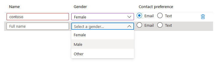
UI サンプル
スキーマ
{
  "name": "people",
  "type": "Microsoft.Common.EditableGrid",
  "ariaLabel": "Enter information per person",
  "label": "People",
  "constraints": {
    "width": "Full",
    "rows": {
      "count": {
        "min": 1,
        "max": 10
      }
    },
    "columns": [
      {
        "id": "colName",
        "header": "Name",
        "width": "1fr",
        "element": {
          "type": "Microsoft.Common.TextBox",
          "placeholder": "Full name",
          "constraints": {
            "required": true,
            "validations": [
              {
                "isValid": "[startsWith(last(take(steps('grid').people, $rowIndex)).colName, 'contoso')]",
                "message": "Must start with 'contoso'."
              },
              {
                "regex": "^[a-z0-9A-Z]{1,30}$",
                "message": "Only alphanumeric characters are allowed, and the value must be 1-30 characters long."
              }
            ]
          }
        }
      },
      {
        "id": "colGender",
        "header": "Gender",
        "width": "1fr",
        "element": {
          "name": "dropDown1",
          "type": "Microsoft.Common.DropDown",
          "placeholder": "Select a gender...",
          "constraints": {
            "allowedValues": [
              {
                "label": "Female",
                "value": "female"
              },
              {
                "label": "Male",
                "value": "male"
              },
              {
                "label": "Other",
                "value": "other"
              }
            ],
            "required": true
          }
        }
      },
      {
        "id": "colContactPreference",
        "header": "Contact preference",
        "width": "1fr",
        "element": {
          "type": "Microsoft.Common.OptionsGroup",
          "constraints": {
            "allowedValues": [
              {
                "label": "Email",
                "value": "email"
              },
              {
                "label": "Text",
                "value": "text"
              }
            ],
            "required": true
          }
        }
      }
    ]
  }
}
サンプル出力
{
  "colName": "contoso",
  "colGender": "female",
  "colContactPreference": "email"
}
解説
列の配列内で有効なコントロールは TextBox、OptionsGroup、および DropDown のみです。
$rowIndex変数は、グリッドの列の子の中に含まれる式でのみ有効です。 これは、要素の相対行インデックスを表す整数で、カウントは 1 から始まり、1 ずつ増分します。 スキーマの"columns":セクションに示すように、$rowIndexは検証に使用されます。$rowIndex変数を使用して検証を実行する場合、last()とtake()のコマンドを組み合わせることにより、現在の行の値を取得できます。次に例を示します。
last(take(<reference_to_grid>, $rowIndex))labelプロパティはコントロールの一部として表示されませんが、最終的なタブの概要に表示されます。ariaLabelプロパティは、グリッドのアクセシビリティ ラベルです。 スクリーン リーダーを使用するユーザーに便利なテキストを指定します。constraints.widthプロパティは、グリッドの全体の幅を設定するために使用されます。 オプションは [Full]\(全体\) 、 [Medium]\(中間\) 、 [Small]\(小\) です。 既定値は [Full]\(全体\) です。列の子の
widthプロパティによって、列の幅が決まります。 幅は 3fr のような小数単位を使用して指定され、合計領域はその単位に応じて列に割り当てられます。 列幅が指定されていない場合、既定値は 1fr になります。
次のステップ
- UI 定義の作成の概要については、「CreateUiDefinition の基本概念」を参照してください。
- UI 要素の共通プロパティの説明については、「CreateUiDefinition の要素」を参照してください。