このプロジェクトは、開発者が Azure Communication UI ライブラリを使用して Azure Communication Services Calling Web SDK から Teams 通話キューと自動応答への呼び出しを開始するのをガイドすることを目的としています。
要件によっては、顧客に複雑なセットアップを行わずに自分に簡単に連絡できる方法を提供することが必要になる場合があります。
Teams 通話キューと自動応答の呼び出しは、カスタマー サポート、ファイナンシャル アドバイザー、およびその他の顧客向けチームとの迅速な対話を容易にする、シンプルですが効果的な考えです。 このチュートリアルの目的は、顧客が Web 上のボタンをクリックしたときに顧客との対話を開始できるようにあなたを支援することです。
試したい場合は、GitHub からコードをダウンロードできます。
このチュートリアルを学習すると、以下が可能になります。
- 顧客のシナリオに応じて、顧客のオーディオとビデオのエクスペリエンスを制御する
- UI ライブラリを使用して Web アプリ上で通話を開始するためのウィジェットを構築する方法について説明します。
前提条件
このチュートリアルに従うには、次の手順が必要です。 最後の 2 つの項目について Teams 管理者に問い合わせて、適切に設定されていることを確認してください。
- サポートされているプラットフォームのいずれかにインストールされた Visual Studio Code。
-
Node.js、アクティブ LTS (長期サポート) とバージョン Node 20 をお勧めします。
node --versionコマンドを使用して、現在のバージョンを確認してください。 - Azure Communication Services リソース。 通信リソースを作成します
- Azure Communication Services リソースとの相互運用のために、Teams テナントのセットアップを完了する
- Teams 通話キューと Azure Communication Services の操作。
- Teams 自動応答と Azure Communication Services の操作。
Node と Visual Studio Code の確認
このコマンドを使用して、Node が正しくインストールされていることを確認できます。
node -v
出力には、使用中のバージョンが示されます。Node がインストールされておらず、PATH に追加されていない場合は失敗します。 Node と同様に、このコマンドを使用して VS Code がインストールされているかどうかを確認できます。
code --version
Node と同様に、コンピューターに VS Code をインストールする際に問題が発生した場合、このコマンドは失敗します。
作業の開始
このチュートリアルには 7 つの手順があり、最後にアプリで Teams 音声アプリケーションを呼び出すことができるようになります。 手順は次のとおりです。
1. プロジェクトのセットアップ
この手順は、新しいアプリケーションを作成する場合にのみ使用します。
React アプリを作成するには、 viteを使用します。 これは、最新の Web プロジェクトに迅速かつ無駄のない開発エクスペリエンスを提供することを目的としたビルド ツールです。
viteの詳細については、「React アプリをゼロから作成する」と「Vite の概要」を参照してください。
Azure Communication Service UI ライブラリでは、React 18 までしかサポートされていない点に注意してください。 React アプリを作成した後、サポートされているバージョンであることを確認します。 package.json
マシンに Node がインストールされていることを確認するには、PowerShell またはターミナルで次のコマンドを実行して、Node のバージョンを確認します。
node -v
2. 依存関係を取得する
次に、ここで構築しようとしているウィジェット エクスペリエンスのために、以下に示す Azure Communication Services のいくつかのパッケージを含むように package.json 内の依存関係配列を更新する必要があります。
"@azure/communication-calling": "^1.23.1",
"@azure/communication-chat": "^1.4.0",
"@azure/communication-react": "^1.15.0",
"@azure/communication-calling-effects": "1.0.1",
"@azure/communication-common": "2.3.0",
"@fluentui/react-icons": "~2.0.203",
"@fluentui/react": "~8.98.3",
必要なパッケージをインストールするには、次の Node Package Manager コマンドを実行します。
npm install
これらのパッケージをインストールすると、アプリケーションをビルドするコードの記述を開始する準備が整います。 このチュートリアルでは、src ディレクトリ内のファイルを変更します。
3. アプリの初期設定
まず、提供された App.tsx コンテンツを、次を行うメイン ページに置き換えます。
- 通話エクスペリエンスを強化する CallAdapter を作成するために必要なすべての Azure Communication 情報を格納する
- エンド ユーザーに公開されるウィジェットを表示します。
App.tsx ファイルは、次のようになります。
src/App.tsx
import "./App.css";
import {
  CommunicationIdentifier,
  MicrosoftTeamsAppIdentifier,
} from "@azure/communication-common";
import {
  Spinner,
  Stack,
  initializeIcons,
  registerIcons,
  Text,
} from "@fluentui/react";
import { CallAdd20Regular, Dismiss20Regular } from "@fluentui/react-icons";
import logo from "./logo.svg";

import { CallingWidgetComponent } from "./components/CallingWidgetComponent";

registerIcons({
  icons: { dismiss: <Dismiss20Regular />, callAdd: <CallAdd20Regular /> },
});
initializeIcons();
function App() {
  /**
   * Token for local user.
   */
  const token = "<Enter your ACS Token here>";

  /**
   * User identifier for local user.
   */
  const userId: CommunicationIdentifier = {
    communicationUserId: "Enter your ACS Id here",
  };

  /**
   * Enter your Teams voice app identifier from the Teams admin center here
   */
  const teamsAppIdentifier: MicrosoftTeamsAppIdentifier = {
    teamsAppId: "<Enter your Teams Voice app id here>",
    cloud: "public",
  };

  const widgetParams = {
    userId,
    token,
    teamsAppIdentifier,
  };

  if (!token || !userId || !teamsAppIdentifier) {
    return (
      <Stack verticalAlign="center" style={{ height: "100%", width: "100%" }}>
        <Spinner
          label={"Getting user credentials from server"}
          ariaLive="assertive"
          labelPosition="top"
        />
      </Stack>
    );
  }

  return (
    <Stack
      style={{ height: "100%", width: "100%", padding: "3rem" }}
      tokens={{ childrenGap: "1.5rem" }}
    >
      <Stack tokens={{ childrenGap: "1rem" }} style={{ margin: "auto" }}>
        <Stack
          style={{ padding: "3rem" }}
          horizontal
          tokens={{ childrenGap: "2rem" }}
        >
          <Text style={{ marginTop: "auto" }} variant="xLarge">
            Welcome to a Calling Widget sample
          </Text>
          <img
            style={{ width: "7rem", height: "auto" }}
            src={logo}
            alt="logo"
          />
        </Stack>

        <Text>
          Welcome to a Calling Widget sample for the Azure Communication
          Services UI Library. Sample has the ability to connect you through
          Teams voice apps to a agent to help you.
        </Text>
        <Text>
          As a user all you need to do is click the widget below, enter your
          display name for the call - this will act as your caller id, and
          action the <b>start call</b> button.
        </Text>
      </Stack>
      <Stack
        horizontal
        tokens={{ childrenGap: "1.5rem" }}
        style={{ overflow: "hidden", margin: "auto" }}
      >
        <CallingWidgetComponent
          widgetAdapterArgs={widgetParams}
          onRenderLogo={() => {
            return (
              <img
                style={{ height: "4rem", width: "4rem", margin: "auto" }}
                src={logo}
                alt="logo"
              />
            );
          }}
        />
      </Stack>
    </Stack>
  );
}

export default App;
このスニペットでは、2 つの新しいアイコン <Dismiss20Regular/> と <CallAdd20Regular> を登録します。 これらの新しいアイコンは、次のセクションで作成するウィジェット コンポーネント内で使用されます。
4. ウィジェットを作成する
次に、以下の 3 つの異なるモードで表示できるウィジェットを作成する必要があります。
- 待機中: このウィジェットの状態は、通話が行われる前後のコンポーネントの状態となります
- セットアップ: この状態は、ウィジェットが名前などの情報をユーザーに尋ねる状態です。
- 通話中: この間、ウィジェットは UI ライブラリの Call Composite に置き換えられます。 これは、ユーザーが Voice アプリを呼び出しているか、エージェントと話しているときのウィジェット モードです。
src/components という名前のフォルダーを作成しましょう。 このフォルダーの中に CallingWidgetComponent.tsx という名前の新しいファイルを作成します。 このファイルは以下のようなスニペットとします。
CallingWidgetComponent.tsx
import {
  IconButton,
  PrimaryButton,
  Stack,
  TextField,
  useTheme,
  Checkbox,
  Icon,
  Spinner,
} from "@fluentui/react";
import React, { useEffect, useRef, useState } from "react";
import {
  callingWidgetSetupContainerStyles,
  checkboxStyles,
  startCallButtonStyles,
  callingWidgetContainerStyles,
  callIconStyles,
  logoContainerStyles,
  collapseButtonStyles,
} from "../styles/CallingWidgetComponent.styles";

import {
  AzureCommunicationTokenCredential,
  CommunicationUserIdentifier,
  MicrosoftTeamsAppIdentifier,
} from "@azure/communication-common";
import {
  CallAdapter,
  CallAdapterState,
  CallComposite,
  CommonCallAdapterOptions,
  StartCallIdentifier,
  createAzureCommunicationCallAdapter,
} from "@azure/communication-react";
// lets add to our react imports as well
import { useMemo } from "react";

import { callingWidgetInCallContainerStyles } from "../styles/CallingWidgetComponent.styles";

/**
 * Properties needed for our widget to start a call.
 */
export type WidgetAdapterArgs = {
  token: string;
  userId: CommunicationUserIdentifier;
  teamsAppIdentifier: MicrosoftTeamsAppIdentifier;
};

export interface CallingWidgetComponentProps {
  /**
   *  arguments for creating an AzureCommunicationCallAdapter for your Calling experience
   */
  widgetAdapterArgs: WidgetAdapterArgs;
  /**
   * Custom render function for displaying logo.
   * @returns
   */
  onRenderLogo?: () => JSX.Element;
}

/**
 * Widget for Calling Widget
 * @param props
 */
export const CallingWidgetComponent = (
  props: CallingWidgetComponentProps
): JSX.Element => {
  const { onRenderLogo, widgetAdapterArgs } = props;

  const [widgetState, setWidgetState] = useState<"new" | "setup" | "inCall">(
    "new"
  );
  const [displayName, setDisplayName] = useState<string>();
  const [consentToData, setConsentToData] = useState<boolean>(false);
  const [useLocalVideo, setUseLocalVideo] = useState<boolean>(false);
  const [adapter, setAdapter] = useState<CallAdapter>();

  const callIdRef = useRef<string>();

  const theme = useTheme();

  // add this before the React template
  const credential = useMemo(() => {
    try {
      return new AzureCommunicationTokenCredential(widgetAdapterArgs.token);
    } catch {
      console.error("Failed to construct token credential");
      return undefined;
    }
  }, [widgetAdapterArgs.token]);

  const adapterOptions: CommonCallAdapterOptions = useMemo(
    () => ({
      callingSounds: {
        callEnded: { url: "/sounds/callEnded.mp3" },
        callRinging: { url: "/sounds/callRinging.mp3" },
        callBusy: { url: "/sounds/callBusy.mp3" },
      },
    }),
    []
  );

  const callAdapterArgs = useMemo(() => {
    return {
      userId: widgetAdapterArgs.userId,
      credential: credential,
      targetCallees: [
        widgetAdapterArgs.teamsAppIdentifier,
      ] as StartCallIdentifier[],
      displayName: displayName,
      options: adapterOptions,
    };
  }, [
    widgetAdapterArgs.userId,
    widgetAdapterArgs.teamsAppIdentifier.teamsAppId,
    credential,
    displayName,
  ]);

  useEffect(() => {
    if (adapter) {
      adapter.on("callEnded", () => {
        /**
         * We only want to reset the widget state if the call that ended is the same as the current call.
         */
        if (
          adapter.getState().acceptedTransferCallState &&
          adapter.getState().acceptedTransferCallState?.id !== callIdRef.current
        ) {
          return;
        }
        setDisplayName(undefined);
        setWidgetState("new");
        setConsentToData(false);
        setAdapter(undefined);
        adapter.dispose();
      });

      adapter.on("transferAccepted", (e) => {
        console.log("transferAccepted", e);
      });

      adapter.onStateChange((state: CallAdapterState) => {
        if (state?.call?.id && callIdRef.current !== state?.call?.id) {
          callIdRef.current = state?.call?.id;
          console.log(`Call Id: ${callIdRef.current}`);
        }
      });
    }
  }, [adapter]);

  /** widget template for when widget is open, put any fields here for user information desired */
  if (widgetState === "setup") {
    return (
      <Stack
        styles={callingWidgetSetupContainerStyles(theme)}
        tokens={{ childrenGap: "1rem" }}
      >
        <IconButton
          styles={collapseButtonStyles}
          iconProps={{ iconName: "Dismiss" }}
          onClick={() => {
            setDisplayName(undefined);
            setConsentToData(false);
            setUseLocalVideo(false);
            setWidgetState("new");
          }}
        />
        <Stack tokens={{ childrenGap: "1rem" }} styles={logoContainerStyles}>
          <Stack style={{ transform: "scale(1.8)" }}>
            {onRenderLogo && onRenderLogo()}
          </Stack>
        </Stack>
        <TextField
          label={"Name"}
          required={true}
          placeholder={"Enter your name"}
          onChange={(_, newValue) => {
            setDisplayName(newValue);
          }}
        />
        <Checkbox
          styles={checkboxStyles(theme)}
          label={
            "Use video - Checking this box will enable camera controls and screen sharing"
          }
          onChange={(_, checked?: boolean | undefined) => {
            setUseLocalVideo(!!checked);
            setUseLocalVideo(true);
          }}
        ></Checkbox>
        <Checkbox
          required={true}
          styles={checkboxStyles(theme)}
          disabled={displayName === undefined}
          label={
            "By checking this box, you are consenting that we will collect data from the call for customer support reasons"
          }
          onChange={async (_, checked?: boolean | undefined) => {
            setConsentToData(!!checked);
            if (callAdapterArgs && callAdapterArgs.credential) {
              setAdapter(
                await createAzureCommunicationCallAdapter({
                  displayName: displayName ?? "",
                  userId: callAdapterArgs.userId,
                  credential: callAdapterArgs.credential,
                  targetCallees: callAdapterArgs.targetCallees,
                  options: callAdapterArgs.options,
                })
              );
            }
          }}
        ></Checkbox>
        <PrimaryButton
          styles={startCallButtonStyles(theme)}
          onClick={() => {
            if (displayName && consentToData && adapter) {
              setWidgetState("inCall");
              adapter?.startCall(callAdapterArgs.targetCallees, {
                audioOptions: { muted: false },
              });
            }
          }}
        >
          {!consentToData && `Enter your name`}
          {consentToData && !adapter && (
            <Spinner ariaLive="assertive" labelPosition="top" />
          )}
          {consentToData && adapter && `StartCall`}
        </PrimaryButton>
      </Stack>
    );
  }

  if (widgetState === "inCall" && adapter) {
    return (
      <Stack styles={callingWidgetInCallContainerStyles(theme)}>
        <CallComposite
          adapter={adapter}
          options={{
            callControls: {
              cameraButton: useLocalVideo,
              screenShareButton: useLocalVideo,
              moreButton: false,
              peopleButton: false,
              displayType: "compact",
            },
            localVideoTile: !useLocalVideo ? false : { position: "floating" },
          }}
        />
      </Stack>
    );
  }

  return (
    <Stack
      horizontalAlign="center"
      verticalAlign="center"
      styles={callingWidgetContainerStyles(theme)}
      onClick={() => {
        setWidgetState("setup");
      }}
    >
      <Stack
        horizontalAlign="center"
        verticalAlign="center"
        style={{
          height: "4rem",
          width: "4rem",
          borderRadius: "50%",
          background: theme.palette.themePrimary,
        }}
      >
        <Icon iconName="callAdd" styles={callIconStyles(theme)} />
      </Stack>
    </Stack>
  );
};
CallAdapterOptions で、いくつかのサウンド ファイルが参照されていることがわかります。これらのファイルは CallComposite の通話音機能を使用します。 サウンドの使用に関心がある場合は、完成したコードを参照してサウンド ファイルをダウンロードしてください。
5.ウィジェットのスタイルを整える
ウィジェットが適切な見た目となり、Call Composite を保持できるようにするために、いくつかのスタイルを記述する必要があります。 ファイル CallingWidgetComponent.tsx に追加したスニペットをコピーすると、ウィジェットではこれらのスタイルが既に使用されているはずです。
src/styles という名前の新しいフォルダーをこのフォルダーに作成し、CallingWidgetComponent.styles.ts という名前のファイルを作成します。 このファイルは以下のようなスニペットとします。
import {
  IButtonStyles,
  ICheckboxStyles,
  IIconStyles,
  IStackStyles,
  Theme,
} from "@fluentui/react";

export const checkboxStyles = (theme: Theme): ICheckboxStyles => {
  return {
    label: {
      color: theme.palette.neutralPrimary,
    },
  };
};

export const callingWidgetContainerStyles = (theme: Theme): IStackStyles => {
  return {
    root: {
      width: "5rem",
      height: "5rem",
      padding: "0.5rem",
      boxShadow: theme.effects.elevation16,
      borderRadius: "50%",
      bottom: "1rem",
      right: "1rem",
      position: "absolute",
      overflow: "hidden",
      cursor: "pointer",
      ":hover": {
        boxShadow: theme.effects.elevation64,
      },
    },
  };
};

export const callingWidgetSetupContainerStyles = (
  theme: Theme
): IStackStyles => {
  return {
    root: {
      width: "18rem",
      minHeight: "20rem",
      maxHeight: "25rem",
      padding: "0.5rem",
      boxShadow: theme.effects.elevation16,
      borderRadius: theme.effects.roundedCorner6,
      bottom: 0,
      right: "1rem",
      position: "absolute",
      overflow: "hidden",
      cursor: "pointer",
      background: theme.palette.white,
    },
  };
};

export const callIconStyles = (theme: Theme): IIconStyles => {
  return {
    root: {
      paddingTop: "0.2rem",
      color: theme.palette.white,
      transform: "scale(1.6)",
    },
  };
};

export const startCallButtonStyles = (theme: Theme): IButtonStyles => {
  return {
    root: {
      background: theme.palette.themePrimary,
      borderRadius: theme.effects.roundedCorner6,
      borderColor: theme.palette.themePrimary,
    },
    textContainer: {
      color: theme.palette.white,
    },
  };
};

export const logoContainerStyles: IStackStyles = {
  root: {
    margin: "auto",
    padding: "0.2rem",
    height: "5rem",
    width: "10rem",
    zIndex: 0,
  },
};

export const collapseButtonStyles: IButtonStyles = {
  root: {
    position: "absolute",
    top: "0.2rem",
    right: "0.2rem",
    zIndex: 1,
  },
};

export const callingWidgetInCallContainerStyles = (
  theme: Theme
): IStackStyles => {
  return {
    root: {
      width: "35rem",
      height: "25rem",
      padding: "0.5rem",
      boxShadow: theme.effects.elevation16,
      borderRadius: theme.effects.roundedCorner6,
      bottom: 0,
      right: "1rem",
      position: "absolute",
      overflow: "hidden",
      cursor: "pointer",
      background: theme.semanticColors.bodyBackground,
    },
  };
};
6.ID 値のセットアップ
アプリを実行する前に、App.tsx に移動し、プレースホルダーの値を Azure Communication Services ID と Teams Voice アプリケーションのリソース アカウント識別子に置き換えます。
token、userId、teamsAppIdentifier の入力値を次に示します。
./src/App.tsx
/**
 * Token for local user.
 */
const token = "<Enter your ACS Token here>";

/**
 * User identifier for local user.
 */
const userId: CommunicationIdentifier = {
  communicationUserId: "Enter your ACS Id here",
};

/**
 * Enter your Teams voice app identifier from the Teams admin center here
 */
const teamsAppIdentifier: MicrosoftTeamsAppIdentifier = {
  teamsAppId: "<Enter your Teams Voice app id here>",
  cloud: "public",
};
7.アプリを実行する
最後に、アプリケーションを実行すると通話を行うことができます。 以下のコマンドを実行して依存関係をインストールし、アプリを実行します。
# Install the new dependencies
npm install

# run the React app
npm run dev
アプリを実行できたら、ブラウザー上の http://localhost:3000 で確認できます。 次のスプラッシュ スクリーンが表示されるはずです。
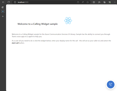
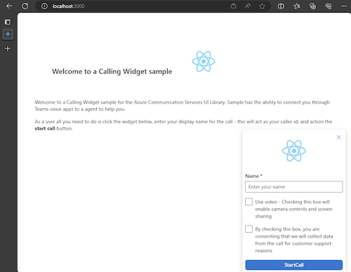
次に、ウィジェット ボタンを操作すると、次の小さなメニューが表示されるはずです。
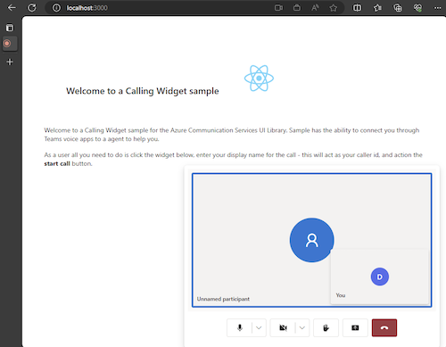
名前を入力した後、[通話の開始] を選択すると、通話が開始されます。 通話を開始した後、ウィジェットは次のようになるはずです。
次のステップ
Teams Voice アプリケーションの詳細については、Teams 自動応答と Teams 通話キューに関するドキュメントを参照してください。 また、JavaScript バンドルで同様のエクスペリエンスを構築する方法に関するチュートリアルも参照してください。
クイックスタート: Teams 通話キューと自動応答を呼び出すための Azure Communication Services UI ライブラリ JavaScript バンドルの概要