Data templates
.NET Multi-platform App UI (.NET MAUI) data templates provide the ability to define the presentation of data on supported controls.
Consider a CollectionView that displays a collection of Person objects. The following example shows the definition of the Person class:
public class Person
{
    public string Name { get; set; }
    public int Age { get; set; }
    public string Location { get; set; }
}
The Person class defines Name, Age, and Location properties, which can be set when a Person object is created. A control that displays collections, such as CollectionView, can be used to display Person objects:
<ContentPage xmlns="http://schemas.microsoft.com/dotnet/2021/maui"
             xmlns:x="http://schemas.microsoft.com/winfx/2009/xaml"
             xmlns:local="clr-namespace:DataTemplates"
             x:Class="DataTemplates.WithoutDataTemplatePage">
    <StackLayout>
        <CollectionView>
            <CollectionView.ItemsSource>
                <x:Array Type="{x:Type local:Person}">
                    <local:Person Name="Steve" Age="21" Location="USA" />
                    <local:Person Name="John" Age="37" Location="USA" />
                    <local:Person Name="Tom" Age="42" Location="UK" />
                    <local:Person Name="Lucas" Age="29" Location="Germany" />
                    <local:Person Name="Tariq" Age="39" Location="UK" />
                    <local:Person Name="Jane" Age="30" Location="USA" />
                </x:Array>
            </CollectionView.ItemsSource>
        </CollectionView>
    </StackLayout>
</ContentPage>
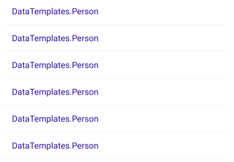
In this example, items are added to the CollectionView by initializing its ItemsSource property from an array of Person objects. CollectionView calls ToString when displaying the objects in the collection. However, because there is no Person.ToString override, ToString returns the type name of each object:

The Person object can override the ToString method to display meaningful data:
public class Person
{
    ...
    public override string ToString ()
    {
        return Name;
    }
}
This results in the CollectionView displaying the Person.Name property value for each object in the collection:

The Person.ToString override could return a formatted string consisting of the Name, Age, and Location properties. However, this approach only offers limited control over the appearance of each item of data. For more flexibility, a DataTemplate can be created that defines the appearance of the data.
Create a DataTemplate
A DataTemplate is used to specify the appearance of data, and typically uses data binding to display data. A common usage scenario for data templates is when displaying data from a collection of objects in a control such as a CollectionView or CarouselView. For example, when a CollectionView is bound to a collection of Person objects, the ItemTemplate property can be set to a DataTemplate that defines the appearance of each Person object in the CollectionView. The DataTemplate will contain objects that bind to property values of each Person object. For more information about data binding, see Data binding.
A DataTemplate that's defined inline in a control is known as an inline template. Alternatively, data templates can be defined as a control-level, page-level, or app-level resource. Choosing where to define a DataTemplate impacts where it can be used:
- A DataTemplate defined at the control-level can only be applied to the control.
- A DataTemplate defined at the page-level can be applied to multiple controls on the page.
- A DataTemplate defined at the app-level can be applied to valid controls throughout the app.
Note
Data templates lower in the view hierarchy take precedence over those defined higher up when they share x:Key attributes. For example, an app-level data template will be overridden by a page-level data template, and a page-level data template will be overridden by a control-level data template, or an inline data template.
A DataTemplate can be created inline, with a type, or as a resource, regardless of where it's defined.
Create an inline DataTemplate
An inline data template, which is one that's defined inline in a control, should be used if there's no need to reuse the data template elsewhere. The objects specified in the DataTemplate define the appearance of each item of data. A control such as CollectionView can then set its ItemTemplate property to the inline DataTemplate:
<CollectionView>
    <CollectionView.ItemsSource>
        <x:Array Type="{x:Type local:Person}">
            <local:Person Name="Steve" Age="21" Location="USA" />
            <local:Person Name="John" Age="37" Location="USA" />
            <local:Person Name="Tom" Age="42" Location="UK" />
            <local:Person Name="Lucas" Age="29" Location="Germany" />
            <local:Person Name="Tariq" Age="39" Location="UK" />
            <local:Person Name="Jane" Age="30" Location="USA" />
        </x:Array>
    </CollectionView.ItemsSource>
    <CollectionView.ItemTemplate>
        <DataTemplate>
            <Grid>
                ...
                <Label Text="{Binding Name}" FontAttributes="Bold" />
                <Label Grid.Column="1" Text="{Binding Age}" />
                <Label Grid.Column="2" Text="{Binding Location}" HorizontalTextAlignment="End" />
            </Grid>
        </DataTemplate>
    </CollectionView.ItemTemplate>
</CollectionView>
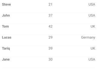
In a CollectionView, the child of an inline DataTemplate must derive from BindableObject. In this example, a Grid, which derives from Layout is used. The Grid contains three Label objects that bind their Text properties to properties of each Person object in the collection. The following screenshot shows the resulting appearance:

Create a DataTemplate with a type
A DataTemplate can be created with a custom view type. The advantage of this approach is that the appearance defined by the view can be reused by multiple data templates throughout an app. A control such as CollectionView can then set its ItemTemplate property to the DataTemplate:
<ContentPage xmlns="http://schemas.microsoft.com/dotnet/2021/maui"
             xmlns:x="http://schemas.microsoft.com/winfx/2009/xaml"
             xmlns:local="clr-namespace:DataTemplates"
             x:Class="DataTemplates.WithDataTemplatePageFromType">
    <StackLayout>
        <CollectionView>
           <CollectionView.ItemsSource>
                <x:Array Type="{x:Type local:Person}">
                    <local:Person Name="Steve" Age="21" Location="USA" />
                    ...
                </x:Array>
            </CollectionView.ItemsSource>
            <CollectionView.ItemTemplate>
                <DataTemplate>
                    <local:PersonView />
                </DataTemplate>
            </CollectionView.ItemTemplate>
        </CollectionView>
    </StackLayout>
</ContentPage>
In this example, the ItemTemplate property is set to a DataTemplate that's created from a custom type that defines the view appearance. The custom type must derive from ContentView:
<ContentView xmlns="http://schemas.microsoft.com/dotnet/2021/maui"
             xmlns:x="http://schemas.microsoft.com/winfx/2009/xaml"
             x:Class="DataTemplates.PersonView">
     <Grid>
        <Grid.ColumnDefinitions>
            <ColumnDefinition Width="0.5*" />
            <ColumnDefinition Width="0.2*" />
            <ColumnDefinition Width="0.3*" />
        </Grid.ColumnDefinitions>
        <Label Text="{Binding Name}" FontAttributes="Bold" />
        <Label Grid.Column="1" Text="{Binding Age}" />
        <Label Grid.Column="2" Text="{Binding Location}" HorizontalTextAlignment="End" />
    </Grid>
</ContentView>
In this example, layout within the ContentView is managed by a Grid. The Grid contains three Label objects that bind their Text properties to properties of each Person object in the collection.
For more information about creating custom views, see ContentView.
Create a DataTemplate as a resource
Data templates can be created as reusable objects in a ResourceDictionary. This is achieved by giving each DataTemplate a unique x:Key value, which provides it with a descriptive key in the ResourceDictionary. A control such as CollectionView can then set its ItemTemplate property to the DataTemplate:
<ContentPage xmlns="http://schemas.microsoft.com/dotnet/2021/maui"
             xmlns:x="http://schemas.microsoft.com/winfx/2009/xaml"
             xmlns:local="clr-namespace:DataTemplates"
             x:Class="DataTemplates.WithDataTemplateResource">
    <ContentPage.Resources>
        <ResourceDictionary>
            <DataTemplate x:Key="personTemplate">
                <Grid>
                    ...
                </Grid>
            </DataTemplate>
        </ResourceDictionary>
    </ContentPage.Resources>

    <StackLayout>
        <CollectionView ItemTemplate="{StaticResource personTemplate}">
            <CollectionView.ItemsSource>
                <x:Array Type="{x:Type local:Person}">
                    <local:Person Name="Steve" Age="21" Location="USA" />
                    ...
                </x:Array>
            </CollectionView.ItemsSource>
        </CollectionView>
    </StackLayout>
</ContentPage>
In this example, the DataTemplate is assigned to the ItemTemplate property by using the StaticResource markup extension. While the DataTemplate is defined in the page's ResourceDictionary, it could also be defined at the control-level or app-level.
Create a DataTemplateSelector
A DataTemplateSelector can be used to choose a DataTemplate at runtime based on the value of a data-bound property. This enables multiple data templates to be applied to the same type of object, to choose their appearance at runtime. A data template selector enables scenarios such as a CollectionView or CarouselView binding to a collection of objects where the appearance of each object can be chosen at runtime by the data template selector returning a specific DataTemplate.
A data template selector is implemented by creating a class that inherits from DataTemplateSelector. The OnSelectTemplate method should then be overridden to return a specific DataTemplate:
public class PersonDataTemplateSelector : DataTemplateSelector
{
    public DataTemplate ValidTemplate { get; set; }
    public DataTemplate InvalidTemplate { get; set; }

    protected override DataTemplate OnSelectTemplate(object item, BindableObject container)
    {
        return ((Person)item).DateOfBirth.Year >= 1980 ? ValidTemplate : InvalidTemplate;
    }
}
In this example, the OnSelectTemplate method returns a specific data template based on the value of the DateOfBirth property. The returned data template is defined by the ValidTemplate or InvalidTemplate property, which are set when consuming the data template selector.
Limitations
DataTemplateSelector objects have the following limitations:
- The DataTemplateSelector subclass must always return the same template for the same data if queried multiple times.
- The DataTemplateSelector subclass must not return another DataTemplateSelector subclass.
- The DataTemplateSelector subclass must not return new instances of a DataTemplate on each call. Instead, the same instance must be returned. Failure to do so will create a memory leak and will disable control virtualization.
Consume a DataTemplateSelector
A data template selector can be consumed by creating it as a resource and assigning its instance to .NET MAUI control properties of type DataTemplate, such as ItemTemplate.
The following example shows declaring PersonDataTemplateSelector as a page-level resource:
<ContentPage xmlns="http://schemas.microsoft.com/dotnet/2021/maui"
             xmlns:local="clr-namespace:Selector"
             xmlns:x="http://schemas.microsoft.com/winfx/2009/xaml"
             x:Class="Selector.MainPage">
    <ContentPage.Resources>
        <DataTemplate x:Key="validPersonTemplate">
            <Grid>
                ...
            </Grid>
        </DataTemplate>
        <DataTemplate x:Key="invalidPersonTemplate">
            <Grid>
                ...
            </Grid>
        </DataTemplate>
        <local:PersonDataTemplateSelector x:Key="personDataTemplateSelector"
                                          ValidTemplate="{StaticResource validPersonTemplate}"
                                          InvalidTemplate="{StaticResource invalidPersonTemplate}" />
    </ContentPage.Resources>
    ...
</ContentPage>
In this example, the page-level ResourceDictionary defines two DataTemplate objects and a PersonDataTemplateSelector object. The PersonDataTemplateSelector object sets its ValidTemplate and InvalidTemplate properties to the DataTemplate objects using the StaticResource markup extension. While the resources are defined in the page's ResourceDictionary, they could also be defined at the control-level or app-level.
The PersonDataTemplateSelector object can be consumed by assigning it to the ItemTemplate property:
<CollectionView x:Name="collectionView"
                ItemTemplate="{StaticResource personDataTemplateSelector}" />
At runtime, the CollectionView calls the PersonDataTemplateSelector.OnSelectTemplate method for each of the items in the underlying collection, with the call passing the data object as the item parameter. The returned DataTemplate is then applied to that object.
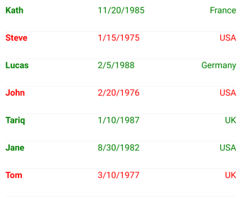
The following screenshot shows the result of the CollectionView applying the PersonDataTemplateSelector to each object in the underlying collection:

In this example, any Person object that has a DateOfBirth property value greater than or equal to 1980 is displayed in green, with the remaining objects being displayed in red.
.NET MAUI
 Browse the sample