RadioButton
 サンプルを参照する
.NET Multi-platform App UI (.NET MAUI) RadioButton は、ユーザーがセットから 1 つのオプションを選択できるようにするボタンの一種です。 各オプションは 1 つのラジオ ボタンで表され、グループ内のラジオ ボタンは 1 つだけ選択できます。 既定では、各 RadioButton でテキストが表示されます。
ただし、一部のプラットフォームでは RadioButton は View を表示でき、すべてのプラットフォームで各 RadioButton の外観を ControlTemplate で再定義できます。
RadioButton は次の特性を定義します。
object型のContentは、RadioButton によって表示されるstringまたは View を定義します。bool型のIsCheckedは、RadioButton がチェックされるかどうかを定義します。 このプロパティはTwoWayバインディングを使用し、既定値はfalseです。string型のGroupNameは、どの RadioButton コントロールが相互に排他的であるかを指定する名前を定義します。 このプロパティの既定値はnullです。object型のValueは、RadioButton に関連付けられたオプションの一意の値を定義します。Color型のBorderColorは、境界線ストロークの色を定義します。double型のBorderWidthは、RadioButton 境界の幅を定義します。double型のCharacterSpacingは、表示されるテキストの文字間の間隔を定義します。int型のCornerRadiusは、RadioButton の角の半径を定義します。FontAttributes型のFontAttributesは、テキスト スタイルを決定します。bool型のFontAutoScalingEnabledは、アプリの UI がオペレーティング システムで設定されたテキスト スケーリング設定を反映するかどうかを定義します。 このプロパティの既定値はtrueです。string型のFontFamilyは、フォント ファミリを定義します。double型のFontSizeは、フォント サイズを定義します。Color型のTextColorは、表示されるテキストの色を定義します。TextTransform型のTextTransformは、表示されるテキストの大文字と小文字を定義します。
これらのプロパティは、BindableProperty オブジェクトが基になっています。つまり、これらは、データ バインディングの対象にすることができ、スタイルを設定できます。
RadioButton は、ユーザーまたはプログラムによる操作によって IsChecked プロパティが変更されたときに発生する CheckedChanged イベントも定義します。 CheckedChanged イベントに付随する CheckedChangedEventArgs オブジェクトには、Value という名前の bool 型のプロパティが 1 つあります。 イベントが発生すると、CheckedChangedEventArgs.Value プロパティの値が IsChecked プロパティの新しい値に設定されます。
RadioButton グループ化は、次の添付プロパティを定義する RadioButtonGroup クラスによって管理できます。
string型のGroupNameは、ILayout内の RadioButton オブジェクトのグループ名を定義します。object型のSelectedValueは、ILayoutグループ内のチェックされた RadioButton オブジェクトの値を表します。 この添付プロパティは、既定でTwoWayバインディングを使用します。
GroupName 添付プロパティの詳細については、「グループ ラジオボタン」を参照してください。 SelectedValue 添付プロパティの詳細については、「RadioButton 状態の変更に応答する」を参照してください。
RadioButtons の作成
RadioButton の外観は、RadioButton.Content プロパティに割り当てられたデータのタイプによって定義されます。
RadioButton.Contentプロパティにstringが割り当てられると、各プラットフォームに表示され、ラジオ ボタンの円の横に水平方向に配置されます。RadioButton.Contentに View が割り当てられている場合、サポートされているプラットフォーム(iOS、Windows)では表示されますが、サポートされていないプラットフォーム (Android)では View オブジェクトの文字列表現にフォールバックします。 いずれの場合も、コンテンツはラジオ ボタンの円の横に水平方向に配置されて表示されます。ControlTemplateが RadioButton に適用されると、すべてのプラットフォームのRadioButton.Contentプロパティに View を割り当てることができます。 詳細については、「RadioButton の外観の再定義」を参照してください。
文字列ベースのコンテンツを表示する
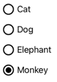
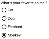
Content プロパティに string が割り当てられると、RadioButton でテキストが表示されます。
<StackLayout>
    <Label Text="What's your favorite animal?" />
    <RadioButton Content="Cat" />
    <RadioButton Content="Dog" />
    <RadioButton Content="Elephant" />
    <RadioButton Content="Monkey"
                 IsChecked="true" />
</StackLayout>
この例では、RadioButton オブジェクトは同じ親コンテナー内で暗黙的にグループ化されます。 この XAML で、次のスクリーンショットのようになります。
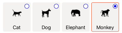
任意のコンテンツを表示する
iOS および Windows では、Content プロパティが View に割り当てられているときに RadioButton で任意のコンテンツが表示されることがあります。
<StackLayout>
    <Label Text="What's your favorite animal?" />
    <RadioButton>
        <RadioButton.Content>
            <Image Source="cat.png" />
        </RadioButton.Content>
    </RadioButton>
    <RadioButton>
        <RadioButton.Content>
            <Image Source="dog.png" />
        </RadioButton.Content>
    </RadioButton>
    <RadioButton>
        <RadioButton.Content>
            <Image Source="elephant.png" />
        </RadioButton.Content>
    </RadioButton>
    <RadioButton>
        <RadioButton.Content>
            <Image Source="monkey.png" />
        </RadioButton.Content>
    </RadioButton>
</StackLayout>
この例では、RadioButton オブジェクトは同じ親コンテナー内で暗黙的にグループ化されます。 この XAML で、次のスクリーンショットのようになります。
Android では、RadioButton オブジェクトは、コンテンツとして設定されている View オブジェクトを文字列ベースで表現します。
Note
ControlTemplate が RadioButton に適用されると、すべてのプラットフォームの RadioButton.Content プロパティに View を割り当てることができます。 詳細については、「RadioButton の外観の再定義」を参照してください。
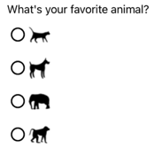
RadioButtons に値を関連付ける
各 RadioButton オブジェクトには、object 型の Value プロパティがあり、ラジオ ボタンに関連付けるオプションの一意の値を定義します。 これにより、RadioButton の値をコンテンツと異なる値に設定できるため、RadioButton オブジェクトが View オブジェクトを表示する場合に特に便利です。
次の XAML では、各 RadioButton オブジェクトで Content プロパティと Value プロパティを設定する方法を示します。
<StackLayout>
    <Label Text="What's your favorite animal?" />
    <RadioButton Value="Cat">
        <RadioButton.Content>
            <Image Source="cat.png" />
        </RadioButton.Content>
    </RadioButton>
    <RadioButton Value="Dog">
        <RadioButton.Content>
            <Image Source="dog.png" />
        </RadioButton.Content>
    </RadioButton>
    <RadioButton Value="Elephant">
        <RadioButton.Content>
            <Image Source="elephant.png" />
        </RadioButton.Content>
    </RadioButton>
    <RadioButton Value="Monkey">
        <RadioButton.Content>
            <Image Source="monkey.png" />
        </RadioButton.Content>
    </RadioButton>
</StackLayout>
この例では、RadioButton のそれぞれに Image がコンテンツとして設定され、文字列ベースの値も定義されています。 これにより、チェックされたラジオ ボタンの値を簡単に識別できます。
RadioButtons をグループ化する
ラジオ ボタンはグループで機能し、ラジオ ボタンをグループ化するには 3 つの方法があります。
- 各ラジオ ボタンを同じ親コンテナー内に追加します。 これは暗黙的なグループ化と呼ばれます。
- 各ラジオ ボタンの
GroupNameプロパティを同じ値に設定します。 これは明示的なグループ化と呼ばれます。 - 親コンテナーに
RadioButtonGroup.GroupName添付プロパティを設定すると、コンテナー内の RadioButton オブジェクトのGroupNameプロパティが設定されます。 これも明示的なグループ化と呼ばれます。
重要
RadioButton オブジェクトは、グループ化するために同じ親に属している必要はありません。 グループ名を共有する場合は、相互に排他的です。
GroupName プロパティを使用した明示的なグループ化
次の XAML の例は、GroupName プロパティを設定して RadioButton オブジェクトを明示的にグループ化する方法を示しています。
<Label Text="What's your favorite color?" />
<RadioButton Content="Red"
             GroupName="colors" />
<RadioButton Content="Green"
             GroupName="colors" />
<RadioButton Content="Blue"
             GroupName="colors" />
<RadioButton Content="Other"
             GroupName="colors" />
この例では、RadioButton はすべて同じ GroupName の値を持つため、相互に排他的です。
RadioButtonGroup.GroupName 添付プロパティを使用した明示的なグループ化
RadioButtonGroup クラスは、string 型の GroupName 添付プロパティを定義し、このプロパティは Layout<View> オブジェクトに設定できます。 これにより、任意のレイアウトをラジオ ボタン グループに変換できます。
<StackLayout RadioButtonGroup.GroupName="colors">
    <Label Text="What's your favorite color?" />
    <RadioButton Content="Red" />
    <RadioButton Content="Green" />
    <RadioButton Content="Blue" />
    <RadioButton Content="Other" />
</StackLayout>
この例では、StackLayout の RadioButton はすべて GroupName プロパティが colors に設定されているので、相互に排他的になります。
Note
RadioButtonGroup.GroupName 添付プロパティを設定する ILayout オブジェクトに、その GroupName プロパティを設定する RadioButton が含まれている場合、RadioButton.GroupName プロパティの値が優先されます。
RadioButton の状態の変更に応答する
ラジオ ボタンには、チェックされているかチェックが解除されているかの 2 つの状態があります。 ラジオ ボタンがチェックされている場合、その IsChecked プロパティは true です。 ラジオ ボタンのチェックが解除されると、その IsChecked プロパティは false になります。 ラジオ ボタンは、同じグループ内の別のラジオ ボタンをクリックするとチェックを解除できますが、もう一度クリックしてもチェックを解除することはできません。 ただし、プログラムで IsChecked プロパティを false に設定すると、ラジオ ボタンをオフにすることができます。
イベントの発生に応答する
ユーザー操作またはプログラム操作で IsChecked プロパティが変更されると、CheckedChanged イベントが発生します。 このイベントのイベント ハンドラーを登録して、変更に応答できます。
<RadioButton Content="Red"
             GroupName="colors"
             CheckedChanged="OnColorsRadioButtonCheckedChanged" />
分離コード ファイルには、CheckedChanged イベントのハンドラーが含まれます。
void OnColorsRadioButtonCheckedChanged(object sender, CheckedChangedEventArgs e)
{
    // Perform required operation
}
引数 sender は、このイベントを発生させる RadioButton です。 これを使用して、RadioButton オブジェクトにアクセスしたり、同じ CheckedChanged イベント ハンドラーを持つ複数の RadioButton オブジェクトを区別したりできます。
プロパティの変更に応答する
RadioButtonGroup クラスは ILayout オブジェクトに設定できる型 object の SelectedValue 添付プロパティを定義します。 この添付プロパティは、レイアウトで定義したグループ内でチェックされた RadioButton の値を表します。
ユーザー操作またはプログラム操作で IsChecked プロパティが変更されると、RadioButtonGroup.SelectedValue 添付プロパティも変更されます。 したがって、RadioButtonGroup.SelectedValue 添付プロパティには、ユーザーの選択を格納するプロパティにバインドされたデータを指定できます。
<StackLayout RadioButtonGroup.GroupName="{Binding GroupName}"
             RadioButtonGroup.SelectedValue="{Binding Selection}">
    <Label Text="What's your favorite animal?" />
    <RadioButton Content="Cat"
                 Value="Cat" />
    <RadioButton Content="Dog"
                 Value="Dog" />
    <RadioButton Content="Elephant"
                 Value="Elephant" />
    <RadioButton Content="Monkey"
                 Value="Monkey"/>
    <Label x:Name="animalLabel">
        <Label.FormattedText>
            <FormattedString>
                <Span Text="You have chosen:" />
                <Span Text="{Binding Selection}" />
            </FormattedString>
        </Label.FormattedText>
    </Label>
</StackLayout>
この例では、RadioButtonGroup.GroupName 添付プロパティの値は、バインディング コンテキストの GroupName プロパティで設定されます。 同様に、RadioButtonGroup.SelectedValue 添付プロパティの値は、バインディング コンテキストの Selection プロパティによって設定されます。 さらに、Selection プロパティは、チェックされた RadioButton の Value プロパティに更新されます。
RadioButton の表示状態
RadioButton オブジェクトには Checked および Unchecked の表示状態があり、RadioButton がオンまたはオフのときの表示変更を開始するために使用できます。
次の XAML 例は、Checked 状態と Unchecked 状態の表示状態を定義する方法を示しています。
<ContentPage ...>
<ContentPage.Resources>
<Style TargetType="RadioButton">
<Setter Property="VisualStateManager.VisualStateGroups">
<VisualStateGroupList>
<VisualStateGroup x:Name="CheckedStates">
<VisualState x:Name="Checked">
<VisualState.Setters>
<Setter Property="TextColor"
Value="Green" />
<Setter Property="Opacity"
Value="1" />
</VisualState.Setters>
</VisualState>
<VisualState x:Name="Unchecked">
<VisualState.Setters>
<Setter Property="TextColor"
Value="Red" />
<Setter Property="Opacity"
Value="0.5" />
</VisualState.Setters>
</VisualState>
</VisualStateGroup>
</VisualStateGroupList>
</Setter>
</Style>
</ContentPage.Resources>
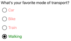
<StackLayout>
<Label Text="What's your favorite mode of transport?" />
<RadioButton Content="Car" />
<RadioButton Content="Bike" />
<RadioButton Content="Train" />
<RadioButton Content="Walking" />
</StackLayout>
</ContentPage>
この例では、暗黙的な Style によって RadioButton オブジェクトがターゲットにされています。 CheckedVisualState は、RadioButton がチェックされると、その TextColor プロパティが Opacity 値 1 で緑色に設定されることを指定します。 UncheckedVisualState は、RadioButton がチェックされていない状態にある場合、その TextColor プロパティが Opacity の値 0.5 で赤色に設定されることを指定します。 したがって、全体的な効果は、 RadioButton がチェックされていない場合は赤で部分的に透明になり、チェックされると透明でない場合は緑色になります。
ビジュアルの状態の詳細については、「表示状態」をご覧ください。
RadioButton の外観の再定義
規定では、RadioButton オブジェクトはハンドラーを使用して、サポートされているプラットフォーム上のネイティブ コントロールを利用します。 ただし、RadioButton のビジュアル構造は ControlTemplate を使用して再定義できるため、RadioButton オブジェクトはすべてのプラットフォームで同じ外観になります。 これは、RadioButton クラスが TemplatedView クラスから継承しているために可能になります。
次の XAML は、RadioButton オブジェクトのビジュアル構造を再定義するために使用できる ControlTemplate を示しています。
<ContentPage ...>
    <ContentPage.Resources>
        <ControlTemplate x:Key="RadioButtonTemplate">
            <Border Stroke="#F3F2F1"
                    StrokeThickness="2"
                    StrokeShape="RoundRectangle 10"
                    BackgroundColor="#F3F2F1"
                    HeightRequest="90"
                    WidthRequest="90"
                    HorizontalOptions="Start"
                    VerticalOptions="Start">
                <VisualStateManager.VisualStateGroups>
                    <VisualStateGroupList>
                        <VisualStateGroup x:Name="CheckedStates">
                            <VisualState x:Name="Checked">
                                <VisualState.Setters>
                                    <Setter Property="Stroke"
                                            Value="#FF3300" />
                                    <Setter TargetName="check"
                                            Property="Opacity"
                                            Value="1" />
                                </VisualState.Setters>
                            </VisualState>
                            <VisualState x:Name="Unchecked">
                                <VisualState.Setters>
                                    <Setter Property="BackgroundColor"
                                            Value="#F3F2F1" />
                                    <Setter Property="Stroke"
                                            Value="#F3F2F1" />
                                    <Setter TargetName="check"
                                            Property="Opacity"
                                            Value="0" />
                                </VisualState.Setters>
                            </VisualState>
                        </VisualStateGroup>
                    </VisualStateGroupList>
                </VisualStateManager.VisualStateGroups>
                <Grid Margin="4"
                      WidthRequest="90">
                    <Grid Margin="0,0,4,0"
                          WidthRequest="18"
                          HeightRequest="18"
                          HorizontalOptions="End"
                          VerticalOptions="Start">
                        <Ellipse Stroke="Blue"
                                 Fill="White"
                                 WidthRequest="16"
                                 HeightRequest="16"
                                 HorizontalOptions="Center"
                                 VerticalOptions="Center" />
                        <Ellipse x:Name="check"
                                 Fill="Blue"
                                 WidthRequest="8"
                                 HeightRequest="8"
                                 HorizontalOptions="Center"
                                 VerticalOptions="Center" />
                    </Grid>
                    <ContentPresenter />
                </Grid>
            </Border>
        </ControlTemplate>

        <Style TargetType="RadioButton">
            <Setter Property="ControlTemplate"
                    Value="{StaticResource RadioButtonTemplate}" />
        </Style>
    </ContentPage.Resources>
    <!-- Page content -->
</ContentPage>
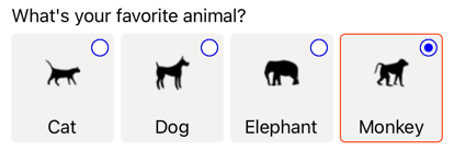
この例では、ControlTemplate のルート要素は、Checked と Unchecked の表示状態を定義する Border オブジェクトです。 Border オブジェクトは、Grid、Ellipse、および ContentPresenter オブジェクトの組み合わせを使用して、RadioButton のビジュアル構造を定義します。 この例には、RadioButtonTemplate をページ上のRadioButton オブジェクトのControlTemplate プロパティに割り当てる 暗黙的 スタイルも含まれています。
Note
ContentPresenter オブジェクトは、RadioButton コンテンツが表示されるビジュアル構造内の位置をマークします。
次の XAML は、暗黙的なスタイルを介して ControlTemplate を使用する RadioButton オブジェクトを示しています。
<StackLayout>
    <Label Text="What's your favorite animal?" />
    <StackLayout RadioButtonGroup.GroupName="animals"
                 Orientation="Horizontal">
        <RadioButton Value="Cat">
            <RadioButton.Content>
                <StackLayout>
                    <Image Source="cat.png"
                           HorizontalOptions="Center"
                           VerticalOptions="Center" />
                    <Label Text="Cat"
                           HorizontalOptions="Center"
                           VerticalOptions="End" />
                </StackLayout>
            </RadioButton.Content>
        </RadioButton>
        <RadioButton Value="Dog">
            <RadioButton.Content>
                <StackLayout>
                    <Image Source="dog.png"
                           HorizontalOptions="Center"
                           VerticalOptions="Center" />
                    <Label Text="Dog"
                           HorizontalOptions="Center"
                           VerticalOptions="End" />
                </StackLayout>
            </RadioButton.Content>
        </RadioButton>
        <RadioButton Value="Elephant">
            <RadioButton.Content>
                <StackLayout>
                    <Image Source="elephant.png"
                           HorizontalOptions="Center"
                           VerticalOptions="Center" />
                    <Label Text="Elephant"
                           HorizontalOptions="Center"
                           VerticalOptions="End" />
                </StackLayout>
            </RadioButton.Content>
        </RadioButton>
        <RadioButton Value="Monkey">
            <RadioButton.Content>
                <StackLayout>
                    <Image Source="monkey.png"
                           HorizontalOptions="Center"
                           VerticalOptions="Center" />
                    <Label Text="Monkey"
                           HorizontalOptions="Center"
                           VerticalOptions="End" />
                </StackLayout>
            </RadioButton.Content>
        </RadioButton>
    </StackLayout>
</StackLayout>
この例では、各 RadioButton に定義されたビジュアル構造が ControlTemplate で定義されたビジュアル構造に置き換えられるため、実行時に ControlTemplate 内のオブジェクトが各 RadioButton の視覚ツリーの一部になります。 さらに、各 RadioButton のコンテンツは、コントロール テンプレートで定義された ContentPresenter に置き換えられます。 その結果、次の RadioButton のような外観になります。
コントロール テンプレートの詳細については、「 コントロール テンプレート」を参照してください。
RadioButton の無効化
場合によっては、アプリが RadioButton のチェックが有効な操作ではない状態になることがあります。 このような場合は、その IsEnabled プロパティを false に設定することで、RadioButton を無効にすることができます。
フィードバック
以下は間もなく提供いたします。2024 年を通じて、コンテンツのフィードバック メカニズムとして GitHub の issue を段階的に廃止し、新しいフィードバック システムに置き換えます。 詳細については、「https://aka.ms/ContentUserFeedback」を参照してください。
フィードバックの送信と表示