Xamarin.Forms でテキストを表示する
Label ビューは、単一行と複数行の両方のテキストを表示するために使用されます。 Label では、テキスト装飾、色付きテキスト、およびカスタム フォント (ファミリ、サイズ、およびオプション) を使用できます。
テキスト装飾
Label.TextDecorations プロパティに 1 つ以上の TextDecorations 列挙メンバーを設定することで、下線と取り消し線のテキスト装飾を Label インスタンスに適用できます。
NoneUnderlineStrikethrough
Label.TextDecorations プロパティを設定する XAML の例を次に示します。
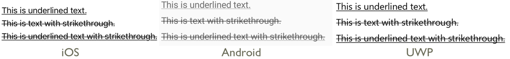
<Label Text="This is underlined text." TextDecorations="Underline"  />
<Label Text="This is text with strikethrough." TextDecorations="Strikethrough" />
<Label Text="This is underlined text with strikethrough." TextDecorations="Underline, Strikethrough" />
同等の C# コードを次に示します。
var underlineLabel = new Label { Text = "This is underlined text.", TextDecorations = TextDecorations.Underline };
var strikethroughLabel = new Label { Text = "This is text with strikethrough.", TextDecorations = TextDecorations.Strikethrough };
var bothLabel = new Label { Text = "This is underlined text with strikethrough.", TextDecorations = TextDecorations.Underline | TextDecorations.Strikethrough };
次のスクリーンショットは、Label インスタンスに適用される TextDecorations 列挙メンバーを示しています。
テキストの変換
Label では、TextTransform プロパティを TextTransform 列挙型の値に設定すると、Text プロパティに格納されているテキストの大文字と小文字を変換できます。 この列挙型には、次の 4 つの値があります。
Noneは、テキストが変換されないことを示します。Defaultは、プラットフォームの既定の動作を使います。 これは、TextTransformプロパティの既定値です。Lowercaseは、テキストが小文字に変換されることを示します。Uppercaseは、テキストが大文字に変換されることを示します。
次の例は、テキストを大文字に変換する方法を示しています。
<Label Text="This text will be displayed in uppercase."
       TextTransform="Uppercase" />
同等の C# コードを次に示します。
Label label = new Label
{
    Text = "This text will be displayed in uppercase.",
    TextTransform = TextTransform.Uppercase
};
文字間隔
Label.CharacterSpacing プロパティに double 値を設定することで、Label インスタンスに文字間隔を適用できます。
<Label Text="Character spaced text"
       CharacterSpacing="10" />
同等の C# コードを次に示します。
Label label = new Label { Text = "Character spaced text", CharacterSpacing = 10 };
結果として、Label により表示されるテキスト内の文字は、デバイスに依存しない単位で CharacterSpacing の間隔が設定されます。
改行
XAML で Label のテキストを強制的に新しい行に配置するには、主に次の 2 つの手法があります。
- Unicode 改行文字 ( ) を使用します。
- プロパティ要素の構文を使用してテキストを指定します。
両方の手法の例を次のコードに示します。
<!-- Unicode line feed character -->
<Label Text="First line Second line" />
<!-- Property element syntax -->
<Label>
<Label.Text>
First line
Second line
</Label.Text>
</Label>
C# では、"\n" 文字を使用して、テキストを強制的に新しい行に配置できます。
Label label = new Label { Text = "First line\nSecond line" };
色
バインド可能な TextColor プロパティを介して、カスタムのテキスト色を使用するようにラベルを設定できます。
各プラットフォームでその色の使用が可能かについては、特別な注意が必要です。 各プラットフォームはテキストと背景の色に異なる既定値を使っているため、それぞれで動作する既定値を注意して確認する必要があります。
次の XAML の例では、テキストの色を Label に設定しています。
<ContentPage xmlns="http://xamarin.com/schemas/2014/forms"
xmlns:x="http://schemas.microsoft.com/winfx/2009/xaml"
x:Class="TextSample.LabelPage"
Title="Label Demo">
<StackLayout Padding="5,10">
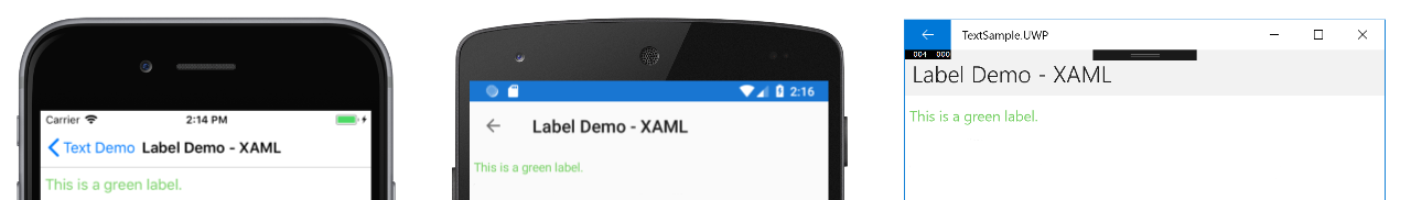
<Label TextColor="#77d065" FontSize = "20" Text="This is a green label." />
</StackLayout>
</ContentPage>
同等の C# コードを次に示します。
public partial class LabelPage : ContentPage
{
    public LabelPage ()
    {
        InitializeComponent ();

        var layout = new StackLayout { Padding = new Thickness(5,10) };
        var label = new Label { Text="This is a green label.", TextColor = Color.FromHex("#77d065"), FontSize = 20 };
        layout.Children.Add(label);
        this.Content = layout;
    }
}
次のスクリーンショットは、TextColor プロパティの設定結果を示しています。
色の詳細については、「色」を参照してください。
フォント
Label でのフォント指定の詳細情報については、「フォント」を参照してください。
切り捨てと折り返し
ラベルは、LineBreakMode プロパティによって公開される複数の方法のいずれかで、1 行に収まらないテキストを処理するように設定できます。 LineBreakMode は、次の値を持つ列挙型です。
- HeadTruncation – テキストの先頭が切り捨てられ、末尾が表示されます。
- CharacterWrap – 文字境界の新しい行にテキストを折り返します。
- MiddleTruncation – テキストの先頭と末尾が表示され、中央が省略記号で置き換えられます。
- NoWrap – テキストを折り返さずに、1 行に収まる量のテキストのみを表示します。
- TailTruncation – テキストの先頭を表示し、末尾を切り捨てます。
- WordWrap – 単語境界でテキストを折り返します。
特定の行数を表示する
Label により 表示される行数は、Label.MaxLines プロパティに int 値を設定することで指定できます。
MaxLinesが既定値である -1 の場合は、Labelは、LineBreakModeプロパティの値を考慮して、1 行のみ (おそらく切り捨てられたもの)表示するか、すべてのテキストを含むすべての行を表示します。MaxLinesが 0 の場合、Labelは表示されません。MaxLinesが 1 の場合、結果はLineBreakModeプロパティをNoWrap、HeadTruncation、MiddleTruncation、またはTailTruncationに設定した場合と同じになります。 ただし、Labelでは、該当する場合、省略記号の配置に関してLineBreakModeプロパティの値を考慮します。MaxLinesが 1 より大きい場合、Labelでは、該当する場合、省略記号の配置に関してLineBreakModeプロパティの値を考慮しながら、指定された行数まで表示します。 ただし、MaxLinesプロパティを 1 より大きい値に設定しても、LineBreakModeプロパティがNoWrapに設定されている場合は効果がありません。
次の XAML の例では、Label で MaxLines プロパティを設定する方法を示しています。
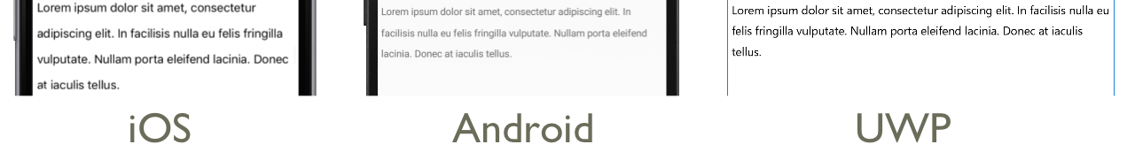
<Label Text="Lorem ipsum dolor sit amet, consectetur adipiscing elit. In facilisis nulla eu felis fringilla vulputate. Nullam porta eleifend lacinia. Donec at iaculis tellus."
       LineBreakMode="WordWrap"
       MaxLines="2" />
同等の C# コードを次に示します。
var label =
{
  Text = "Lorem ipsum dolor sit amet, consectetur adipiscing elit. In facilisis nulla eu felis fringilla vulputate. Nullam porta eleifend lacinia. Donec at iaculis tellus.", LineBreakMode = LineBreakMode.WordWrap,
  MaxLines = 2
};
次のスクリーンショットは、テキストの長さが 2 行を充分に超える場合に、MaxLines プロパティを 2 に設定した際の結果を示しています。

HTML の表示
Label クラスには、Label インスタンスにプレーン テキストと HTML テキストのどちらを表示させるかを決定する、TextType プロパティがあります。 このプロパティは、TextType 列挙型メンバーのいずれかに設定する必要があります。
Textは、Label.TextTypeプロパティの既定値であり、Labelにプレーンテキストが表示されることを示します。Htmlは、Labelに HTML テキストが表示されることを示します。
そのため、Label インスタンスは、Label.TextType プロパティに Html を設定することで HTML を表示し、これを Label.Text プロパティに設定することで HTML 文字列 を表示します。
Label label = new Label
{
    Text = "This is <strong style=\"color:red\">HTML</strong> text.",
    TextType = TextType.Html
};
上記の例では、\ 記号を使用して HTML 内の二重引用符文字をエスケープする必要があります。
XAML では、< や > の記号がエスケープされるため、HTML 文字列が読み取れなくなる可能性があります。
<Label Text="This is <strong style="color:red">HTML</strong> text."
TextType="Html" />
あるいは、読みやすくするために、HTML を CDATA セクションにインライン化することもできます。
<Label TextType="Html">
    <![CDATA[
    This is <strong style="color:red">HTML</strong> text.
    ]]>
</Label>
この例では、Label.Text プロパティは、CDATA セクションにインライン化された HTML 文字列に設定されています。 これは、Text プロパティが Label クラスの ContentProperty であるため機能します。
次のスクリーンショットに、HTML を表示している Label を示します。

重要
Label で HTML を表示するのは、基盤となるプラットフォームでサポートされている HTML タグに限られます。
書式付きテキスト
Label は、同じビュー内で複数のフォントと色を持つテキストを表示できるようにする、FormattedText プロパティを公開します。
FormattedString 型の FormattedText プロパティは,,1 つまたは複数の Span インスタンスで構成され、Spans プロパティを介して設定されます。 次の Span プロパティは、ビジュアル的外観を設定するために使用されます。
BackgroundColor– スパンの背景の色。CharacterSpacing:double型、Spanテキストの文字間の間隔。Font– スパン内のテキストのフォント。FontAttributes– スパン内のテキストのフォント属性。FontFamily– スパン内のテキストのフォントが属するフォント ファミリ。FontSize– スパン内のテキストのフォントのサイズ。ForegroundColor– スパン内のテキストの色。 このプロパティは以前のもので、現在、TextColorプロパティに置き換えられています。LineHeight- スパンの行の既定の高さに適用する乗数。 詳細については、「行の高さ」を参照してください。Style– スパンに適用するスタイル。Text– スパンのテキスト。TextColor– スパン内のテキストの色。TextDecorations- スパン内のテキストに適用する装飾。 詳細については、「テキスト装飾」を参照してください。
BackgroundColor、Text、および Text のバインド可能なプロパティのバインディング モードは、既定値で OneWay になります。 このバインディング モードの詳細については、「バインディング モード」ガイドの「既定のバインディング モード」を参照してください。
さらに、GestureRecognizers プロパティを使用して、ジェスチャ認識エンジンのコレクションを定義できます。ジェスチャ認識エンジンは、Span でのジェスチャに反応します。
Note
Span で HTML を表示することはできません。
次の XAML の例は、FormattedText プロパティが 3 つの Span インスタンスで構成されていることを示しています。
<ContentPage xmlns="http://xamarin.com/schemas/2014/forms"
xmlns:x="http://schemas.microsoft.com/winfx/2009/xaml"
x:Class="TextSample.LabelPage"
Title="Label Demo - XAML">
<StackLayout Padding="5,10">
...
<Label LineBreakMode="WordWrap">
<Label.FormattedText>
<FormattedString>
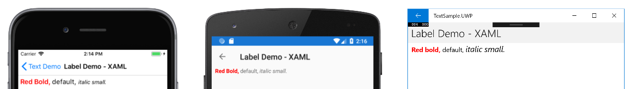
<Span Text="Red Bold, " TextColor="Red" FontAttributes="Bold" />
<Span Text="default, " Style="{DynamicResource BodyStyle}">
<Span.GestureRecognizers>
<TapGestureRecognizer Command="{Binding TapCommand}" />
</Span.GestureRecognizers>
</Span>
<Span Text="italic small." FontAttributes="Italic" FontSize="Small" />
</FormattedString>
</Label.FormattedText>
</Label>
</StackLayout>
</ContentPage>
同等の C# コードを次に示します。
public class LabelPageCode : ContentPage
{
    public LabelPageCode ()
    {
        var layout = new StackLayout{ Padding = new Thickness (5, 10) };
        ...
        var formattedString = new FormattedString ();
        formattedString.Spans.Add (new Span{ Text = "Red bold, ", ForegroundColor = Color.Red, FontAttributes = FontAttributes.Bold });

        var span = new Span { Text = "default, " };
        span.GestureRecognizers.Add(new TapGestureRecognizer { Command = new Command(async () => await DisplayAlert("Tapped", "This is a tapped Span.", "OK")) });
        formattedString.Spans.Add(span);
        formattedString.Spans.Add (new Span { Text = "italic small.", FontAttributes = FontAttributes.Italic, FontSize =  Device.GetNamedSize(NamedSize.Small, typeof(Label)) });

        layout.Children.Add (new Label { FormattedText = formattedString });
        this.Content = layout;
    }
}
重要
Span の Text プロパティは、データ バインディング経由で設定できます。 詳細については、データ バインディングに関するページを参照してください。
また、Span は、スパンの GestureRecognizers コレクションに追加された任意のジェスチャにも、応答できることに注意してください。 たとえば、上記のコード例では、 2 番目の Span に TapGestureRecognizer が追加されています。 そのため、この Span をタップすると、TapGestureRecognizer は反応し、Command プロパティによって定義された ICommand を実行します。 ジェスチャ認識エンジンの詳細については、「Xamarin.Forms ジェスチャ」を参照してください。
次のスクリーンショットは、FormattedString プロパティに 3 つの Span インスタンスを設定した結果を示しています。
行の高さ
Label と Span の垂直方向の高さは、Label.LineHeight または Span.LineHeight プロパティに double 値を設定することでカスタマイズできます。 iOS および Android では、これらの値は元の行の高さに対する乗数であり、ユニバーサル Windows プラットフォーム (UWP) では、Label.LineHeight プロパティの値はラベルのフォント サイズに対する乗数です。
Note
- iOS では、1 行に収まるテキストと複数行に折り返されるテキストの行の高さが、
Label.LineHeightおよびSpan.LineHeightプロパティによって変更されます。 - Android の場合、
Label.LineHeightおよびSpan.LineHeightプロパティは、複数行に折り返されるテキストの行の高さのみを変更します。 - UWP では、
Label.LineHeightプロパティが複数行に折り返されるテキストの行の高さを変更し、Span.LineHeightプロパティには効果がありません。
次の XAML の例では、Label で LineHeight プロパティを設定する方法を示しています。
<Label Text="Lorem ipsum dolor sit amet, consectetur adipiscing elit. In facilisis nulla eu felis fringilla vulputate. Nullam porta eleifend lacinia. Donec at iaculis tellus."
       LineBreakMode="WordWrap"
       LineHeight="1.8" />
同等の C# コードを次に示します。
var label =
{
  Text = "Lorem ipsum dolor sit amet, consectetur adipiscing elit. In facilisis nulla eu felis fringilla vulputate. Nullam porta eleifend lacinia. Donec at iaculis tellus.", LineBreakMode = LineBreakMode.WordWrap,
  LineHeight = 1.8
};
次のスクリーンショットに、Label.LineHeight プロパティを 1.8 に設定した場合の結果を示します。
次の XAML の例では、Span で LineHeight プロパティを設定する方法を示しています。
<Label LineBreakMode="WordWrap">
    <Label.FormattedText>
        <FormattedString>
            <Span Text="Lorem ipsum dolor sit amet, consectetur adipiscing elit. In a tincidunt sem. Phasellus mollis sit amet turpis in rutrum. Sed aliquam ac urna id scelerisque. "
                  LineHeight="1.8"/>
            <Span Text="Nullam feugiat sodales elit, et maximus nibh vulputate id."
                  LineHeight="1.8" />
        </FormattedString>
    </Label.FormattedText>
</Label>
同等の C# コードを次に示します。
var formattedString = new FormattedString();
formattedString.Spans.Add(new Span
{
  Text = "Lorem ipsum dolor sit amet, consectetur adipiscing elit. In a tincidunt sem. Phasellus mollis sit amet turpis in rutrum. Sed aliquam ac urna id scelerisque. ",
  LineHeight = 1.8
});
formattedString.Spans.Add(new Span
{
  Text = "Nullam feugiat sodales elit, et maximus nibh vulputate id.",
  LineHeight = 1.8
});
var label = new Label
{
  FormattedText = formattedString,
  LineBreakMode = LineBreakMode.WordWrap
};
次のスクリーンショットに、Span.LineHeight プロパティを 1.8 に設定した場合の結果を示します。

パディング
パディングは、要素とその子要素の間の間隔を表すもので、要素をそれ自体のコンテンツから分離するために使用されます。 Label.Padding プロパティに Thickness 値を設定することで、パディングを Labelインスタンスに適用できます。
<Label Padding="10">
    <Label.FormattedText>
        <FormattedString>
            <Span Text="Lorem ipsum" />
            <Span Text="dolor sit amet." />
        </FormattedString>
    </Label.FormattedText>
</Label>
同等の C# コードを次に示します。
FormattedString formattedString = new FormattedString();
formattedString.Spans.Add(new Span
{
  Text = "Lorem ipsum"
});
formattedString.Spans.Add(new Span
{
  Text = "dolor sit amet."
});
Label label = new Label
{
    FormattedText = formattedString,
    Padding = new Thickness(20)
};
重要
iOS では、Padding プロパティを設定する Label が作成されるとパディングが適用されます。このパディング値は後で更新できます。 ただし、Padding プロパティを設定しない Label が作成された場合、後でこれを設定しようとしても効果はありません。
Android およびユニバーサル Windows プラットフォームでは、Padding プロパティ値を Label の作成時、あるいは以後に指定できます。
パディングの詳細については、「余白とパディング」を参照してください。
ハイパーリンク
Label インスタンスと Span インスタンスで表示されるテキストは、次の方法でハイパーリンクに変換できます。
LabelまたはSpanのTextColorプロパティとTextDecorationプロパティを設定します。LabelまたはSpanのGestureRecognizersコレクションにTapGestureRecognizerを追加します。ここでは、CommandプロパティがICommandにバインドされ、開こうとしている URL がCommandParameterプロパティに追加されます。TapGestureRecognizerによって実行されるICommandを定義します。ICommandによって実行されるコードを記述します。
次のコード例は、コンテンツが複数の Span インスタンスから設定されている Label を示しています。
<Label>
    <Label.FormattedText>
        <FormattedString>
            <Span Text="Alternatively, click " />
            <Span Text="here"
                  TextColor="Blue"
                  TextDecorations="Underline">
                <Span.GestureRecognizers>
                    <TapGestureRecognizer Command="{Binding TapCommand}"
                                          CommandParameter="https://learn.microsoft.com/xamarin/" />
                </Span.GestureRecognizers>
            </Span>
            <Span Text=" to view Xamarin documentation." />
        </FormattedString>
    </Label.FormattedText>
</Label>
この例では、1 番目と 3 番目の Span インスタンスはテキストを含んでおり、一方、2 番目の Span は利用可能なハイパーリンクを表しています。 テキストの色が青に設定され、下線テキスト装飾が施されています。 次のスクリーンショットに示すように、これによりハイパーリンクの外観が作成されます。

このハイパーリンクがタップされると、TapGestureRecognizer が応答して、Command プロパティで定義された ICommand を実行します。 さらに、CommandParameter プロパティで指定された URL がパラメーターとして ICommand に渡されます。
XAML ページの分離コードには、TapCommand 実装が含まれています。
public partial class MainPage : ContentPage
{
    // Launcher.OpenAsync is provided by Xamarin.Essentials.
    public ICommand TapCommand => new Command<string>(async (url) => await Launcher.OpenAsync(url));

    public MainPage()
    {
        InitializeComponent();
        BindingContext = this;
    }
}
TapCommand は Launcher.OpenAsync メソッドを実行して、TapGestureRecognizer.CommandParameter プロパティの値をパラメーターとして渡します。 Launcher.OpenAsync メソッドは Xamarin.Essentials によって提供されており、これは Web ブラウザーで URL を開きます。 したがって、全体的な結果としては、ページ上でハイパーリンクがタップされると、Web ブラウザーが表示され、ハイパーリンクに関連付けられている URL に移動します。
再利用可能なハイパーリンク クラスを作成する
前出のハイパーリンクの作成方法では、アプリケーションがハイパーリンクを必要とするたびに、コードを反復して記述する必要があります。 一方、Label クラスと Span クラスの両方をサブクラス化して HyperlinkLabel クラスと HyperlinkSpan クラスを作成し、そこにジェスチャ認識エンジンとテキスト書式設定のコードを追加することができます。
次のコード例は、HyperlinkSpan クラスを示しています。
public class HyperlinkSpan : Span
{
    public static readonly BindableProperty UrlProperty =
        BindableProperty.Create(nameof(Url), typeof(string), typeof(HyperlinkSpan), null);

    public string Url
    {
        get { return (string)GetValue(UrlProperty); }
        set { SetValue(UrlProperty, value); }
    }

    public HyperlinkSpan()
    {
        TextDecorations = TextDecorations.Underline;
        TextColor = Color.Blue;
        GestureRecognizers.Add(new TapGestureRecognizer
        {
            // Launcher.OpenAsync is provided by Xamarin.Essentials.
            Command = new Command(async () => await Launcher.OpenAsync(Url))
        });
    }
}
HyperlinkSpan クラスには Url プロパティのほか、関連する BindableProperty が定義されており、ハイパーリンクの外観と、ハイパーリンクがタップされたときに応答する TapGestureRecognizer をコンストラクターが設定します。 HyperlinkSpan がタップされると、TapGestureRecognizer は Launcher.OpenAsync メソッドを実行して応答し、Url プロパティで指定された URL を Web ブラウザーで開きます。
HyperlinkSpan クラスを使用するには、クラスのインスタンスを XAML に追加します。
<ContentPage xmlns="http://xamarin.com/schemas/2014/forms"
             xmlns:x="http://schemas.microsoft.com/winfx/2009/xaml"
             xmlns:local="clr-namespace:HyperlinkDemo"
             x:Class="HyperlinkDemo.MainPage">
    <StackLayout>
        ...
        <Label>
            <Label.FormattedText>
                <FormattedString>
                    <Span Text="Alternatively, click " />
                    <local:HyperlinkSpan Text="here"
                                         Url="https://learn.microsoft.com/appcenter/" />
                    <Span Text=" to view AppCenter documentation." />
                </FormattedString>
            </Label.FormattedText>
        </Label>
    </StackLayout>
</ContentPage>
ラベルのスタイル設定
前のセクションでは、インスタンスごとの Label と Span プロパティの設定について説明しました。 しかし、一連のプロパティは、1 つまたは複数のビューに一貫して適用される、単一のスタイルにグループ化することが可能です。 これにより、コードの可読性が向上し、設計の変更を実装しやすくなります。 詳細情報については、「スタイル」を参照してください。