Xamarin.Forms のスタイル クラス
 サンプルのダウンロード
Xamarin.Forms のスタイル クラスを使用すると、スタイルの継承に頼らなくても、ひとつのコントロールに複数のスタイルを適用できます。
スタイル クラスを作成する
スタイル クラスは、Style の Class プロパティを、クラス名を表す string に設定することで作成できます。 この方法が、x:Key 属性を使用して明示的なスタイルを定義するよりも好都合な点は、複数のスタイル クラスを VisualElement に適用できることです。
重要
複数のスタイルが異なる型を対象としている場合は、それらのスタイルで同じクラス名を共有できます。 これにより、同じ名前を持つ複数のスタイル クラスで、異なる型を対象とすることができます。
次の例は、3 つの BoxView スタイル クラスと VisualElement スタイル クラスを示しています。
<ContentPage ...>
    <ContentPage.Resources>
        <Style TargetType="BoxView"
               Class="Separator">
            <Setter Property="BackgroundColor"
                    Value="#CCCCCC" />
            <Setter Property="HeightRequest"
                    Value="1" />
        </Style>

        <Style TargetType="BoxView"
               Class="Rounded">
            <Setter Property="BackgroundColor"
                    Value="#1FAECE" />
            <Setter Property="HorizontalOptions"
                    Value="Start" />
            <Setter Property="CornerRadius"
                    Value="10" />
        </Style>

        <Style TargetType="BoxView"
               Class="Circle">
            <Setter Property="BackgroundColor"
                    Value="#1FAECE" />
            <Setter Property="WidthRequest"
                    Value="100" />
            <Setter Property="HeightRequest"
                    Value="100" />
            <Setter Property="HorizontalOptions"
                    Value="Start" />
            <Setter Property="CornerRadius"
                    Value="50" />
        </Style>

        <Style TargetType="VisualElement"
               Class="Rotated"
               ApplyToDerivedTypes="true">
            <Setter Property="Rotation"
                    Value="45" />
        </Style>
    </ContentPage.Resources>
</ContentPage>
Separator、Rounded、Circle スタイル クラスはそれぞれ、BoxView プロパティに特定の値を設定します。
Rotated スタイル クラスには VisualElement という TargetType があります。つまり、VisualElement インスタンスにのみ適用できます。 ただし、その ApplyToDerivedTypes プロパティは true に設定され、BoxView などの、VisualElement から派生するあらゆるコントロールに確実に適用できるようになります。 派生型にスタイルを適用する方法の詳細については、「派生型にスタイルを適用する」を参照してください。
同等の C# コードを次に示します。
var separatorBoxViewStyle = new Style(typeof(BoxView))
{
    Class = "Separator",
    Setters =
    {
        new Setter
        {
            Property = VisualElement.BackgroundColorProperty,
            Value = Color.FromHex("#CCCCCC")
        },
        new Setter
        {
            Property = VisualElement.HeightRequestProperty,
            Value = 1
        }
    }
};

var roundedBoxViewStyle = new Style(typeof(BoxView))
{
    Class = "Rounded",
    Setters =
    {
        new Setter
        {
            Property = VisualElement.BackgroundColorProperty,
            Value = Color.FromHex("#1FAECE")
        },
        new Setter
        {
            Property = View.HorizontalOptionsProperty,
            Value = LayoutOptions.Start
        },
        new Setter
        {
            Property = BoxView.CornerRadiusProperty,
            Value = 10
        }
    }
};

var circleBoxViewStyle = new Style(typeof(BoxView))
{
    Class = "Circle",
    Setters =
    {
        new Setter
        {
            Property = VisualElement.BackgroundColorProperty,
            Value = Color.FromHex("#1FAECE")
        },
        new Setter
        {
            Property = VisualElement.WidthRequestProperty,
            Value = 100
        },
        new Setter
        {
            Property = VisualElement.HeightRequestProperty,
            Value = 100
        },
        new Setter
        {
            Property = View.HorizontalOptionsProperty,
            Value = LayoutOptions.Start
        },
        new Setter
        {
            Property = BoxView.CornerRadiusProperty,
            Value = 50
        }
    }
};

var rotatedVisualElementStyle = new Style(typeof(VisualElement))
{
    Class = "Rotated",
    ApplyToDerivedTypes = true,
    Setters =
    {
        new Setter
        {
            Property = VisualElement.RotationProperty,
            Value = 45
        }
    }
};

Resources = new ResourceDictionary
{
    separatorBoxViewStyle,
    roundedBoxViewStyle,
    circleBoxViewStyle,
    rotatedVisualElementStyle
};
スタイル クラスを使用する
スタイル クラスを使用するには、コントロールの StyleClass プロパティ (IList<string> 型) をスタイル クラス名のリストに設定します。 コントロールの型がスタイル クラスの TargetType と一致する場合は、スタイル クラスが適用されます。
次の例は、それぞれ異なるスタイル クラスに設定されている 3 つの BoxView インスタンスを示しています。
<ContentPage ...>
    <ContentPage.Resources>
        ...
    </ContentPage.Resources>
    <StackLayout Margin="20">
        <BoxView StyleClass="Separator" />
        <BoxView WidthRequest="100"
                 HeightRequest="100"
                 HorizontalOptions="Center"
                 StyleClass="Rounded, Rotated" />
        <BoxView HorizontalOptions="Center"
                 StyleClass="Circle" />
    </StackLayout>
</ContentPage>
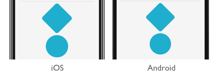
この例では、最初の BoxView が行区切り記号にスタイル設定されるのに対して、3 番目の BoxView は円形です。 2 番目の BoxView には 2 つのスタイル クラスが適用されており、角が丸く 45 度回転した形になっています。
重要
StyleClass プロパティが IList<string> 型なので、コントロールに複数のスタイル クラスを適用できます。 この場合、スタイル クラスは昇順に適用されます。 したがって、複数のスタイル クラスで同じプロパティが設定されている場合、リストの最も高い位置にあるスタイル クラスのプロパティが優先されます。
同等の C# コードを次に示します。
...
Content = new StackLayout
{
    Children =
    {
        new BoxView { StyleClass = new [] { "Separator" } },
        new BoxView { WidthRequest = 100, HeightRequest = 100, HorizontalOptions = LayoutOptions.Center, StyleClass = new [] { "Rounded", "Rotated" } },
        new BoxView { HorizontalOptions = LayoutOptions.Center, StyleClass = new [] { "Circle" } }
    }
};