Xamarin.Forms 이중 화면 디자인 패턴
 샘플 다운로드
이 가이드에서는 이중 화면 디바이스를 위한 권장 디자인 패턴을 소개하고 멋지고 유용한 사용자 환경을 제공하는 인터페이스를 만드는 데 도움이 되는 코드와 샘플을 제공합니다.
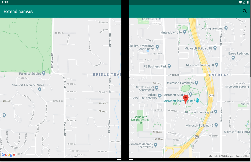
확장된 캔버스 패턴
확장된 캔버스 패턴에서는 두 화면을 하나의 큰 캔버스로 처리하여 지도, 이미지, 스프레드시트와 같이 펼쳐져서 최대한의 공간을 사용하면 좋은 콘텐츠를 표시합니다.
<ContentPage xmlns:local="clr-namespace:Xamarin.Duo.Forms.Samples"
             xmlns="http://xamarin.com/schemas/2014/forms"
             xmlns:x="http://schemas.microsoft.com/winfx/2009/xaml"
             xmlns:d="http://xamarin.com/schemas/2014/forms/design"
             xmlns:mc="http://schemas.openxmlformats.org/markup-compatibility/2006"
             mc:Ignorable="d"
             x:Class="Xamarin.Duo.Forms.Samples.ExtendCanvas">
    <Grid>
        <WebView x:Name="webView"
                 HorizontalOptions="FillAndExpand"
                 VerticalOptions="FillAndExpand" />
        <SearchBar x:Name="searchBar"
                   Placeholder="Find a place..."
                   BackgroundColor="DarkGray"
                   Opacity="0.8"
                   HorizontalOptions="FillAndExpand"
                   VerticalOptions="Start" />
    </Grid>
</ContentPage>
이 예제에서는 Grid 및 내부 콘텐츠가 확장되어 단일 화면에 표시되든 두 화면에 걸쳐 표시되든 사용 가능한 화면을 모두 사용합니다.
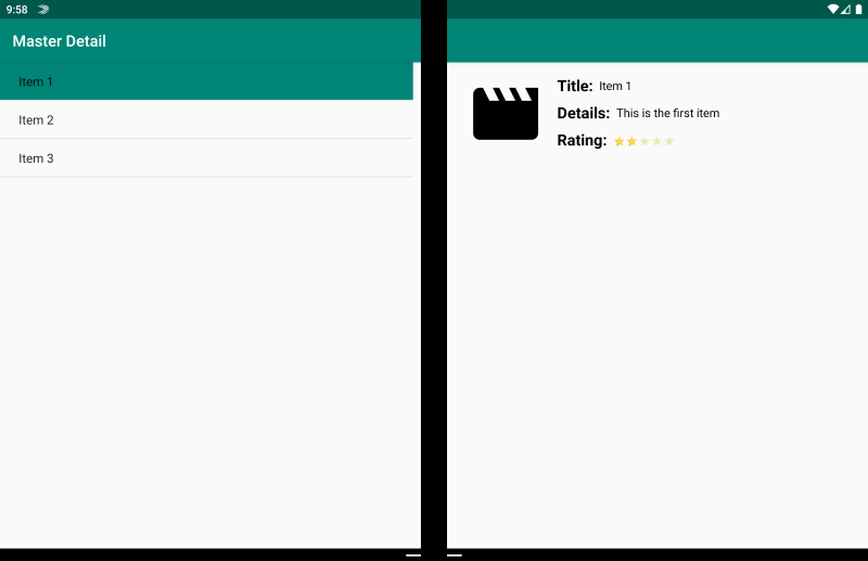
마스터-세부 패턴
마스터-세부 패턴은 (일반적으로 왼쪽에 목록으로 나타나는) 마스터 보기에서 사용자가 항목을 선택하면 오른쪽에 해당 항목의 세부 정보가 나타나는 경우에 사용됩니다.
<ContentPage xmlns:local="clr-namespace:Xamarin.Duo.Forms.Samples"
             xmlns="http://xamarin.com/schemas/2014/forms"
             xmlns:x="http://schemas.microsoft.com/winfx/2009/xaml"
             xmlns:dualScreen="clr-namespace:Xamarin.Forms.DualScreen;assembly=Xamarin.Forms.DualScreen"
             x:Class="Xamarin.Duo.Forms.Samples.MasterDetail">
    <dualScreen:TwoPaneView MinWideModeWidth="4000"
                            MinTallModeHeight="4000">
        <dualScreen:TwoPaneView.Pane1>
            <local:Master x:Name="masterPage" />
        </dualScreen:TwoPaneView.Pane1>
        <dualScreen:TwoPaneView.Pane2>
            <local:Details x:Name="detailsPage" />
        </dualScreen:TwoPaneView.Pane2>
    </dualScreen:TwoPaneView>
</ContentPage>
이 예제에서는 TwoPaneView를 사용하여 한 창에서는 목록을 설정하고 다른 창에서는 세부 정보 보기를 설정할 수 있습니다.
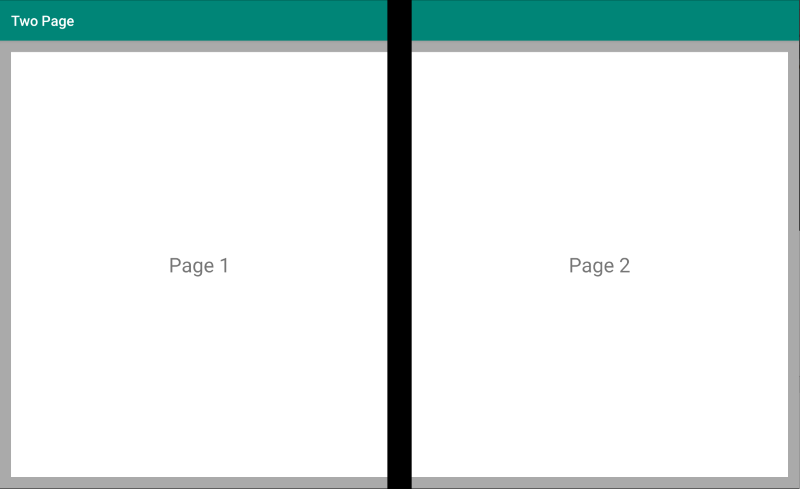
두 페이지 패턴
두 페이지 패턴은 문서 리더, 메모, 아트보드와 같이 2단 레이아웃을 사용하면 좋은 콘텐츠에 적합합니다.
<Grid x:Name="layout">
    <CollectionView x:Name="cv"
                    BackgroundColor="LightGray">
        <CollectionView.ItemsLayout>
            <GridItemsLayout SnapPointsAlignment="Start"
                             SnapPointsType="MandatorySingle"
                             Orientation="Horizontal"
                             HorizontalItemSpacing="{Binding Source={x:Reference mainPage}, Path=HingeWidth}" />
        </CollectionView.ItemsLayout>
        <CollectionView.ItemTemplate>
            <DataTemplate>
                <Frame BackgroundColor="LightGray"
                       Padding="0"
                       Margin="0"
                       WidthRequest="{Binding Source={x:Reference mainPage}, Path=ContentWidth}"
                       HeightRequest="{Binding Source={x:Reference mainPage}, Path=ContentHeight}">
                    <Frame Margin="20"
                           BackgroundColor="White">
                        <Label FontSize="Large"
                               Text="{Binding .}"
                               VerticalTextAlignment="Center"
                               HorizontalTextAlignment="Center"
                               HorizontalOptions="Center"
                               VerticalOptions="Center" />
                    </Frame>
                </Frame>
            </DataTemplate>
        </CollectionView.ItemTemplate>
    </CollectionView>
</Grid>
힌지 너비에서 분할되는 그리드 레이아웃을 사용하는 CollectionView는 이 이중 화면 환경을 구현하기 위한 적합한 방법입니다.
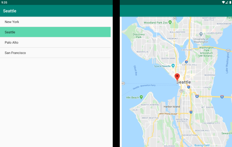
이중 보기 패턴
이중 보기 패턴은 “두 페이지” 보기처럼 보이긴 하나, 콘텐츠와 사용자 시나리오에서 차이가 있습니다. 이 패턴에서는 예를 들어 문서 또는 사진을 편집하거나 여러 식당 메뉴를 비교하거나 코드 파일의 병합 충돌을 살펴볼 때 콘텐츠를 나란히 두고 비교합니다.
<ContentPage xmlns:local="clr-namespace:Xamarin.Duo.Forms.Samples"
             xmlns="http://xamarin.com/schemas/2014/forms"
             xmlns:x="http://schemas.microsoft.com/winfx/2009/xaml"
             xmlns:dualScreen="clr-namespace:Xamarin.Forms.DualScreen;assembly=Xamarin.Forms.DualScreen"
             x:Class="Xamarin.Duo.Forms.Samples.DualViewListPage">
    <dualScreen:TwoPaneView>
        <dualScreen:TwoPaneView.Pane1>
            <CollectionView x:Name="mapList"
                            SelectionMode="Single">
                <CollectionView.ItemTemplate>
                    <DataTemplate>
                        <Grid Padding="10,5,10,5">
                            <Frame Visual="Material"
                                   BorderColor="LightGray">
                                <StackLayout Padding="5">
                                    <Label FontSize="Title"
                                           Text="{Binding Title}" />
                                </StackLayout>
                            </Frame>
                        </Grid>
                    </DataTemplate>
                </CollectionView.ItemTemplate>
            </CollectionView>
        </dualScreen:TwoPaneView.Pane1>
        <dualScreen:TwoPaneView.Pane2>
            <local:DualViewMap x:Name="mapPage" />
        </dualScreen:TwoPaneView.Pane2>
    </dualScreen:TwoPaneView>
</ContentPage>
보조 패턴
보조 패턴에서는 그리기 앱, 게임, 미디어 편집과 같은 경우에서처럼 두 번째 화면을 사용하여 기본 보기와 관련된 두 번째 수준의 콘텐츠를 제공하는 방법을 보여 줍니다.
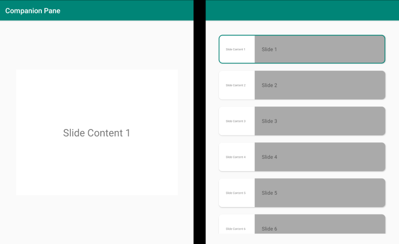
<ContentPage xmlns:local="clr-namespace:Xamarin.Duo.Forms.Samples"
             xmlns="http://xamarin.com/schemas/2014/forms"
             xmlns:x="http://schemas.microsoft.com/winfx/2009/xaml"
             xmlns:dualscreen="clr-namespace:Xamarin.Forms.DualScreen;assembly=Xamarin.Forms.DualScreen"
             x:Name="mainPage"
             x:Class="Xamarin.Duo.Forms.Samples.CompanionPane"
             BackgroundColor="LightGray"
             Visual="Material">
    <dualscreen:TwoPaneView x:Name="twoPaneView"
                            MinWideModeWidth="4000"
                            MinTallModeHeight="4000">
        <dualscreen:TwoPaneView.Pane1>
            <CarouselView x:Name="cv"
                          BackgroundColor="LightGray"
                          IsScrollAnimated="False" >
                <CarouselView.ItemTemplate>
                    <DataTemplate>
                        <Frame BackgroundColor="LightGray"
                               Padding="0"
                               Margin="0"
                               WidthRequest="{Binding Source={x:Reference twoPaneView}, Path=Pane1.Width}"
                               HeightRequest="{Binding Source={x:Reference twoPaneView}, Path=Pane1.Height}">
                            <Frame Margin="20"
                                   BackgroundColor="White">
                                <Label FontSize="Large"
                                       Text="{Binding ., StringFormat='Slide Content {0}'}"
                                       VerticalTextAlignment="Center"
                                       HorizontalTextAlignment="Center"
                                       HorizontalOptions="Center"
                                       VerticalOptions="Center" />
                            </Frame>
                        </Frame>
                    </DataTemplate>
                </CarouselView.ItemTemplate>
            </CarouselView>
        </dualscreen:TwoPaneView.Pane1>
        <dualscreen:TwoPaneView.Pane2>
            <CollectionView x:Name="indicators"
                            SelectionMode="Single"
                            Margin="20, 20, 20, 20"
                            BackgroundColor="LightGray"
                            WidthRequest="{Binding Source={x:Reference twoPaneView}, Path=Pane2.Width}"
                            ItemsSource="{Binding Source={x:Reference cv}, Path=ItemsSource}">
                <CollectionView.Resources>
                    <ResourceDictionary>
                        <Style TargetType="Frame">
                            <Setter Property="VisualStateManager.VisualStateGroups">
                                <VisualStateGroupList>
                                    <VisualStateGroup x:Name="CommonStates">
                                        <VisualState x:Name="Normal">
                                            <VisualState.Setters>
                                                <Setter Property="Padding"
                                                        Value="0" />
                                            </VisualState.Setters>
                                        </VisualState>
                                        <VisualState x:Name="Selected">
                                            <VisualState.Setters>
                                                <Setter Property="BorderColor"
                                                        Value="Green" />
                                                <Setter Property="Padding"
                                                        Value="1" />
                                            </VisualState.Setters>
                                        </VisualState>
                                    </VisualStateGroup>
                                </VisualStateGroupList>
                            </Setter>
                        </Style>
                    </ResourceDictionary>
                </CollectionView.Resources>
                <CollectionView.ItemsLayout>
                    <LinearItemsLayout Orientation="Vertical"
                                       ItemSpacing="10" />
                </CollectionView.ItemsLayout>
                <CollectionView.ItemTemplate>
                    <DataTemplate>
                        <Frame WidthRequest="{Binding Source={x:Reference twoPaneView}, Path=Pane2.Width}"
                               CornerRadius="10"
                               HeightRequest="60"
                               BackgroundColor="White"
                               Margin="0">
                            <StackLayout HorizontalOptions="Fill"
                                         VerticalOptions="Fill"
                                         Orientation="Horizontal">
                                <Label FontSize="Micro"
                                       Padding="20,0,20,0"
                                       VerticalTextAlignment="Center"
                                       WidthRequest="140" Text="{Binding ., StringFormat='Slide Content {0}'}" />
                                <Label FontSize="Small"
                                       Padding="20,0,20,0"
                                       VerticalTextAlignment="Center"
                                       HorizontalOptions="FillAndExpand"
                                       BackgroundColor="DarkGray"
                                       Grid.Column="1"
                                       Text="{Binding ., StringFormat='Slide {0}'}" />
                            </StackLayout>
                        </Frame>
                    </DataTemplate>
                </CollectionView.ItemTemplate>
            </CollectionView>
        </dualscreen:TwoPaneView.Pane2>
    </dualscreen:TwoPaneView>
</ContentPage>
관련 링크
- DualScreen(sample)(DualScreen(샘플))
- Create apps for dual screen devices(이중 화면 디바이스용 앱 만들기)