디바이스 방향
애플리케이션을 사용하는 방법과 사용자 환경을 개선하기 위해 가로 방향을 통합하는 방법을 고려하는 것이 중요합니다. 개별 레이아웃은 여러 방향을 수용하고 사용 가능한 공간을 가장 잘 사용하도록 설계할 수 있습니다. 애플리케이션 수준에서 회전을 사용하지 않도록 설정하거나 사용하도록 설정할 수 있습니다.
방향 제어
사용하는 Xamarin.Forms경우 디바이스 방향을 제어하는 지원되는 방법은 각 개별 프로젝트에 대한 설정을 사용하는 것입니다.
iOS
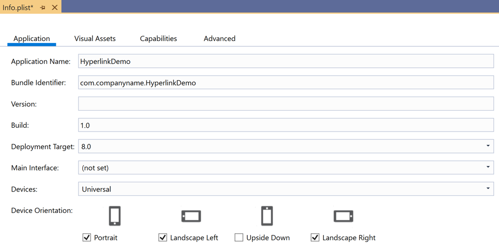
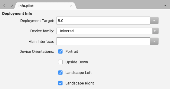
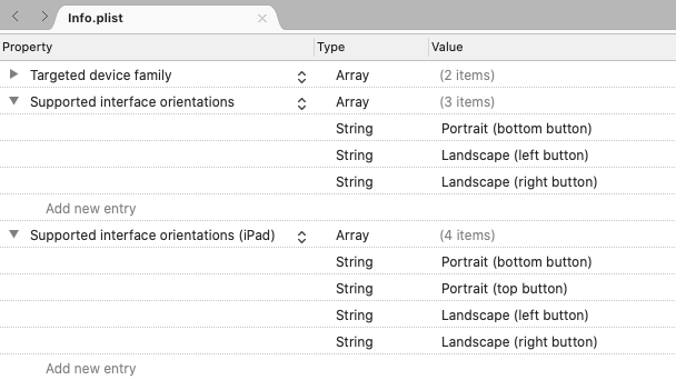
iOS에서 디바이스 방향은 Info.plist 파일을 사용하는 애플리케이션에 대해 구성됩니다. 이 문서의 맨 위에 있는 IDE 옵션을 사용하여 보려는 지침을 선택합니다.
Visual Studio에서 iOS 프로젝트를 열고 Info.plist를 엽니다. 파일은 i전화 배포 정보 탭부터 구성 패널로 열립니다.
Android
Android에서 방향을 제어하려면 MainActivity.cs 열고 클래스를 데코레이팅하는 MainActivity 특성을 사용하여 방향을 설정합니다.
namespace MyRotatingApp.Droid
{
    [Activity (Label = "MyRotatingApp.Droid", Icon = "@drawable/icon", Theme = "@style/MainTheme", MainLauncher = true, ConfigurationChanges = ConfigChanges.ScreenSize | ConfigChanges.Orientation, ScreenOrientation = ScreenOrientation.Landscape)] //This is what controls orientation
    public class MainActivity : FormsAppCompatActivity
    {
        protected override void OnCreate (Bundle bundle)
...
Xamarin.Android는 방향을 지정하는 몇 가지 옵션을 지원합니다.
- 가로 – 센서 데이터에 관계없이 애플리케이션 방향이 가로로 강제 적용됩니다.
- 세로 – 센서 데이터에 관계없이 애플리케이션 방향을 세로로 강제합니다.
- 사용자 – 사용자의 기본 방향을 사용하여 애플리케이션을 표시합니다.
- Behind – 애플리케이션의 방향이 뒤에 있는 활동의 방향과 같게 합니다.
- 센서 – 사용자가 자동 회전을 사용하지 않도록 설정한 경우에도 센서에 의해 애플리케이션의 방향을 결정합니다.
- SensorLandscape – 센서 데이터를 사용하는 동안 애플리케이션이 가로 방향을 사용하여 화면이 향하고 있는 방향을 변경합니다(화면이 거꾸로 표시되지 않도록).
- SensorPortrait – 센서 데이터를 사용하는 동안 애플리케이션이 세로 방향을 사용하여 화면이 향하고 있는 방향을 변경합니다(화면이 거꾸로 표시되지 않도록).
- ReverseLandscape – 애플리케이션이 "거꾸로" 표시되도록 일반적인 방향과 반대 방향을 향하여 가로 방향을 사용하도록 합니다.
- ReversePortrait – 애플리케이션이 "거꾸로" 표시되도록 일반적인 방향과 반대 방향을 향하여 세로 방향을 사용하도록 합니다.
- FullSensor – 애플리케이션이 센서 데이터에 의존하여 올바른 방향을 선택하게 합니다(가능한 4개 중).
- FullUser – 애플리케이션에서 사용자의 방향 기본 설정을 사용하도록 합니다. 자동 회전을 사용하도록 설정하면 4개의 방향을 모두 사용할 수 있습니다.
- UserLandscape – [지원되지 않음] 은 사용자가 자동 회전을 사용하도록 설정하지 않는 한 애플리케이션에서 가로 방향을 사용하도록 설정하며, 이 경우 센서를 사용하여 방향을 결정합니다. 이 옵션은 컴파일을 중단합니다.
- UserPortrait – [지원되지 않음] 은 사용자가 자동 회전을 사용하도록 설정하지 않는 한 애플리케이션에서 세로 방향을 사용하도록 설정하며, 이 경우 센서를 사용하여 방향을 결정합니다. 이 옵션은 컴파일을 중단합니다.
- 잠김 – [지원되지 않음] 으로 인해 애플리케이션은 디바이스의 물리적 방향 변경에 응답하지 않고 시작 시 화면 방향을 사용합니다. 이 옵션은 컴파일을 중단합니다.
네이티브 Android API는 사용자의 표현된 기본 설정과 명시적으로 모순되는 옵션을 포함하여 방향 관리 방법을 많이 제어합니다.
유니버설 Windows 플랫폼
UWP(유니버설 Windows 플랫폼)에서 지원되는 방향은 Package.appxmanifest 파일에 설정됩니다. 매니페스트를 열면 지원되는 방향을 선택할 수 있는 구성 패널이 표시됩니다.
방향 변경에 대응
Xamarin.Forms 는 공유 코드의 방향 변경 내용을 앱에 알리기 위한 네이티브 이벤트를 제공하지 않습니다. 그러나Xamarin.Essentials 방향 변경 알림을 제공하는 [DeviceDisplay] 클래스가 포함되어 있습니다.
없이 Xamarin.Essentials방향을 감지하려면 변경 내용의 너비 또는 높이가 Page발생할 때 발생하는 이벤트를 모니터링 SizeChanged 합니다Page. 너비 Page 가 높이보다 크면 디바이스가 가로 모드에 있습니다. 자세한 내용은 화면 방향을 기준으로 이미지 표시를 참조하세요.
또는 메서드를 재정 OnSizeAllocatedPage의하여 레이아웃 변경 논리를 삽입할 수 있습니다. 이 OnSizeAllocated 메서드는 디바이스가 Page 회전될 때마다 발생하는 새 크기가 할당될 때마다 호출됩니다. 기본 구현은 중요한 레이아웃 함수를 수행하므로 재정의 OnSizeAllocated 에서 기본 구현을 호출하는 것이 중요합니다.
protected override void OnSizeAllocated(double width, double height)
{
    base.OnSizeAllocated(width, height); //must be called
}
해당 단계를 수행하지 않으면 작동하지 않는 페이지가 발생합니다.
디바이스를 OnSizeAllocated 회전할 때 메서드를 여러 번 호출할 수 있습니다. 매번 레이아웃을 변경하면 리소스가 낭비되고 깜박일 수 있습니다. 페이지 내에서 인스턴스 변수를 사용하여 방향이 가로 또는 세로인지 여부를 추적하고 변경이 있을 때만 다시 그리는 것이 좋습니다.
private double width = 0;
private double height = 0;

protected override void OnSizeAllocated(double width, double height)
{
    base.OnSizeAllocated(width, height); //must be called
    if (this.width != width || this.height != height)
    {
        this.width = width;
        this.height = height;
        //reconfigure layout
    }
}
디바이스 방향의 변경이 감지되면 사용 가능한 공간의 변경에 대응하기 위해 사용자 인터페이스에서 추가 보기를 추가하거나 제거할 수 있습니다. 예를 들어 각 플랫폼의 기본 제공 계산기를 세로로 고려합니다.
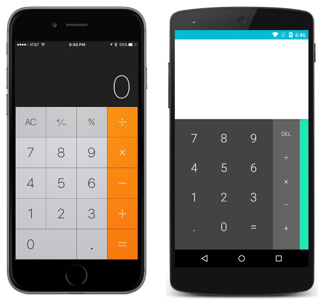
및 가로:
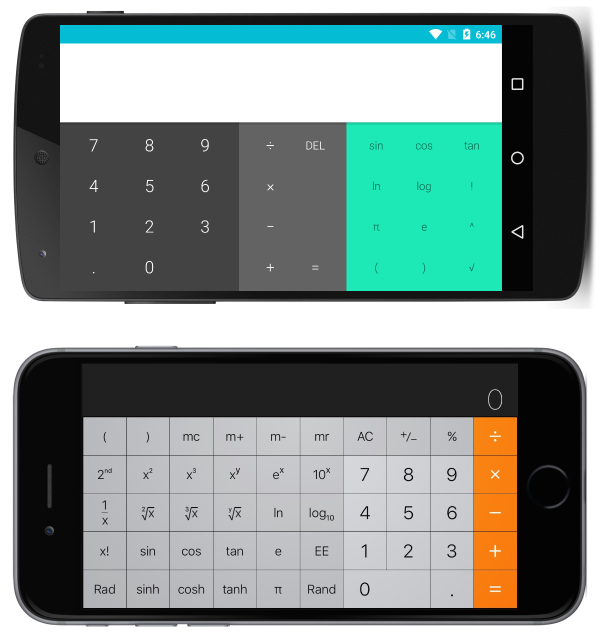
앱은 가로에 더 많은 기능을 추가하여 사용 가능한 공간을 활용합니다.
반응형 레이아웃
기본 제공 레이아웃을 사용하여 인터페이스를 디자인하여 디바이스를 회전할 때 정상적으로 전환할 수 있습니다. 방향 변경에 응답할 때 계속 매력적인 인터페이스를 디자인하는 경우 다음 일반적인 규칙을 고려합니다.
- 비율 에 주의 – 방향이 변경되면 비율과 관련하여 특정 가정이 이루어지면 문제가 발생할 수 있습니다. 예를 들어 세로 화면의 세로 공간 중 1/3에 충분한 공간이 있는 보기는 가로의 세로 공간 1/3에 맞지 않을 수 있습니다.
- 절대값 에 주의하세요. 세로에서 의미가 있는 절대(픽셀) 값은 가로에서 의미가 없을 수 있습니다. 절대 값이 필요한 경우 중첩된 레이아웃을 사용하여 영향을 격리합니다. 예를 들어 항목 템플릿의 균일한 높이가 보장되는 경우 절대값
TableViewItemTemplate을 사용하는 것이 좋습니다.
위의 규칙은 여러 화면 크기에 대한 인터페이스를 구현할 때도 적용되며 일반적으로 모범 사례로 간주됩니다. 이 가이드의 나머지 부분에는 각 기본 레이아웃을 사용하는 반응형 레이아웃의 특정 예제가 설명되어 있습니다 Xamarin.Forms.
참고 항목
명확성을 위해 다음 섹션에서는 한 번에 하나의 형식 Layout 만 사용하여 반응형 레이아웃을 구현하는 방법을 보여 줍니다. 실제로 각 구성 요소에 대해 더 간단하거나 가장 직관적인 Layout 레이아웃을 사용하여 원하는 레이아웃을 달성하기 위해 s를 혼합Layout하는 것이 더 간단한 경우가 많습니다.
StackLayout
세로로 표시된 다음 애플리케이션을 고려합니다.
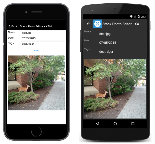
및 가로:
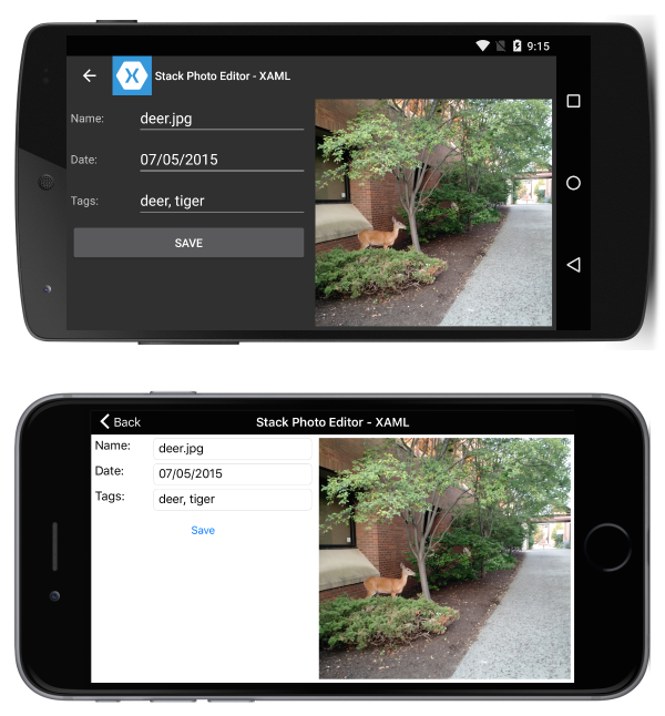
이 작업은 다음 XAML을 사용하여 수행됩니다.
<?xml version="1.0" encoding="UTF-8"?>
<ContentPage xmlns="http://xamarin.com/schemas/2014/forms"
xmlns:x="http://schemas.microsoft.com/winfx/2009/xaml"
x:Class="ResponsiveLayout.StackLayoutPageXaml"
Title="Stack Photo Editor - XAML">
    <ContentPage.Content>
        <StackLayout Spacing="10" Padding="5" Orientation="Vertical"
        x:Name="outerStack"> <!-- can change orientation to make responsive -->
            <ScrollView>
                <StackLayout Spacing="5" HorizontalOptions="FillAndExpand"
                    WidthRequest="1000">
                    <StackLayout Orientation="Horizontal">
                        <Label Text="Name: " WidthRequest="75"
                            HorizontalOptions="Start" />
                        <Entry Text="deer.jpg"
                            HorizontalOptions="FillAndExpand" />
                    </StackLayout>
                    <StackLayout Orientation="Horizontal">
                        <Label Text="Date: " WidthRequest="75"
                            HorizontalOptions="Start" />
                        <Entry Text="07/05/2015"
                            HorizontalOptions="FillAndExpand" />
                    </StackLayout>
                    <StackLayout Orientation="Horizontal">
                        <Label Text="Tags:" WidthRequest="75"
                            HorizontalOptions="Start" />
                        <Entry Text="deer, tiger"
                            HorizontalOptions="FillAndExpand" />
                    </StackLayout>
                    <StackLayout Orientation="Horizontal">
                        <Button Text="Save" HorizontalOptions="FillAndExpand" />
                    </StackLayout>
                </StackLayout>
            </ScrollView>
            <Image  Source="deer.jpg" />
        </StackLayout>
    </ContentPage.Content>
</ContentPage>
일부 C#은 디바이스의 outerStack 방향에 따라 방향을 변경하는 데 사용됩니다.
protected override void OnSizeAllocated (double width, double height){
    base.OnSizeAllocated (width, height);
    if (width != this.width || height != this.height) {
        this.width = width;
        this.height = height;
        if (width > height) {
            outerStack.Orientation = StackOrientation.Horizontal;
        } else {
            outerStack.Orientation = StackOrientation.Vertical;
        }
    }
}
다음을 참고하십시오.
outerStack는 사용 가능한 공간을 최대한 활용하기 위해 이미지와 컨트롤을 방향에 따라 가로 또는 세로 스택으로 표시하도록 조정됩니다.
AbsoluteLayout
세로로 표시된 다음 애플리케이션을 고려합니다.
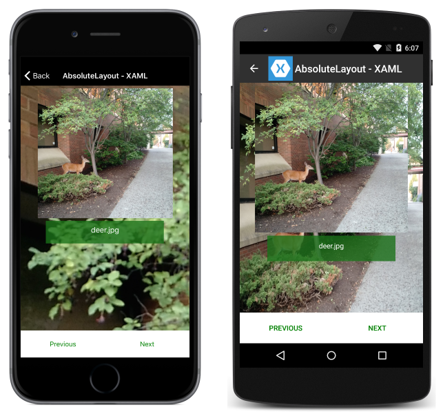
및 가로:
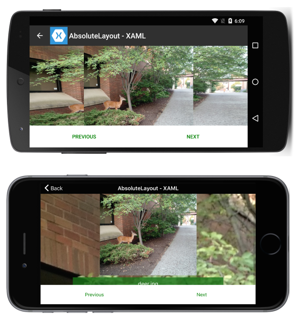
이 작업은 다음 XAML을 사용하여 수행됩니다.
<?xml version="1.0" encoding="UTF-8"?>
<ContentPage xmlns="http://xamarin.com/schemas/2014/forms"
xmlns:x="http://schemas.microsoft.com/winfx/2009/xaml"
x:Class="ResponsiveLayout.AbsoluteLayoutPageXaml"
Title="AbsoluteLayout - XAML" BackgroundImageSource="deer.jpg">
    <ContentPage.Content>
        <AbsoluteLayout>
            <ScrollView AbsoluteLayout.LayoutBounds="0,0,1,1"
                AbsoluteLayout.LayoutFlags="PositionProportional,SizeProportional">
                <AbsoluteLayout>
                    <Image Source="deer.jpg"
                        AbsoluteLayout.LayoutBounds=".5,0,300,300"
                        AbsoluteLayout.LayoutFlags="PositionProportional" />
                    <BoxView Color="#CC1A7019" AbsoluteLayout.LayoutBounds=".5
                        300,.7,50" AbsoluteLayout.LayoutFlags="XProportional
                        WidthProportional" />
                    <Label Text="deer.jpg" AbsoluteLayout.LayoutBounds = ".5
                        310,1, 50" AbsoluteLayout.LayoutFlags="XProportional
                        WidthProportional" HorizontalTextAlignment="Center" TextColor="White" />
                </AbsoluteLayout>
            </ScrollView>
            <Button Text="Previous" AbsoluteLayout.LayoutBounds="0,1,.5,60"
                AbsoluteLayout.LayoutFlags="PositionProportional
                    WidthProportional"
                BackgroundColor="White" TextColor="Green" BorderRadius="0" />
            <Button Text="Next" AbsoluteLayout.LayoutBounds="1,1,.5,60"
                AbsoluteLayout.LayoutFlags="PositionProportional
                    WidthProportional" BackgroundColor="White"
                    TextColor="Green" BorderRadius="0" />
        </AbsoluteLayout>
    </ContentPage.Content>
</ContentPage>
다음을 참고하십시오.
- 페이지가 배치된 방식 때문에 응답성을 도입하기 위한 절차 코드가 필요하지 않습니다.
ScrollView화면 높이가 단추 및 이미지의 고정 높이 합계보다 작은 경우에도 레이블을 표시할 수 있도록 하는 데 사용됩니다.
RelativeLayout
세로로 표시된 다음 애플리케이션을 고려합니다.
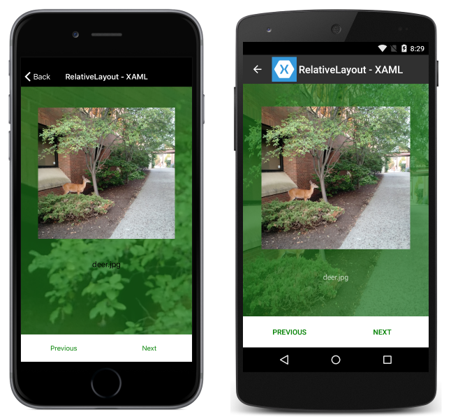
및 가로:
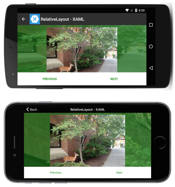
이 작업은 다음 XAML을 사용하여 수행됩니다.
<?xml version="1.0" encoding="UTF-8"?>
<ContentPage xmlns="http://xamarin.com/schemas/2014/forms"
xmlns:x="http://schemas.microsoft.com/winfx/2009/xaml"
x:Class="ResponsiveLayout.RelativeLayoutPageXaml"
Title="RelativeLayout - XAML"
BackgroundImageSource="deer.jpg">
    <ContentPage.Content>
        <RelativeLayout x:Name="outerLayout">
            <BoxView BackgroundColor="#AA1A7019"
                RelativeLayout.WidthConstraint="{ConstraintExpression
                    Type=RelativeToParent,Property=Width,Factor=1}"
                RelativeLayout.HeightConstraint="{ConstraintExpression
                    Type=RelativeToParent,Property=Height,Factor=1}"
                RelativeLayout.XConstraint="{ConstraintExpression
                    Type=RelativeToParent,Property=Width,Factor=0,Constant=0}"
                RelativeLayout.YConstraint="{ConstraintExpression
                    Type=RelativeToParent,Property=Height,Factor=0,Constant=0}" />
            <ScrollView
                RelativeLayout.WidthConstraint="{ConstraintExpression
                    Type=RelativeToParent,Property=Width,Factor=1}"
                RelativeLayout.HeightConstraint="{ConstraintExpression
                    Type=RelativeToParent,Property=Height,Factor=1,Constant=-60}"
                RelativeLayout.XConstraint="{ConstraintExpression
                    Type=RelativeToParent,Property=Width,Factor=0,Constant=0}"
                RelativeLayout.YConstraint="{ConstraintExpression
                    Type=RelativeToParent,Property=Height,Factor=0,Constant=0}">
                <RelativeLayout>
                    <Image Source="deer.jpg" x:Name="imageDeer"
                        RelativeLayout.WidthConstraint="{ConstraintExpression
                            Type=RelativeToParent,Property=Width,Factor=.8}"
                        RelativeLayout.XConstraint="{ConstraintExpression
                            Type=RelativeToParent,Property=Width,Factor=.1}"
                        RelativeLayout.YConstraint="{ConstraintExpression
                            Type=RelativeToParent,Property=Height,Factor=0,Constant=10}" />
                    <Label Text="deer.jpg" HorizontalTextAlignment="Center"
                        RelativeLayout.WidthConstraint="{ConstraintExpression
                            Type=RelativeToParent,Property=Width,Factor=1}"
                        RelativeLayout.HeightConstraint="{ConstraintExpression
                            Type=RelativeToParent,Property=Height,Factor=0,Constant=75}"
                        RelativeLayout.XConstraint="{ConstraintExpression
                            Type=RelativeToParent,Property=Width,Factor=0,Constant=0}"
                        RelativeLayout.YConstraint="{ConstraintExpression
                            Type=RelativeToView,ElementName=imageDeer,Property=Height,Factor=1,Constant=20}" />
                </RelativeLayout>

            </ScrollView>

            <Button Text="Previous" BackgroundColor="White" TextColor="Green" BorderRadius="0"
                RelativeLayout.YConstraint="{ConstraintExpression
                    Type=RelativeToParent,Property=Height,Factor=1,Constant=-60}"
                RelativeLayout.XConstraint="{ConstraintExpression
                    Type=RelativeToParent,Property=Width,Factor=0,Constant=0}"
                RelativeLayout.HeightConstraint="{ConstraintExpression
                    Type=RelativeToParent,Property=Width,Factor=0,Constant=60}"
                RelativeLayout.WidthConstraint="{ConstraintExpression
                    Type=RelativeToParent,Property=Width,Factor=.5}"
                 />
            <Button Text="Next" BackgroundColor="White" TextColor="Green" BorderRadius="0"
                RelativeLayout.XConstraint="{ConstraintExpression
                    Type=RelativeToParent,Property=Width,Factor=.5}"
                RelativeLayout.YConstraint="{ConstraintExpression
                    Type=RelativeToParent,Property=Height,Factor=1,Constant=-60}"
                RelativeLayout.HeightConstraint="{ConstraintExpression
                    Type=RelativeToParent,Property=Width,Factor=0,Constant=60}"
                RelativeLayout.WidthConstraint="{ConstraintExpression
                    Type=RelativeToParent,Property=Width,Factor=.5}"
                />
        </RelativeLayout>
    </ContentPage.Content>
</ContentPage>
다음을 참고하십시오.
- 페이지가 배치된 방식 때문에 응답성을 도입하기 위한 절차 코드가 필요하지 않습니다.
ScrollView화면 높이가 단추 및 이미지의 고정 높이 합계보다 작은 경우에도 레이블을 표시할 수 있도록 하는 데 사용됩니다.
그리드
세로로 표시된 다음 애플리케이션을 고려합니다.
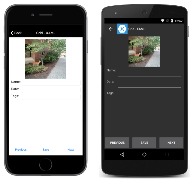
및 가로:
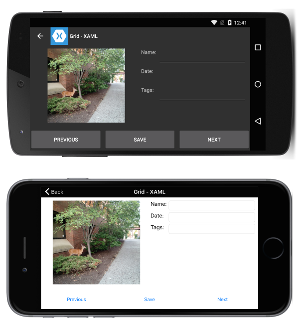
이 작업은 다음 XAML을 사용하여 수행됩니다.
<?xml version="1.0" encoding="UTF-8"?>
<ContentPage xmlns="http://xamarin.com/schemas/2014/forms"
xmlns:x="http://schemas.microsoft.com/winfx/2009/xaml"
x:Class="ResponsiveLayout.GridPageXaml"
Title="Grid - XAML">
    <ContentPage.Content>
        <Grid x:Name="outerGrid">
            <Grid.RowDefinitions>
                <RowDefinition Height="*" />
                <RowDefinition Height="60" />
            </Grid.RowDefinitions>
            <Grid x:Name="innerGrid" Grid.Row="0" Padding="10">
                <Grid.RowDefinitions>
                    <RowDefinition Height="*" />
                </Grid.RowDefinitions>
                <Grid.ColumnDefinitions>
                    <ColumnDefinition Width="*" />
                    <ColumnDefinition Width="*" />
                </Grid.ColumnDefinitions>
                <Image Source="deer.jpg" Grid.Row="0" Grid.Column="0" HeightRequest="300" WidthRequest="300" />
                <Grid x:Name="controlsGrid" Grid.Row="0" Grid.Column="1" >
                    <Grid.RowDefinitions>
                        <RowDefinition Height="Auto" />
                        <RowDefinition Height="Auto" />
                        <RowDefinition Height="Auto" />
                    </Grid.RowDefinitions>
                    <Grid.ColumnDefinitions>
                        <ColumnDefinition Width="Auto" />
                        <ColumnDefinition Width="*" />
                    </Grid.ColumnDefinitions>
                    <Label Text="Name:" Grid.Row="0" Grid.Column="0" />
                    <Label Text="Date:" Grid.Row="1" Grid.Column="0" />
                    <Label Text="Tags:" Grid.Row="2" Grid.Column="0" />
                    <Entry Grid.Row="0" Grid.Column="1" />
                    <Entry Grid.Row="1" Grid.Column="1" />
                    <Entry Grid.Row="2" Grid.Column="1" />
                </Grid>
            </Grid>
            <Grid x:Name="buttonsGrid" Grid.Row="1">
                <Grid.ColumnDefinitions>
                    <ColumnDefinition Width="*" />
                    <ColumnDefinition Width="*" />
                    <ColumnDefinition Width="*" />
                </Grid.ColumnDefinitions>
                <Button Text="Previous" Grid.Column="0" />
                <Button Text="Save" Grid.Column="1" />
                <Button Text="Next" Grid.Column="2" />
            </Grid>
        </Grid>
    </ContentPage.Content>
</ContentPage>
회전 변경을 처리하는 다음 절차 코드와 함께:
private double width;
private double height;

protected override void OnSizeAllocated (double width, double height){
    base.OnSizeAllocated (width, height);
    if (width != this.width || height != this.height) {
        this.width = width;
        this.height = height;
        if (width > height) {
            innerGrid.RowDefinitions.Clear();
            innerGrid.ColumnDefinitions.Clear ();
            innerGrid.RowDefinitions.Add (new RowDefinition{ Height = new GridLength (1, GridUnitType.Star) });
            innerGrid.ColumnDefinitions.Add (new ColumnDefinition { Width = new GridLength (1, GridUnitType.Star) });
            innerGrid.ColumnDefinitions.Add (new ColumnDefinition { Width = new GridLength (1, GridUnitType.Star) });
            innerGrid.Children.Remove (controlsGrid);
            innerGrid.Children.Add (controlsGrid, 1, 0);
        } else {
            innerGrid.RowDefinitions.Clear();
            innerGrid.ColumnDefinitions.Clear ();
            innerGrid.ColumnDefinitions.Add (new ColumnDefinition{ Width = new GridLength (1, GridUnitType.Star) });
            innerGrid.RowDefinitions.Add (new RowDefinition { Height = new GridLength (1, GridUnitType.Auto) });
            innerGrid.RowDefinitions.Add (new RowDefinition { Height = new GridLength (1, GridUnitType.Star) });
            innerGrid.Children.Remove (controlsGrid);
            innerGrid.Children.Add (controlsGrid, 0, 1);
        }
    }
}
다음을 참고하십시오.
- 페이지가 배치된 방식 때문에 컨트롤의 그리드 배치를 변경하는 메서드가 있습니다.