Xamarin.Forms 레이블
에 텍스트 표시 Xamarin.Forms
보기 Label 는 텍스트를 표시하는 데 사용되며, 한 줄과 여러 줄로 표시됩니다. 레이블은 텍스트 장식, 색이 지정된 텍스트를 포함할 수 있으며 사용자 지정 글꼴(패밀리, 크기 및 옵션)을 사용할 수 있습니다.
텍스트 장식
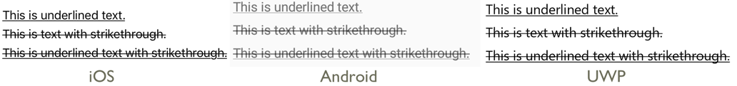
속성을 하나 이상의 TextDecorations 열거형 멤버로 Label 설정 Label.TextDecorations 하여 인스턴스에 밑줄 및 취소선 텍스트 장식을 적용할 수 있습니다.
NoneUnderlineStrikethrough
다음 XAML 예제에서는 속성을 설정하는 방법을 Label.TextDecorations 보여 줍니다.
<Label Text="This is underlined text." TextDecorations="Underline"  />
<Label Text="This is text with strikethrough." TextDecorations="Strikethrough" />
<Label Text="This is underlined text with strikethrough." TextDecorations="Underline, Strikethrough" />
해당하는 C# 코드는 다음과 같습니다.
var underlineLabel = new Label { Text = "This is underlined text.", TextDecorations = TextDecorations.Underline };
var strikethroughLabel = new Label { Text = "This is text with strikethrough.", TextDecorations = TextDecorations.Strikethrough };
var bothLabel = new Label { Text = "This is underlined text with strikethrough.", TextDecorations = TextDecorations.Underline | TextDecorations.Strikethrough };
다음 스크린샷은 인스턴스에 적용된 TextDecorations 열거형 멤버를 Label 보여줍니다.
텍스트 변환
A Label 는 속성을 열거형 값으로 설정 TextTransform 하여 속성에 Text 저장된 텍스트의 TextTransform 대/소문자를 변환할 수 있습니다. 이 열거형에는 다음 네 가지 값이 있습니다.
None는 텍스트가 변환되지 않음을 나타냅니다.Default는 플랫폼의 기본 동작이 사용됨을 나타냅니다.TextTransform속성의 기본값입니다.Lowercase는 텍스트가 소문자로 변환됨을 나타냅니다.Uppercase는 텍스트가 대문자로 변환됨을 나타냅니다.
다음 예제에서는 텍스트를 대문자로 변환하는 방법을 보여줍니다.
<Label Text="This text will be displayed in uppercase."
       TextTransform="Uppercase" />
해당하는 C# 코드는 다음과 같습니다.
Label label = new Label
{
    Text = "This text will be displayed in uppercase.",
    TextTransform = TextTransform.Uppercase
};
문자 간격
속성을 값으로 Label 설정하여 인스턴스에 문자 간격을 Label.CharacterSpacing 적용할 double 수 있습니다.
<Label Text="Character spaced text"
       CharacterSpacing="10" />
해당하는 C# 코드는 다음과 같습니다.
Label label = new Label { Text = "Character spaced text", CharacterSpacing = 10 };
그 결과 텍스트에 표시되는 Label 문자는 간격이 지정된 CharacterSpacing 디바이스 독립적 단위가 떨어져 있습니다.
새로운 줄
XAML에서 텍스트를 새 줄로 강제 Label 적용하는 두 가지 기본 기술이 있습니다.
- " "인 유니코드 줄 바꿈 문자를 사용합니다.
- 속성 요소 구문을 사용하여 텍스트를 지정합니다.
다음 코드는 두 기술의 예를 보여 줍니다.
<!-- Unicode line feed character -->
<Label Text="First line Second line" />
<!-- Property element syntax -->
<Label>
<Label.Text>
First line
Second line
</Label.Text>
</Label>
C#에서 텍스트는 "\n" 문자가 있는 새 줄로 강제 적용할 수 있습니다.
Label label = new Label { Text = "First line\nSecond line" };
색
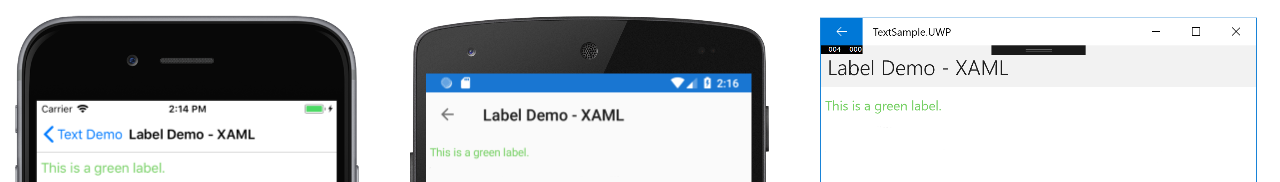
바인딩 가능한 속성을 통해 사용자 지정 텍스트 색을 사용하도록 레이블을 설정할 수 있습니다 TextColor .
각 플랫폼에서 색을 사용할 수 있도록 하려면 특별한 주의가 필요합니다. 각 플랫폼에는 텍스트 및 배경색에 대한 기본값이 다르기 때문에 각각에 대해 작동하는 기본값을 선택해야 합니다.
다음 XAML 예제에서는 텍스트 색을 설정합니다.Label
<ContentPage xmlns="http://xamarin.com/schemas/2014/forms"
             xmlns:x="http://schemas.microsoft.com/winfx/2009/xaml"
             x:Class="TextSample.LabelPage"
             Title="Label Demo">
    <StackLayout Padding="5,10">
      <Label TextColor="#77d065" FontSize = "20" Text="This is a green label." />
    </StackLayout>
</ContentPage>
해당하는 C# 코드는 다음과 같습니다.
public partial class LabelPage : ContentPage
{
    public LabelPage ()
    {
        InitializeComponent ();

        var layout = new StackLayout { Padding = new Thickness(5,10) };
        var label = new Label { Text="This is a green label.", TextColor = Color.FromHex("#77d065"), FontSize = 20 };
        layout.Children.Add(label);
        this.Content = layout;
    }
}
다음 스크린샷은 속성 설정 결과를 보여 줍니다 TextColor .
색에 대한 자세한 내용은 색을 참조 하세요.
글꼴
글꼴을 지정하는 방법에 대한 자세한 내용은 글꼴을 Label참조 하세요.
잘림 및 래핑
레이블은 속성에 의해 LineBreakMode 노출되는 여러 가지 방법 중 하나로 한 줄에 맞지 않는 텍스트를 처리하도록 설정할 수 있습니다. LineBreakMode 는 다음 값을 가진 열거형입니다.
- HeadTruncation – 끝 부분을 표시하는 텍스트의 헤드를 자른다.
- CharacterWrap – 문자 경계의 새 줄에 텍스트를 래핑합니다.
- MiddleTruncation – 텍스트의 시작과 끝을 표시하고 가운데는 줄임표로 바꿉니다.
- NoWrap – 텍스트를 줄 바꿈하지 않으며 한 줄에 맞을 수 있는 만큼의 텍스트만 표시합니다.
- TailTruncation – 끝 부분을 잘라내어 텍스트의 시작을 표시합니다.
- WordWrap – 단어 경계에 텍스트를 래핑합니다.
특정 줄 수 표시
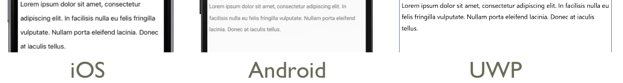
속성을 int 값으로 설정 Label.MaxLines 하여 한 Label 줄로 표시되는 줄 수를 지정할 수 있습니다.
- 기본값
Label인 -1인 경우MaxLines속성 값LineBreakMode은 한 줄만 표시하거나 잘렸거나 모든 텍스트가 있는 모든 줄을 표시합니다. - 0
Label이면MaxLines표시되지 않습니다. - 1인 경우
MaxLines결과는 속성을 ,HeadTruncationMiddleTruncation또는TailTruncation.로 설정하는LineBreakMode것과NoWrap동일합니다. 그러나Label해당되는 경우 줄임표의LineBreakMode배치와 관련하여 속성 값을 적용합니다. - 1
Label보다 크면MaxLines줄임표의 배치와 관련하여 속성 값을LineBreakMode유지하면서 지정된 줄 수까지 표시됩니다(해당하는 경우). 그러나 속성을 1보다 큰 값으로 설정MaxLines해도 속성이 1보다 큰 경우에는LineBreakModeNoWrap효과가 없습니다.
다음 XAML 예제에서는 다음에서 속성을 설정하는 MaxLines 방법을 보여 줍니다 Label.
<Label Text="Lorem ipsum dolor sit amet, consectetur adipiscing elit. In facilisis nulla eu felis fringilla vulputate. Nullam porta eleifend lacinia. Donec at iaculis tellus."
       LineBreakMode="WordWrap"
       MaxLines="2" />
해당하는 C# 코드는 다음과 같습니다.
var label =
{
  Text = "Lorem ipsum dolor sit amet, consectetur adipiscing elit. In facilisis nulla eu felis fringilla vulputate. Nullam porta eleifend lacinia. Donec at iaculis tellus.", LineBreakMode = LineBreakMode.WordWrap,
  MaxLines = 2
};
다음 스크린샷은 텍스트가 2줄을 초과할 만큼 긴 경우 속성을 2로 설정한 MaxLines 결과를 보여 줍니다.

HTML 표시
클래스에는 Label 인스턴스에 TextType 일반 텍스트 또는 HTML 텍스트를 표시할지 여부를 Label 결정하는 속성이 있습니다. 이 속성은 열거형의 TextType 멤버 중 하나로 설정해야 합니다.
Text는Label일반 텍스트를 표시하며 속성의Label.TextType기본값임을 나타냅니다.Html는 HTML 텍스트가Label표시될 것임을 나타냅니다.
따라서 Label 인스턴스는 속성을 HTML 문자열로 설정하고 속성을 HtmlLabel.Text HTML 문자열로 설정 Label.TextType 하여 HTML을 표시할 수 있습니다.
Label label = new Label
{
    Text = "This is <strong style=\"color:red\">HTML</strong> text.",
    TextType = TextType.Html
};
위의 예제에서 HTML의 큰따옴표 문자는 기호를 사용하여 \ 이스케이프해야 합니다.
XAML에서 HTML 문자열은 추가적으로 < 이스케이프 및 > 기호로 인해 읽을 수 없게 될 수 있습니다.
<Label Text="This is <strong style="color:red">HTML</strong> text."
TextType="Html" />
또는 가독성을 높이기 위해 HTML을 섹션에 CDATA 인라인 처리할 수 있습니다.
<Label TextType="Html">
    <![CDATA[
    This is <strong style="color:red">HTML</strong> text.
    ]]>
</Label>
이 예제 Label.Text 에서 속성은 섹션에 인라인된 HTML 문자열로 CDATA 설정됩니다. 이는 속성이 Text 클래스에 ContentProperty 대한 속성이기 때문에 작동합니다 Label .
다음 스크린샷은 HTML을 Label 표시하는 것을 보여 줍니다.

Important
HTML을 A Label 에 표시하는 것은 기본 플랫폼에서 지원하는 HTML 태그로 제한됩니다.
서식 있는 텍스트
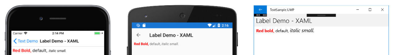
레이블은 동일한 보기에서 여러 글꼴과 색을 사용하여 텍스트를 표시할 수 있는 속성을 노출 FormattedText 합니다.
속성은 FormattedText 속성을 통해 설정되는 하나 이상의 Span 인스턴스로 구성된 형식FormattedString입니다Spans. 시각적 모양을 설정하는 데 사용할 수 있는 속성은 다음과 같습니다 Span .
BackgroundColor– 범위 배경의 색입니다.double형식의CharacterSpacing은Span텍스트를 구성하는 문자 사이의 간격입니다.Font– 범위에 있는 텍스트의 글꼴입니다.FontAttributes– 범위 내 텍스트의 글꼴 특성입니다.FontFamily– 범위 내 텍스트의 글꼴이 속한 글꼴 패밀리입니다.FontSize– 범위 내 텍스트의 글꼴 크기입니다.ForegroundColor– 범위에 있는 텍스트의 색입니다. 이 속성은 사용되지 않으며 속성으로TextColor대체되었습니다.LineHeight- 범위의 기본 줄 높이에 적용할 승수입니다. 자세한 내용은 선 높이를 참조 하세요.Style– 범위에 적용할 스타일입니다.Text– 범위의 텍스트입니다.TextColor– 범위에 있는 텍스트의 색입니다.TextDecorations- 범위의 텍스트에 적용할 장식입니다. 자세한 내용은 텍스트 장식을 참조 하세요.
, Text및 Text 바인딩 가능한 속성에는 BackgroundColor기본 바인딩 모드가 OneWay있습니다. 이 바인딩 모드에 대한 자세한 내용은 바인딩 모드 가이드의 기본 바인딩 모드를 참조하세요.
또한 이 GestureRecognizers 속성을 사용하여 제스처에 Span응답할 제스처 인식기 컬렉션을 정의할 수 있습니다.
참고 항목
에 HTML Span을 표시할 수 없습니다.
다음 XAML 예제에서는 세 Span 개의 인스턴스로 FormattedText 구성된 속성을 보여 줍니다.
<ContentPage xmlns="http://xamarin.com/schemas/2014/forms"
             xmlns:x="http://schemas.microsoft.com/winfx/2009/xaml"
             x:Class="TextSample.LabelPage"
             Title="Label Demo - XAML">
    <StackLayout Padding="5,10">
        ...
        <Label LineBreakMode="WordWrap">
            <Label.FormattedText>
                <FormattedString>
                    <Span Text="Red Bold, " TextColor="Red" FontAttributes="Bold" />
                    <Span Text="default, " Style="{DynamicResource BodyStyle}">
                        <Span.GestureRecognizers>
                            <TapGestureRecognizer Command="{Binding TapCommand}" />
                        </Span.GestureRecognizers>
                    </Span>
                    <Span Text="italic small." FontAttributes="Italic" FontSize="Small" />
                </FormattedString>
            </Label.FormattedText>
        </Label>
    </StackLayout>
</ContentPage>
해당하는 C# 코드는 다음과 같습니다.
public class LabelPageCode : ContentPage
{
    public LabelPageCode ()
    {
        var layout = new StackLayout{ Padding = new Thickness (5, 10) };
        ...
        var formattedString = new FormattedString ();
        formattedString.Spans.Add (new Span{ Text = "Red bold, ", ForegroundColor = Color.Red, FontAttributes = FontAttributes.Bold });

        var span = new Span { Text = "default, " };
        span.GestureRecognizers.Add(new TapGestureRecognizer { Command = new Command(async () => await DisplayAlert("Tapped", "This is a tapped Span.", "OK")) });
        formattedString.Spans.Add(span);
        formattedString.Spans.Add (new Span { Text = "italic small.", FontAttributes = FontAttributes.Italic, FontSize =  Device.GetNamedSize(NamedSize.Small, typeof(Label)) });

        layout.Children.Add (new Label { FormattedText = formattedString });
        this.Content = layout;
    }
}
또한 범위 Span 의 GestureRecognizers 컬렉션에 추가되는 모든 제스처에 응답할 수 있습니다. 예를 들어 TapGestureRecognizer 위의 코드 예제에서 두 번째 Span 코드에 a가 추가되었습니다. 따라서 이 Span 옵션을 탭 TapGestureRecognizer 하면 속성에 정의된 값을 실행하여 ICommand 응답합니다 Command . 제스처 인식자에 대한 자세한 내용은 제스처를 참조 Xamarin.Forms 하세요.
다음 스크린샷은 속성을 세 Span 개의 인스턴스로 설정한 FormattedString 결과를 보여 줍니다.
줄 높이
속성 또는 값을 설정 Label.LineHeight 하여 a와 a LabelSpan 의 세로 높이를 double 사용자 지정할 수 있습니다.Span.LineHeight iOS 및 Android에서 이러한 값은 원래 줄 높이의 승수이며 UWP(유니버설 Windows 플랫폼)Label.LineHeight에서 속성 값은 레이블 글꼴 크기의 승수입니다.
참고 항목
- iOS에서 속성은
Label.LineHeightSpan.LineHeight한 줄에 맞는 텍스트의 줄 높이와 여러 줄로 줄 바꿈되는 텍스트를 변경합니다. - Android에서
Label.LineHeight속성은Span.LineHeight여러 줄로 래핑되는 텍스트의 줄 높이만 변경합니다. - UWP에서 속성은
Label.LineHeight여러 줄로 줄 바꿈되는 텍스트의 줄 높이를 변경하며Span.LineHeight속성은 영향을 주지 않습니다.
다음 XAML 예제에서는 다음에서 속성을 설정하는 LineHeight 방법을 보여 줍니다 Label.
<Label Text="Lorem ipsum dolor sit amet, consectetur adipiscing elit. In facilisis nulla eu felis fringilla vulputate. Nullam porta eleifend lacinia. Donec at iaculis tellus."
       LineBreakMode="WordWrap"
       LineHeight="1.8" />
해당하는 C# 코드는 다음과 같습니다.
var label =
{
  Text = "Lorem ipsum dolor sit amet, consectetur adipiscing elit. In facilisis nulla eu felis fringilla vulputate. Nullam porta eleifend lacinia. Donec at iaculis tellus.", LineBreakMode = LineBreakMode.WordWrap,
  LineHeight = 1.8
};
다음 스크린샷은 속성을 1.8로 설정한 Label.LineHeight 결과를 보여 줍니다.
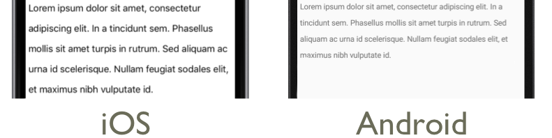
다음 XAML 예제에서는 다음에서 속성을 설정하는 LineHeight 방법을 보여 줍니다 Span.
<Label LineBreakMode="WordWrap">
    <Label.FormattedText>
        <FormattedString>
            <Span Text="Lorem ipsum dolor sit amet, consectetur adipiscing elit. In a tincidunt sem. Phasellus mollis sit amet turpis in rutrum. Sed aliquam ac urna id scelerisque. "
                  LineHeight="1.8"/>
            <Span Text="Nullam feugiat sodales elit, et maximus nibh vulputate id."
                  LineHeight="1.8" />
        </FormattedString>
    </Label.FormattedText>
</Label>
해당하는 C# 코드는 다음과 같습니다.
var formattedString = new FormattedString();
formattedString.Spans.Add(new Span
{
  Text = "Lorem ipsum dolor sit amet, consectetur adipiscing elit. In a tincidunt sem. Phasellus mollis sit amet turpis in rutrum. Sed aliquam ac urna id scelerisque. ",
  LineHeight = 1.8
});
formattedString.Spans.Add(new Span
{
  Text = "Nullam feugiat sodales elit, et maximus nibh vulputate id.",
  LineHeight = 1.8
});
var label = new Label
{
  FormattedText = formattedString,
  LineBreakMode = LineBreakMode.WordWrap
};
다음 스크린샷은 속성을 1.8로 설정한 Span.LineHeight 결과를 보여 줍니다.
패딩
안쪽 여백은 요소와 자식 요소 사이의 공간을 나타내며 요소를 자체 콘텐츠와 구분하는 데 사용됩니다. 속성을 값으로 Label 설정하여 인스턴스에 안쪽 여백을 Label.Padding 적용할 Thickness 수 있습니다.
<Label Padding="10">
    <Label.FormattedText>
        <FormattedString>
            <Span Text="Lorem ipsum" />
            <Span Text="dolor sit amet." />
        </FormattedString>
    </Label.FormattedText>
</Label>
해당하는 C# 코드는 다음과 같습니다.
FormattedString formattedString = new FormattedString();
formattedString.Spans.Add(new Span
{
  Text = "Lorem ipsum"
});
formattedString.Spans.Add(new Span
{
  Text = "dolor sit amet."
});
Label label = new Label
{
    FormattedText = formattedString,
    Padding = new Thickness(20)
};
Important
iOS에서 속성을 설정하는 Padding a Label 가 만들어지면 안쪽 여백이 적용되고 안쪽 여백 값은 나중에 업데이트할 수 있습니다. 그러나 Label 속성을 설정 Padding 하지 않는 속성이 만들어지면 나중에 설정하려고 시도해도 아무런 효과가 없습니다.
Android 및 유니버설 Windows 플랫폼 Padding 속성 값을 만들 때 Label 지정할 수 있습니다.
안쪽 여백에 대한 자세한 내용은 여백 및 안쪽 여백을 참조 하세요.
하이퍼링크
다음 방법을 사용하여 표시한 Label 텍스트와 Span 인스턴스를 하이퍼링크로 전환할 수 있습니다.
- 또는
Span.의TextColorLabel속성 및TextDecoration속성을 설정합니다. - 속성이 a
TapGestureRecognizer에 바인딩되고CommandParameter열 URL이 포함된Command속성의 컬렉션SpanLabel에 aICommand를 추가GestureRecognizers합니다. - 에
ICommand의해 실행될 해당 항목을 정의합니다TapGestureRecognizer. - 에서 실행할 코드를 작성합니다
ICommand.
다음 코드 예제에서는 해당 콘텐츠가 여러 Span 인스턴스에서 설정된 것을 보여 Label 줍니다.
<Label>
    <Label.FormattedText>
        <FormattedString>
            <Span Text="Alternatively, click " />
            <Span Text="here"
                  TextColor="Blue"
                  TextDecorations="Underline">
                <Span.GestureRecognizers>
                    <TapGestureRecognizer Command="{Binding TapCommand}"
                                          CommandParameter="https://learn.microsoft.com/xamarin/" />
                </Span.GestureRecognizers>
            </Span>
            <Span Text=" to view Xamarin documentation." />
        </FormattedString>
    </Label.FormattedText>
</Label>
이 예제에서 첫 번째 인스턴스와 세 번째 Span 인스턴스는 텍스트로 구성되고 두 번째 Span 인스턴스는 탭 가능한 하이퍼링크를 나타냅니다. 텍스트 색이 파란색으로 설정되고 밑줄 텍스트 장식이 있습니다. 그러면 다음 스크린샷과 같이 하이퍼링크의 모양이 만들어집니다.

하이퍼링크를 탭 TapGestureRecognizer 하면 해당 속성으로 정의된 하이퍼링크를 ICommand 실행하여 응답합니다 Command . 또한 속성에 지정된 CommandParameter URL은 매개 변수로 전달 ICommand 됩니다.
XAML 페이지의 코드 숨김에는 다음 구현이 TapCommand 포함됩니다.
public partial class MainPage : ContentPage
{
    // Launcher.OpenAsync is provided by Xamarin.Essentials.
    public ICommand TapCommand => new Command<string>(async (url) => await Launcher.OpenAsync(url));

    public MainPage()
    {
        InitializeComponent();
        BindingContext = this;
    }
}
메서드 TapCommand 를 실행하여 Launcher.OpenAsync 속성 값을 매개 변수로 전달 TapGestureRecognizer.CommandParameter 합니다. 메서드가 Launcher.OpenAsync 제공되고 Xamarin.Essentials웹 브라우저에서 URL이 열립니다. 따라서 전체적인 효과는 페이지에서 하이퍼링크를 탭하면 웹 브라우저가 나타나고 하이퍼링크와 연결된 URL이 탐색된다는 것입니다.
재사용 가능한 하이퍼링크 클래스 만들기
하이퍼링크를 만드는 이전 방법은 애플리케이션에서 하이퍼링크가 필요할 때마다 반복 코드를 작성해야 합니다. 그러나 제스처 인식기와 Span 텍스트 서식 코드가 추가된 상태에서 클래스와 HyperlinkSpan 클래스를 모두 Label 서브클래스하여 만들고 클래스를 만들 HyperlinkLabel 수 있습니다.
다음 코드 예제에서는 클래스를 보여줍니다.HyperlinkSpan
public class HyperlinkSpan : Span
{
    public static readonly BindableProperty UrlProperty =
        BindableProperty.Create(nameof(Url), typeof(string), typeof(HyperlinkSpan), null);

    public string Url
    {
        get { return (string)GetValue(UrlProperty); }
        set { SetValue(UrlProperty, value); }
    }

    public HyperlinkSpan()
    {
        TextDecorations = TextDecorations.Underline;
        TextColor = Color.Blue;
        GestureRecognizers.Add(new TapGestureRecognizer
        {
            // Launcher.OpenAsync is provided by Xamarin.Essentials.
            Command = new Command(async () => await Launcher.OpenAsync(Url))
        });
    }
}
클래스는 HyperlinkSpan 속성과 연결된 BindableProperty속성을 정의 Url 하고, 생성자는 하이퍼링크 모양을 TapGestureRecognizer 설정하고 하이퍼링크를 탭할 때 응답합니다. 탭 HyperlinkSpan 하면 TapGestureRecognizer 웹 브라우저에서 속성에 지정된 URL을 Launcher.OpenAsync 여는 메서드를 Url 실행하여 응답합니다.
클래스의 HyperlinkSpan 인스턴스를 XAML에 추가하여 클래스를 사용할 수 있습니다.
<ContentPage xmlns="http://xamarin.com/schemas/2014/forms"
             xmlns:x="http://schemas.microsoft.com/winfx/2009/xaml"
             xmlns:local="clr-namespace:HyperlinkDemo"
             x:Class="HyperlinkDemo.MainPage">
    <StackLayout>
        ...
        <Label>
            <Label.FormattedText>
                <FormattedString>
                    <Span Text="Alternatively, click " />
                    <local:HyperlinkSpan Text="here"
                                         Url="https://learn.microsoft.com/appcenter/" />
                    <Span Text=" to view AppCenter documentation." />
                </FormattedString>
            </Label.FormattedText>
        </Label>
    </StackLayout>
</ContentPage>
레이블 스타일 지정
이전 섹션에서는 인스턴스별로 설정 Label 및 Span 속성을 설명했습니다. 그러나 속성 집합은 하나 이상의 뷰에 일관되게 적용되는 하나의 스타일로 그룹화할 수 있습니다. 이렇게 하면 코드의 가독성을 높이고 디자인 변경 내용을 보다 쉽게 구현할 수 있습니다. 자세한 내용은 스타일을 참조 하세요.