Issues with Excel's exponential and power trendlines
When using exponential or power trendlines in Excel, there are the following issues.
- A systematically wrong value for R² (square of Pearson's coefficient) is displayed in the diagram
What is displayed, is not the R² for your original (x,y) values, but the R² of the linear approximazion of the (x,ln(y)) values.
To resolve this issue and get the correct R², take the coefficients of the displayed function formula and calculate the approximating function values a*eb*x yourself.
The use the worksheet function =CORREL(y-values , Exp-values), where "y-values" are your original data, and Exp-values are the a*eb*x values just calculated.
Make sure that you first have adjusted the displayed precision of the formula and R² in the diagram.
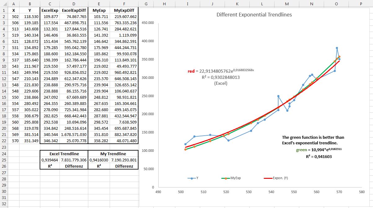
- The trendline functions for exponential and power are not optimal
The calculated trendlines in general are not the best ones to fit your data - see the included example.
The basic reason for this suboptimal result is, that Excel does not determine the exponential coefficients directly, but calculates a linear trend for the ln(y) instead. The factors a and b in the function equation a*x + b are then translated back into an exponential function - which in general will not be best way to approximate your original data.
I have not figured out an easy way to resolve this issue. Of course you always do the calculation yourself and write a program that does not use logarithms for finding the optimum.
So be carefull when checking your data for exponential behaviour with Excel: the exponential function is probably not the best one you can get, and the R² value is probably wrong.