Dynamic Axis Unit in SSRS Reports
Introduction
Sometimes it is not easy to identify what is the exact axis unit suitable for a chart. Let’s assume a column chart with total amount in Y axis(Billions) and months in X axis. If we filter this chart by a branch, those amounts will go down to millions. Sometimes the difference can be significant compared to total amount. In this scenario we need to change the y axis unit accordingly, otherwise users will be unable to get the correct picture.
Solution
Well, there is a LabelsFormat property when you select the axis.
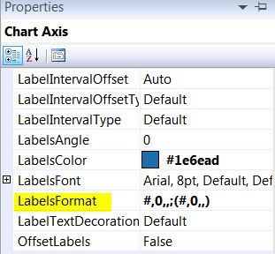
Following is an expression for that property, where Y axis field is Fields!Total_Amount.Value
=SWITCH(MAX(Fields!Total_Amount.Value)>1000000000,”0,,,.00;(0,,,.00)”, MAX(Fields!Total_Amount.Value)>1000000,”0,,.00;(0,,.00)”, MAX(Fields!Total_Amount.Value)>=0,”0,.00;(0,.00)”)
As you can see, using switch statement I just divided measure column in to three categories. By billions, by millions and by thousands comparing maximum amount of the current data set. "0,,,.00;(0,,,.00)" this expression indicates numbers in billions with thousand separator for both positive and negative values.
However this expression won't be enough. We also need to change the axis label as well. Below shows relevant axis label expression.
=SWITCH(MAX(Fields!Total_Amount.Value)>1000000000,”Rs.(Bn)”,MAX(Fields!Total_Amount.Value)>1000000,”Rs.(Mn)”,MAX(Fields!Total_Amount.Value)>=0,”Rs.('000)”)