Visual Studio Sample: Build Your First Hamburger Menu
Building a simple menu like structure for a Universal Windows Apps SplitView.
Introduction
The idea of this article is to show how to produce a basic menu for a SplitView. Since this is a beginner level article it does not illustrate best practice but instead aims to keep things nice and simple. A "hamburger button" is the little icon button in the corner of a menu, which is often used on mobile applications. It is depicted as three horizontal lines, corresponding to the two halves of a bun and the meat in the middle.
Create The Solution
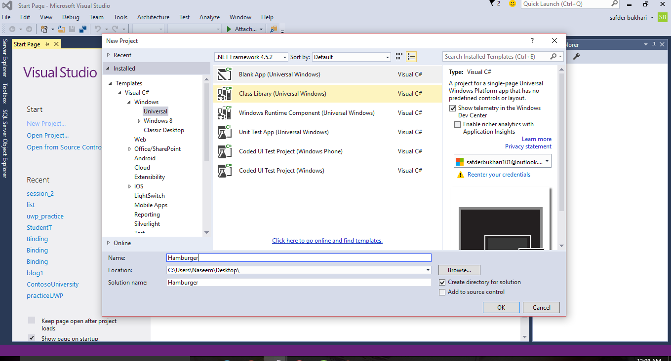
Open up Visual Studio. From the File menu choose New Project. From the options, choose a new blank Windows Application. Give it a name and click OK.
Add Markup
Open up your MainPage.xaml file.
<Page
x:Class="Hamburger.MainPage"
xmlns="http://schemas.microsoft.com/winfx/2006/xaml/presentation"
xmlns:x="http://schemas.microsoft.com/winfx/2006/xaml"
xmlns:local="using:Hamburger"
xmlns:d="http://schemas.microsoft.com/expression/blend/2008"
xmlns:mc="http://schemas.openxmlformats.org/markup-compatibility/2006"
mc:Ignorable="d">
<SplitView x:Name="MySplitView" DisplayMode="CompactOverlay" IsPaneOpen="False"
CompactPaneLength="50" OpenPaneLength="150">
<SplitView.Pane>
<StackPanel Background="Aqua">
Inside your stack panel, add the "hamburger" button, and below that a couple of dummy buttons just for reference.
<Button x:Name="HamburgerButton"
FontFamily="Segoe MDL2 Assets"
Content=""
Width="50"
Height="50"
Background="Transparent"
Click="HamburgerButton_Click"
/>
<StackPanel Orientation="Horizontal">
<Button x:Name="MenuButton1"
FontFamily="Segoe MDL2 Assets"
Content=""
Width="50"
Height="50"
Background="Transparent"
/>
<TextBlock Text="Home"
FontSize="18"
VerticalAlignment="Center"
HorizontalAlignment="Right"
/>
</StackPanel>
<StackPanel Orientation="Horizontal">
<Button x:Name="MenuButton2"
FontFamily="Segoe MDL2 Assets"
Content=""
Width="50"
Height="50"
Background="Transparent"
/>
<TextBlock Text="Settings"
FontSize="18"
VerticalAlignment="Center"
HorizontalAlignment="Right"
/>
</StackPanel>
<StackPanel Orientation="Horizontal">
<Button x:Name="MenuButton3"
FontFamily="Segoe MDL2 Assets"
Content=""
Width="50"
Height="50"
Background="Transparent"
/>
<TextBlock Text="Messages"
FontSize="18"
VerticalAlignment="Center"
HorizontalAlignment="Right"
/>
</StackPanel>
<StackPanel Orientation="Horizontal">
<Button x:Name="MenuButton4"
FontFamily="Segoe MDL2 Assets"
Content=""
Width="50"
Height="50"
Background="Transparent"
/>
<TextBlock Text="Contact"
FontSize="18"
VerticalAlignment="Center"
HorizontalAlignment="Right"
/>
</StackPanel>
</StackPanel>
</SplitView.Pane>
<SplitView.Content>
<Grid Background="Azure">
<TextBlock Text="Hamburger Menu"
FontSize="54"
Foreground="Purple"
HorizontalAlignment="Center"
VerticalAlignment="Center"
/>
</Grid>
</SplitView.Content>
</SplitView>
</Page>
Code Behind
The final step is to add the logic to our Hamburger Button to open and close the menu. Open the MainPage.xaml.cs.
using System;
using System.Collections.Generic;
using System.IO;
using System.Linq;
using System.Runtime.InteropServices.WindowsRuntime;
using Windows.Foundation;
using Windows.Foundation.Collections;
using Windows.UI.Xaml;
using Windows.UI.Xaml.Controls;
using Windows.UI.Xaml.Controls.Primitives;
using Windows.UI.Xaml.Data;
using Windows.UI.Xaml.Input;
using Windows.UI.Xaml.Media;
using Windows.UI.Xaml.Navigation;
// The Blank Page item template is documented at http://go.microsoft.com/fwlink/?LinkId=402352&clcid=0x409
namespace Hamburger
{
/// <summary>
/// An empty page that can be used on its own or navigated to within a Frame.
/// </summary>
public sealed partial class MainPage : Page
{
public MainPage()
{
this.InitializeComponent();
}
private void HamburgerButton_Click(object sender, RoutedEventArgs e) {
MySplitView.IsPaneOpen = !MySplitView.IsPaneOpen;
}
}
}
Try it
Run your project by pressing F5 or clicking the Start Button. You should be able to open and close your menu with the hamburger button.
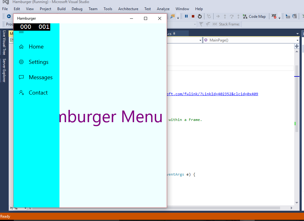
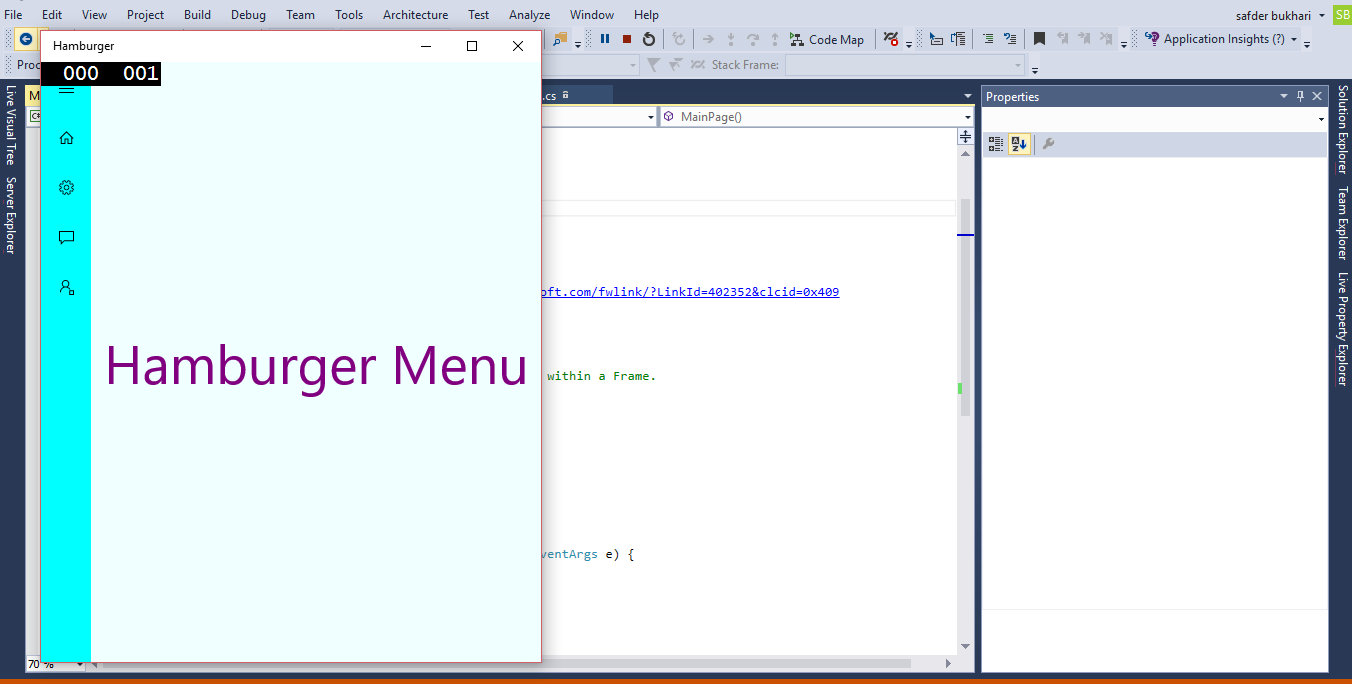
Split View:
The Split View control has an expandable pane and a content area.
The Split View has two main elements, the pane and the content. The pane represents the menu that you want to be able to interact with and the content represents the main content of your page.
The pane and content areas divide the available screen.
The pane is always visible in this mode and is just wide enough to show icons.