풍력은 기후 변화에 맞서기 위해 화석 연료를 대체할 수 있는 에너지원입니다. 바람은 본질적으로 일관되지 않으므로 풍력 연산자는 ML(기계 학습) 모델을 빌드하여 풍력 용량을 예측해야 합니다. 이 예측은 전기 수요를 충족하고 그리드 안정성을 보장하기 위해 필요합니다. 이 자습서에서는 Azure Maps 날씨 예측 데이터가 날씨 판독값이 있는 데모 데이터와 결합되는 방식을 안내합니다. Azure Maps Weather Service를 호출하여 일기 예보 데이터를 요청합니다.
이 자습서에서는 다음을 수행합니다.
참고
이 프로젝트의 Jupyter Notebook 파일은 기상도 Juppyter Notebook 리포지토리에서 다운로드할 수 있습니다.
필수 조건
Azure 구독이 없는 경우 시작하기 전에 체험 계정을 만듭니다.
- Azure Maps 계정
- 구독 키
- Visual Studio Code
- VS Code의 Jupyter Notebook에 대한 실무 지식
- Jupyter Notebook에서 Python과 함께 작동하도록 설정된 환경입니다. 자세한 내용은 환경 설정을 참조하세요.
참고
Azure Maps의 인증에 대한 자세한 내용은 Azure Maps의 인증 관리를 참조하세요.
프로젝트 수준 패키지 설치
EV 라우팅 및 도달 가능한 범위 프로젝트에는 aiohttp 및 IPython python 라이브러리에 대한 종속성이 있습니다. pip를 사용하여 Visual Studio 터미널에 설치할 수 있습니다.
pip install aiohttp
pip install ipython
pip install pandas
Visual Studio Code에서 Jupyter Notebook 열기
다운로드한 후 이 자습서에 사용된 Notebook을 엽니다.
GitHub의 AzureMapsJupyterSamples 리포지토리에서 weatherDataMaps.ipynb 파일을 엽니다.
화면의 오른쪽 위 모서리에서 원시 파일 다운로드 단추를 선택하여 파일을 로컬로 저장합니다.
다운로드한 Notebook을 Visual Studio Code에서 열려면 파일을 마우스 오른쪽 버튼으로 클릭하고 >를 선택하거나, 엽니다.
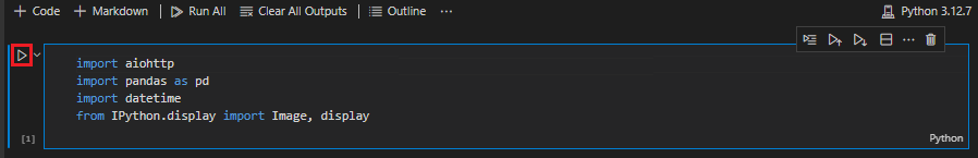
필요한 모듈 및 프레임워크 로드
코드가 추가되면 셀 왼쪽의 실행 아이콘을 사용하여 셀을 실행할 수 있으며 출력은 코드 셀 아래에 표시됩니다.
다음 스크립트를 실행하여 필요한 모든 모듈 및 프레임워크를 로드합니다.
import aiohttp
import pandas as pd
import datetime
from IPython.display import Image, display
날씨 데이터 가져오기
이 자습서에서는 4개의 서로 다른 풍력 터빈에 설치된 센서의 날씨 데이터 판독값을 사용합니다. 샘플 데이터는 30일의 날씨 판독값으로 구성됩니다. 이러한 판독값은 각 터빈 위치 근처의 날씨 데이터 센터에서 수집됩니다. 데모 데이터에는 기온, 풍속 및 풍향에 대한 데이터 판독값이 포함되어 있습니다. GitHub에서 weather_dataset_demo.csv에 포함된 데모 데이터를 다운로드할 수 있습니다. 다음 스크립트는 데모 데이터를 Azure Notebook으로 가져옵니다.
df = pd.read_csv("./data/weather_dataset_demo.csv")
일일 예측 데이터 요청
시나리오에서는 각 센서 위치에 대한 일일 예측을 요청하려고 합니다. 다음 스크립트는 Azure Maps Weather Service의 일일 예측 API를 호출합니다. 이 API는 현재 날짜로부터 다음 15일 동안 각 풍력 터빈에 대한 날씨 예보를 반환합니다.
subscription_key = "Your Azure Maps key"

# Get a lists of unique station IDs and their coordinates
station_ids = pd.unique(df[['StationID']].values.ravel())
coords = pd.unique(df[['latitude','longitude']].values.ravel())

years,months,days = [],[],[]
dates_check=set()
wind_speeds, wind_direction = [], []

# Call azure maps Weather service to get daily forecast data for 15 days from current date
session = aiohttp.ClientSession()
j=-1
for i in range(0, len(coords), 2):
    wind_speeds.append([])
    wind_direction.append([])

    query = str(coords[i])+', '+str(coords[i+1])
    forecast_response = await(await session.get("https://atlas.microsoft.com/weather/forecast/daily/json?query={}&api-version=1.0&subscription-key={}&duration=15".format(query, subscription_key))).json()
    j+=1
    for day in range(len(forecast_response['forecasts'])):
            date = forecast_response['forecasts'][day]['date'][:10]
            wind_speeds[j].append(forecast_response['forecasts'][day]['day']['wind']['speed']['value'])
            wind_direction[j].append(forecast_response['forecasts'][day]['day']['windGust']['direction']['degrees'])

            if date not in dates_check:
                year,month,day= date.split('-')
                years.append(year)
                months.append(month)
                days.append(day)
                dates_check.add(date)

await session.close()
다음 스크립트는 맵 이미지 가져오기 서비스를 호출하여 맵에 터빈 위치를 렌더링합니다.
# Render the turbine locations on the map by calling the Azure Maps Get Map Image service
session = aiohttp.ClientSession()
pins="default|la-25+60|ls12|lc003C62|co9B2F15||'Location A'{} {}|'Location B'{} {}|'Location C'{} {}|'Location D'{} {}".format(coords[1],coords[0],coords[3],coords[2],coords[5],coords[4], coords[7],coords[6])
image_response = "https://atlas.microsoft.com/map/static?subscription-key={}&api-version=2024-04-01&layer=basic&style=main&zoom=6¢er={},{}&pins={}".format(subscription_key,coords[7],coords[6],pins)
static_map_response = await session.get(image_response)
poi_range_map = await static_map_response.content.read()
await session.close()
display(Image(poi_range_map))

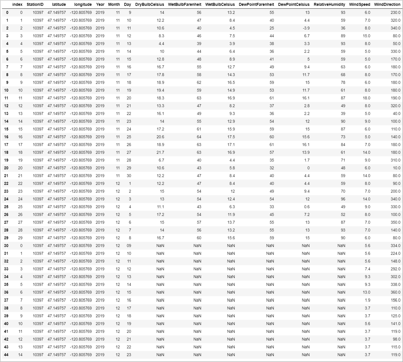
스테이션 ID를 기반으로 하는 데모 데이터를 사용하여 예측 데이터를 그룹화합니다. 스테이션 ID는 날씨 데이터 센터용입니다. 이 그룹화는 예측 데이터를 사용하여 데모 데이터를 보강합니다.
# Group forecasted data for all locations
df = df.reset_index(drop=True)
forecast_data = pd.DataFrame(columns=['StationID','latitude','longitude','Year','Month','Day','DryBulbCelsius','WetBulbFarenheit','WetBulbCelsius','DewPointFarenheit','DewPointCelsius','RelativeHumidity','WindSpeed','WindDirection'])

for i in range(len(station_ids)):
    loc_forecast = pd.DataFrame({'StationID':station_ids[i], 'latitude':coords[0], 'longitude':coords[1], 'Year':years, 'Month':months, 'Day':days, 'WindSpeed':wind_speeds[i], 'WindDirection':wind_direction[i]})
    forecast_data = pd.concat([forecast_data,loc_forecast], axis=0, sort=False)

combined_weather_data = pd.concat([df,forecast_data])
grouped_weather_data = combined_weather_data.groupby(['StationID'])
다음 테이블에는 터빈 위치 중 하나에 대한 기록 데이터와 예측 데이터가 결합되어 있습니다.
# Display data for first location
grouped_weather_data.get_group(station_ids[0]).reset_index()
예측 데이터 그리기
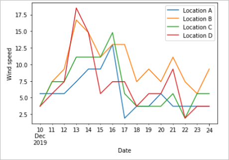
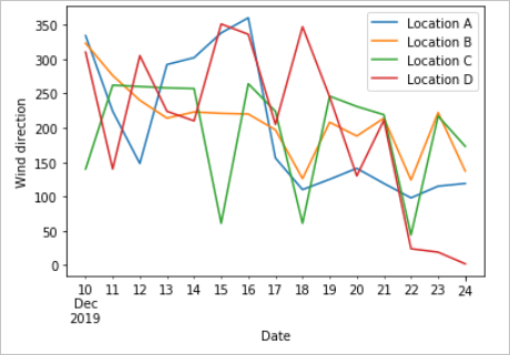
예측된 값을 예측한 날짜와 비교하여 표시합니다. 이 플롯을 사용하면 다음 15일 동안 풍속 및 풍향 변화를 확인할 수 있습니다.
# Plot wind speed
curr_date = datetime.datetime.now().date()
windsPlot_df = pd.DataFrame({ 'Location A': wind_speeds[0], 'Location B': wind_speeds[1], 'Location C': wind_speeds[2], 'Location D': wind_speeds[3]}, index=pd.date_range(curr_date,periods=15))
windsPlot = windsPlot_df.plot.line()
windsPlot.set_xlabel("Date")
windsPlot.set_ylabel("Wind speed")
#Plot wind direction
windsPlot_df = pd.DataFrame({ 'Location A': wind_direction[0], 'Location B': wind_direction[1], 'Location C': wind_direction[2], 'Location D': wind_direction[3]}, index=pd.date_range(curr_date,periods=15))
windsPlot = windsPlot_df.plot.line()
windsPlot.set_xlabel("Date")
windsPlot.set_ylabel("Wind direction")
다음 그래프는 예측 데이터를 시각화합니다. 풍속 변화의 경우 왼쪽 그래프를 참조하세요. 풍향 변화의 경우 오른쪽 그래프를 참조하세요. 이 데이터는 데이터가 요청된 날짜로부터 다음 15일 동안의 예측입니다.
이 자습서에서 Azure Maps REST API를 호출하여 날씨 예측 데이터를 가져오는 방법을 알아보았습니다. 또한 데이터를 그래프로 시각화하는 방법을 알아보았습니다.
이 자습서에서 사용되는 Azure Maps API를 살펴보려면 다음을 참조하세요.
Azure Maps REST API의 전체 목록은 Azure Maps REST API를 참조하세요.